Waterlogged

PL Waterlogged a3

Vert

L2: Junior Member
May 30, 2014
71
21
pl_waterlogged - Pretty much pl_cornered_a2

The legacy of pl_cornered. I took everyone's feedback to heart, and pretty much redid the whole thing. The only things that stayed the same are the blue base, and part of A's major flank. Despite being the second version of the map, I'm still calling this an a1 because of the new name, and how different it is.
waterlogged_a1 A-Blue.png
waterlogged_a1 A-Red.png
waterlogged_a1 AB connector.png
waterlogged_a1 B-Blue.png
waterlogged_a1 B-Flank.png
waterlogged_a1 B-Red.png
 

Vert

L2: Junior Member
May 30, 2014
71
21
Not actually a2a, just a2. That's just because of some nonsense on my end. My first time packing custom content (frontline!) so it might not work...

Read the rest of this update entry...
 

Vert

L2: Junior Member
May 30, 2014
71
21
Whole lotta changes made to stage two in this one, such as a fairer flank for 2A and a stronger choke on 2B. Overall, I've made it harder for Blu. Stage one had only one major change, which was at point A. I hope it will convince red to defend the point room, and not spawncamp. Also, I'm 99% sure I packed the frontline stuff correctly this time!
waterlogged_a3 1A_blu.png
waterlogged_a3 1A_point.png
waterlogged_a3 1B_flank.png
waterlogged_a3 1B_point.png
waterlogged_a3 2A_blu.png
waterlogged_a3 2A_mid.png
waterlogged_a3 2A_red.png
waterlogged_a3 2B_blu.png
waterlogged_a3 2B_red.png
waterlogged_a3 Finale.png

RIP Theodore Tugboat

Read the rest of this update entry...
 

The Letter Before A

Cool Idiot
Jul 15, 2016
292
196
CC-
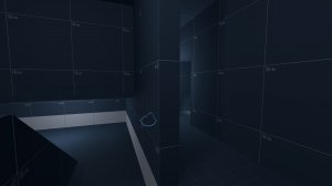
Overall great looking map

Needs one more stage in between
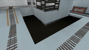
Water texture is cheap and too cloudy
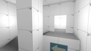
some indoor areas are too bright
The first blu respawn at first comes across as only having one exit
I fucking hate pyros we should collab sometime
And maybe add some func_preciptitaion
 

Attachments

  • 20160810211605_1.jpg
    20160810211605_1.jpg
    108 KB · Views: 162
  • 20160810211621_1.jpg
    20160810211621_1.jpg
    157.1 KB · Views: 154
  • 20160810211644_1.jpg
    20160810211644_1.jpg
    378.8 KB · Views: 160
  • 20160810211709_1.jpg
    20160810211709_1.jpg
    156.6 KB · Views: 164

ExtraCheesyPie

L420: High Member
Jan 29, 2015
485
151
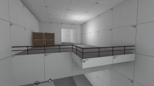
I am a simple man, I see the cliff still there in the screenshot, with that one side room, I smile. That was my favourite part of the map, i just stood there as pyro airblasting defenders off.
 

Vert

L2: Junior Member
May 30, 2014
71
21
Overall great looking map

Thanks!

Needs one more stage in between

I've thought about it, but I don't want to give myself too much to work on, as I haven't finished a single map yet. Also, adding another stage would throw off my "pacing" for the detailing and facade. Maybe, *sniff*, maybe.

Water texture is cheap and too cloudy

I used that texture on purpose, because the detailing is meant to have the pools as pits not meant to be filled with water, so they end up muddy. The opacity also makes it a better flank than clearer textures like water_well.

some indoor areas are too bright

I am awful at lighting so thanks for pointing this out!

The first blu respawn at first comes across as only having one exit

I'm probably going to redo the whole thing, and make it more like some of the thunder mountain blue spawns.

I fucking hate pyros we should collab sometime

Dude I am so down.
 

zahndah

professional letter
aa
Jul 4, 2015
763
647
I'm probably going to redo the whole thing, and make it more like some of the thunder mountain blue spawns.

no no no no, no. The thunder mountain spawns (other than stage 3 i guess) are pretty terrible. They are terrible, because the defenders can easily spam both doorways from one position in stage 1 and 2. What you would want for your spawns, is multiple exits but spaced far enough away that you cannot cover more than 1 / all of the exits when you are defending the spawn (without having to run a reasonable distance to rotate) - its not fun to get spawncamped.