Thoughts:
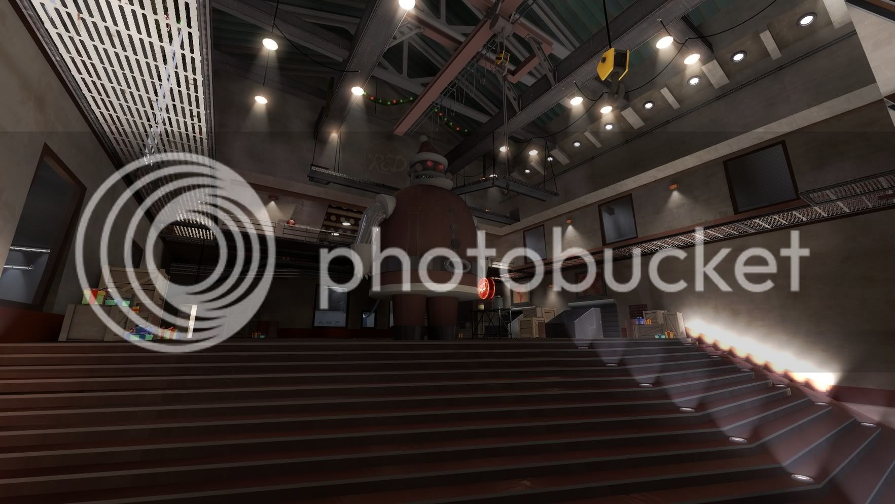
ctf_sleighride Pros: :O Dat control tower. Also, I like the "santa's runway" theme, it's creative and fits into TF2 perfectly.
Cons: That spiral staircase is a pain to navigate and the outdoor area's are a little bare. (nitpicking i know

)
holiday_cynick best map in whole contest easy winner lololololo
holiday_godslayer57 Pros: I like the "snowed-in" hallways, it's much more interesting than just having closed doors.
Cons: It's a little dark and cramped especially with the chandalier not lit, it almost feels like halloween at christmas. I think maybe some windows would help, even if they are just to the sky.
holiday_j4ck8 Pros: Where to start

hmy:. You managed to put a ton of detail into the small space provided without making it feel cramped, which is pretty amazing. The skybox choice was great and the lighting made it stand out (in a good way) even more. The underground base was awesome, although i never figured out what exactly happened when i picked up the intel.
Cons The waterfall was loud, i had to turn my sound down. Also some of the cliffs are kind of blocky (the tunnel right near spawn). Overall awesome job.
holiday_moose Pros: Does a great job of feeling cold and desolate. Definately looks like it could be a real place. I like the skybox as well, it fits the theme.
Cons: The map doesn't quite seem "complete" but that's mostly because of the size limitations of the contest making the buildings on the edge really thin. I think this theme could be really good in an actual map with no 2048x2048 limit so you could make the rest of those buildings.
holiday_nitram Pros: The detailing on the inside and outside of the barn was top notch, definately looked more like a barn than anything i've seen in the official maps. the basement was a nice touch.
Cons: The skybox wall is mostly visible around the edge of the whole map. This is kind of unavoidable due to the size restraints, but i think a few trees or even a fence would have made the edge look 10 times better. (Also, soundscapes!)Overall, great work.
holiday_pl-7764 Pros: Can't comment on much specifically here because it was all very good. You did an excellent job using the mansion props without making it feel like halloween. Also those displacement wreaths fit in perfectly, i thought they were custom models at first then i was like :O.
Cons Soundscapes! Other than that i got nothing here except maybe that, some of the ceiling beams have misaligned textures. Very good job.
holiday_spank Pros: Robot santa. nuff said.  Also the wreath and christmas lights were a nice touch. The windows prevent it from feeling cramped. Cons I can't get back to the balcony
  . Also, lack of soundscapes :/. I know it was a detailing contest but I hate when maps are completely silent. Overall, very good job, (btw when i saw the screenshot in the upload thread i spent like five minutes looking at robot santa just like :O)
holiday_void_2 Pros: All around amazing ski-lodge theme. Love the architecture on the lodge itself and the door that caved in under the snow. Cons Spawns are broken, and I didn't like having to noclip to each floor, but the contest is about detail, so that's not a huge deal. add soundscapes though, silent maps are boring :/. Overall, definately one of my favorites. (unrelated: if you shoot the clocks in the basement, there are two bullet holes for every bullet that hits the clock :O)
Overall, amazing work to everyone. I only expected to spend two minutes or less on each entry, but i ended up running around each for at least ten. Good luck to all of you!
Overall favorites: J4CK8, void and nitram. Tough decision is tough


