Overcast

PL overcast 2015-08-29

Vaconcovat

L3: Member
Jan 15, 2012
116
188
Pl_overcast, originally an attempt at a single-stage payload map for the dynamic element competition, now moved back into planning for a new style/conversion to multi-stage
 
Last edited:
Mar 23, 2010
1,874
1,699
this looks pretty cool!
 

tyler

aa
Sep 11, 2013
5,100
4,621
I really like that you used a spawnroom as a flank (I sort of did that in Hella). I think it's underutilized, but be careful, because it'll really confuse people.
 

Freyja

aa
Jul 31, 2009
3,011
5,839
I took a run around. It was pretty good, but I'll really have to play it during a game to see how it goes. I felt there was a few side areas that would never be used, as they were a bit far away from the track, however.
 

Vaconcovat

L3: Member
Jan 15, 2012
116
188
Yeah, I think i'll remove the fence and extend out the building to the left of it. It'll make it less confusing and make an excuse for why you can't rocket jump over it.

Also, I think the finale's a bit boring ATM, so I may add some sort of walkway round the pit with (inaccessible) stairs to make the whole thing more believable, as in someone actually operates the raygun. Also i'll remember to include the killtrigger next time. >_>

Still need a name :|

Also it's up for gameday tomorrow so i'll see how that goes.
 

Pocket

Half a Lambert is better than one.
aa
Nov 14, 2009
4,701
2,583
I think there may be something wrong with your spawn entities; there are three different spawn rooms for RED, and all three seemed to be enabled at the beginning of the round.
 

Tarry H Sruman

Large Orphanage Proprietor
aa
Jul 31, 2011
872
1,021
I thought the biggest problem was the sheer size of the map. It is really long, thin, and winding. I think you could greatly improve it by making it shorter and wider (particularly the beginning bit), and removing some of the wierd/underused things (that giant spiral tower was baffling). The map is so long that it doesn't feel focused, so it's hard for players to quickly grasp the overall layout.
 

Vaconcovat

L3: Member
Jan 15, 2012
116
188
Yeah, I forgot to disable red's spawn down near the finale, making the forward spawn act more like a sub-spawn, which according to the comments gave blu a large advantage. I'll attempt to either cut down the size of the map or hopefully try to explain it to players better. I don't want to end it at the furnace because that's my dynamic element :p.

TODO:
--Fix red's spawn :U

--Actually put the killtrigger in the finale and for the drop off the edge. Don't know why I didn't do that.

--Possibly re-think the spiral between D and E. It adds length to the track that isn't needed. Then, remove E.

--Possible additional access route for red into the first area, either via a building or just back walkway, might help red defend a bit if they have a drop-down only access point, rather than the chokepoint.
Lookey Here

--The door coming out of the break-through area under the furnace could be converted into either a one-way door (going out) before the cart gets there, or just a normal roller-door that opens on both sides.

--Add scaffolding or some sort of walkway around the raygun, also give red a spawn route from their top spawn out onto this walkway, so that they aren't forced through that little door.

--Change the huge fence splitting B-C from D-E into a building, and possibly allow access into it for cover / refuge. I still want the flank route in that spiral building connecting the two areas (it only opens once the cart has broken through the floor) so that blue isn't forced to have to fall through the floor or risk going past red's spawn in order to continue. I'll probably remove the spiral and drop-down thing, that was just a gimmick anyway.
 

LeSwordfish

semi-trained quasi-professional
aa
Aug 8, 2010
4,101
6,597
Okay, right. My suggestions.

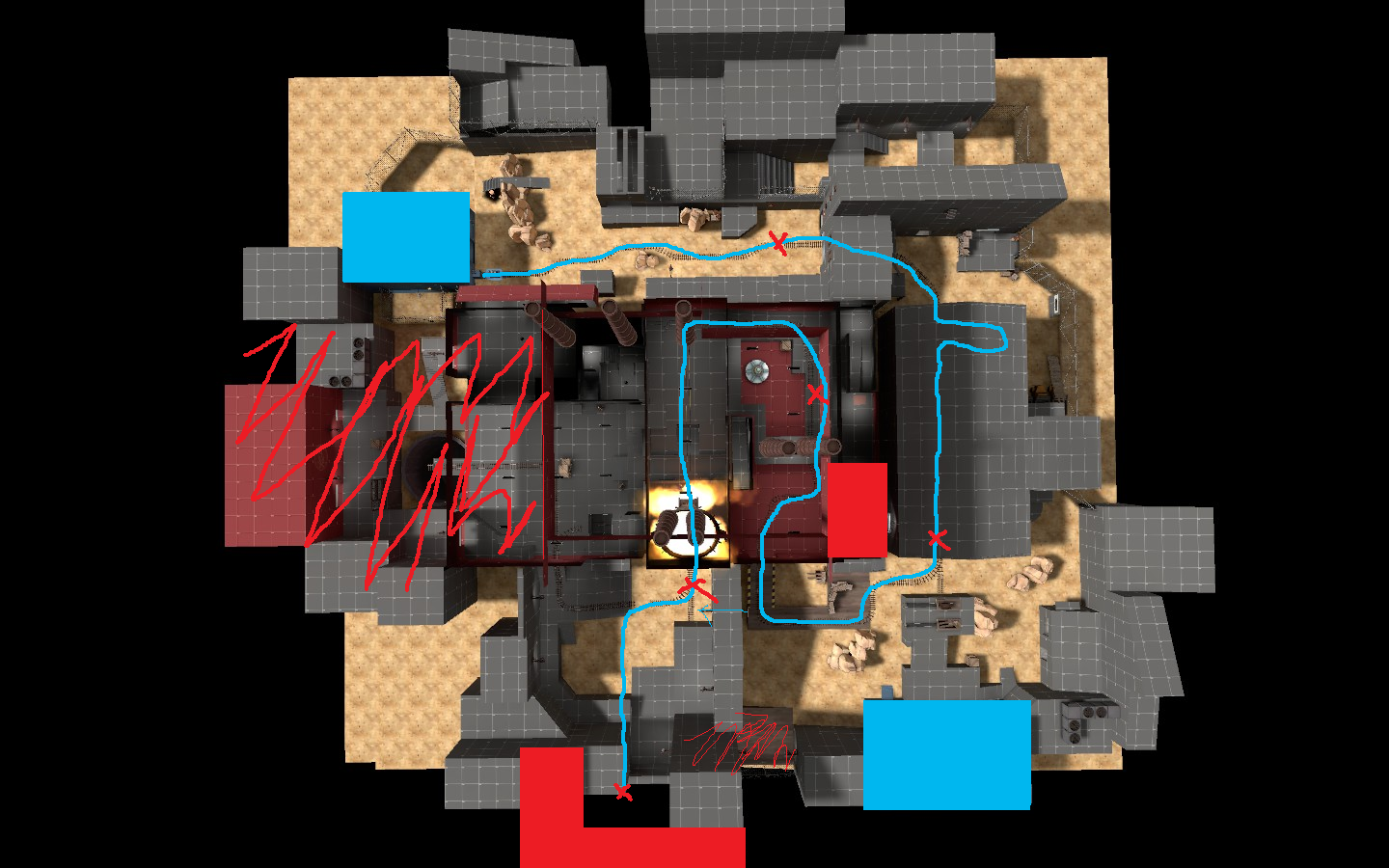
Vaconvat%20edit.jpg


Firstly, i suggest cutting the areas i've scribbled out, and making the cart path similar to the line i've drawn in blue. That should allow you to cut it down to a more reasonable length and size, and no longer require massive defending times.

1) Change this room. It's big and dull and empty, and takes ages to move around. Look at Badwater B-C area, that could be good here- with the flanking route that crosses the track.

Somewhere between here and the finale, you need an area for blu to take and defend, for building ubers and a teleporter and such.

2) This area will need some changing if you do as i suggest. and cut, or at least trim B-C. I like the firing range, but the exit from it is too cramped and spammy.

3) Okay, the big one. Cut the entire D-E area. It's Filler. You don't need it. Instead, stick to a simple ramp up and flank route. Blu has to choose between going down and pushing the cart up, or going through the doorway into the main room, and not being in a height disadvantage.

Also, i suggest moving the finale pit inside. It makes for less cool a spectacle, but Blue now have two angles of attack to this room, and no longer need to push the cart across a massive empty floor.

This also makes room for...

4) Move the red spawn. Red now face the doorways they need to go through right off. Lock off the underground area until the cart nears it, to stop people wandering into it.

Drop the dropdowns outside red spawn- maybe go for something a bit more like upward. (Actually, upwards final point wouldn't be bad as inspiration overall.) Dropdowns are bad since red cant retreat, and can build sentry nests that blu have trouble taking out.

--Possible additional access route for red into the first area, either via a building or just back walkway, might help red defend a bit if they have a drop-down only access point, rather than the chokepoint.
Lookey Here

Good idea.
 
Last edited:

Vaconcovat

L3: Member
Jan 15, 2012
116
188
Alright, I think i'm going to move redspawn out into the buildings where the raygun is pointing, and add platforms/ walkways & the works to create more of a finale experience. I don't really want to move it inside. This way, there's still the effect of being able to see the finale from blu's initial spawn. I am going to cut D/E (D/finale) into a very small ramp (or even an elevator?). I'm not too sure about completely cutting B/C, but I will definitely trim it down.

I also came up with this design off your recommendations, but I probably won't roll with it.

EDIT:
The breakthrough (Dynamic element)
Code:
BLU approaches RED's furnace, and are faced with a declined track that appears to roll straight into the furnace. As they tip the cart over the decline, they lose control of the cart and the furnace access doors open. This is the end of it for BLU, they have failed. Then, luckily, the floor collapses below the cart just before it reaches the furnace into red's secret spytech base. Blu escorts the cart out of the spytech base, and back onto the initial path.

3 Trigger points: 
Start of the rollforward, The breakthrough, the landing.

6 access points to the dropdown area:
RED minor (Stairwell)
RED major (Broken service elevator)
Breakthrough hole
BLU minor (Service hallways)
BLU major (Service hallways - shortcut)
Exit path

Initial:
RED minor is open, all others locked.
Exit Path can be freely opened and closed, but blu do not have access to it yet unless they are wandering around)

Nearing (Control point C or nearest control point):
BLU minor opens.

Start of the rollforward:
RED major opens.

Breakthrough:
BLU major opens, Breakthrough hole opens (duh).

Landing:
Exit path opens.
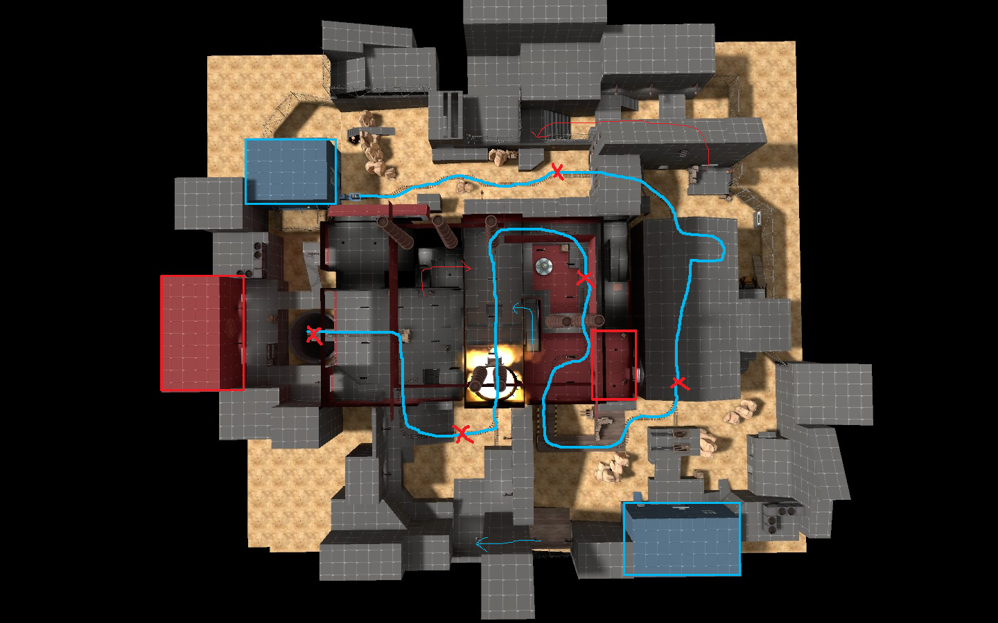
 
Last edited:

Vaconcovat

L3: Member
Jan 15, 2012
116
188
Ok, bump for what i did in a2

a2_nope.png


* Added a flank route (dropdown) for red at first point.
* Gave Blu early access to the underground area, Upon capping C A door is open to allow access to an underground room, then once the cart starts rolling down, a slow door opens allowing blu to access the underground area JUST before the cart breaks through.
* Pretty much deleted D-E and replaced it with a simple ramp and kept the flank.
* Moved red's spawn into the buildings adjacent, and created a horrible, flat finale.

Essentially, I got rid of some of the filler and choke points, but then no matter which way i go about the finale, it turns into a long flat factory floor with props to create cover and break sight lines. Its just weird and clunky, including the ramp up (Point D). So I've decided to get inspiration from goldrush's stage 3 point B and finale. Basically, the finale will take place almost directly after point D.

a2_idunno.png


It will be a partially straight, but short track to the finale (which will still be the same superweapon) with the two sections of buildings on either side of tracks being able to be access, not necessarily as flanks, but to serve as cover and something to dart in and out of whilst pushing the cart slowly into the goal. And so, i'm not releasing a2 as of yet, i want to apply these changes first. if i can get these done before the competition, then i'll submit that, otherwise i'm not sure if i want to submit a1
 

Vaconcovat

L3: Member
Jan 15, 2012
116
188
Bumpidy bumpidy

I tried to open up the first area, by completely expanding around the middle building.
F065833CBAD8AF9300B72CD7A91778FB899C0D75

15E13524F39E8652AA2D46E2DD9CCCEB62D24296

A27CB225A03CBF5E21F9018A168D571872CC1D24


Now, dat finale
 

Vaconcovat

L3: Member
Jan 15, 2012
116
188
Alright, in preparation to submit this mess of devtextured and changing alpha designs, I've made a new finale, cleaned up C a bit, and generally are working towards a better layout.

Next stop, (If i have enough time tomorrow), look at B and submit :(

I'm still going to work on this after the competition, shame i didn't put more time into it to before the deadline, though.

pics
242E0C84A14F1673FEFAB5FD966FC9BD1DA4CABC

61E322B4CC7FD04F6F669A81AC63BE5ECC73BA71

0B6D718AFFC700B5CB335E923D6EC4BB1E357B31
 

Vaconcovat

L3: Member
Jan 15, 2012
116
188
fafadfsafasdffa gotta go fast like sanic

K, I made blu's initial spawn better
F010D8F6AEBE27615D5D98FA28FDF4EB0EB23B09

2389FC4FC5C7A3615C7DA0A098F0395D93DFCD7E

4 doors, in 2 sections

And then made this area smaller
17371E9BC7DEBBE9118516DEE740BB821C648A06


yup

now, cubemaps, nobuilds, hints/areaportals wheeeeeeeee
 

Vaconcovat

L3: Member
Jan 15, 2012
116
188
Submitted, phew.

Now, things i now realize i forgot but its too late:
*Spectator cameras
*Fixing the stupid furnace particles
 

Vaconcovat

L3: Member
Jan 15, 2012
116
188
There's a large amount of problems with the general flow and layout of the map. Most of the chokes are thrown together and the flanks either don't have any tactical advantage or move too far into enemy territory. I'm going to stop with this map as it is, 'twas a good learning experience but because i had no idea what i was doing in planning, trying to fix the problems one by one just created a mix-mash of bad chokes and weird flow in the map. I'll probably keep the initial ideas of the drop-down area accompanied by furnace, and the shooting range, but otherwise i'll try again and actually use the sawmill/alpine theme so that overcast as a name makes sense.

I think i'll turn it into a 3-stage (or 2-stage? hmmm) payload.