Office Wars

KotH Office Wars koth_office_wars_a5

ETHAN BRADBERRY

L1: Registered
Apr 7, 2016
3
0
Office Wars - The red and blu offices fight to the death! This is my first real map.

This map is my first real map I ever made. I used UEAKcrash's guide on YouTube to make it. My idea was two competing company buildings (for red and blue) have enough and start fighting to the death.
 

ExtraCheesyPie

L420: High Member
Jan 29, 2015
485
151
Please add a few screenshots
 

DeleteMyAccount

L1: Registered
Apr 8, 2016
46
21
The architecture is quite strange for an office and strange generally. There are random cuts in the floor and bridges with no support

It helps to add a visual cue to the player that an area is inaccessible for places like the orange path on the right of the spawn.

Is there a reason you have to hold it for 4 minutes?

I find the death-pit a bit strange but maybe it's ok in playtesting. Also while I guessed it was maybe add a sign or something to make it clear.

If you don't go to the point via the tunnel there isn't much cover for the attacker and they have a height disadvantage.

The RED and BLU offices feel a little over-scaled and the stairs/ramp on the ground floor go pretty close to the wall. Maybe not a gameplay problem.
 

ETHAN BRADBERRY

L1: Registered
Apr 7, 2016
3
0
The architecture is quite strange for an office and strange generally. There are random cuts in the floor and bridges with no support

It helps to add a visual cue to the player that an area is inaccessible for places like the orange path on the right of the spawn.

Is there a reason you have to hold it for 4 minutes?

I find the death-pit a bit strange but maybe it's ok in playtesting. Also while I guessed it was maybe add a sign or something to make it clear.

If you don't go to the point via the tunnel there isn't much cover for the attacker and they have a height disadvantage.

The RED and BLU offices feel a little over-scaled and the stairs/ramp on the ground floor go pretty close to the wall. Maybe not a gameplay problem.


These are all valid points. The architecture is a bit weird mainly because when I started the map it was purely abstract. I plan to add fences around the map to signify the inaccessible areas, though keep in mind the updated version is a little bit more open. The 4-minute timer is dumb, and I don't know why I did it. I think it is also a good idea to put signs to signify things like death pits and one-way paths. I also plan to redesign the "offices" by shortening the ceilings, adding some cubicle type props to the top floor and a sort of lobby to the bottom door, and changing the weird "stairs" in the buildings into a hole blown in the floor. This might take a while though, as recently I was forced to reset my SSD with the vmf file on it and have lost that file. I will have to figure out how to convert a bsp file to a vmf file. If you have any suggestions that would be greatly appreciated.
 

FRAЭR

L2: Junior Member
Jan 1, 2017
58
15
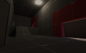
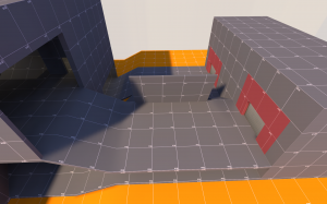
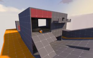
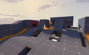
Remember: No pics - No clicks , so I did some for you
6.png 1.png 4.png 5.png