Maizefield

KotH Maizefield A2

Hejod

L1: Registered
Jan 25, 2021
2
1
Maizefield - first map

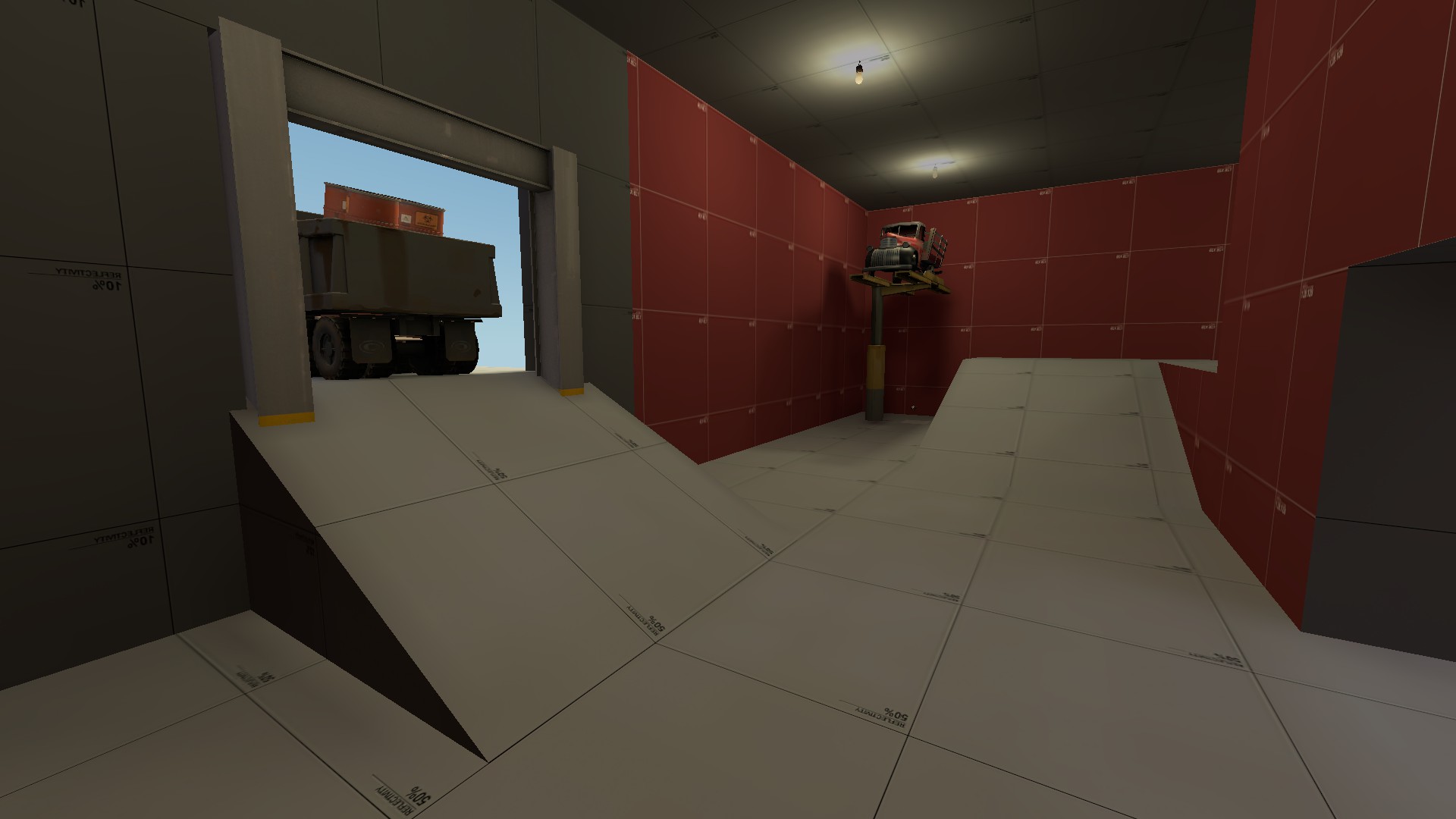
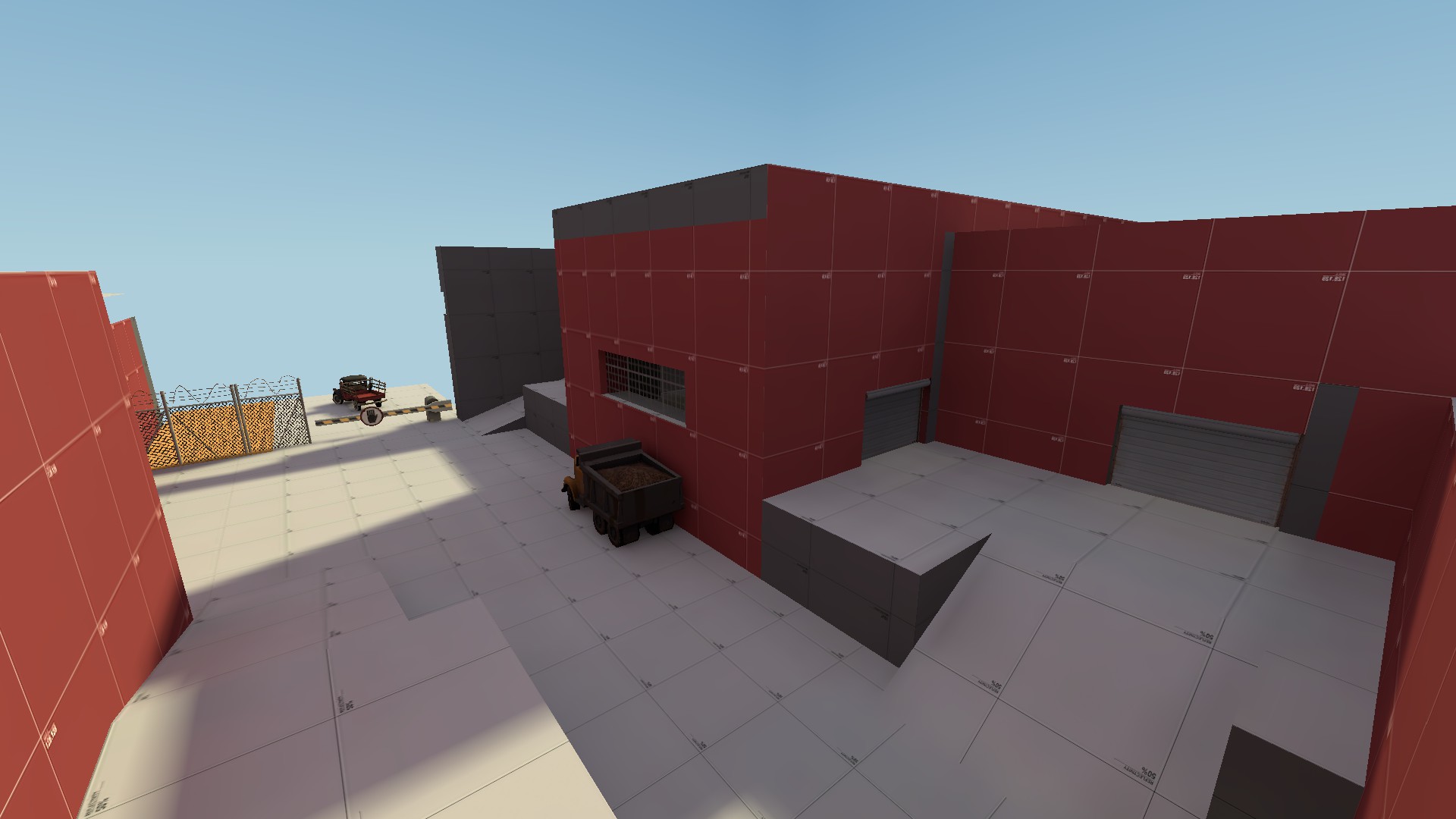
A rather basic koth map set on a farm. Also my first map. View attachment 141661
20210127103119_1.jpg
View attachment 141663
20210127103215_1.jpg
 

d3adfin

L4: Comfortable Member
Jul 21, 2019
185
71
i see potential here but there are a few points i'd like to make

upload_2021-1-28_9-58-55.png

- large doorway that opens up a long sightline to spawn, this also applies to other doors but this one is the worst in that regard

upload_2021-1-28_9-52-5.png

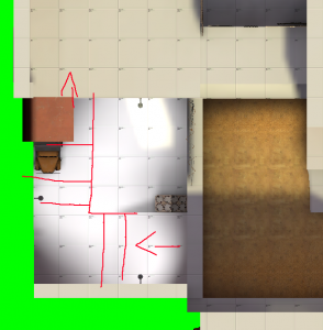
- this area would probably play more interestingly if the ground was a displacement that gradually sloped upwards towards the right instead of just being a flat plane with a sharp incline to the side of the house

upload_2021-1-28_9-48-51.png

- there is basically no reason to go in this pit, it is way too easy to get spammed out down here
- the only way to the top from the attacking side is through the house when a ramp up to it would work very well

upload_2021-1-28_9-53-47.png

- this sightline is a little but crazy
- maybe not worth covering up if you fuck up the map geometry too much but it would still probably be annoying in gameplay

upload_2021-1-28_9-54-39.png

- ditto, it is very easy to shoot and be shot from here
- this would be much better if it just had some cover on it like viaduct does

upload_2021-1-28_9-50-7.png

- with the direction this ramp is facing it seems to me like it would be annoying to try to go to the connector while fighting people when it shouldn't be
- this would probably play much better if the ramp was facing forwards instead of to the side

upload_2021-1-28_9-56-11.png

- there isn't too much reason to go here, it's tight, long and there's already a connector that is easier to get through
- personally i would remove it but there are also ways you could make it more usable i think

upload_2021-1-28_9-57-6.png

- personally i think you should make this area accessible on offense to classes that aren't scout and soldier, it feels like it could work better than the flank to the side of this that you currently have

overall i think this map has had a very good start
can't wait to see how it changes!
 
Last edited:

d3adfin

L4: Comfortable Member
Jul 21, 2019
185
71
the improvements here are very nice but here's a few concerns i had looking at it

upload_2021-2-2_19-35-59.png

- the geometry here is very messy and for the amount of time it takes to get to the flank it honestly feels like you're choosing to take longer to get an advantageous position going here
- personally i would do away with the pit and just move this building into it, as well as getting rid of the spiral ramps and making it a right turn or something like this
upload_2021-2-2_19-39-54.png


upload_2021-2-2_19-34-52.png

- the height variation here is nice but the tight spaces under the bridge would make you instantly die if you're standing there
- additionally it could be cool if there was a way up to the bridge from one side in the lobby so that rotating onto it is doable without going inside a building
- personally i would add a ramp or some stairs onto the bridge and make the doorways in the bridge less tight

upload_2021-2-2_19-42-14.png

- this sightline still exists
- personally i think it would be a lot better if the cover looked more like this so it would be impossible to snipe at people to or from it
upload_2021-2-2_19-42-58.png


upload_2021-2-2_19-44-41.png

- the ramp to the dropdown is very thin and steep and the dropdown makes attacking through it way slower, additionally there's a decently safe sightline from the point directly into the dropdown room
- i would decrease the height variation in the dropdown room, make the ramp into it thinner, remove the dropdown and remove the sightline

upload_2021-2-2_19-49-51.png

- there's lots of bumpy, annoying geometry on this map
- do you have grid snapping on? seems like a lot of these problems shouldn't exist if you do, but if you do then it's as simple as just making the geometry less bumpy and more uniform

liking the changes in the newest version, excited to see how this map develops more
 

Attachments

  • upload_2021-2-2_19-39-43.png
    upload_2021-2-2_19-39-43.png
    416.8 KB · Views: 63