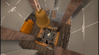
Hello, I thought your map looked interesting, so I downloaded it and booted it up. Here are some interesting things that I noticed.
There is far too much cover around the control point as shown in the image above. Players trying to regain control of the point have almost no line of sight onto the control point which makes defending much much easier.
Here is another example showing how going on top of the battlements area gives the attacking team no advantage against the defending team.
I would recommend getting rid of this giant fence all together. It would open up the sight lines a bit more and give the attacking team a better chance of regaining the control point.
This vent is nothing but a death trap. There is no incentive to go inside it. The fact that you are forced to crouch inside makes you a sitting duck for spam.


