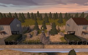
I took a look at your map in-game and I want to leave some quik-feedback on it. Lets begin with a sideview of your map.

Judging by this, I thought the map was using
mirrored symmetry. However there are some parts of the map which don't follow this symmetry.


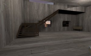
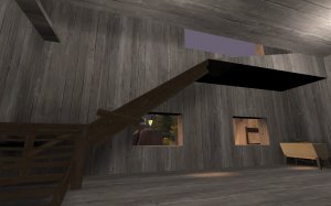
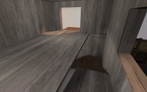
These 2 screenshots are the blu side stairs and red side stairs respectively. The issue is that both these stairs are placed in the same side and are heading in the same direction. (which shouldn't be the case in a mirrored map)


The blu side stairs are leading TOWARD the wooden balcony but the red side stairs are leading AWAY from the balcony. This is due to the balconies being mirrored (as you can see in the sideview screenshot earlier) but the room with the stairs being
rotationally symmetrical. I'm not sure if you intended this but I've never seen a map do this before.
Speaking of the balconies...

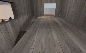
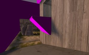
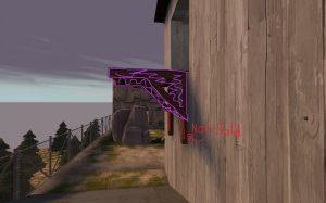
I bumped my head on a balcony which disrupted my movement quite a bit. I turned on r_drawclipbrushes 2 (or something like that) and that is exactly how you clipped it. I want to show you a (possibly) better way to do it.

The purple is the new clip brushes. To make players not hit their head, you may want to split (clip) the vertical brushes (the red lines) and turn them into func_brushes. In the properties somewhere you should find Solidity. Then make it non-solid. These may seem weird but players aren't going to notice and even if they do, we all know TF2 maps do these kinds of things anyway.
Also BTW...

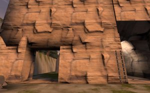
Some brushes in your map are Z-fighting. (going into each other) Idk if you noticed it already but put the effort into fixing these problems because people can and will leave multiple feedbacks on really apparent issues like these.
Anyway I hope this mini-guide was a little useful and this map actually looks pretty nice and the base layout is pretty good so keep the work on it!

