If you would indulge me, I wrote a brief essay on my 2017 detail contest entry

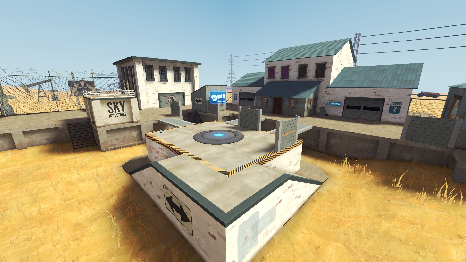
I created this entry for the 2017 Detailing Mini-Contest in the summer of that year. I was inspired by the vast emptiness of the Kansas prairie and Colorado high plains. Indeed, a two-lane asphalt road runs past the “map:” a memento of my journey.
Though my scene played into established tropes of farmland and industrial areas, I’m not sure any one map has done this exact location, and, with the benefit of hindsight, I think I see why. The game is no stranger to lonely landscapes, but the sweeping desert vistas of Badlands and the like inspire the imagination. Maps like Harvest are downright idyllic. By contrast, my vision of middle America is desolate and barren - there are no pumpkins, nor hay bales, nor vintage trucks, only power lines and oil drills. It’s just… kind of a shitty place in a way that befits a COD clone, not a game inspired by JC Leyendecker and goddamn Rockwell.
The gameplay spaces as well suffer from a weakness of vision. I wanted to build a grand art-deco-esque industrial building with huge windows and embossed corners like turrets on a castle. So I did, even though it makes no sense for one to be out in the prairie and the space is too small to inspire grandeur. “Why build it that tall if its only purpose is to conceal the missile silo?” wondered the judges. An excellent question.
My ego tripped me up in smaller ways as well. The concrete structure on the left - why is “Sky Industries” stenciled on the side? It has no logo, so it’s not much of an advertisement. And what a strange place for the owner of the property to put their name. It makes no sense. But alas, I had made a sign and I was determined to use it.

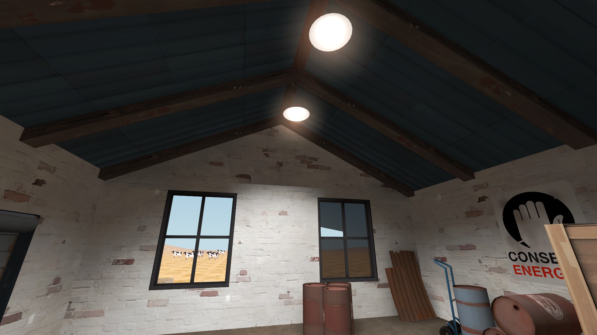
This review up until now has been me shitting all over Five-Years-Ago-Me, but there are things I like. I like the brushwork farmhouse out in the background. I don’t have any pictures of it, but the spytech command center underneath the point was inspiring as well. I was also especially proud of the brushwork of the wood and metal roofing, so much so that the only other remaining image I have is conspicuously framed to show it off. I’m also quite pleased with the arrangement of props in this scene, with stacks of well-used oil drums and a herd of cutout-cows in the background.
Memory informs me that I came in fifth or sixth place, a disappointing result at the time, but one I have largely come to accept. However, looking back at the thread I discovered that I actually did much worse. SEVENTH place?! Are you fucking with me? You gamers probably saw a stock theme with a stock skybox and smashed the downvote button - NO ONE APPRECIATES MY GENIUS!
I created this entry for the 2017 Detailing Mini-Contest in the summer of that year. I was inspired by the vast emptiness of the Kansas prairie and Colorado high plains. Indeed, a two-lane asphalt road runs past the “map:” a memento of my journey.
Though my scene played into established tropes of farmland and industrial areas, I’m not sure any one map has done this exact location, and, with the benefit of hindsight, I think I see why. The game is no stranger to lonely landscapes, but the sweeping desert vistas of Badlands and the like inspire the imagination. Maps like Harvest are downright idyllic. By contrast, my vision of middle America is desolate and barren - there are no pumpkins, nor hay bales, nor vintage trucks, only power lines and oil drills. It’s just… kind of a shitty place in a way that befits a COD clone, not a game inspired by JC Leyendecker and goddamn Rockwell.
The gameplay spaces as well suffer from a weakness of vision. I wanted to build a grand art-deco-esque industrial building with huge windows and embossed corners like turrets on a castle. So I did, even though it makes no sense for one to be out in the prairie and the space is too small to inspire grandeur. “Why build it that tall if its only purpose is to conceal the missile silo?” wondered the judges. An excellent question.
My ego tripped me up in smaller ways as well. The concrete structure on the left - why is “Sky Industries” stenciled on the side? It has no logo, so it’s not much of an advertisement. And what a strange place for the owner of the property to put their name. It makes no sense. But alas, I had made a sign and I was determined to use it.
This review up until now has been me shitting all over Five-Years-Ago-Me, but there are things I like. I like the brushwork farmhouse out in the background. I don’t have any pictures of it, but the spytech command center underneath the point was inspiring as well. I was also especially proud of the brushwork of the wood and metal roofing, so much so that the only other remaining image I have is conspicuously framed to show it off. I’m also quite pleased with the arrangement of props in this scene, with stacks of well-used oil drums and a herd of cutout-cows in the background.
Memory informs me that I came in fifth or sixth place, a disappointing result at the time, but one I have largely come to accept. However, looking back at the thread I discovered that I actually did much worse. SEVENTH place?! Are you fucking with me? You gamers probably saw a stock theme with a stock skybox and smashed the downvote button - NO ONE APPRECIATES MY GENIUS!

