Hey Bakscratch,
so after playing the map a couple times we (seba and I..) have a general conclusion of
if the map should be in the showcase, but we think it would be fair to give you some feedback of our thoughts and maybe you can create a fixed version for us to playtest again shortly.
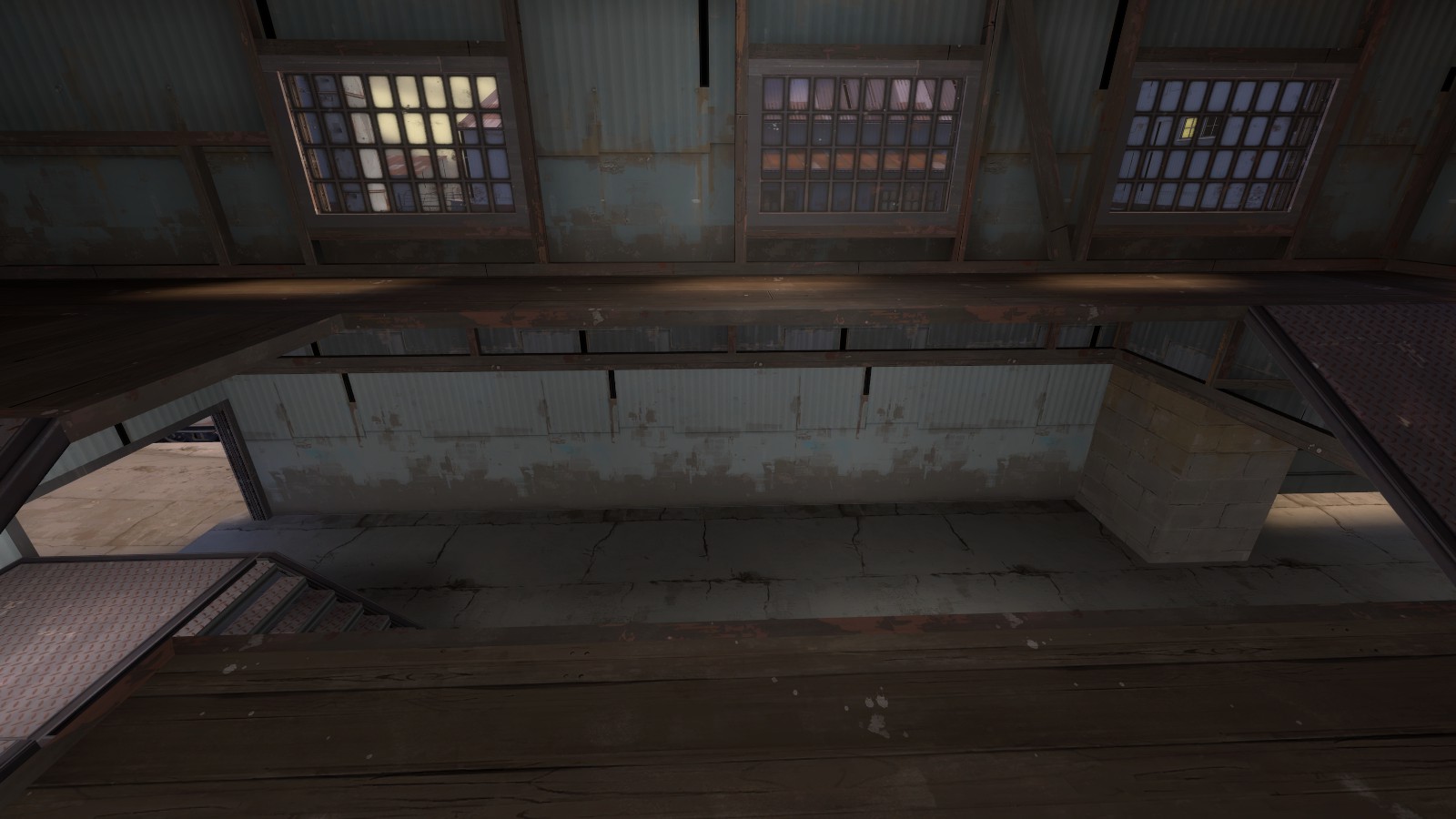
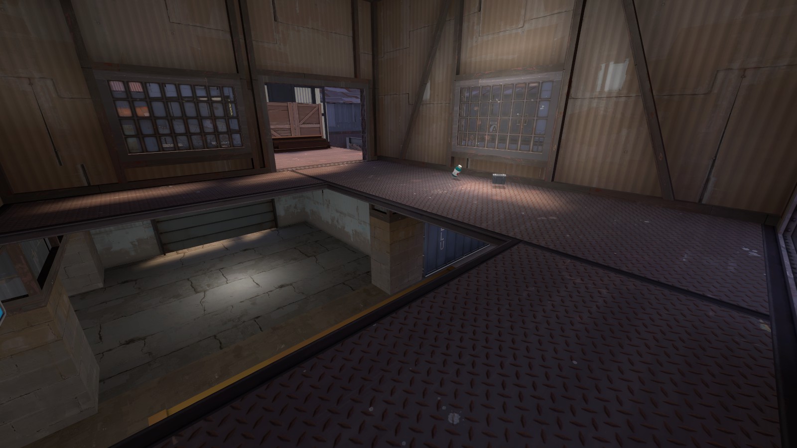
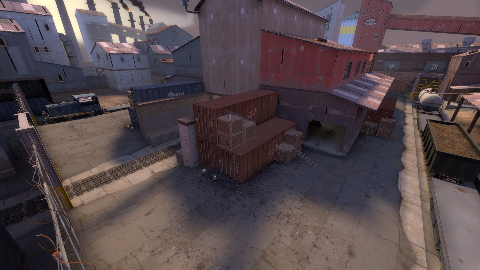
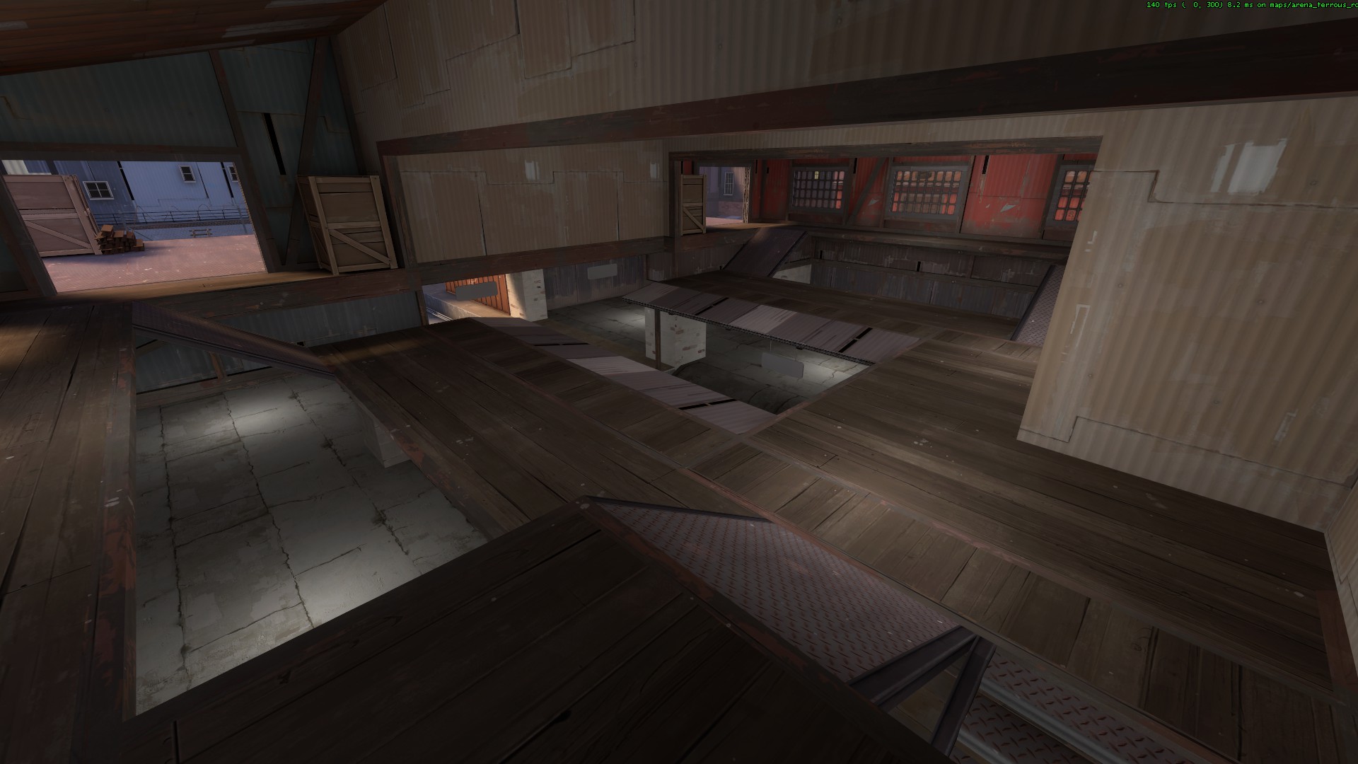
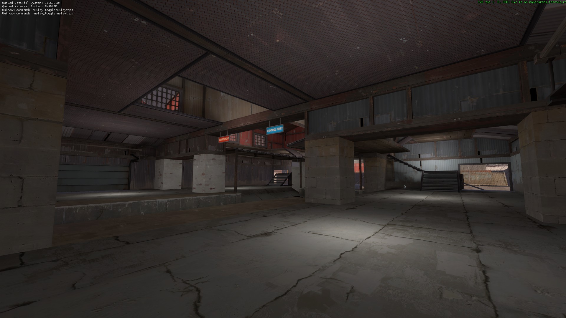
Looking down from the top of mid you can observe all entrances towards the point, meaning that controlling the top routes also controlled the bottom routes. We found that the map devolved into a quick chaotic battle for control of the top of mid, rather than anyone utilising prediction and strategy to assume where people might show up differently each round.
Mid being so open also made playing heavy feel particularly useless since he tends to stay away from open areas and hopefully catch people by surprise, but mid is open from the top, and the side routes are sniper magnets.
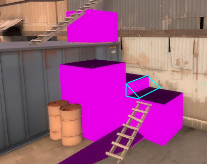
Jumping up these was annoying. Should add a playerclip to this spot since it looks like you can walk up it, and it would make the route smoother.
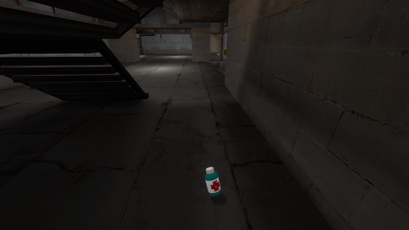
Remove these small healthpacks under the stairs at mid. In general you have too much health on this map - you could take immense risks at the start of the round, and could easily recover from the first attack for control of the building without even having to go out to the sides for the medium or the two small health packs.
You may also want to remove the small health packs just in front of spawn. You shouldn't really encourage people to camp near spawn, but they are at the base of the routes to top of mid again. They aren't useless, but again, you have a lot of health packs on this map.
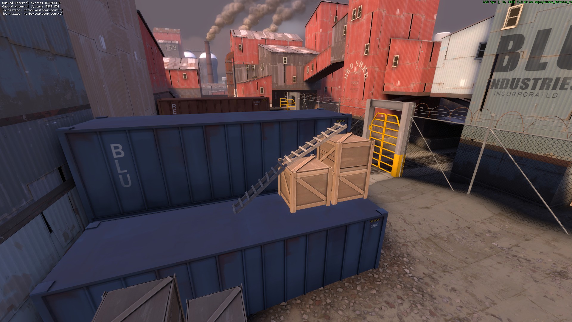
It always felt useless wandering to this side of the map, unless you're sniper picking off dumbies who forgot the route had no use. Going up the crates as most classes serves no purpose. Perhaps give a way for other classes to get from the containers to the roofs.
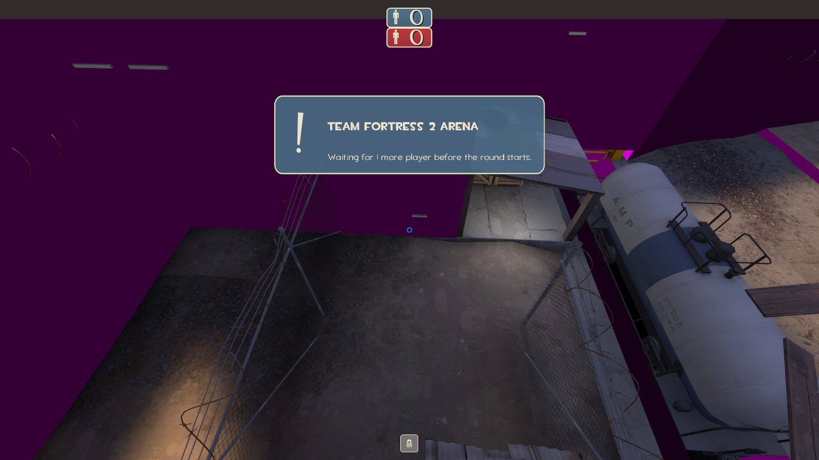
You can jump over this fence near spawn.
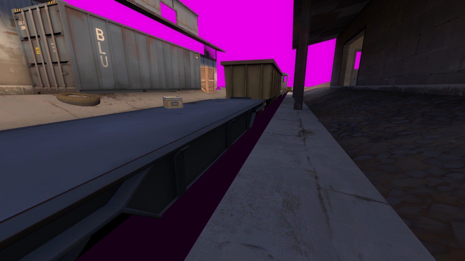
You should clip this flatbed trailer so people don't get that bug thing where if you jump at a step sometimes it stops your motion. A few people mentioned it happened.
This pipe at red spawn is a bit strange, having a support thing just sticking out. I guess not a big deal.
(Stuff from Seba):
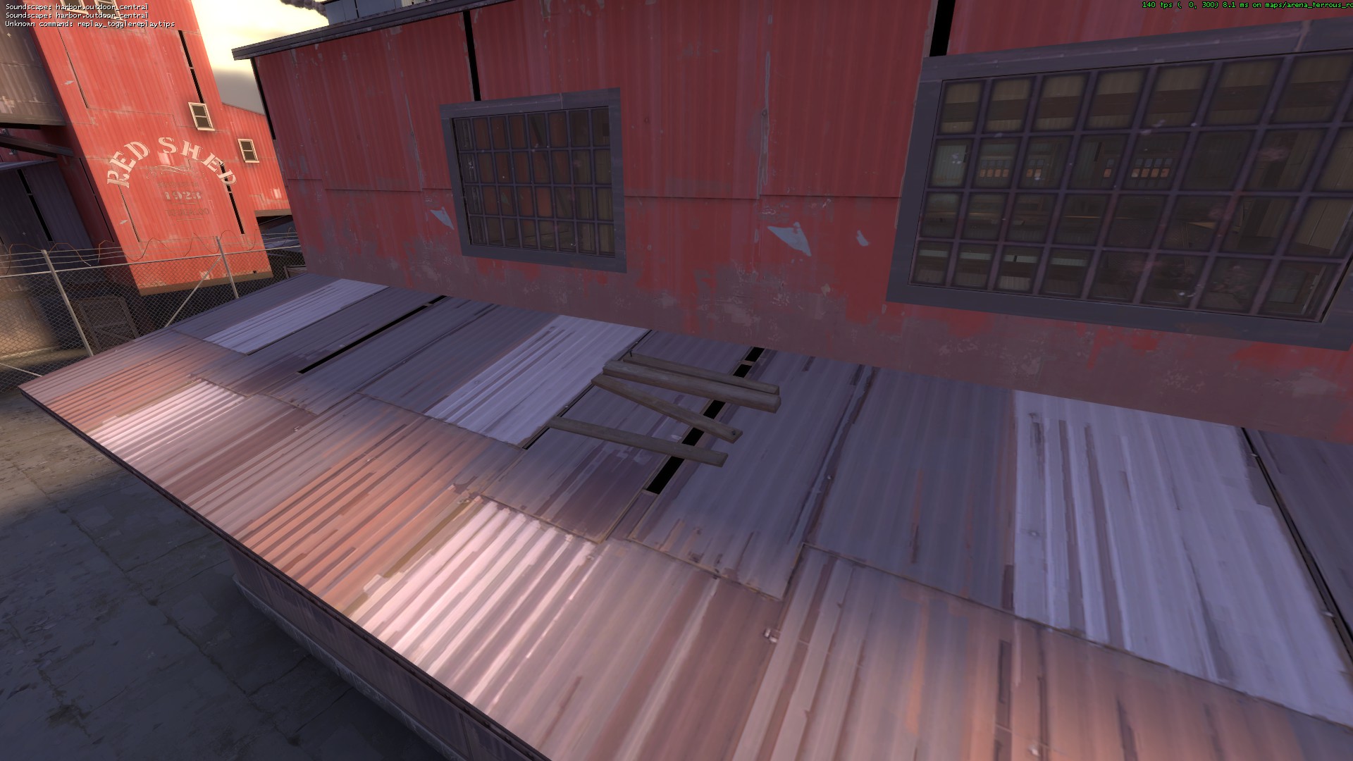
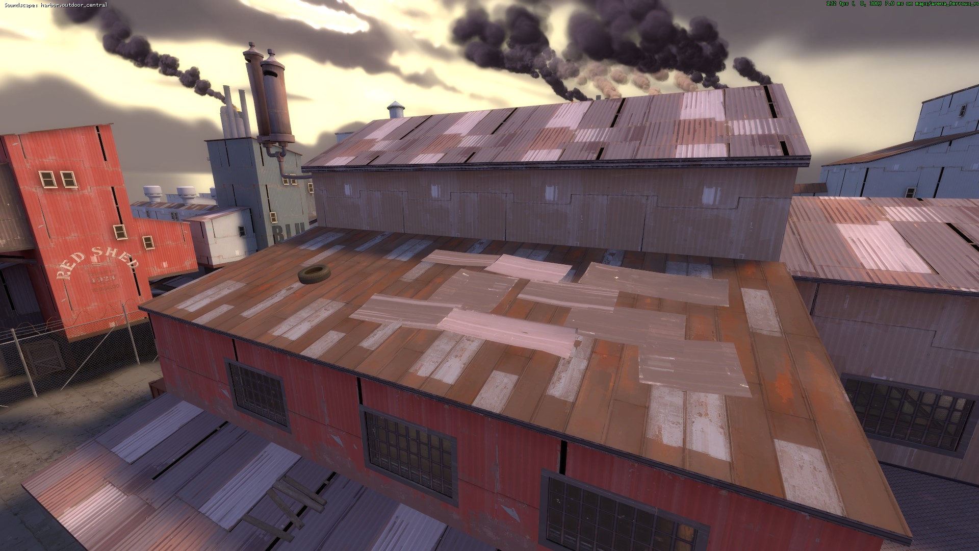
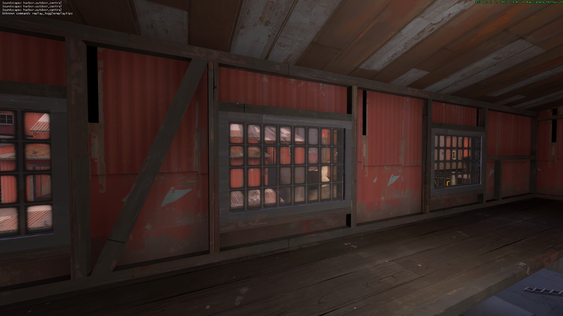
these models look awkward; I think they were made for patching up windows
no vertex lighting
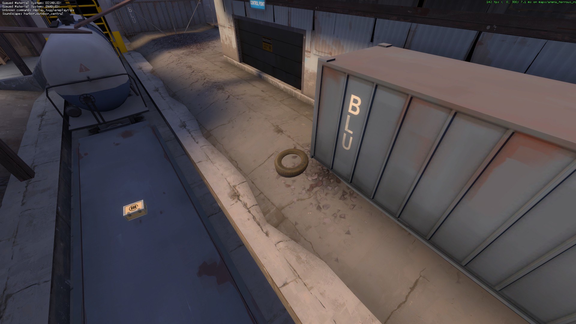
tire inside concrete doesn't make much sense imo; also the seam between normal and displaced concrete is very ugly
no detail props; some unobtrusive props and posters would do wonders for mid
no detail props
I don't think anyone aside from spectators sees this; the tire is fine, but the metal is rotated the wrong way and is the wrong color
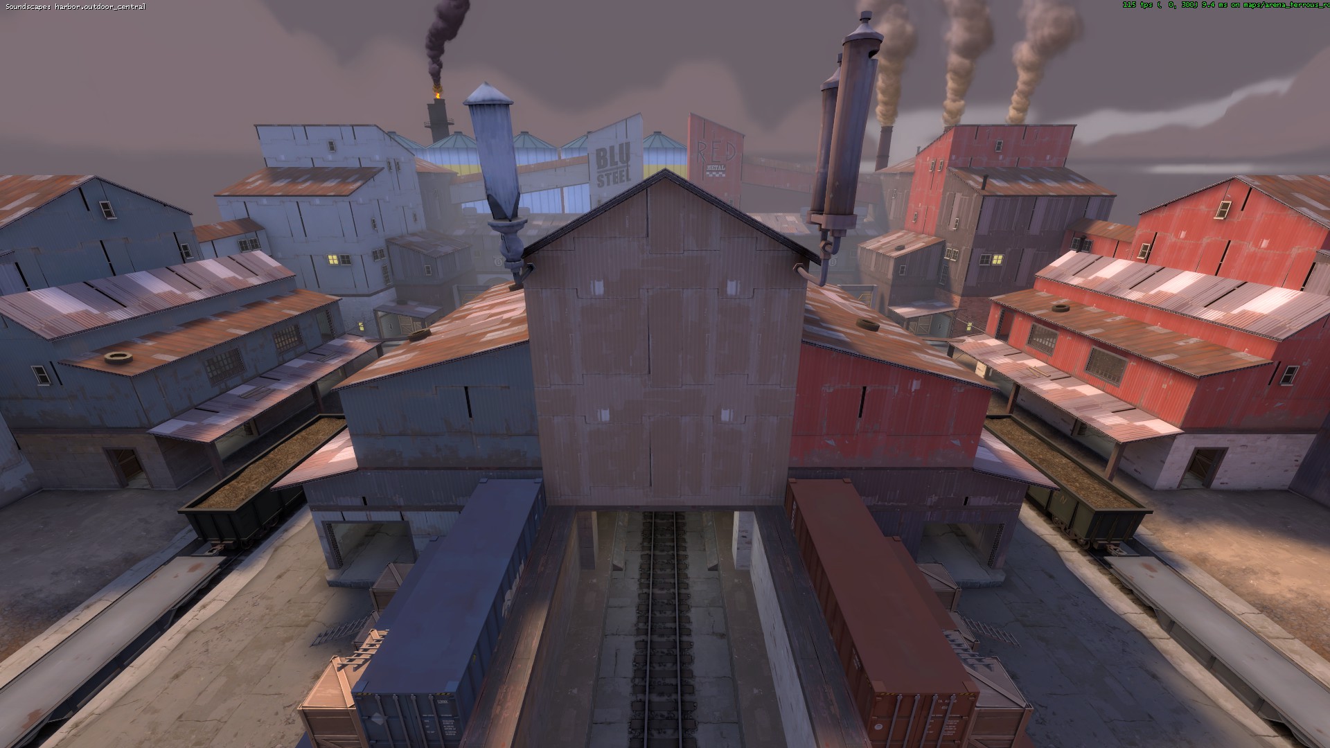
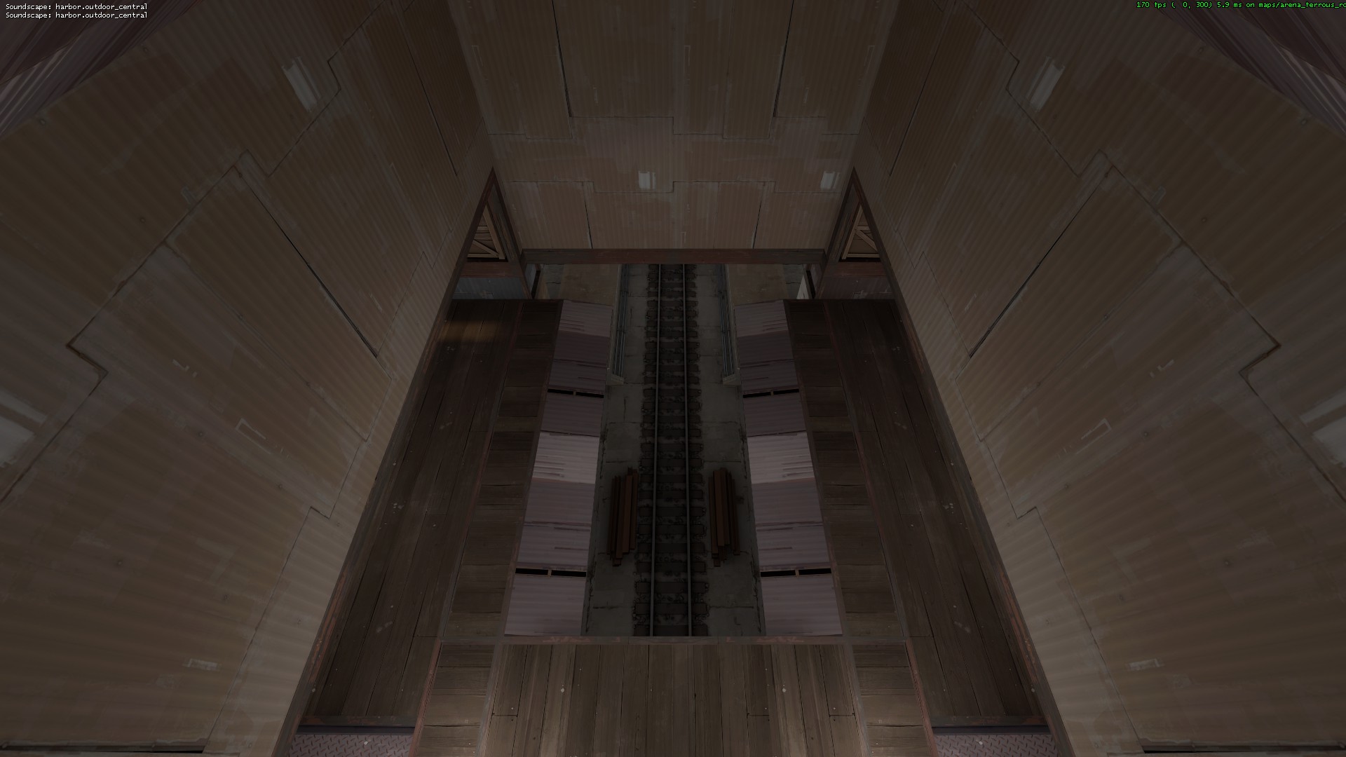
boring spectator camera; an excellent place for a rad logo or something
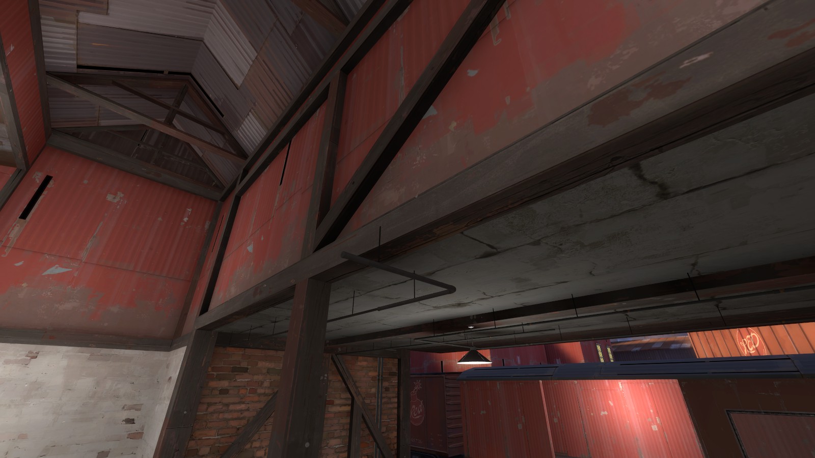
another boring camera; map generally needs more interest on vertical surfaces
the metal window frames are too thick I think; either make them thinner or remove them


