You are using an out of date browser. It may not display this or other websites correctly.
You should upgrade or use an alternative browser.
You should upgrade or use an alternative browser.
- Oct 18, 2018
- 59
- 13
TylowStar updated Ett with a new update entry:
a4
Read the rest of this update entry...
a4
Update a4. Basically a3's mid with a2's spawns.
Read the rest of this update entry...
- Oct 18, 2018
- 59
- 13
TylowStar updated Ett with a new update entry:
a5
Read the rest of this update entry...
a5
I highly doubt removing shutters, as I did here, will improve the experience. But I kept getting feedback telling me to remove them, so here you go.
Read the rest of this update entry...
- Oct 18, 2018
- 59
- 13
TylowStar updated Ett with a new update entry:
a6
Read the rest of this update entry...
a6
Shutterless was a flop, so they're back in. Altered spawn in the hopes of directing more people to the flank. Also Sniper Rock is easier for spies to get backstabs on.
Read the rest of this update entry...
- Jul 30, 2021
- 813
- 511
Heyo! I had some feedback regarding Ett that I wanted to share
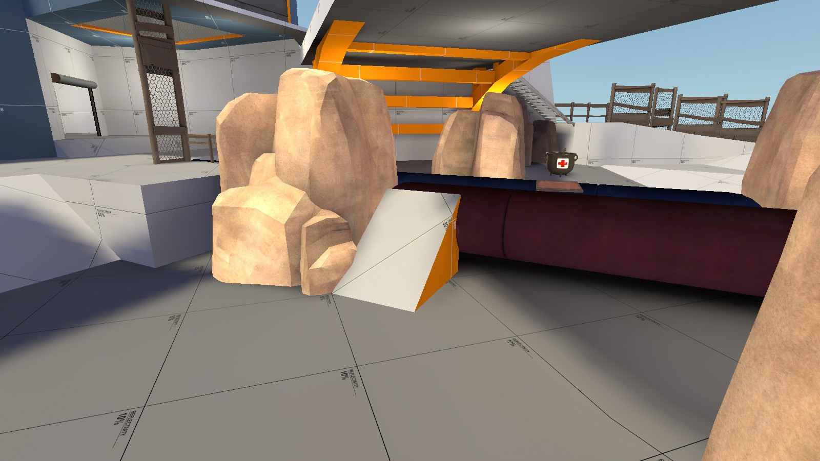
Could you please widen this ramp a little bit please? I don't like being forced to get close to props in an otherwise open area. Somewhere between where it currently is and the health pack would be a good improvement, I feel.
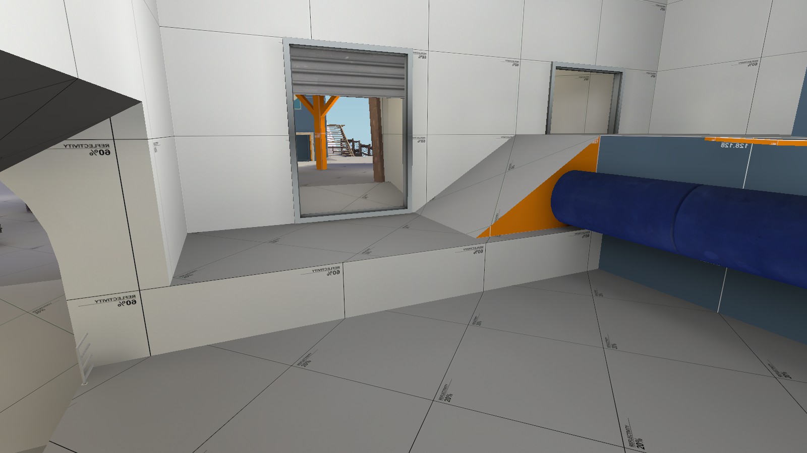
I also would appreciate having a short ramp right here. Areas that shouldn't require a jump are particularly frustrating to me, mostly out of "Why should I have to jump here." It doesn't really make sense with dev textures, and for an area around spawn you want your spawnroom to be available at all times to get back to safety and regroup.
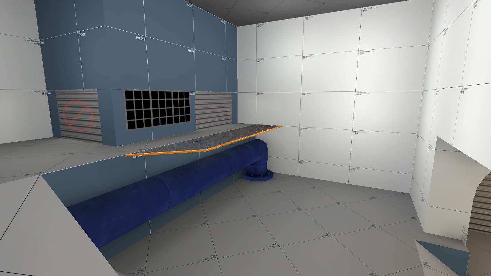
So, I do think your spawn has some worth to it as it is. However I feel like I could be greatly improved, as well as allow for better player navigation. I've made an edited image of this to display what I mean.
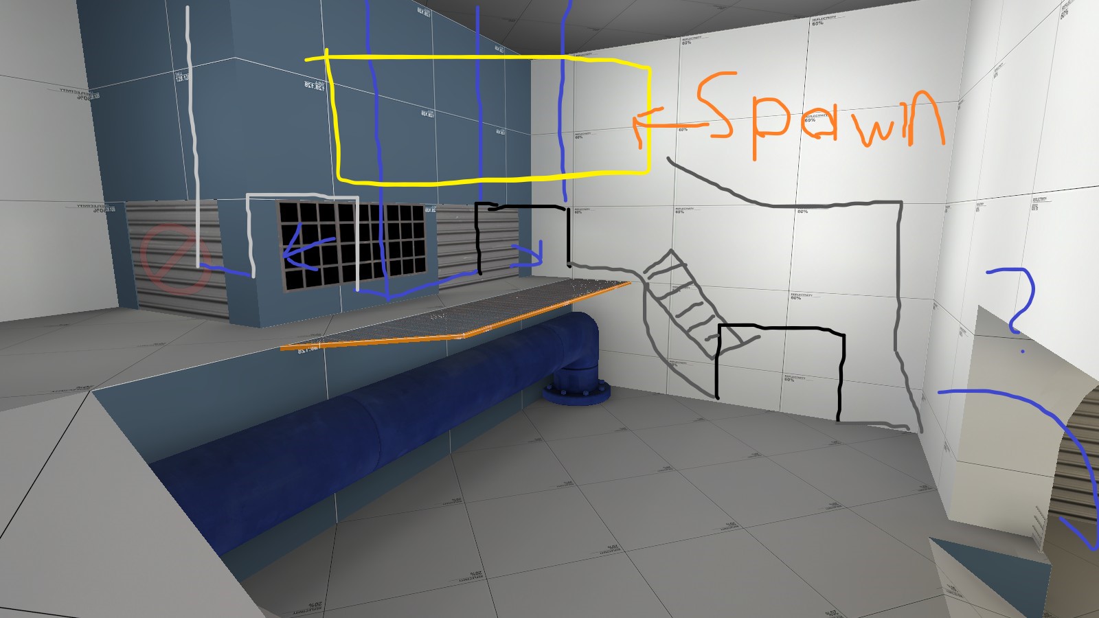
I personally feel that it is very important to allow players to choose how they leave spawn; Giving players multiple spawn exits, particularly on a King of the Hill map that is relatively short, would also allow better spawncamping prevention. So, I added a new route to the low ground from spawn (where the spawn zone itself is now a bit further back into the wall, putting players at a 45 degree angle so they can both see the stairwell as well as the original spawn door. I've proposed shortening up the original spawn exits a bit, as I feel that there is a lack of space in the general area for players to walk around in. I've also added a 45-degree spawn door between the two normal spawn doors, as like I said I feel it's important to have multiple ways to leave spawn.
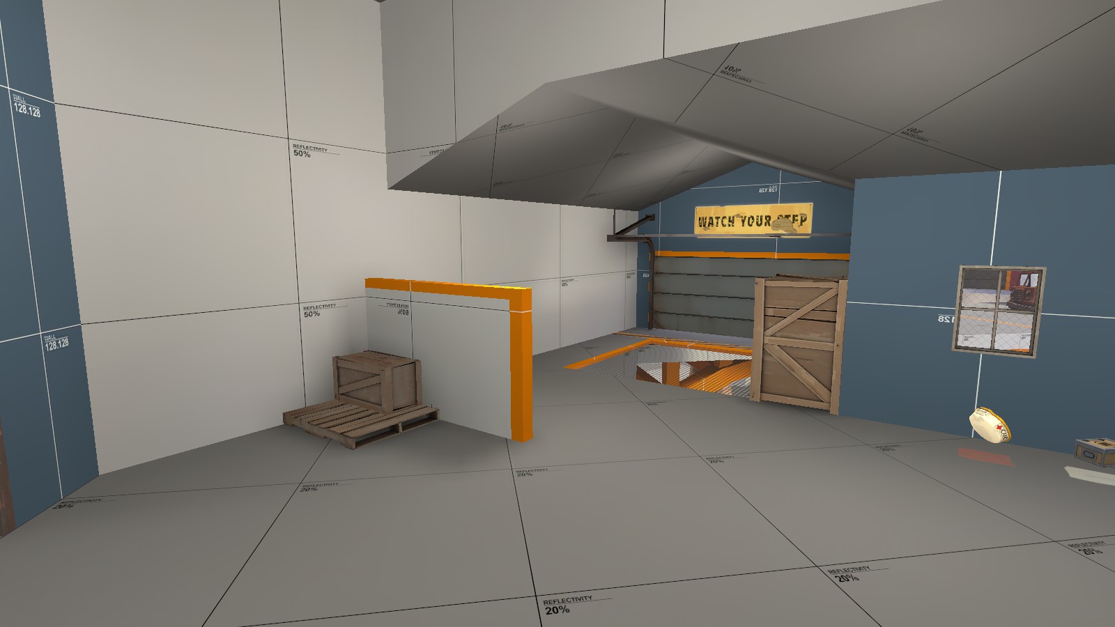
This is more of just something I find good about the map but I think this is really smart cover. I still feel like the shutter is a mis-step, but I haven't played this version of the map yet, so maybe not.
Other than this feedback I've given, I genuinely think this map is ready for beta and the detailing stage; I will warn you that people will start complaining about "Large sightlines" on your map because in dev texture mode, a lot of people will see scaling as a non-issue unless it's particularly egregious. I, personally, however, think that the sightlines are completely fine. You're welcome to see for yourself though if they're good or not! The more self-experience with your map the better!
But anyway, I hope this helped you with your future mapping endeavors! If you wanna talk to me about anything I talked about here, or just any other feedback you'd want or need, contact me at Katsu! ;3#1023 via discord, or just PM on TF2Maps.
FIRST IMPRESSIONS - Ett a6
Could you please widen this ramp a little bit please? I don't like being forced to get close to props in an otherwise open area. Somewhere between where it currently is and the health pack would be a good improvement, I feel.
I also would appreciate having a short ramp right here. Areas that shouldn't require a jump are particularly frustrating to me, mostly out of "Why should I have to jump here." It doesn't really make sense with dev textures, and for an area around spawn you want your spawnroom to be available at all times to get back to safety and regroup.
So, I do think your spawn has some worth to it as it is. However I feel like I could be greatly improved, as well as allow for better player navigation. I've made an edited image of this to display what I mean.
I personally feel that it is very important to allow players to choose how they leave spawn; Giving players multiple spawn exits, particularly on a King of the Hill map that is relatively short, would also allow better spawncamping prevention. So, I added a new route to the low ground from spawn (where the spawn zone itself is now a bit further back into the wall, putting players at a 45 degree angle so they can both see the stairwell as well as the original spawn door. I've proposed shortening up the original spawn exits a bit, as I feel that there is a lack of space in the general area for players to walk around in. I've also added a 45-degree spawn door between the two normal spawn doors, as like I said I feel it's important to have multiple ways to leave spawn.
This is more of just something I find good about the map but I think this is really smart cover. I still feel like the shutter is a mis-step, but I haven't played this version of the map yet, so maybe not.
Other than this feedback I've given, I genuinely think this map is ready for beta and the detailing stage; I will warn you that people will start complaining about "Large sightlines" on your map because in dev texture mode, a lot of people will see scaling as a non-issue unless it's particularly egregious. I, personally, however, think that the sightlines are completely fine. You're welcome to see for yourself though if they're good or not! The more self-experience with your map the better!
But anyway, I hope this helped you with your future mapping endeavors! If you wanna talk to me about anything I talked about here, or just any other feedback you'd want or need, contact me at Katsu! ;3#1023 via discord, or just PM on TF2Maps.
- Oct 18, 2018
- 59
- 13
I think I will. I hadn't actually checked this page since updating to a6, so I didn't see your original feedback. Thank you for giving me inspiration to keep going.Pleaaaaaaaase continue this!!!!!!
- Oct 18, 2018
- 59
- 13
For historical purposes, I think I'll post my thoughts on this map as of a6 and not having updated in half a year. They're based mostly on feedback and demo review rather than personal experience, since this thing keeps getting playtested at like 2 A.M. where I live.
Firstly, my hunch is that this map has a verticality problem. The map, genereally speaking, has 2 floors. The upper floor, with the houses and the point, is lacking in space. The lower floor, aka basements and everywhere else, is coverless and lacking in upward mobility, giving you little recourse against those standing on the upper floor. I get a lot of feedback to the effect of "I have to push chokes / hold the point to win, but it is difficult and frustrating to do so." In other words "I can't stand on the lower floor, but the upper floor is a chokefest". What I've seen in the demos reflects this: people approaching the point on the lower floor are blown up by between two thousand and too many explosives, so 90% of each team gathers in the houses to approach with a push and the situation degenerates into Dustbowl.
It seems an obvious solution is simply to make the lower floor a stronger position, taking pressure off the chokes as people are more keen to leave them and flank. Successive updates have attempted exactly that: adding cover to the low ground to make it safer from the bridge but without having it lose it's charactersitic openness. I don't think I've succeeded yet.
An alternative solution is to direct more players toward the left flank with the guard rail slope. Currently it's the least populated region on the map in the demos, I've gotten (which is reflected in that I almost never get feedback on it) and it is actually a pretty decent and open staging area for pushes from the attacking team. In this regard, I've had two problems. 1) Nobody ever goes left out of spawn. 2) I think this part of the map looks scarier to push from than it actually is. In regards to the former, this is a spawn design issue that I've attempted to resolve, but have been too intimidated by the sightline coming from the house basement through the middle spawnyward exit to put a spawndoor down there. In regards to the latter, the main problem is that attackers feel like they have no way to gain advantage against the point because they're fighting uphill. Previously I've struggled to imagine how to give the attackers some sort of obvious leverage to make them more comfortable, but I think what I'll do is incorporate a ledge into the cliff that gains a height advantage over the choke. That being said, the geometry I'm working with is terrible for this. It'll require some major layout shuffles and reimagining the map's appearance.
That actually ties into my second opinion on this map, which is that it's reallly hard to ...map. The map is impractically thin, so there's very little space to toy with bredthening this or giving more cover to that. All the delicate up-and-down of the lower floor will be needing displacements, but I'm really bad at the fine-tuning that will need. Which is also why the lighting is crap. Everything being on a diagonal doesn't exactly make the geometry easier to work with either. In fact, it's directly responsible for the most complained about element of this map...
Those damn shutters. They will be the death of me. While I might not have updated this map in a very long time, I have about a thousand unifinished iterations in my local storage, all various failed attempts to remove the shutters without also destroying the map. The sightlines really are that much of a problem. And yes, Sniper is a large culprit, but honestly the main problem is just that the stubby little tunnel between the cover and the doorway itself becomes a unnavigable sea of spam from the point. The shutter not only works to block the shots, but also to leave players on the point unaware whether or not there is anyone to shoot at in the house. So they don't. The only way to block the sightline without a shutter is to try to make a bend or wall for the attackers to go around, but there just isn't the space to work with. It always becomes an even worse choke.
Granted, a large part of why the shutters are so bad is because, as mentioned, they are practically the only way that either team pushes at the moment. Ashville's door, while complained about, is often given a pass because it's rarely used. Solving the verticality problem could alleviate the problematicity (maybe a word) of the shutters.
Not to be strictly constructive, though! For what was a spur-of-the-moment creation upon discovering the hydro guard rail in the prop library, no map I've made (or at least released publically) has been as good as this. Sniper sightlines are less of a problem than I thought they would be, likely because shooting down or up is difficult for him to do. Every class, it seems, can be effective, though Engi does struggle building anywhere except house. The small size of the map does work to something resembling a benefit too. Much like Databank, (probably my favourite KotH map atm) the spawn is just the right distance from the point where having a teleporter is good but not neccesary. The map's open skybox and variance in terrain has gotten tons of positive feedback from jumping classes, and in my experience rocket jumping around the map whilst testing lighting and logic, it really is fun.
Also I really like the aesthetic I stumbled into with this map. It's fitting, in the style of TF2, and the gameplay-relevant pipelines provide just enough of a narrative about what the mercs are canonically fighting over. I've struggled to decide whether to lean harder on the orange badlands style or the grey alpine style.
- Oct 18, 2018
- 59
- 13
TylowStar updated Ett with a new update entry:
a7
Read the rest of this update entry...
a7
More cover on point, though one could argue it's actually cover for the low ground flank area. Ledge with ammopack overlooks railing hill, accessible from the open window. All-around geometry reshuffle, most significantly affecting basement. Third spawn exit added in low-ground of spawnyard.
The shutters have not been removed yet. I have ideas on how to replace them, but the resulting angles are still spooky.
Read the rest of this update entry...
- Oct 18, 2018
- 59
- 13
TylowStar updated Ett with a new update entry:
a8
Read the rest of this update entry...
a8
Second attempt at shutterless. Except I actually tried to make it work this time.
Read the rest of this update entry...
- Oct 18, 2018
- 59
- 13
TylowStar updated Ett with a new update entry:
a9
Read the rest of this update entry...
a9
Changes so slight you'd think the map was in beta.
Added a cylinder to point. Not really a nip point, just a sightline blocker that's hopefully fun to play around(?). Jank reductions to railing hill: you can now get up to the ledge from the point directly, and a prop makes it hopefully easier to walk through the window.
Read the rest of this update entry...
- Oct 18, 2018
- 59
- 13
TylowStar updated Eyrie with a new update entry:
beta begin! (b1)
Read the rest of this update entry...
beta begin! (b1)
THIS MAP HAS NOT BEEN OPTIMISED YET. I just wanted to get the b1 out the door after half a year of on-and-off effort. The map has been partially detailed and more or less rebuilt from scratch, now actually using displacements. Hopefully people will not randomly clip on the hill.
Read the rest of this update entry...
