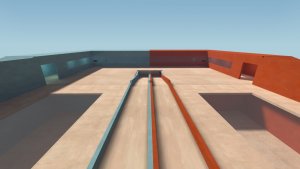
Note that idle maps are still being looked at in a critical way here. This means its looked at if it was a trade map, which means players will at least have to witness the visuals and not be afk.
And in the current state i wouldnt call it good at all, the first achievement_idle does perfectly the same and even that one has better usage of the features hammer provides. For an orange style map this again would be considered too simple. Get the idea out of your head that it must be this basic. Instead, try to create an interesting looking area.
A map like this might recieve a 9/10 on gamebanana, but thats because there are less people as critical as i would be, as for trade_plaza (where the lowest is a 5.2/10) i would be close to a 4/10 aswel.
just take a quick look in gamebanana through the possible trade and idle maps:
http://gamebanana.com/maps/cats/8770
http://gamebanana.com/maps/cats/5091
And notice that even though simple, some already look way better than just a flat map with flat textures:
http://gamebanana.com/maps/134589
http://gamebanana.com/maps/188198
Dont think that a map should look less good just because its an idle map. Because for that matter people can idle on cp_cloak:
http://wiki.teamfortress.com/wiki/Cloak_(Control_Point)


