Drudgery

CP Drudgery B2

Bearface

L1: Registered
Jan 6, 2016
29
10
Drudgery - A 5cp map, catering to 6v6 gameplay

As seen on sideshows stream (wow)

Drudgery is a map I made to try and remove some of the parts of the game I find really boring in both 6s and pubs. With a dual flank system from mid -> 2nd, and a last that favours holding lobby, the map is easy to push at all times, making it very hard to stalemate.

Inspiration- Borneo, Hydro, Biomass, and cubemaps artpass entry.

With big thanks for these assets- Bulletcrops, heyo's borneo thematics, Seba's wind turbines. (somebody please notify me if I have to do anything else here x )

Other than that I guess feel free to rip me a new one, I like feedback.

xoxo, me
 
Last edited:

Zed

Certified Most Crunk™
aa
Aug 7, 2014
1,241
1,025
To fix prop textures rendering as pure black in your screenshots, type "retry" into the console after loading the map once, and take screenshots after that.
 

ExtraCheesyPie

L420: High Member
Jan 29, 2015
485
151
Gravelpit? Subpar. No :-(
 

Zed

Certified Most Crunk™
aa
Aug 7, 2014
1,241
1,025
Gravelpit is extremely subpar.
 

Bearface

L1: Registered
Jan 6, 2016
29
10
Gravelpit? Subpar. No :-(

The issue with gravelpit is solely in competitive 6s play, I think it's one of the best public maps, happens to be my favourite and I think both A and B are extremely fun to play on as themselves. The only thing is, in comp play, it just takes way too long and is extremely slow, it's mostly holding with the attacking team saccing for uber forces, and A is 100% ignored and is saved for just wasting an extra minute for the attacking team.

In this case, I think it's fair to say that gpit does count as subpar, but what I'm trying to say is the similar mid is honestly ripped for the love of the map, not because I don't like it. Unsurprisingly I've found mid is one of the things people find really fun.

PS. I genuinely would take nicer pictures, they were taken in a bit of a rush though, and I don't really plan on changing the pictures until I've done a bit of detail on it. After all, why take nice pictures for what is at the moment a pretty ugly map?
 

ExtraCheesyPie

L420: High Member
Jan 29, 2015
485
151
In any case, that sort of mid is pretty common actually. A bunch of maps do this, like standin, among others
 

Lain

lobotomy success story
aa
Jan 8, 2015
723
757
"Pretty common actually"
>Litterally only Standin
 

ExtraCheesyPie

L420: High Member
Jan 29, 2015
485
151
"Pretty common actually"
>Litterally only Standin
i cant be assed to find it. A lot of maps use the "structure with little hole in roof" thing. See foundry mid also, I will only give examples one at a time
 

Bearface

L1: Registered
Jan 6, 2016
29
10
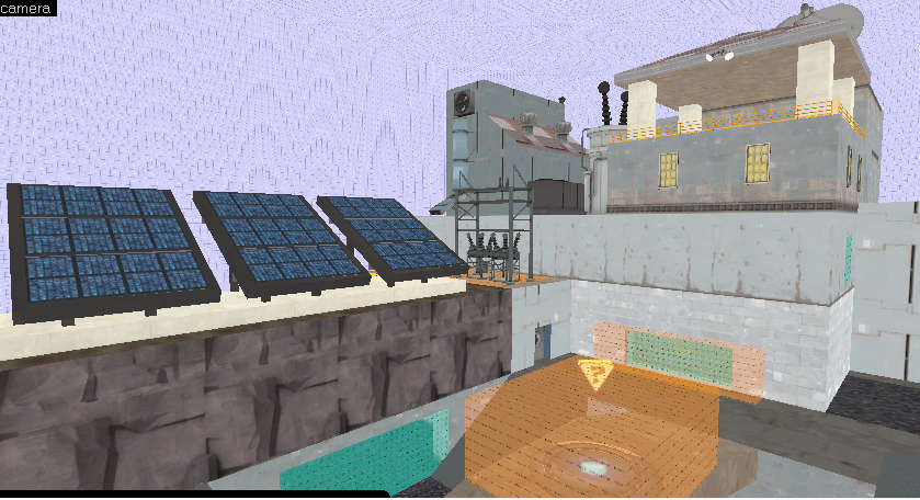
That's true I guess. I can't say I was hoping to create an original mid here to be honest, so either way it doesn't really matter. I'm detailing right now, I think I've developed a somewhat decent idea on how I want the map to go. Here's something I've started on, but I'm really learning detailing as I go at the moment. Well, it looks fairly decent so I'm happy for now. I will probably redo that observation tower thing in the next version, but if I can get this all looking how this image looks, I'll definitely be happy for a first attempt.

G5KhOGV.jpg
 

Zed

Certified Most Crunk™
aa
Aug 7, 2014
1,241
1,025
Is it supposed to be some kind of research facility in the shield?
 

Bearface

L1: Registered
Jan 6, 2016
29
10
Is it supposed to be some kind of research facility in the shield?

I'm not sure if that's meant to be rude since I've never seen the shield, I thought it was about police tbh. Well I was going for more "green energy" on blue side, so that's meant to be a few solar panels, there's wires connecting the base to the electrical things and up to the larger electrical thing. The other things meant to be an observation area, since it'd be overlooking the panels, and whatever I put on the right of the base, which I reckon is gonna be a few wind turbines. So I guess, no it's not, so maybe I fucked it up a bit, but I guess I have no deadline. :p

Then over on red side I'm planning to use oil pumps along where the solar panels are, desolate muddy area where trees might be, maybe some kind of contaminated river? I'm not sure if 'dirty nuclear' is very thematic with red side.

Also, I forgot to say, the solar panels are from the bulletcrops project, so thanks to them :)

-

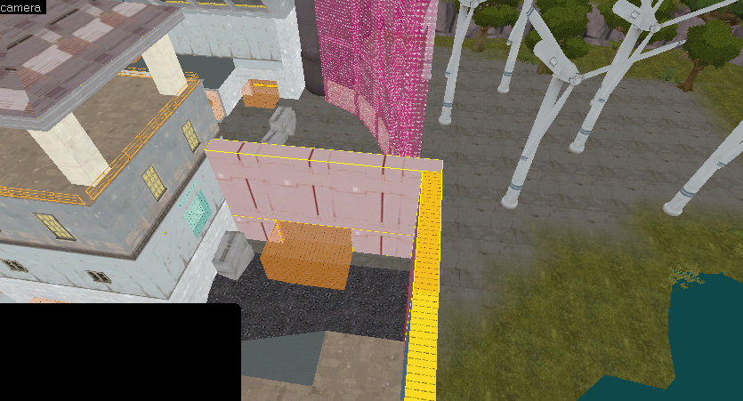
Don't want to double post, so here's what I'm stuck on right now...
S6OkP75.jpg


what do I do with those highlighted blocks? I'm pretty sure I can just do a fence on the vertical part, but as for the horizontal bit, I've no idea. That part of the map has been problematic since day 1 SMH
 
Last edited:

Bearface

L1: Registered
Jan 6, 2016
29
10
Hi there mapperoos.

I haven't been working on this map a lot recently, in part due to bad health, but I also got picked up for a couple of decent teams in the past few seasons, for that reason I wasn't working on it a lot. I lost most of my motivation to work on it, because I had an asset deal with someone who let me down quite a lot and meant I was out of pocket for nothing. Plus, Phi's reckoner ended up releasing which is frankly a much better and more polished map and stole most of my 'testing' people!

However I thought I'd upload this latest version, since I forgot to really do anything with this. The plan was mostly to go over with a more detailed artpass and then push it into beta phase, but obviously that got sidetracked when I wasn't able to get the assets to do so. I was pretty much done with the layout though, so it was mostly a case of doing a bit of building work on the outsides, some bonus 'viewing rooms'- that sort of thing. The part that's the funnest bit, where you can just go wild. +3d skybox of course :p
Then finally optimising work. (which you'll probably be unhappy to hear is even worse than bare minimum at the moment.)

I guess if you have experience doing any tf2 related 3d modelling/texturing I'd love to hear from you, or anyone to put me in contact with, obviously I'm not exactly a regular here and I've never gone far enough with an idea to the point where it might actually be finished one day, so I have no idea how to go about doing this. I do pay, but I have no idea what the costs usually are around these parts.

Other than that, take a look at the screenshots, give it a run around if you have time or want to do so, as always feel free to tear me a new one. xoxo, me

Changelog - There's a lot here so I might miss things etc.
  • Basic artpass
    • Created outside world on both sides
    • textured red side
    • improved building work
    • decals for health/ammo, this is barely artpass but hey
    • general theme is mostly complete
  • Optimised cap time vs spawn times for gameplay
    • Last caps a little slower
    • Attackers spawn moved backward around 2secs worth
    • Spawn timer increased around a second
      • This should allow for lower backcap ratio
      • General ease of pushing out of lasts
    • Reduced cap timer on mid point, reduced spawn times for team that lost mid
      • This will hopefully allow for contesting 2nd a little bit
  • Height changes
    • Added prop cue for no fall damage coming out of lobby window
      • Players were landing on the lower part of the displacement as it wasn't obvious
    • Reduced height difference in pit on 2nd, this should prevent fall damage
  • Removed windows from huts on mid
  • Cave from mid->2nd now has HP for defenders, reduced sightline from door
  • Lowered roof from main mid->2nd
  • Improved lighting, tested HDR in this version aswell which wasn't that great
I think that's about it.
 
Last edited: