- Jun 16, 2021
- 7
- 2
ctf_subwaysandvich - Heavy retired from mercenary work and decided to open a sandvich shop.
My first map! Any and all feedback greatly appreciated.
Design Goals
I'm well-aware of the KotH/Viaduct formula prescription for first-time mappers, but I want to be different. So the next most simple standard gamemode to implement is CTF, however it is notorious for turtle-stalemate-hell.
Through the map's layout, I'm trying to mitigate this by designing flank and shortcut routes of varying risk levels. The center shortcut, for example, is the shortest route to the enemy, but is very exposed. Contrast this with the ducts and the boxes behind the shop stands, which provide more cover but are narrow and less direct.
There is a round timer (with overtime disabled) to help encourage offensive play. The clock starts at and is capped at 5 minutes. Whenever a flag is captured by either team, the clock time is incremented back up to 5 minutes. Therefore, the maximum theoretical duration of a "play to 3" round is 25 minutes, with stalemates allowed to last no longer than 5 minutes. If time runs out before a team captures 3 flags, the game ends in a stalemate regardless of if a team captured more flags than the other. These exact settings are almost certainly subject to change following playtesting. An alternative I considered was having flag captures add less time but the clock has a higher cap, like 10 minutes. My reasoning for not doing this is because that would mean stalemates could last longer and make the gameplay dull.
Open Questions
Known Issues
Please refrain from using the exploits I point out here during IMPS. Any other exploits you find are fair game, but it'd be greatly appreciated if you report what you find via feedback so I can fix it in the next version!
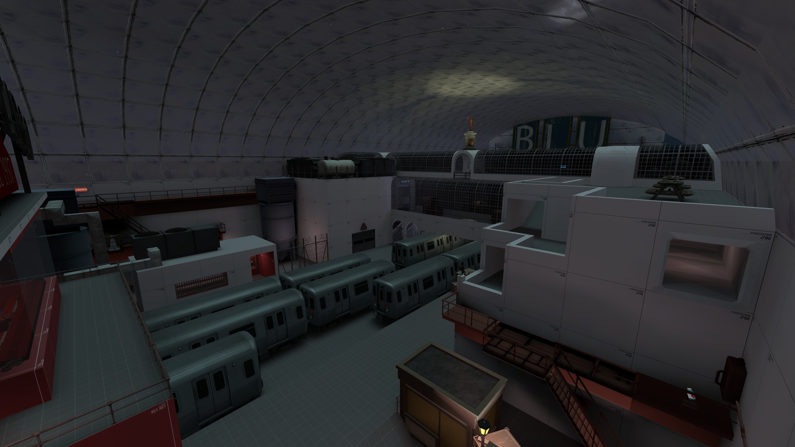
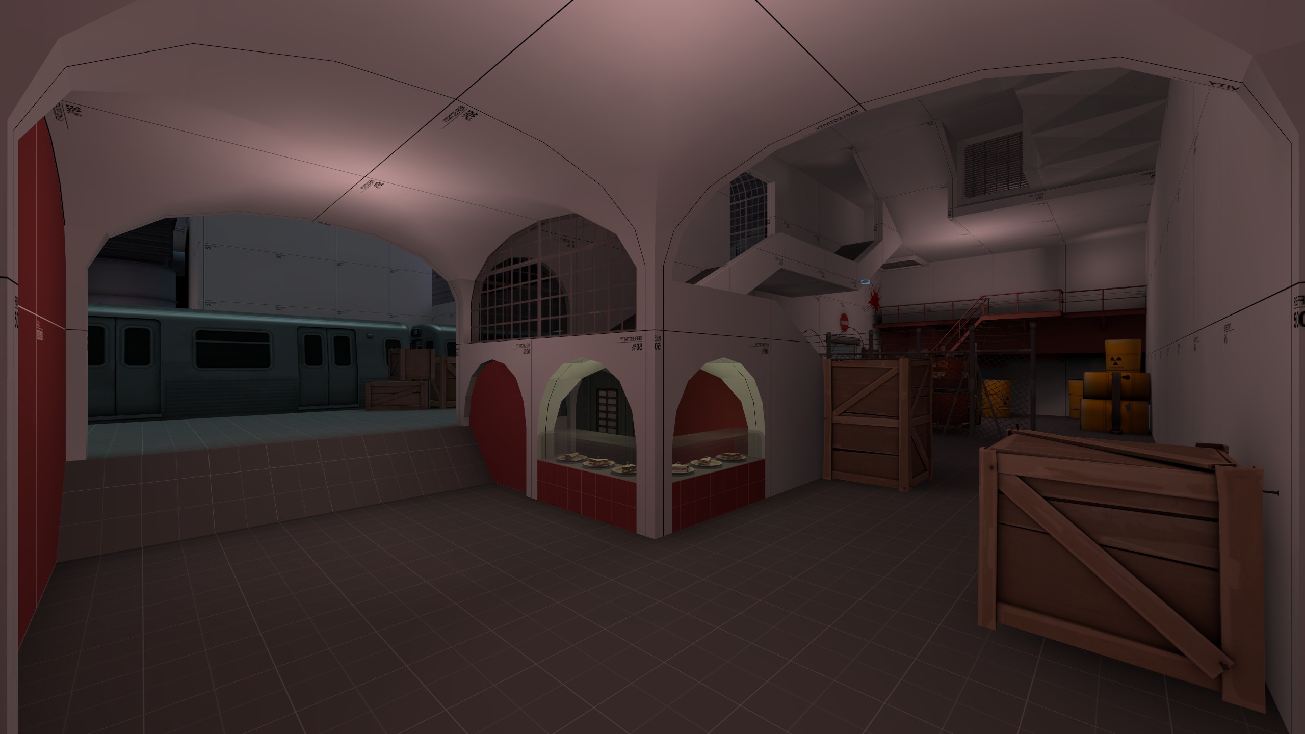
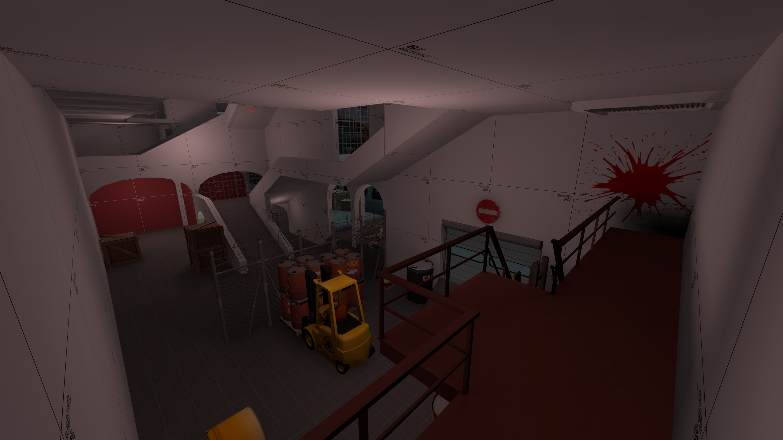
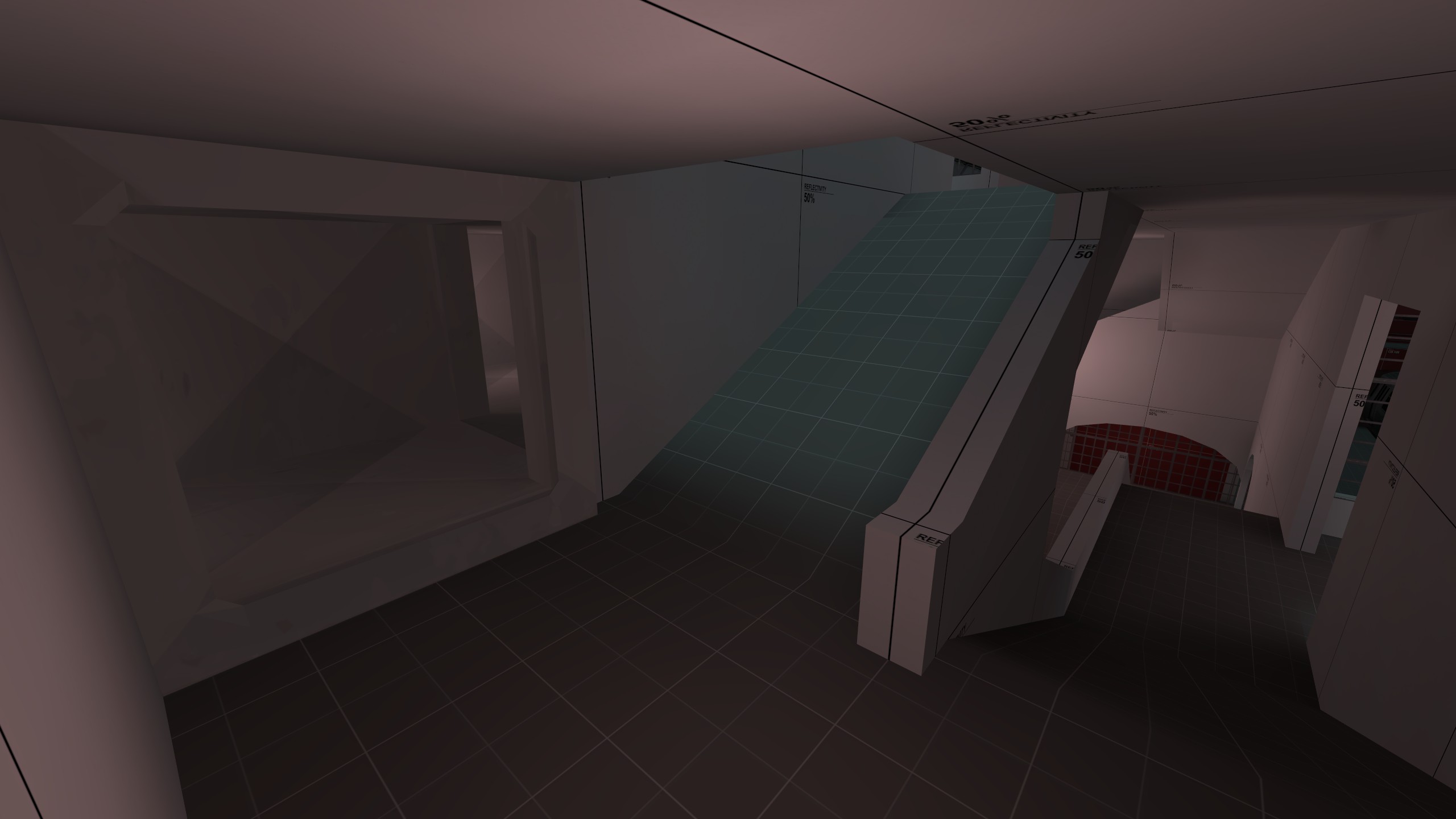
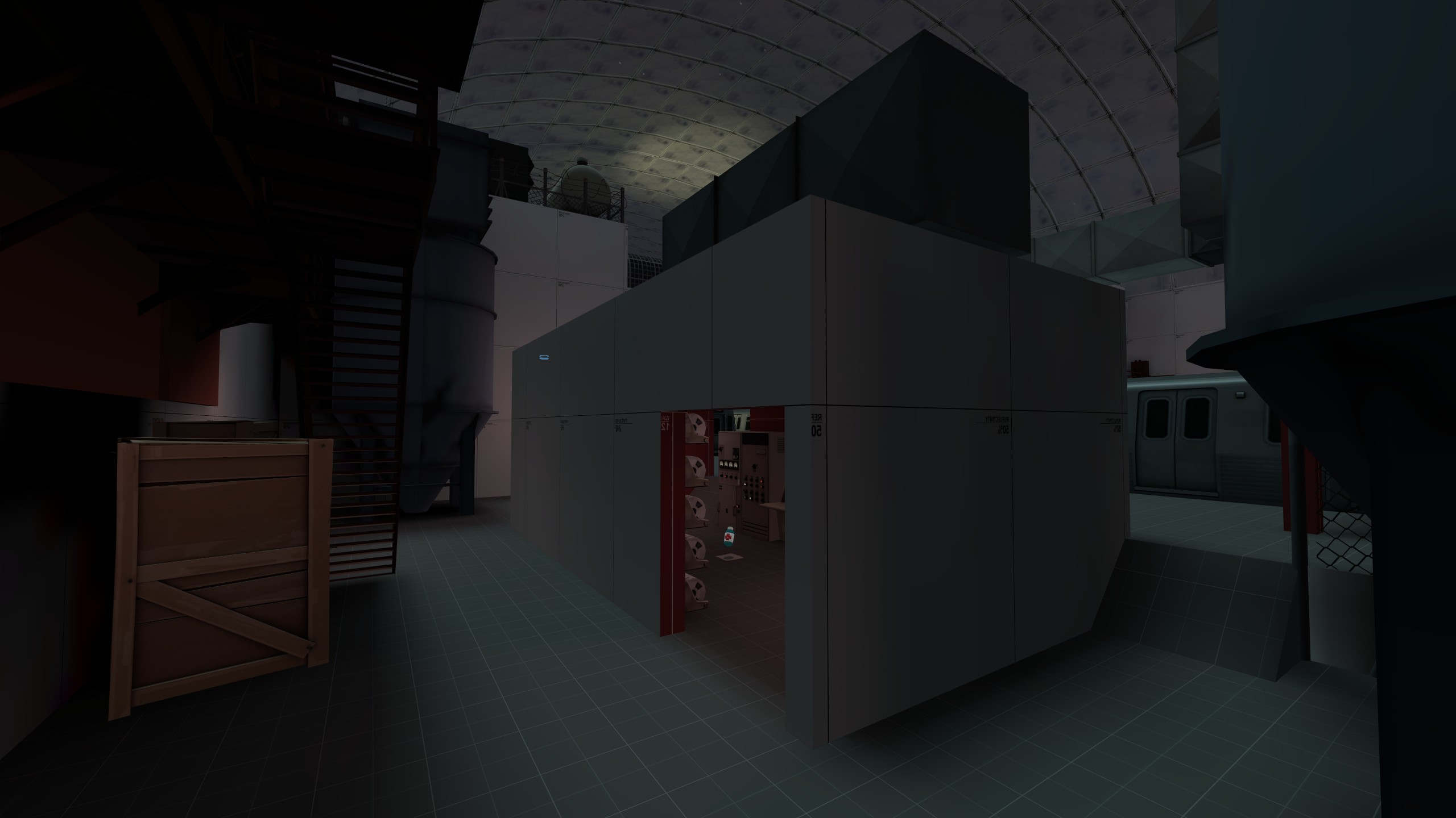
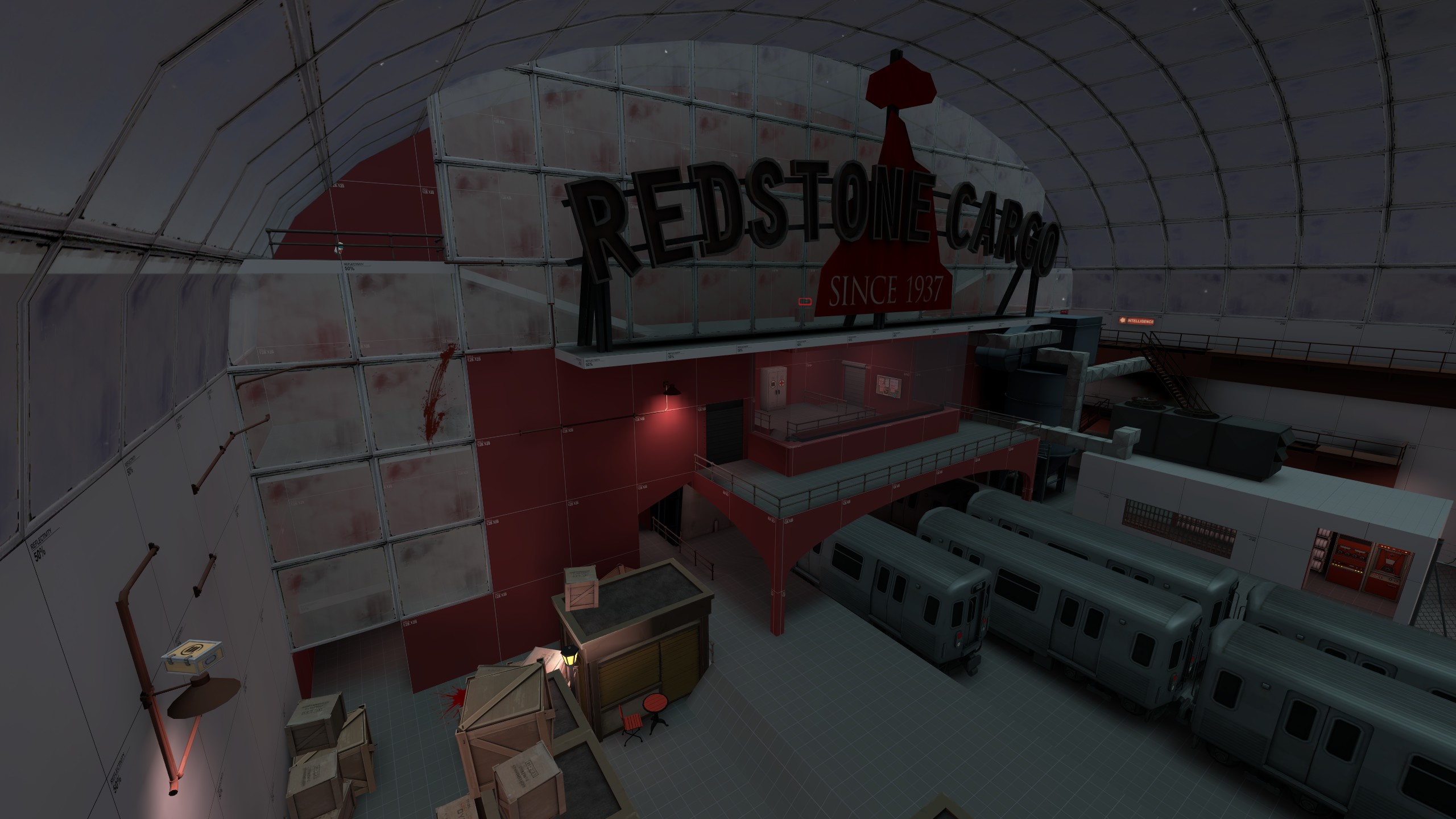
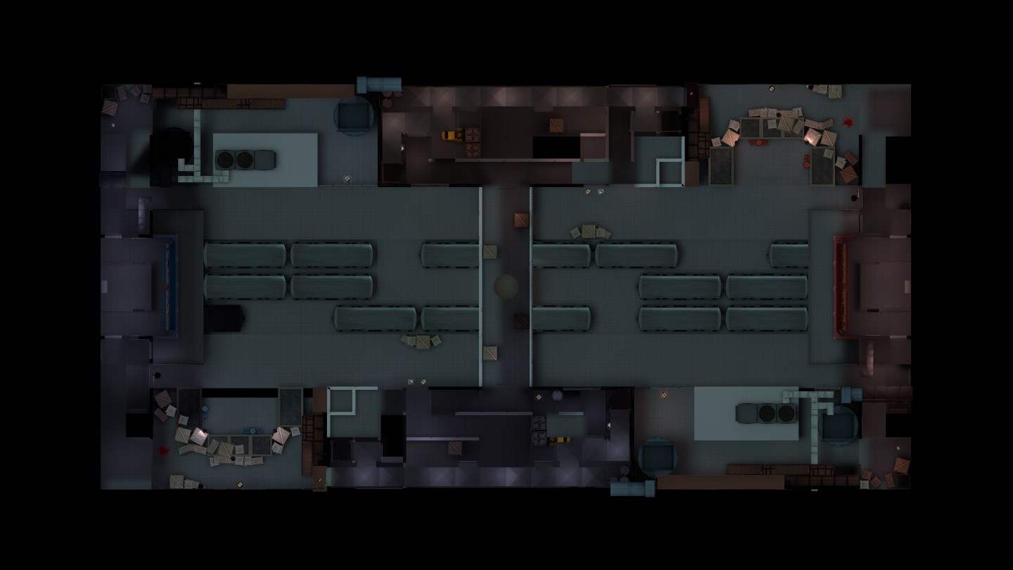
My first map! Any and all feedback greatly appreciated.
Design Goals
I'm well-aware of the KotH/Viaduct formula prescription for first-time mappers, but I want to be different.
Through the map's layout, I'm trying to mitigate this by designing flank and shortcut routes of varying risk levels. The center shortcut, for example, is the shortest route to the enemy, but is very exposed. Contrast this with the ducts and the boxes behind the shop stands, which provide more cover but are narrow and less direct.
There is a round timer (with overtime disabled) to help encourage offensive play. The clock starts at and is capped at 5 minutes. Whenever a flag is captured by either team, the clock time is incremented back up to 5 minutes. Therefore, the maximum theoretical duration of a "play to 3" round is 25 minutes, with stalemates allowed to last no longer than 5 minutes. If time runs out before a team captures 3 flags, the game ends in a stalemate regardless of if a team captured more flags than the other. These exact settings are almost certainly subject to change following playtesting. An alternative I considered was having flag captures add less time but the clock has a higher cap, like 10 minutes. My reasoning for not doing this is because that would mean stalemates could last longer and make the gameplay dull.
Open Questions
- Do the round timer settings provide a balance of preventing stalemates but also allow enough time for teams to capture flags?
- Is the map too generous to Snipers? I tried to mitigate this by reducing sightlines on home base exits and providing options for cover, but there's probably room for improvement.
- Is the map too generous to Spies? There are some intentional hiding spots and perch points I can remove if this becomes a problem.
- Should the jumping puzzle flank be impossible for slower classes? I'm guessing this whole feature is too gimmicky for it to matter, but I could see how having an undetected Heavy position himself in weird places using this route could be problematic.
- Are the all the routes to the enemy side utilized? Are they all well-balanced in terms of risk vs reward? For reference, the routes are: 1) the central route through the metro cars, 2) the one-way door to the enemy barrels, and 3) the inside of the central bridge (via the friendly sandvich shop or ducts), and 4) on top of the central bridge.
Known Issues
Please refrain from using the exploits I point out here during IMPS.
- The large gantry and silo props are casting unaesthetic shadows. I might end up remaking the gantries with brushes instead anyway if those areas need to be redesigned.
- One of the metro and vent unit props are extra dark.
- Demomen standing indoors can hide stickies inside the large door frame prop at the barrel area. I'm probably going to change this door into a custom brush-based door though, hence why I skipped fixing this.
- The one-way vent grate door above the barrels area is supposed to not allow players to remain in the vents while having the door open. However, if a player jumps onto where the grate hinges, the player can perch there with the door open, despite me disabling collision on the grate and frame. I'll need to spend some more time debugging this.
- The rooftop, balcony, and ramp walls should probably all be player clip handrails. I was just too lazy to place them for version a1.
- The clipping within the sandvich shop could use improvement.
Last edited:


