Badlands_event

KotH Badlands_event 2016-10-05

sooshey

:3c
aa
Jan 7, 2015
514
410
Definitely remove the props from the trains at the point, especially the coffins on top. People actually stand up there.
 

Billo

aa
Feb 8, 2016
921
405
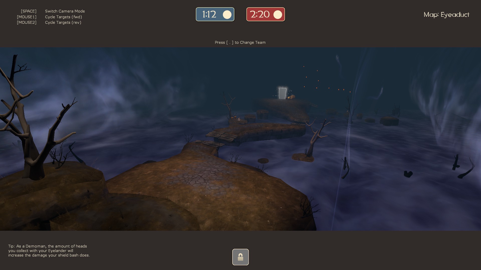
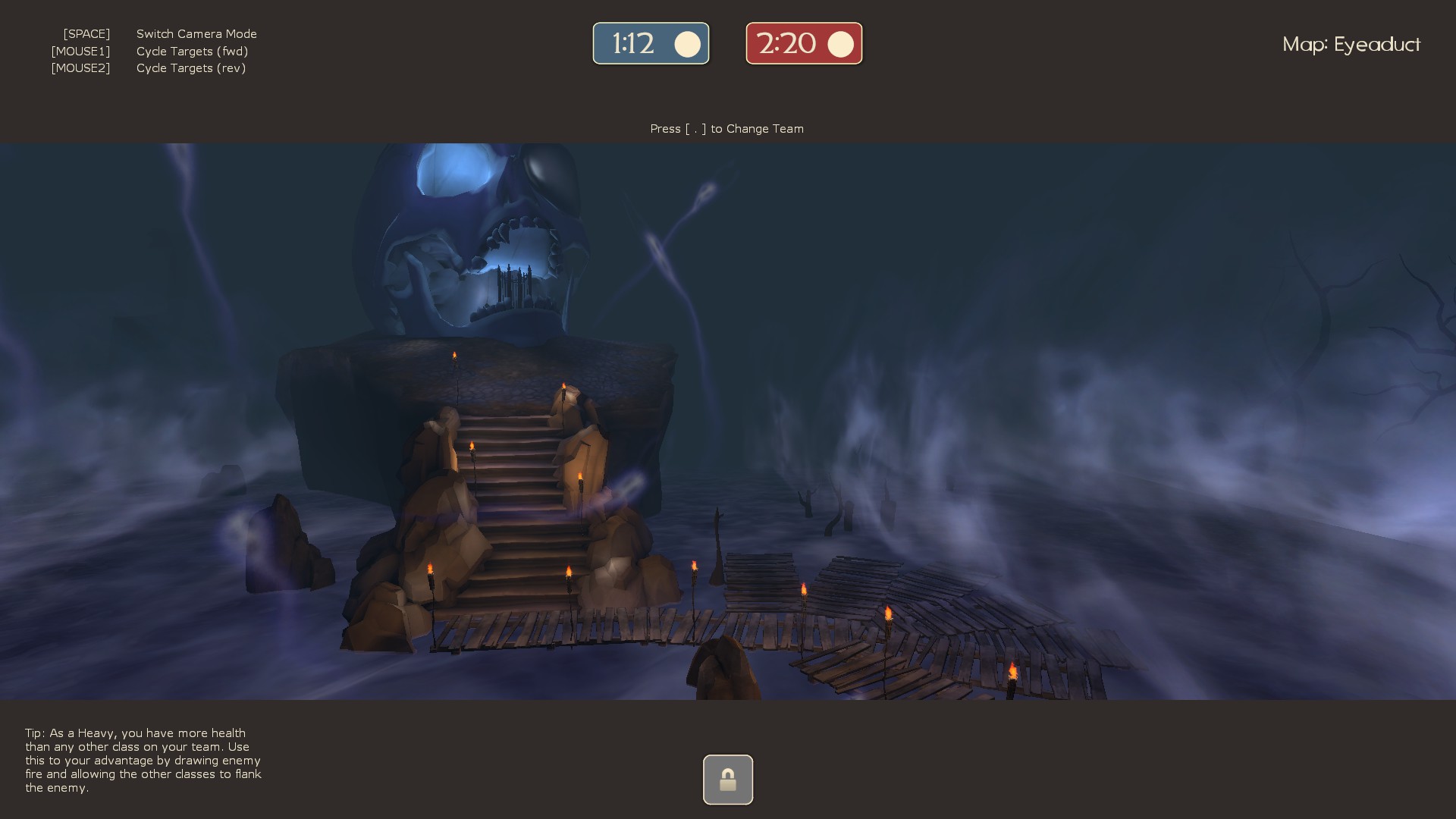
looks cool but i have a feeling you just copied paste hell-underworld from the koth_eyeduct
i may be wrong but i have this feeling.
 

leprecan

L2: Junior Member
Feb 10, 2013
96
89
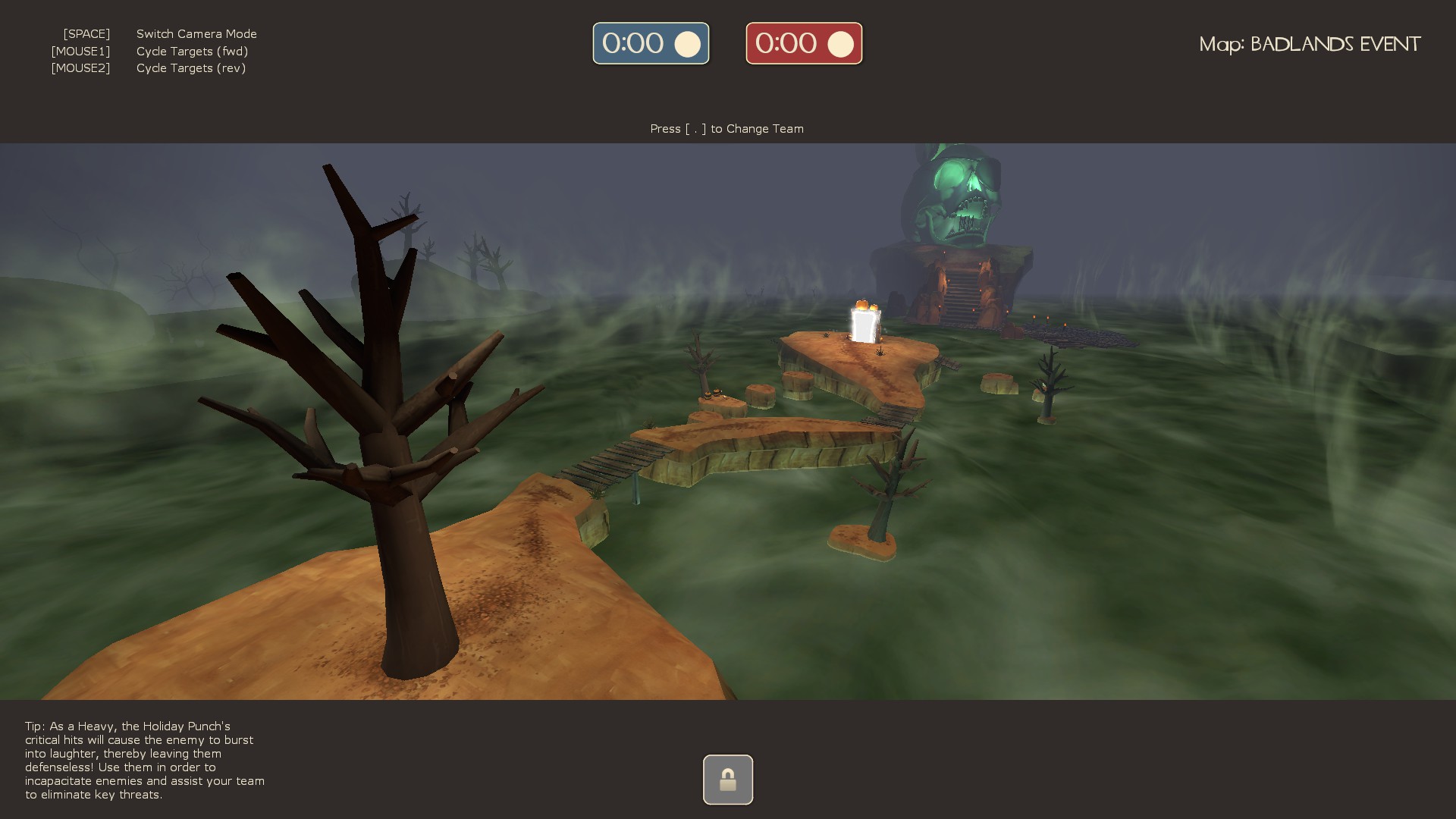
The thumbnail images are well done! Taking a look inside the map there were a few areas that were lacking detail however.

39YVfTQ.jpg


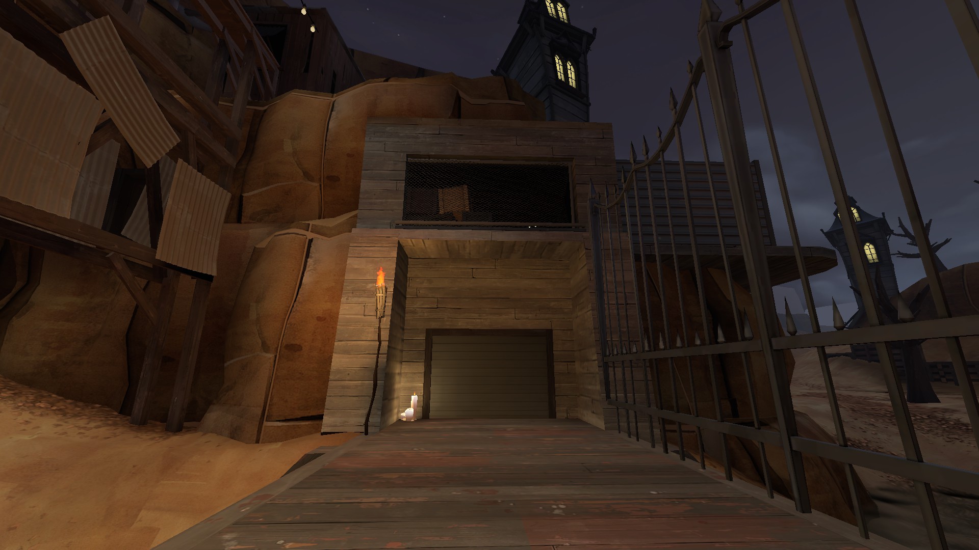
The spawndoors are very simplistic retextures of the original concrete bunker that was in normal koth_badlands, and it certainly doesn't mesh with the rest of the map's buildings which were left unchanged. I'd suggest reworking both spawn exits and the still unchanged battlements pictured top right.

5Eco2La.jpg


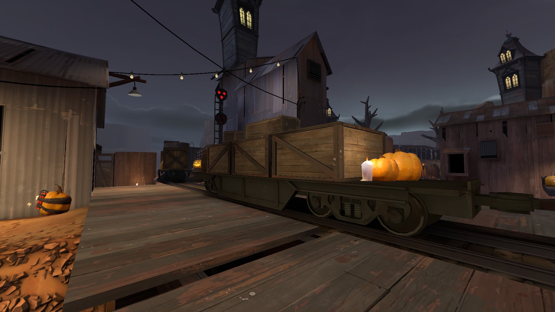
The train flats at mid look neat, but are much harder to jump around on with the added clutter from the pumpkins and coffins.

LdoypjI.jpg


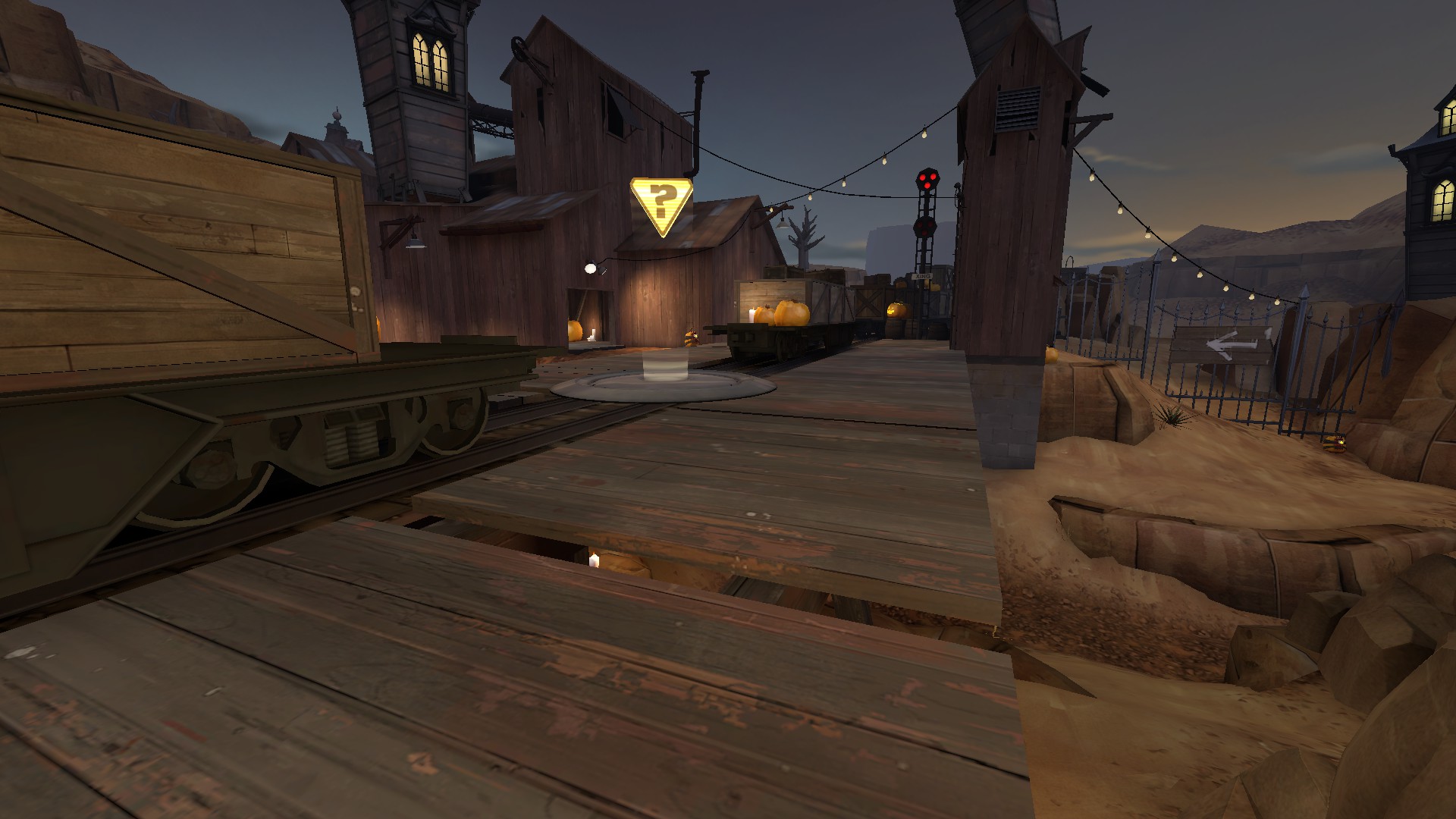
The point needs its hazard lines back! At the moment there isn't a clear indication as to where the cap zone exists.

PSljeT4.jpg


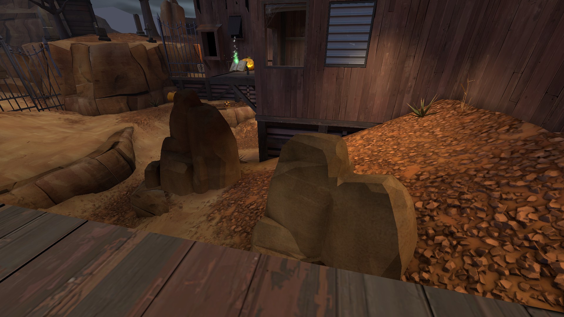
This is more a question out of curiosity, but why did you get rid of the hoodoos that were here? The rock surfaces will surely be more difficult to hit players on than the flat hoodoos.

O96c2TQ.jpg


This Hellscape will need to be redone, since its nearly a copy of viaduct_event. Copied elements are no good.

WIDCSMM.jpg


PrJl4qU.jpg


As far as non pictured stuff, the lightbulbs all over the map's cables aren't lined up correctly, and are rather bulky looking. The non playable areas outside of the map also have several floating rocks that likely lost their context with some of koth_badlands' detail removal. The spawn interiors are much too basic in terms of changes. Since they were orignally concrete bunkers, the spawns will need to the most work to blend with the rest of the map easier.
 

UKCS-Alias

Mann vs Machine... or... Mapper vs Meta?
aa
Sep 8, 2008
1,264
817
At least try to get the name into halloween theme: Deadlands, Death Land or whatever you can make fit.

Also, i think you need to go further with detailing, all you did now was slam in some props and change textures where everything non-wood is changed to wood. But this looks quite cheap as an effect. Add trims etc.

And note that especialy huge areas with a single tint of wood are going to be much more visible under halloween lighting. So diffirent textures sometimes become a must. Lets for example take coaltown and look at these 2 screens:
https://wiki.teamfortress.com/wiki/File:Coal_Town_base.png
https://wiki.teamfortress.com/wiki/File:Mvm_coaltown_event1.jpg

Note that even though they have the same textures, the halloween textures differ alot in light and have a higher contrast. Without that contrast it will look bland.
Other example:
https://wiki.teamfortress.com/wiki/File:Mvm_coaltown_event2.jpg
https://wiki.teamfortress.com/wiki/File:Menu_photos_mvm_coaltown.png
You see those 2 buildings on the right and that wall in front of it? Thats 3 textures, in the halloween version it does look like just 2. Take alot of care at those textures, it can improve the map alot while barely spending any effort (as this realy is just changing some textures).