You are using an out of date browser. It may not display this or other websites correctly.
You should upgrade or use an alternative browser.
You should upgrade or use an alternative browser.
P
Prosciutto
In general, it seems solid. I'm a little worried about both spawns. Does RED only have a single exit door? And the BLU spawns looks very prone to be camped since there's only path in front of the spawn.
In general, it seems solid. I'm a little worried about both spawns. Does RED only have a single exit door? And the BLU spawns looks very prone to be camped since there's only path in front of the spawn.
Red has 3 exit doors but 2 spawn rooms dunno why i did that and im currently thinkin of how to make blu spawn better
- reworked connectors to A and B,
- reworked flank route to B,
- reworked BLU spawn and yard,
- made cap zone on A bigger,
- added some details
Read the rest of this update entry...
- reworked flank route to B,
- reworked BLU spawn and yard,
- made cap zone on A bigger,
- added some details
Read the rest of this update entry...
-reworked B platform (and detailed it to waste even more time),
-reworked building near blu spawn,
-removed sightlines,
-minor changes on whole map,
Read the rest of this update entry...
-reworked building near blu spawn,
-removed sightlines,
-minor changes on whole map,
Read the rest of this update entry...
S
saph
Alright, first off, disclaimer: This is from my perspective and as a perfectionist, a ton of my feedback will likely be nitpicking. I'm an ex-soldier main, now a medic main. I believe I've played two or three previous versions of the map. Below is all based on A4, before you've reworked it into a 3CP.
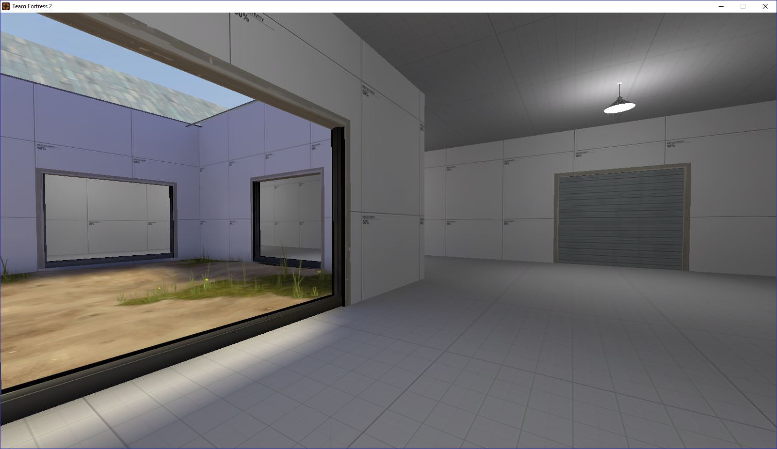
Personally, I like having the back room where the players spawn a bit more centralised. Here, the player is given three options. No main door is defined (which doesn't matter as much), but all three doors proceed to dump out into the same courtyard, and in turn, choke.
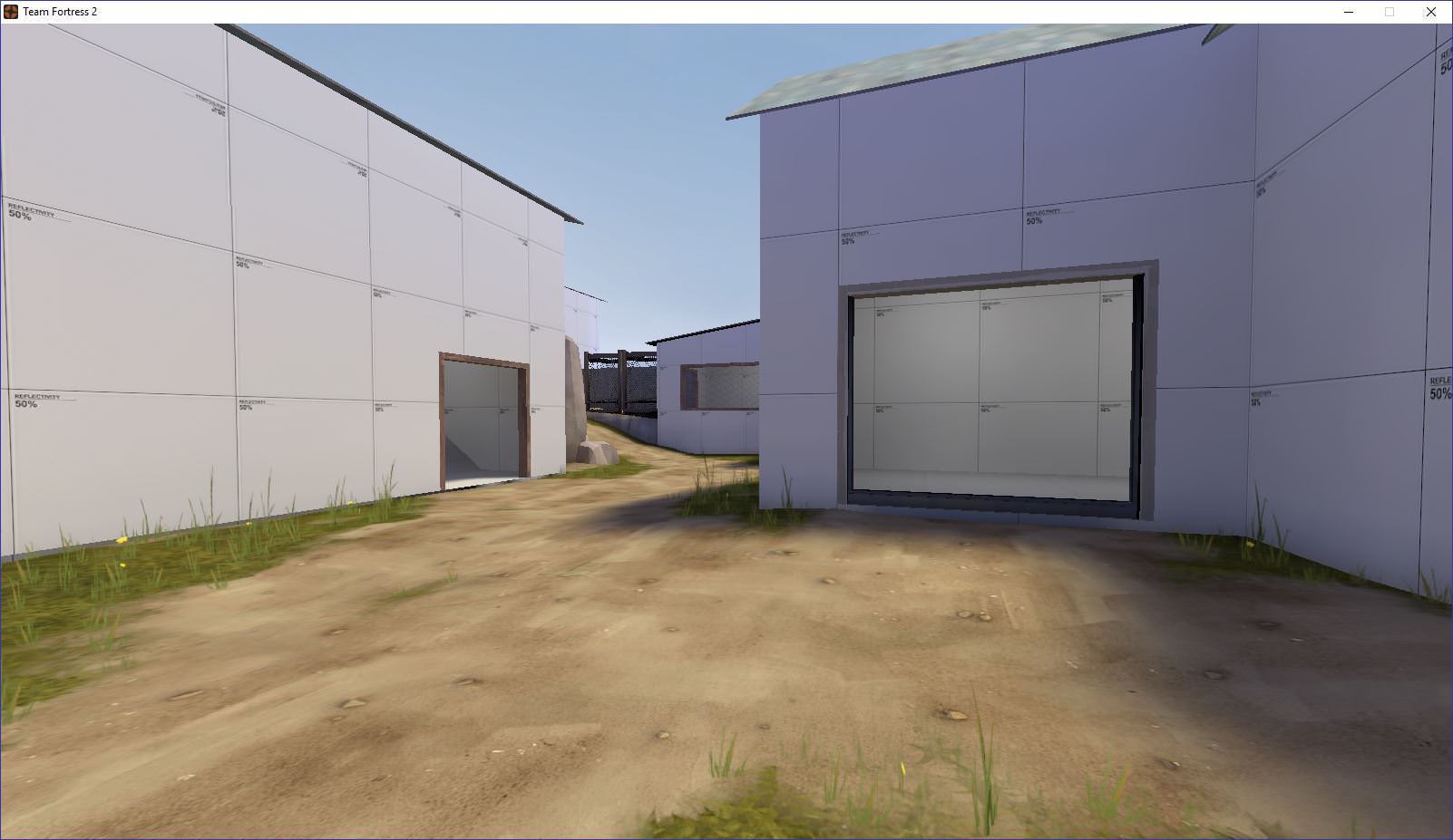
Here the player sees two options, moving forward outdoors, or cutting in through the building. The door is in the same tight section as the choke though, meaning that players will be pushed together there. There's a couple very delicate sightlines into spawn, unavoidable due to a compactness of the area. Overall, not much has significantly changed since A1, but there is some improvement. Keep the idea of 2.5 routes in mind. A main route or two, plus flank(s). This allows for better player movement and as the level designer, it is your job to provide them with clear, effective routes that each serve a purpose. The purpose may be a bit abstract and changed by the player, but having options is important.
Another thing to note: That window is hard to see.
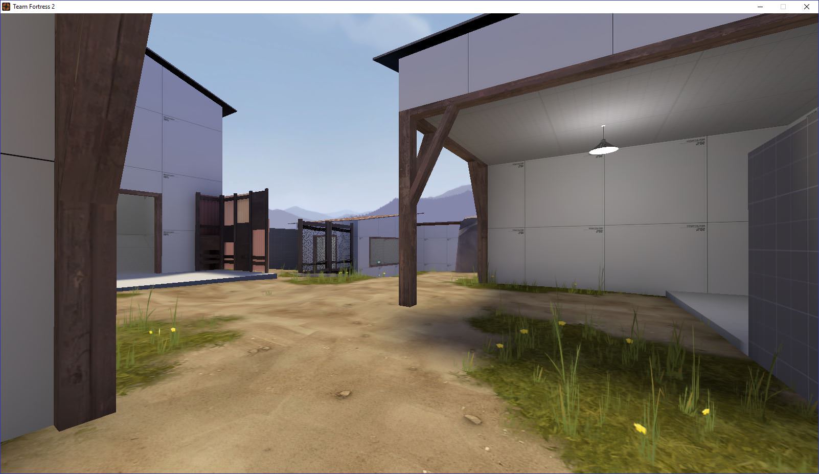
In the background, there's the window room. One way in, one way out. For defenders, it's a nice little pocket. Being exposed by the prop and window makes it a risk-reward, but it does feel like a death trap. On the right, the first building exits. That room is well designed.
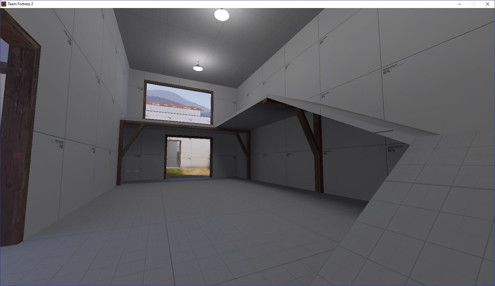
This room makes sense, but feels weird. To gain access to the high ground of the window, there are the ramps. The player must cross through the doorway, which is nice. You remain exposed throughout the entire thing though. Also, the full ammo in the top corner is unnecessary as ammo is directly to the left of the door. The balcony provides very a nice spam angle, but is restricted by the metal fence. If you want to see a room similar to this, but more well-tested, look at Mojave, Stage 1, between points A and B.
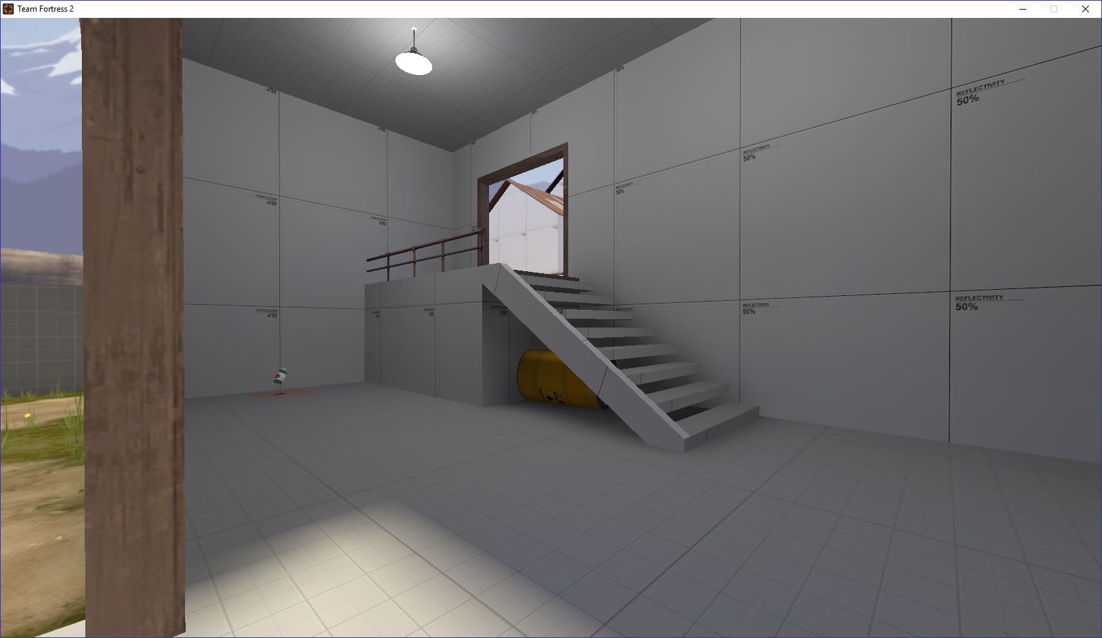
This room plays well. Small nitpicks would be the stairs look awkward. I'd make the side of the staircase just follow straight through instead of clipping the end. The barrel underneath is nice, but in a room like this, having an open hanging stair creates a lot of visual noise.
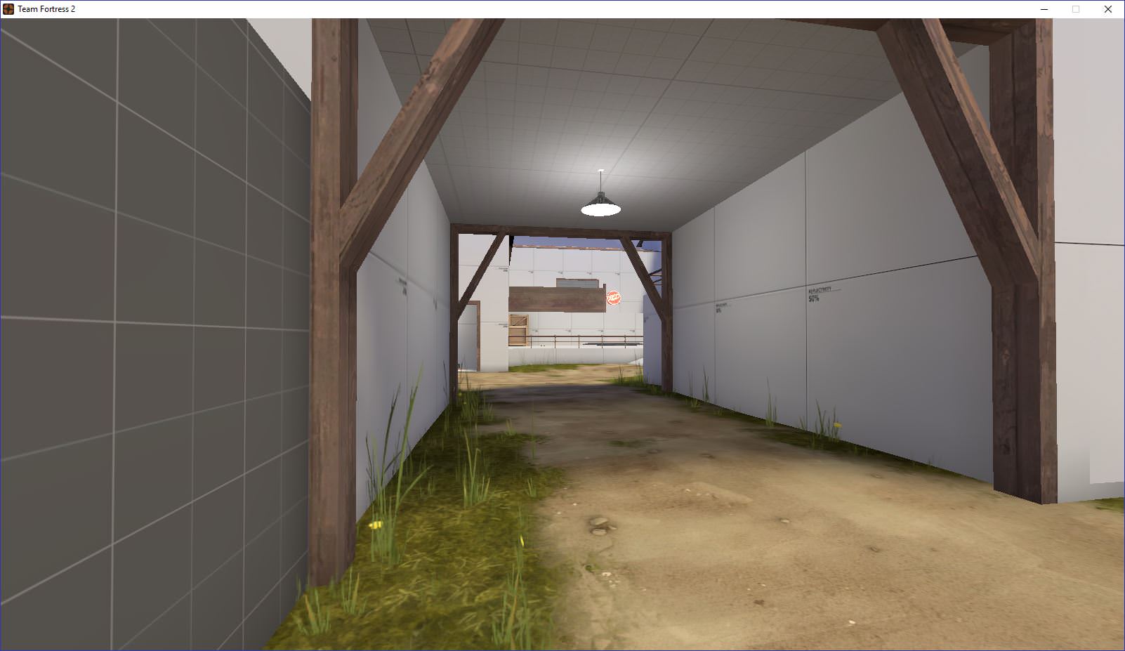
Lastly, the open corridor. I like this, just be mindful of what it reveals for both offense and defense. The full health pack is a bit much (maybe go medium there). There's a sightline from that pack all the way towards the choke next to the window room (see the second picture).
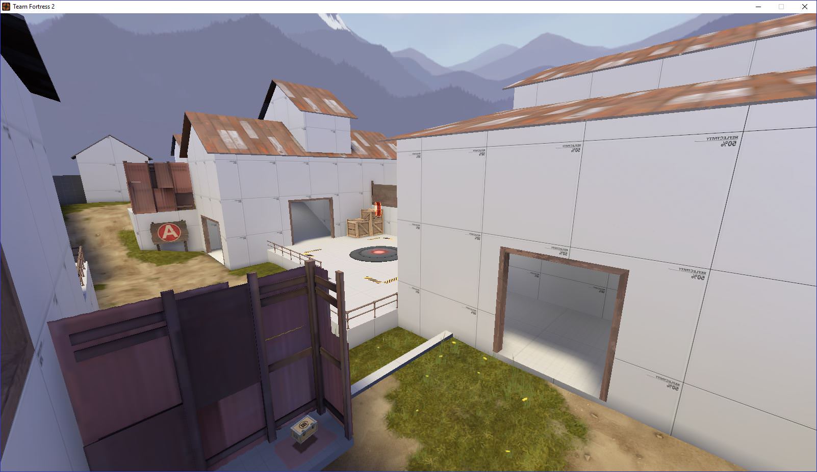
The area directly beneath the camera is a bit close to the short railing prop and it doesn't feel right when playing it. The room to the right connects to a hall that leads to B, dumping in front of B and directly onto A. Towards the middle of this screenshot, there's a door with a steep ramp (next to the crates). I dislike the shutter in there and the ramp looks down upon the point.
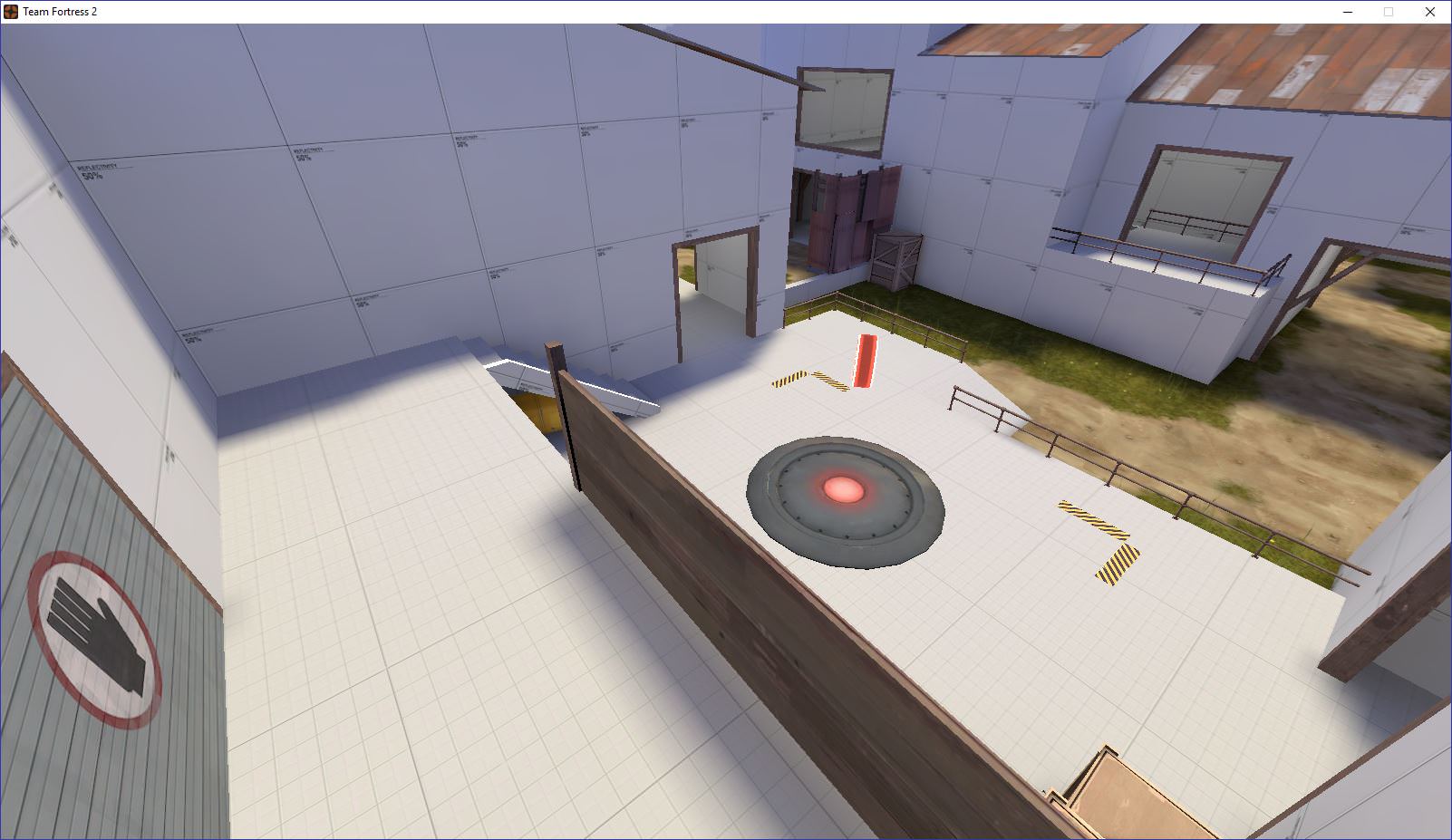
A plays pretty well. Both sides have height to contest the point. The point has been expanded to accomodate more players and routes around it have been cleaned up. The removal and reworking of the shutters has defintiely contributed to the development of this area. Maybe pulling the point platform farther from blue would help a little to open up the space more. Blue's balcony is kinda small and easily spammable. The staircase next to the point could also be widened. The point takes a while to cap when at 2x (whether it be a scout, demo with Pain Train, et cetera), emphasising capping as a team. Be careful of spam though! Good work here so far!
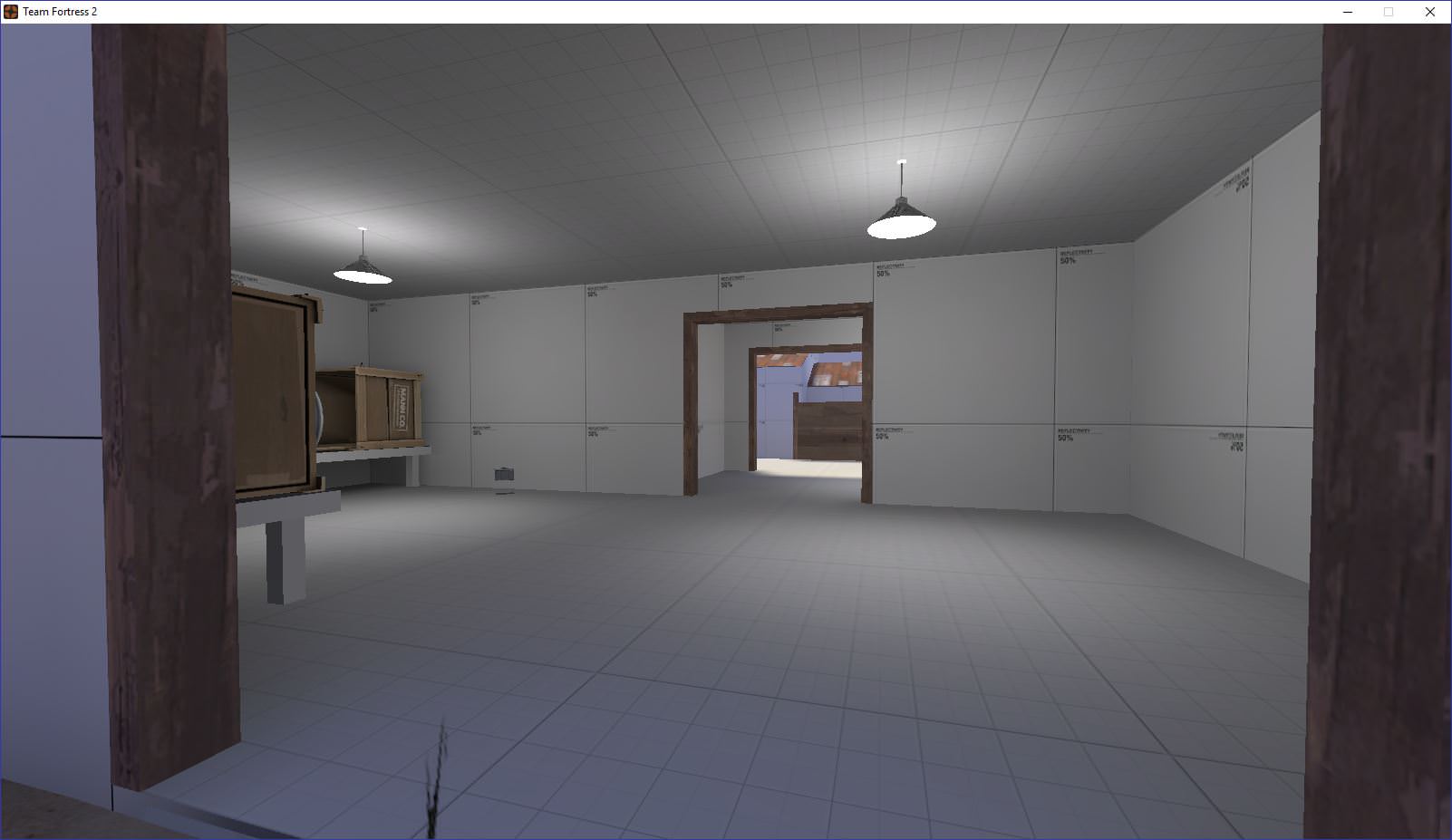
Yikes! This dumps right out into the open and is barely protected. Spam can be dumped into that tight hallway. This route is awfully short because it leads from behind A right onto B, but isn't too desireable for attackers.
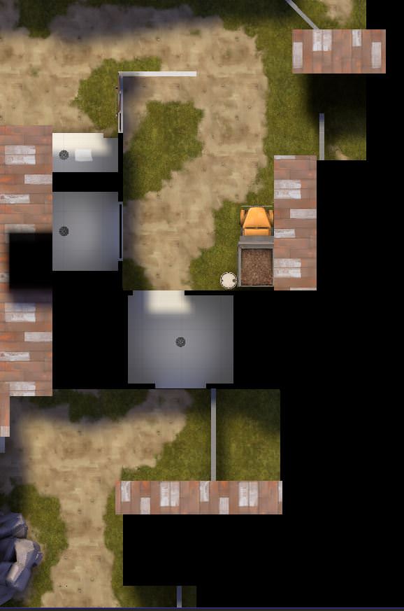
On the other hand, this route is super long and offers a lot of cover until you actually arrive at B. It dumps into the same spot, but offers a deep flank through the shutter door onto B and red spawn. However, when you come out of it, you're faced by another narrow room and no clear view of the point. The shutter door itself isn't really needed.
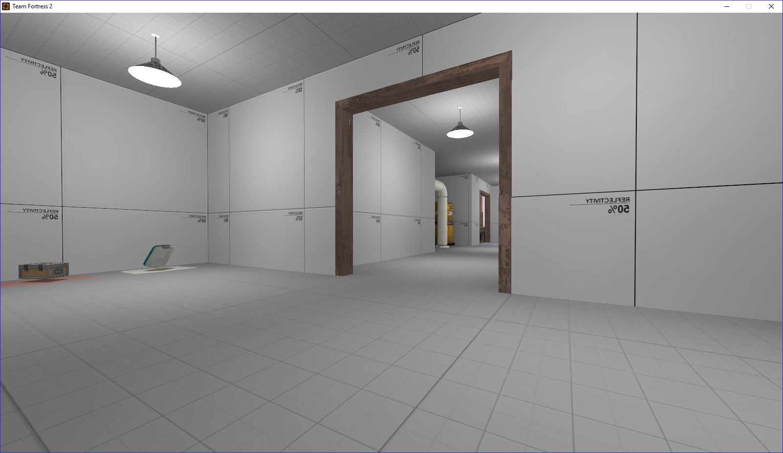
Lastly, there's this hallway. It's length is about right, but small things could clean it up. Moving the health packs into a pocket less deep than that would work well. (Maybe even move them to the right of this view!) Once again the player is faced with more of a hallway-esqe route instead of a fighting area. Make things into more of a combat space. Lastly, the pipes and barrels are all clipped off (which is good), but make a visual hint for that. There's the wonderful chicken wire for small things like that.
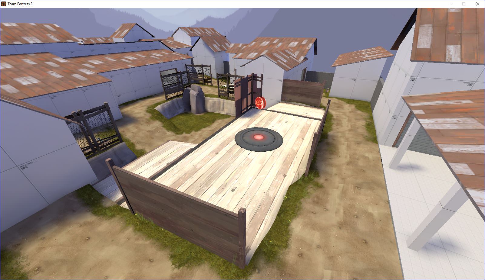
Here's the finale! My biggest grip here is that blue is funneled into that space right below the point in order to attack it. Red has a huge height advantage and blue is left at the mercy of them in the pit of spam below! Yes, the flank is there, but covering it as well as the point was fairly easy. Once again, the 2.5 rule would apply here as well. You have the pit (and yes, two ramps) and the flank. Blue's only options are to go for picks or brute force their way in. Both were very challenging.
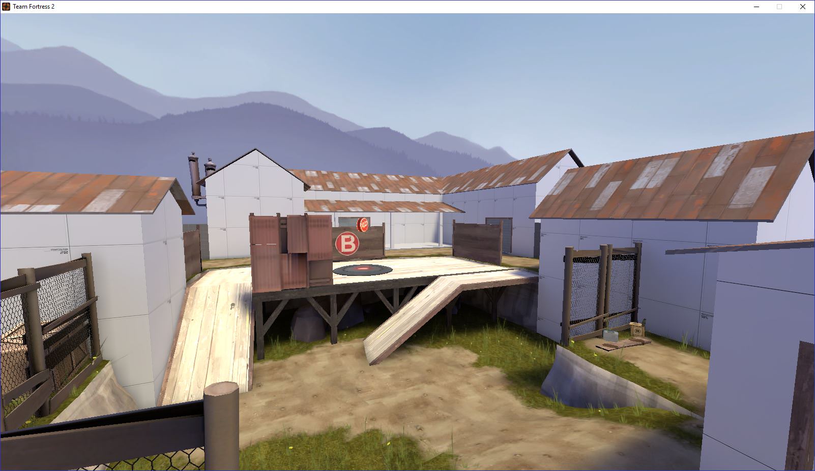
The point should be contestable, but blue must completely expose themselves in order to get to the point. The health and ammo on the right is more of a bait as it traps the attackers in that corner. Lastly, the right ramp could be brought out into blue's direction to offer another way up where they don't have to hug the wall. Lastly, red spawns directly behind blue point. There is no buffer between their spawn and the point meaning that they can camp and if blue tries to flood the point, then resupply and surge back out.
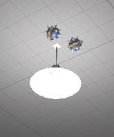
Please, for the sake of all your players, make these nonsolid. I don't want to hit my head while jumping, get caught on it, or die by the hands of my opponents.
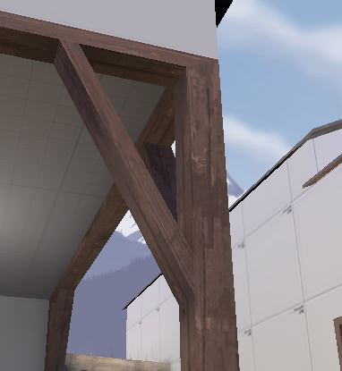
These support look awkward and are awfully thin. I try to keep my crossbeams as well as the columns at the same thickness. If they're used in a hallway (as in the path to A), clip in when it's against the wall. There's some small collision issues and places to get caught everywhere.

I know you clipped your stairs, but there's still small jittery bumps everywhere! Either clip the edge of the platforms or raise the displacement. If you choose the former, I'd use blockbullets.
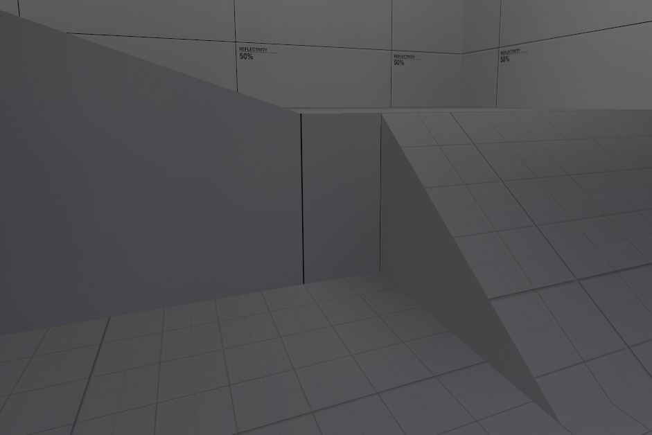
Keep your stairs/ramps mostly consistent please! 1:1 works in rare clases, but most mappers use either 1:2 or 2:3 for stairs. More of a nitpick and your steepness is fine, but consistency is nice.
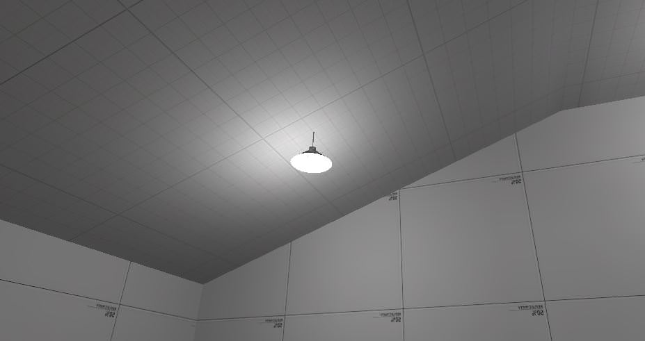
The ceiling looks odd, but that's mostly me.
In chat the other day, you didn't know how to optimise with all the angled roofs. It can be tricky. Since it's alpha, focus more on gameplay. Flat roofs might be easier for you to work with for the time being.
Some areas might need a raised skybox for jumping classes.
Please, please do not be discouraged by all of this. A lot of the things are moreso my preference or general pointers. There's some good design. As you pour love into the development of Akim, it'll fix more and more issues. A lot of the things may seem like major issues, but you've got some decent improvements made since A1! I think the biggest thing is working with player routes and options throughout the map.

Personally, I like having the back room where the players spawn a bit more centralised. Here, the player is given three options. No main door is defined (which doesn't matter as much), but all three doors proceed to dump out into the same courtyard, and in turn, choke.

Here the player sees two options, moving forward outdoors, or cutting in through the building. The door is in the same tight section as the choke though, meaning that players will be pushed together there. There's a couple very delicate sightlines into spawn, unavoidable due to a compactness of the area. Overall, not much has significantly changed since A1, but there is some improvement. Keep the idea of 2.5 routes in mind. A main route or two, plus flank(s). This allows for better player movement and as the level designer, it is your job to provide them with clear, effective routes that each serve a purpose. The purpose may be a bit abstract and changed by the player, but having options is important.
Another thing to note: That window is hard to see.

In the background, there's the window room. One way in, one way out. For defenders, it's a nice little pocket. Being exposed by the prop and window makes it a risk-reward, but it does feel like a death trap. On the right, the first building exits. That room is well designed.

This room makes sense, but feels weird. To gain access to the high ground of the window, there are the ramps. The player must cross through the doorway, which is nice. You remain exposed throughout the entire thing though. Also, the full ammo in the top corner is unnecessary as ammo is directly to the left of the door. The balcony provides very a nice spam angle, but is restricted by the metal fence. If you want to see a room similar to this, but more well-tested, look at Mojave, Stage 1, between points A and B.

This room plays well. Small nitpicks would be the stairs look awkward. I'd make the side of the staircase just follow straight through instead of clipping the end. The barrel underneath is nice, but in a room like this, having an open hanging stair creates a lot of visual noise.

Lastly, the open corridor. I like this, just be mindful of what it reveals for both offense and defense. The full health pack is a bit much (maybe go medium there). There's a sightline from that pack all the way towards the choke next to the window room (see the second picture).

The area directly beneath the camera is a bit close to the short railing prop and it doesn't feel right when playing it. The room to the right connects to a hall that leads to B, dumping in front of B and directly onto A. Towards the middle of this screenshot, there's a door with a steep ramp (next to the crates). I dislike the shutter in there and the ramp looks down upon the point.

A plays pretty well. Both sides have height to contest the point. The point has been expanded to accomodate more players and routes around it have been cleaned up. The removal and reworking of the shutters has defintiely contributed to the development of this area. Maybe pulling the point platform farther from blue would help a little to open up the space more. Blue's balcony is kinda small and easily spammable. The staircase next to the point could also be widened. The point takes a while to cap when at 2x (whether it be a scout, demo with Pain Train, et cetera), emphasising capping as a team. Be careful of spam though! Good work here so far!

Yikes! This dumps right out into the open and is barely protected. Spam can be dumped into that tight hallway. This route is awfully short because it leads from behind A right onto B, but isn't too desireable for attackers.

On the other hand, this route is super long and offers a lot of cover until you actually arrive at B. It dumps into the same spot, but offers a deep flank through the shutter door onto B and red spawn. However, when you come out of it, you're faced by another narrow room and no clear view of the point. The shutter door itself isn't really needed.

Lastly, there's this hallway. It's length is about right, but small things could clean it up. Moving the health packs into a pocket less deep than that would work well. (Maybe even move them to the right of this view!) Once again the player is faced with more of a hallway-esqe route instead of a fighting area. Make things into more of a combat space. Lastly, the pipes and barrels are all clipped off (which is good), but make a visual hint for that. There's the wonderful chicken wire for small things like that.

Here's the finale! My biggest grip here is that blue is funneled into that space right below the point in order to attack it. Red has a huge height advantage and blue is left at the mercy of them in the pit of spam below! Yes, the flank is there, but covering it as well as the point was fairly easy. Once again, the 2.5 rule would apply here as well. You have the pit (and yes, two ramps) and the flank. Blue's only options are to go for picks or brute force their way in. Both were very challenging.

The point should be contestable, but blue must completely expose themselves in order to get to the point. The health and ammo on the right is more of a bait as it traps the attackers in that corner. Lastly, the right ramp could be brought out into blue's direction to offer another way up where they don't have to hug the wall. Lastly, red spawns directly behind blue point. There is no buffer between their spawn and the point meaning that they can camp and if blue tries to flood the point, then resupply and surge back out.

Please, for the sake of all your players, make these nonsolid. I don't want to hit my head while jumping, get caught on it, or die by the hands of my opponents.

These support look awkward and are awfully thin. I try to keep my crossbeams as well as the columns at the same thickness. If they're used in a hallway (as in the path to A), clip in when it's against the wall. There's some small collision issues and places to get caught everywhere.

I know you clipped your stairs, but there's still small jittery bumps everywhere! Either clip the edge of the platforms or raise the displacement. If you choose the former, I'd use blockbullets.

Keep your stairs/ramps mostly consistent please! 1:1 works in rare clases, but most mappers use either 1:2 or 2:3 for stairs. More of a nitpick and your steepness is fine, but consistency is nice.

The ceiling looks odd, but that's mostly me.
In chat the other day, you didn't know how to optimise with all the angled roofs. It can be tricky. Since it's alpha, focus more on gameplay. Flat roofs might be easier for you to work with for the time being.
Some areas might need a raised skybox for jumping classes.
Please, please do not be discouraged by all of this. A lot of the things are moreso my preference or general pointers. There's some good design. As you pour love into the development of Akim, it'll fix more and more issues. A lot of the things may seem like major issues, but you've got some decent improvements made since A1! I think the biggest thing is working with player routes and options throughout the map.
I only caught the second point for a bit, but ya I think the scale of the last room was good, but the routes leading towards it for blue team were a bit un-fun, kinda flat and short-feeling.
Maybe you may wanna move last just a bit farther back from blue's forward spawn , or pull blue's forward just a bit further back from them. I do like in a/d cp maps when I can push/pull for control of a building in front of the CP, kinda gives you a clear focus too on what you can work on doing to have better traction towards the point.
The balcony route for blue towards B is probably that route, but it is too short and there isn't a way up for red - maybe extend it a bit and add some side-route from the middle flat-area? And probably also turn that flat area into some sort of hilly-thing for pizazz.
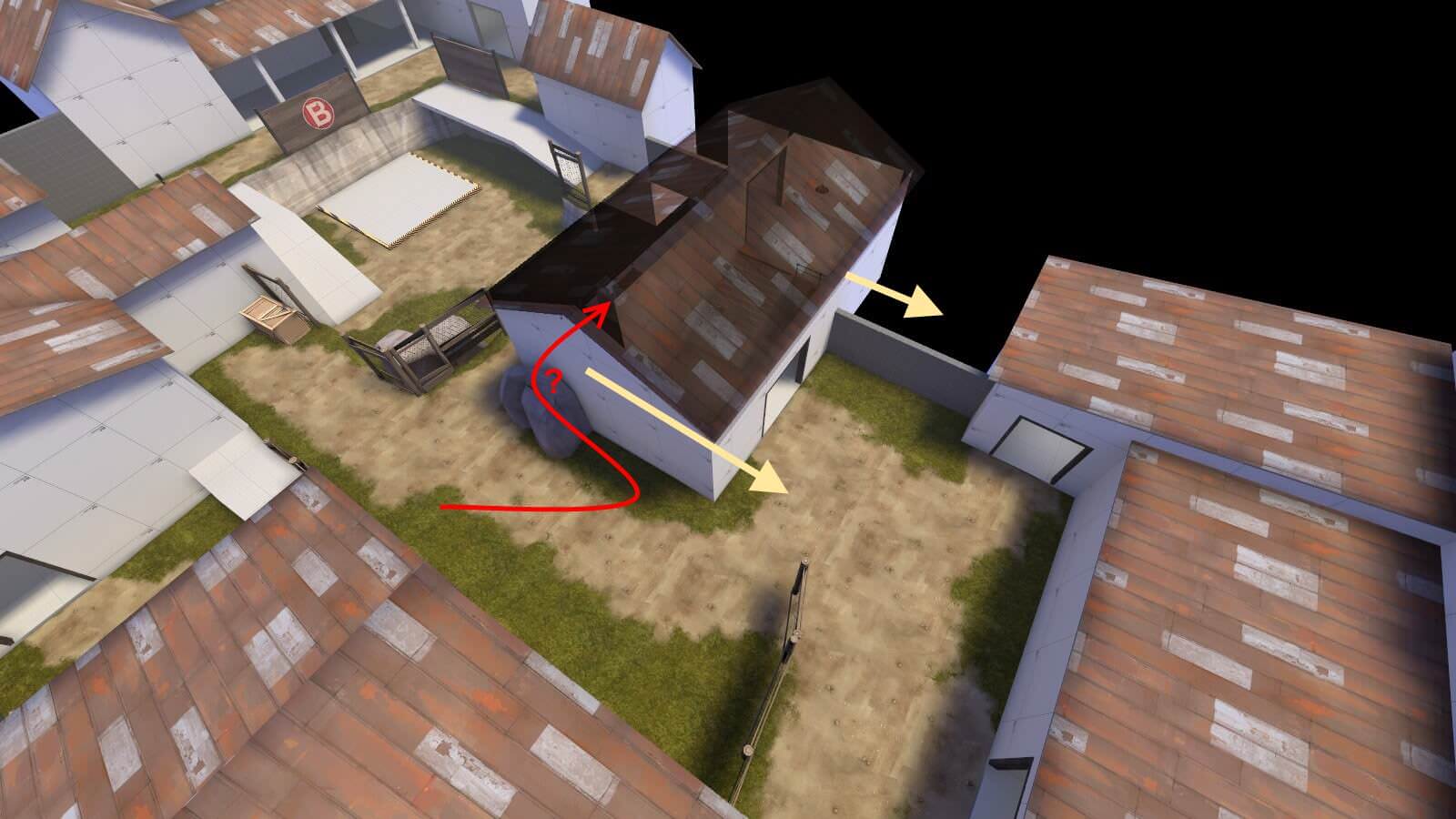
Lookin good as far as I saw otherwise!
Maybe you may wanna move last just a bit farther back from blue's forward spawn , or pull blue's forward just a bit further back from them. I do like in a/d cp maps when I can push/pull for control of a building in front of the CP, kinda gives you a clear focus too on what you can work on doing to have better traction towards the point.
The balcony route for blue towards B is probably that route, but it is too short and there isn't a way up for red - maybe extend it a bit and add some side-route from the middle flat-area? And probably also turn that flat area into some sort of hilly-thing for pizazz.

Lookin good as far as I saw otherwise!
- did some tweaks with covers and the building in front of last (thats what i remember i finished this like a month ago a never actually updated)
Read the rest of this update entry...
Read the rest of this update entry...


