Artpass_honeymustard

honeymustard

L9: Fashionable Member
Oct 26, 2009
698
575
You guys sounded really unenthused. Try to get more- oh wait wrong thing.

Please :(

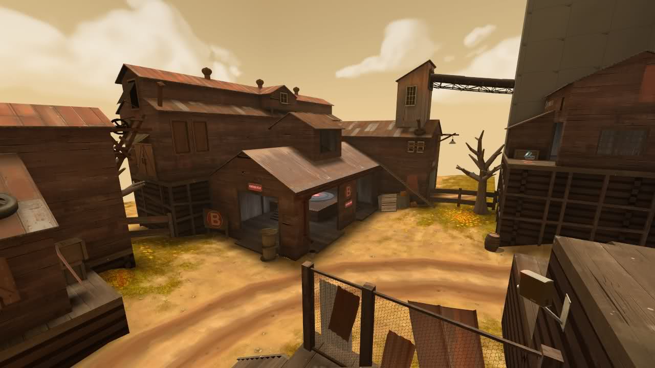
Well here are a couple of new shots:

cjgvl.jpg


2irq3xx.jpg
 

Acumen

Annoyer
aa
Jun 11, 2009
704
628
that new fence and stair --> awesome !
high expectations when thinking of your past work :)
this turns out really good so far !
 

Draco18s

L9: Fashionable Member
Sep 19, 2009
622
136
That second picture makes those two areas very well integrated. My (pile of) hat's off to you, sir.
 

Nineaxis

Quack Doctor
aa
May 19, 2008
1,767
2,820
Looks a bit plain. Either do something about that long flat roof or remove it (I liked the cap point building being on its own better).
 

honeymustard

L9: Fashionable Member
Oct 26, 2009
698
575
I would have just left it but the problem is people will stand on the edge of the roof and the clipping will be keeping them on it, when you'd expect to fall off the side.
 

IrishTaxIDriver

L6: Sharp Member
Sep 27, 2008
271
149
Looks a bit plain. Either do something about that long flat roof or remove it (I liked the cap point building being on its own better).

A few of those spinning roof vents would look nice. Like two or three.

EDIT: But you're my competitor! Uhh... it looks great as is! Don't change any more! Its perfect!
 

honeymustard

L9: Fashionable Member
Oct 26, 2009
698
575
Haven't been able to show much lately as I've been working on the geometry around C and haven't been able to seal the map with skybox, so can't really compile. It's coming along nicely, though, having quite a few vis problems (roofs popping in and out etc.) but hopefully these won't be too difficult to address.

Anyway, here's a picture of A. Still need to adjust some of the buildings here for better optimisation. And obviously I haven't finished detailing it yet :p

zireiu.jpg
 
Last edited:

Goombac

L4: Comfortable Member
Mar 27, 2010
172
84
The concrete tunnel looks a bit out of place with the rest of A, but alltogether it's looking great!
 

honeymustard

L9: Fashionable Member
Oct 26, 2009
698
575
30m7pck.jpg


Slightly more detail to the blu spawn and 3D skybox.

3481wu1.jpg


Bit more progress on C. Still needs more detail, as does the red spawn.

34g8yuq.jpg


Just a random angle.

I think all I need to do is detail the red spawn, finish detailing C, add a bit more detail to the 3D skybox and add some ropes here and there, then it's pretty much done.
 

re1wind

aa
Aug 12, 2009
644
588
IT feels rather brown, in part due to the sky texture and skylight colour which don't really work well with the texture colour scheme used. It really needs more green and blue to make the browns and oranges stand out instead of the brown smear it kind of looks like now.
 

honeymustard

L9: Fashionable Member
Oct 26, 2009
698
575
Hmm, I know what you mean. I wanted to have all the RED buildings the same colour, but I can try mixing it up a bit like in Upward etc. I can't really make the RED buildings green or blue though.
 

Huckle

L3: Member
May 31, 2010
149
101
Hmm, I know what you mean. I wanted to have all the RED buildings the same colour, but I can try mixing it up a bit like in Upward etc. I can't really make the RED buildings green or blue though.

There are lots of props that have different colors that will still fit in well with nearly any theme. You can start with things like the metal panels and a few overlays and work from there.