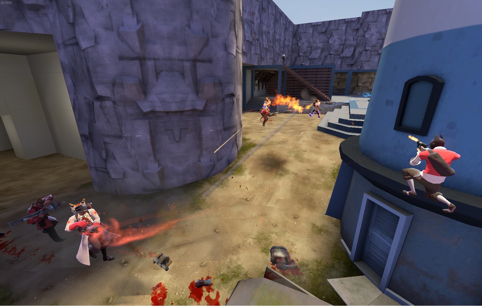
Jamrock

CP Jamrock A1

Bud Calypso

L1: Registered
Jul 28, 2015
39
25
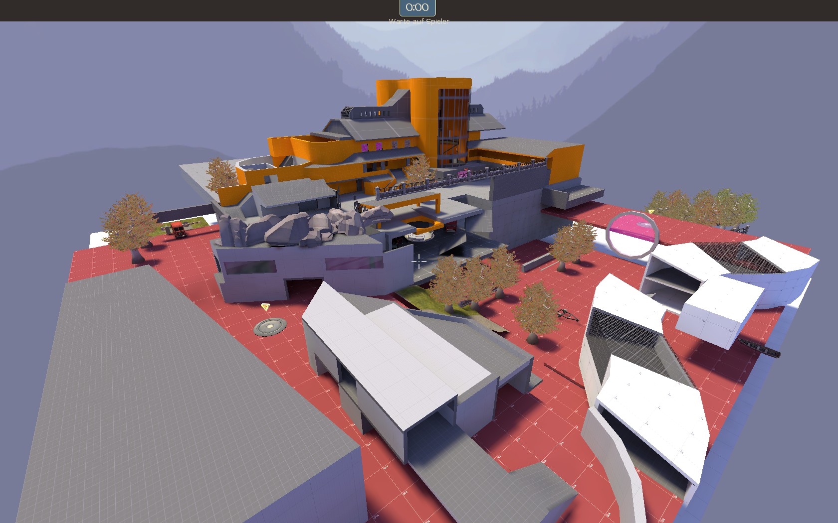
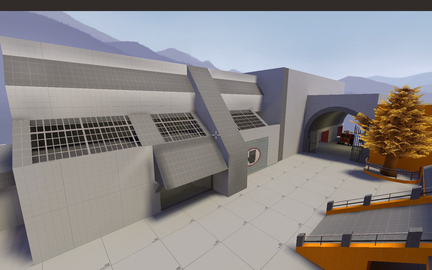
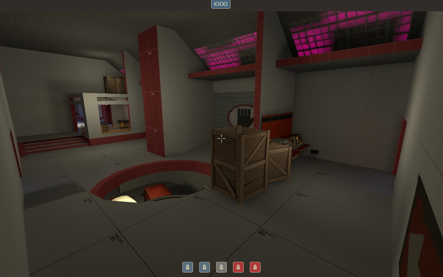
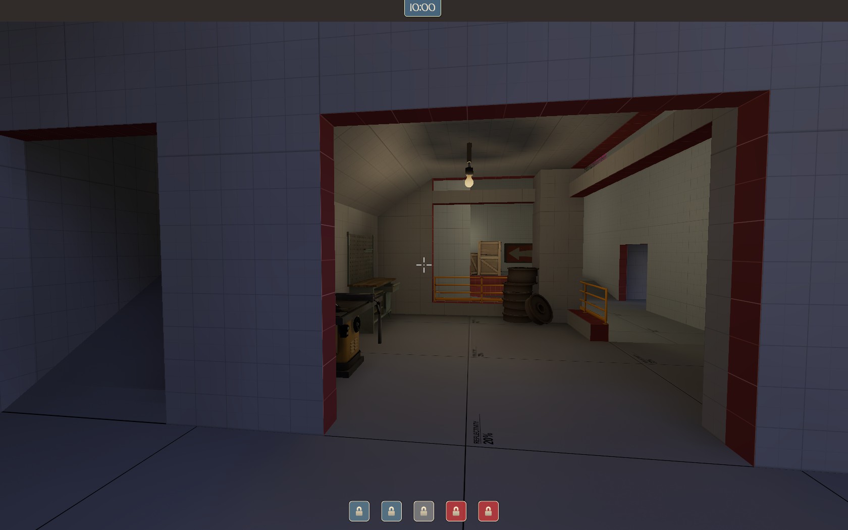
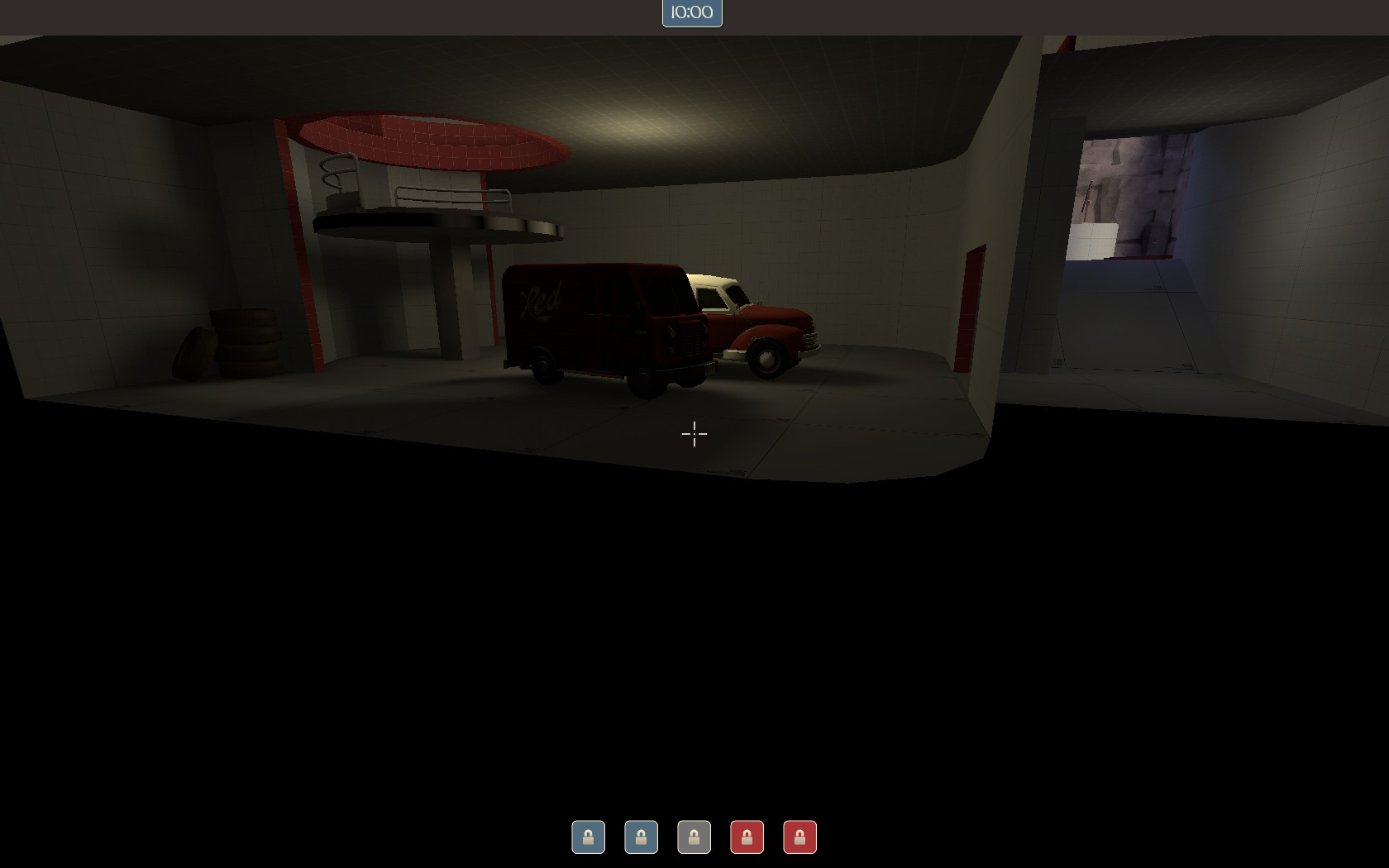
Welcome to my first alpha: Jamrock!

This actually was planned as a cp map, but being aware of my current pace and limit of skill,
I decided to make it a koth.
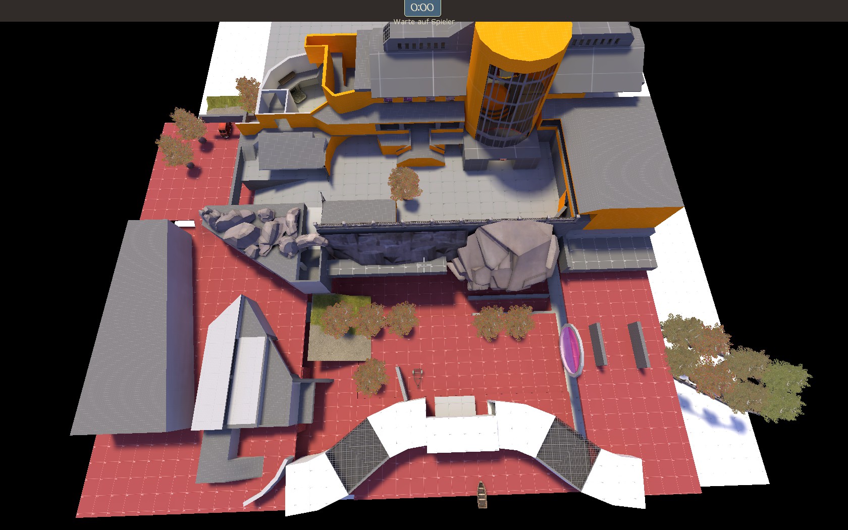
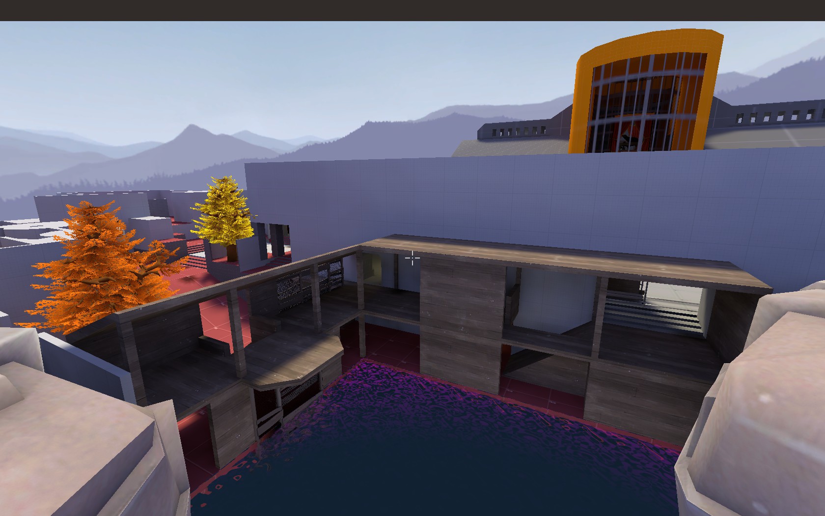
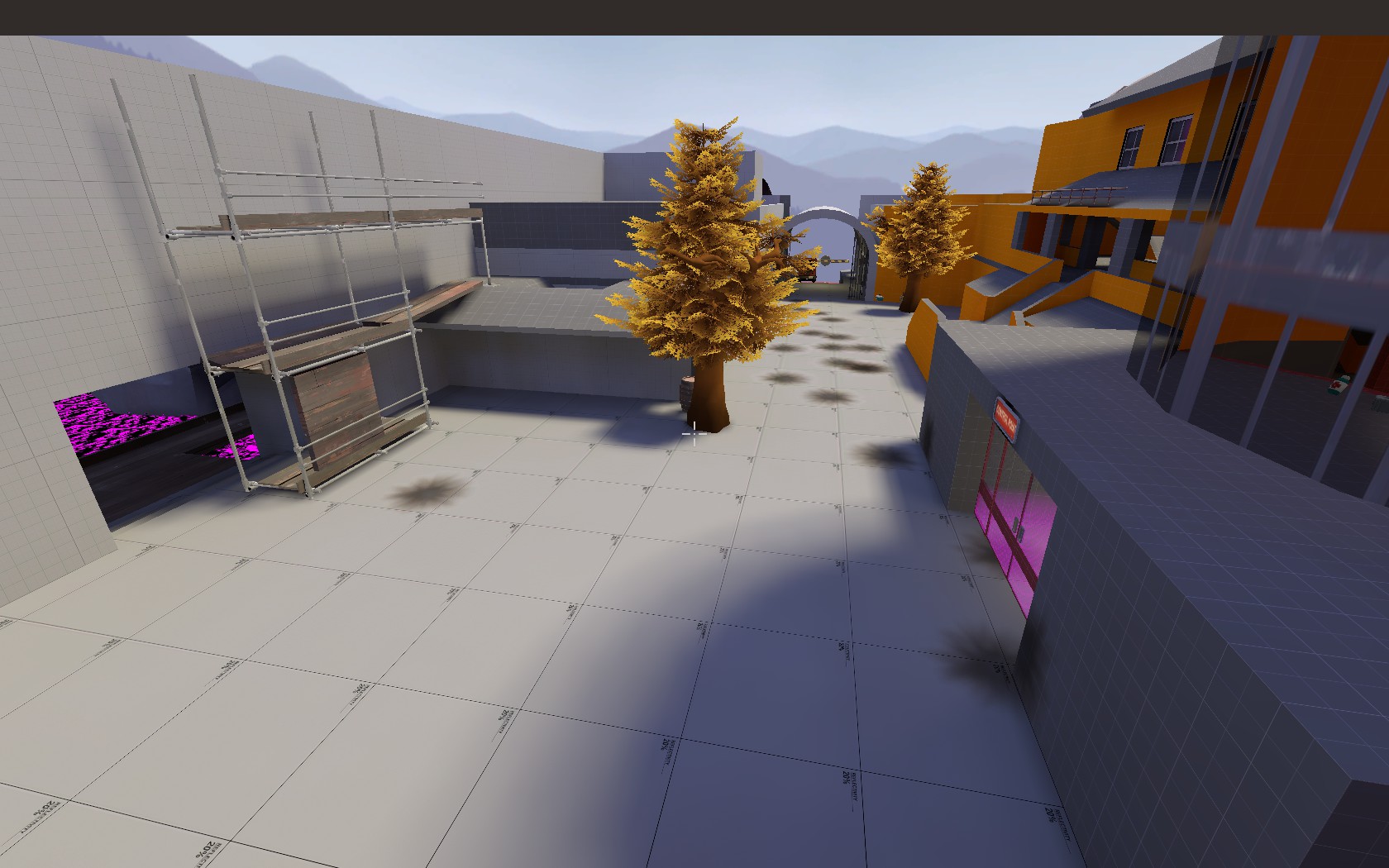
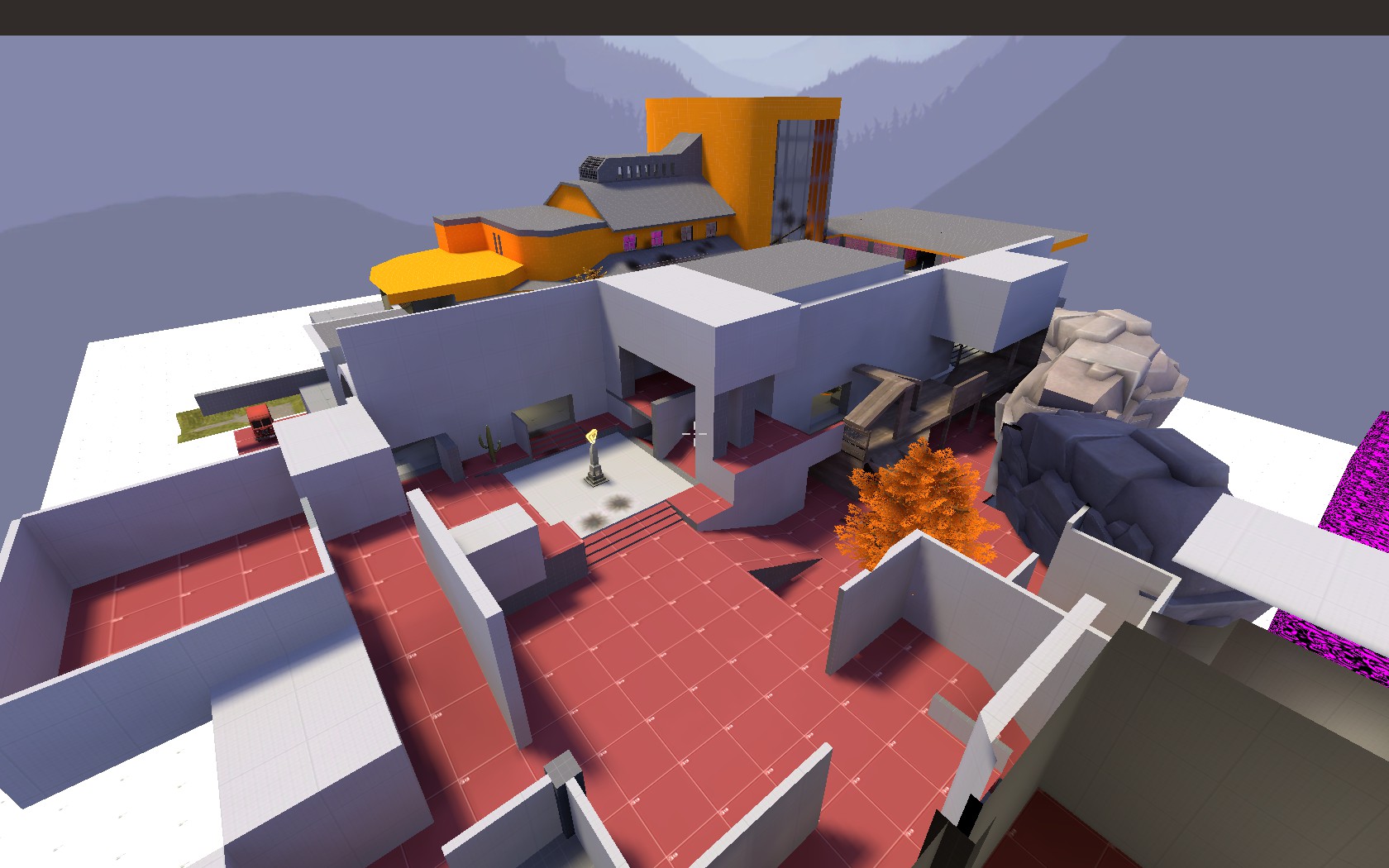
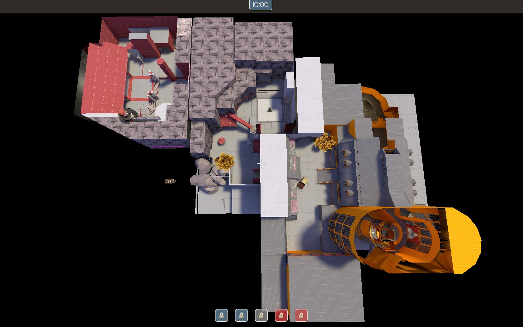
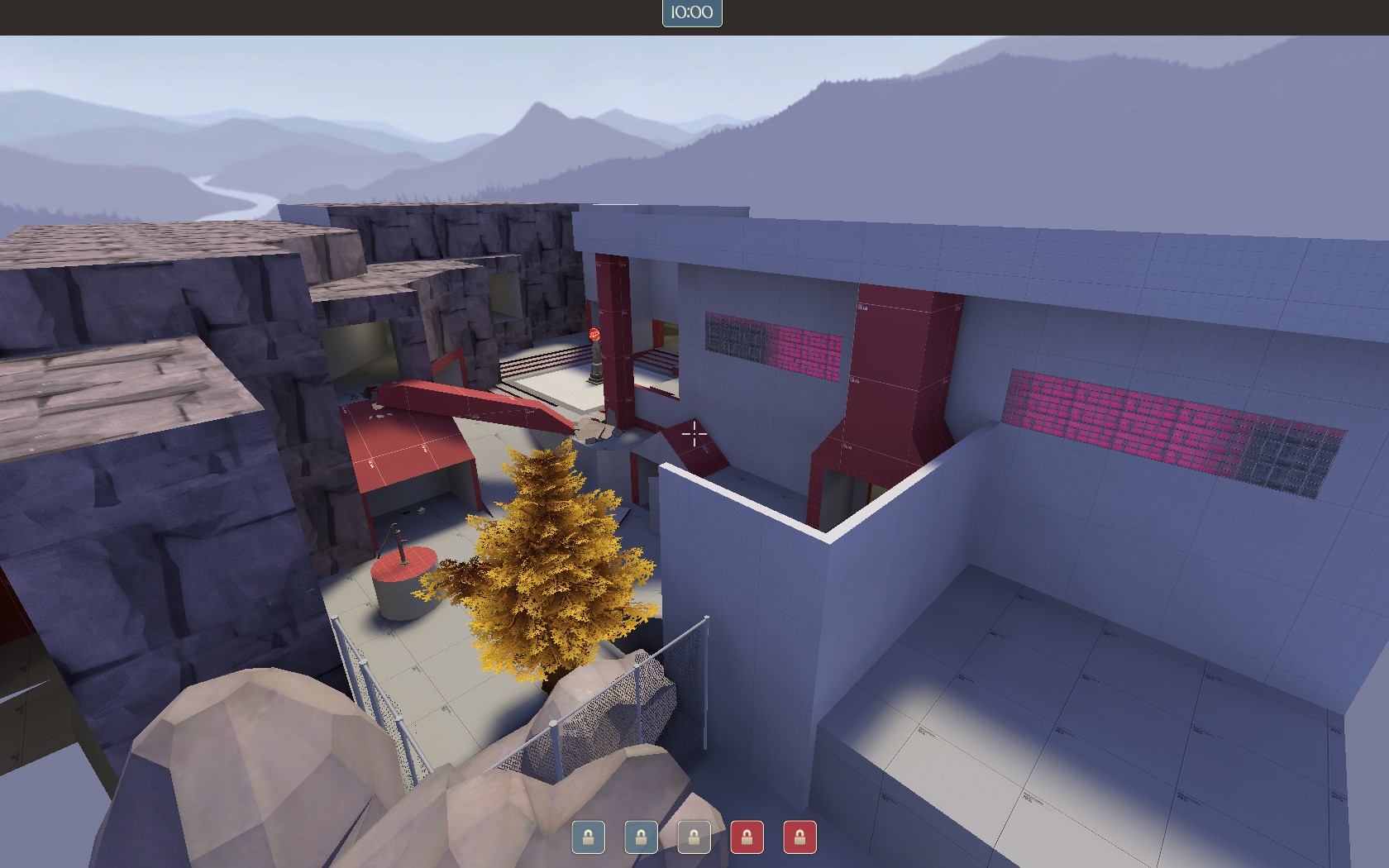
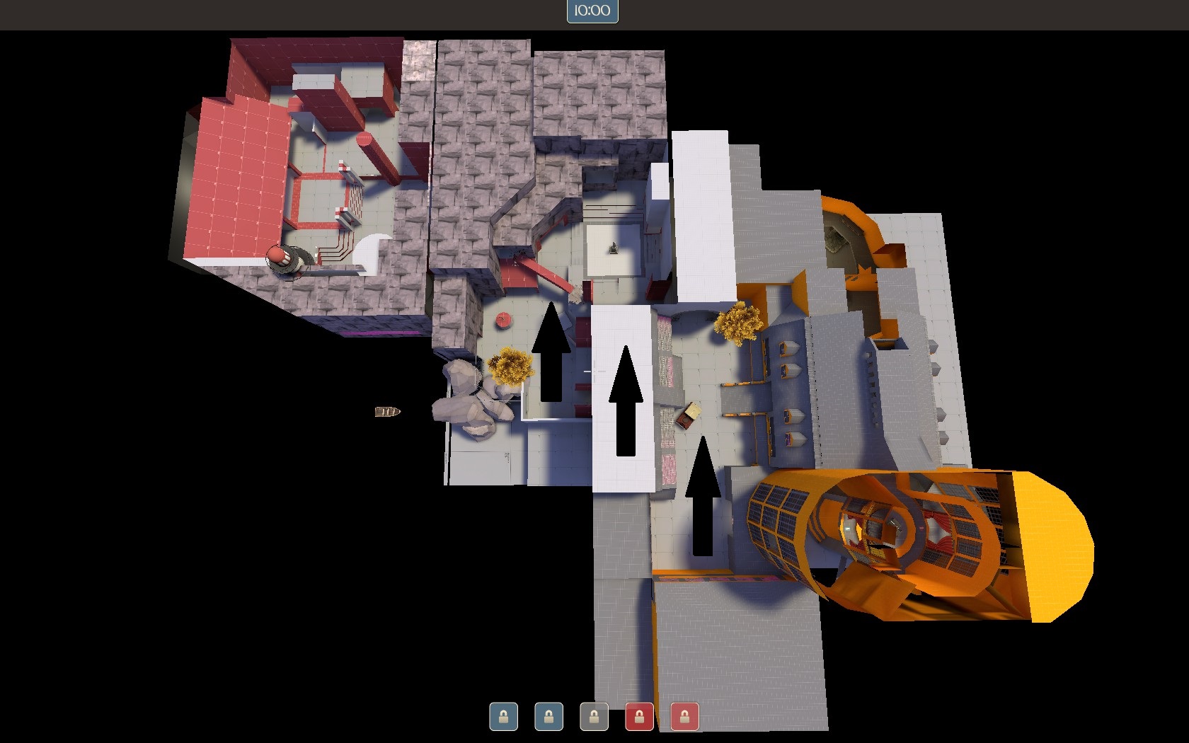
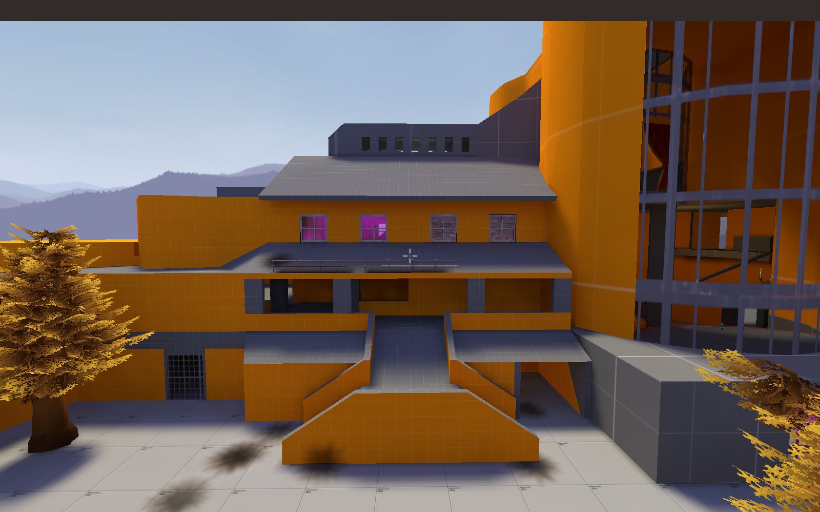
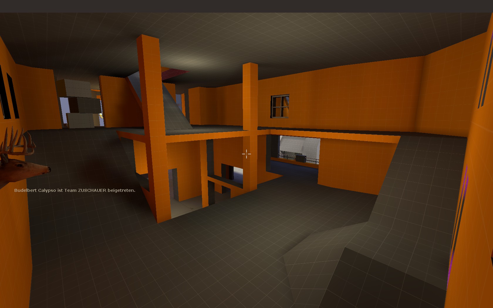
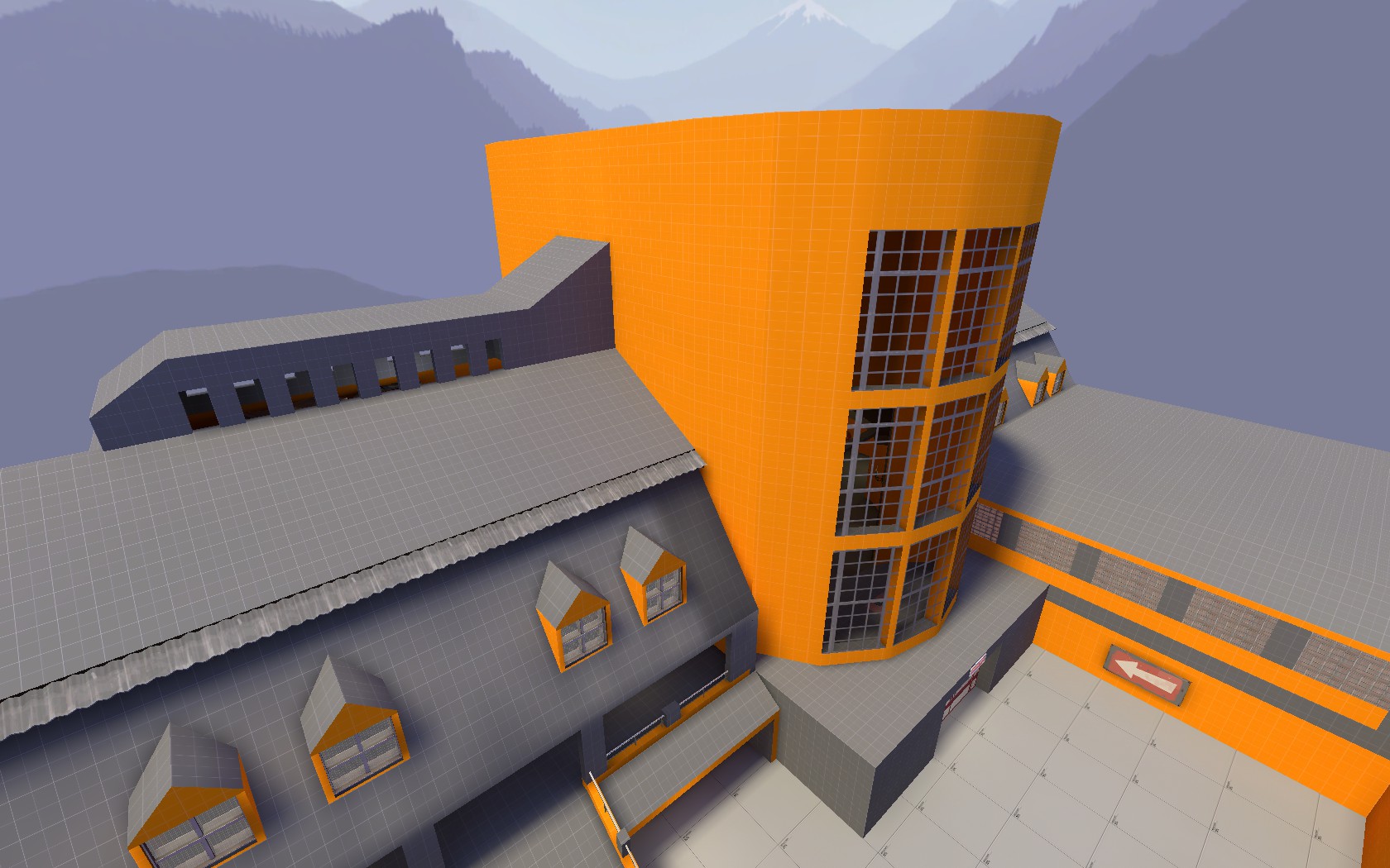
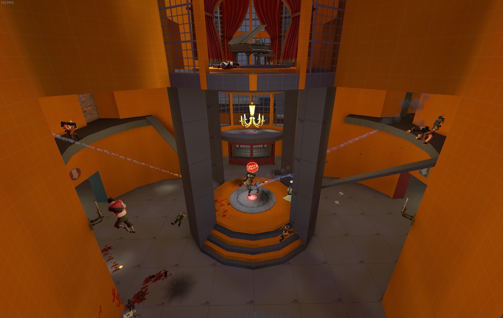
The main building is inspired by my old school. It features three stages and a piano!
This is a hint of what this shall end up. The alternative titles are "duke" or "property".
I want this to be a mansion in a autumn setting, which blu and red called out as their new base.

The a1 is still up till I made the neccessary changes, which became obvious after the first test.

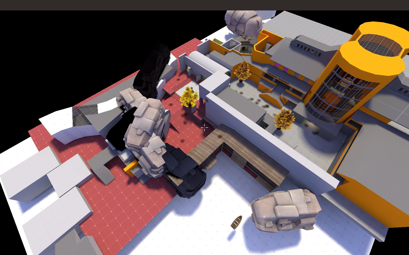
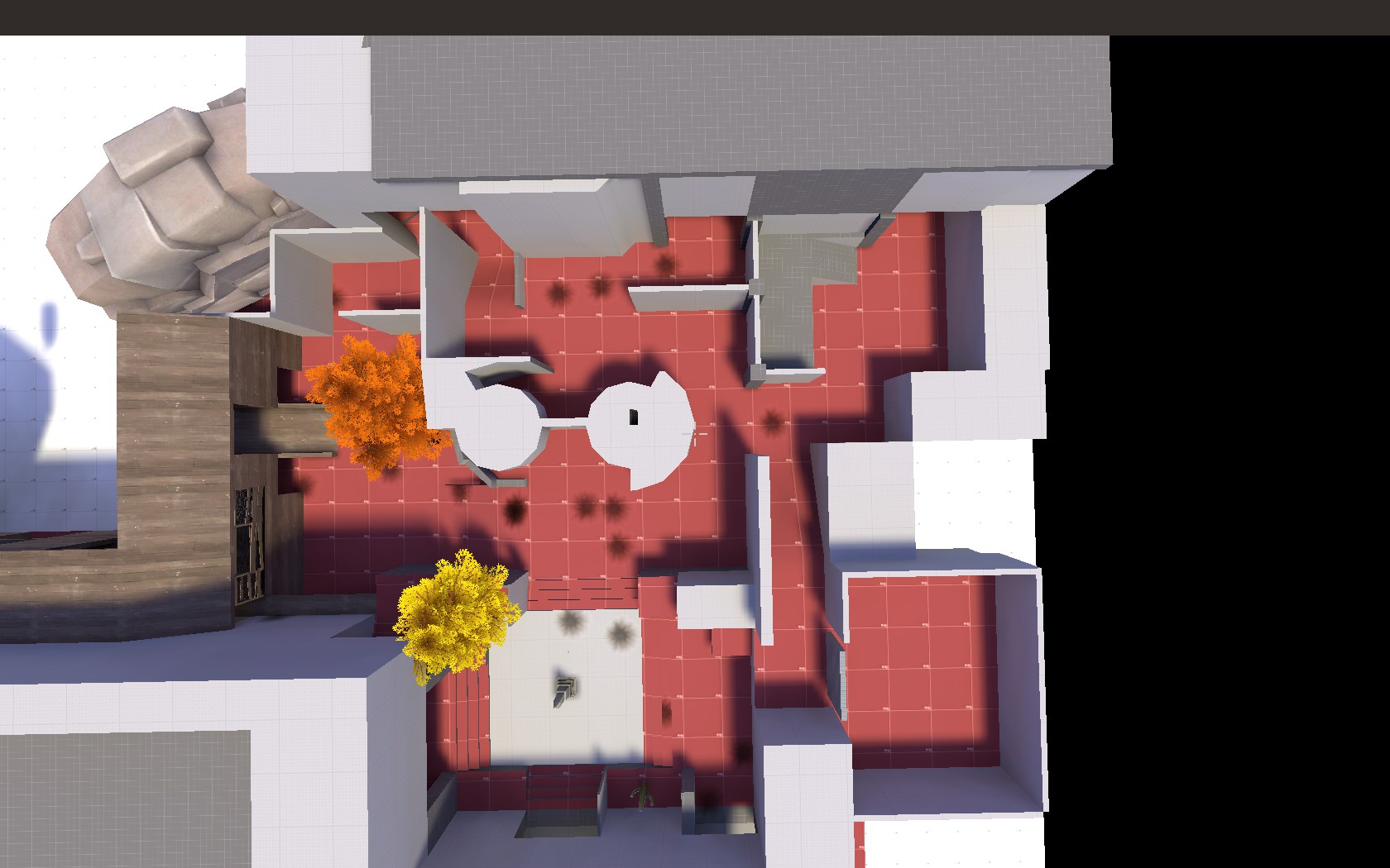
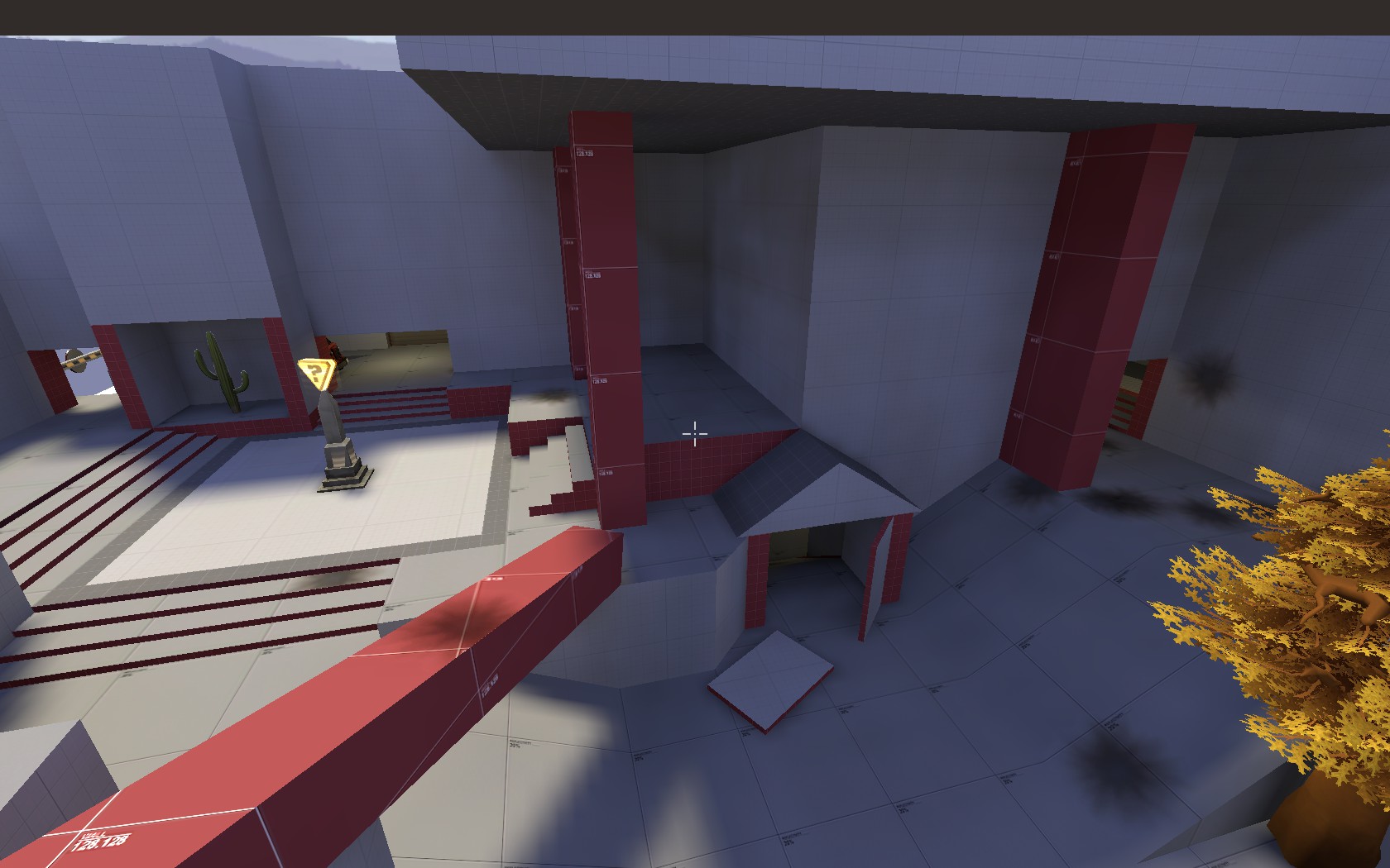
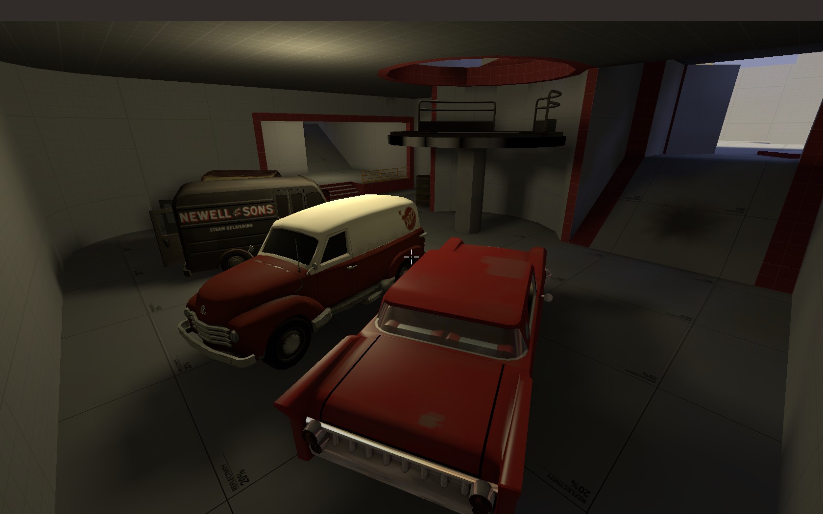
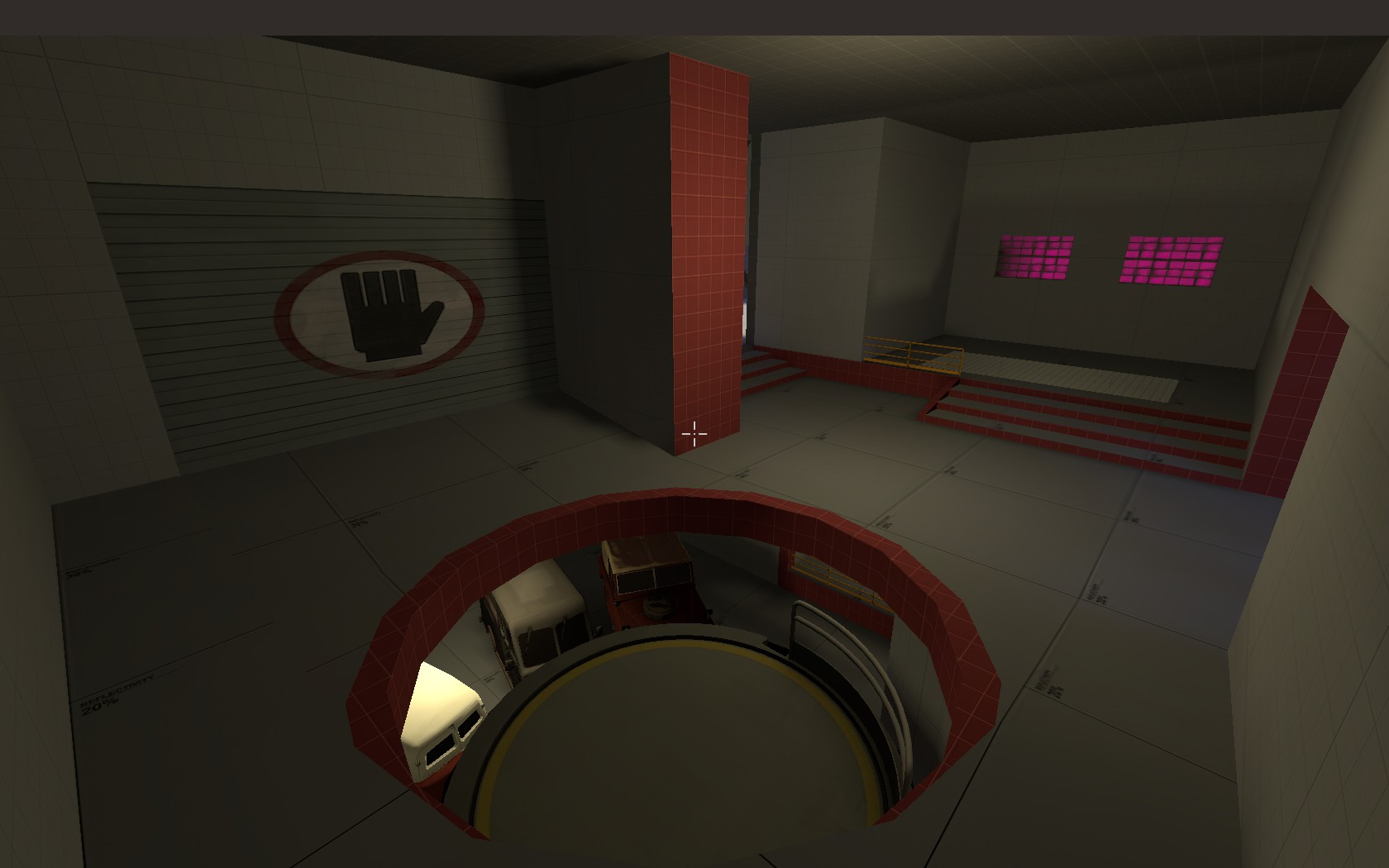
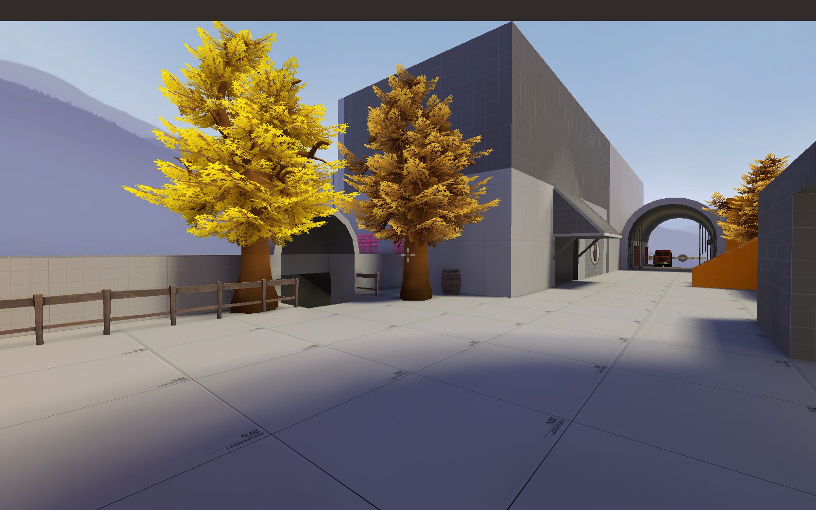
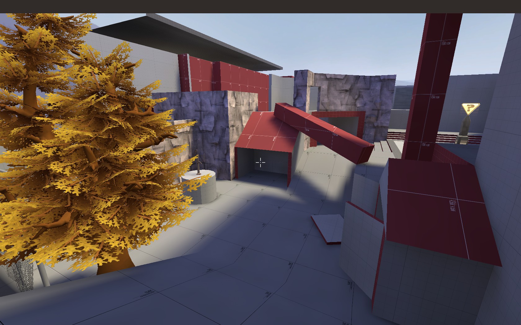
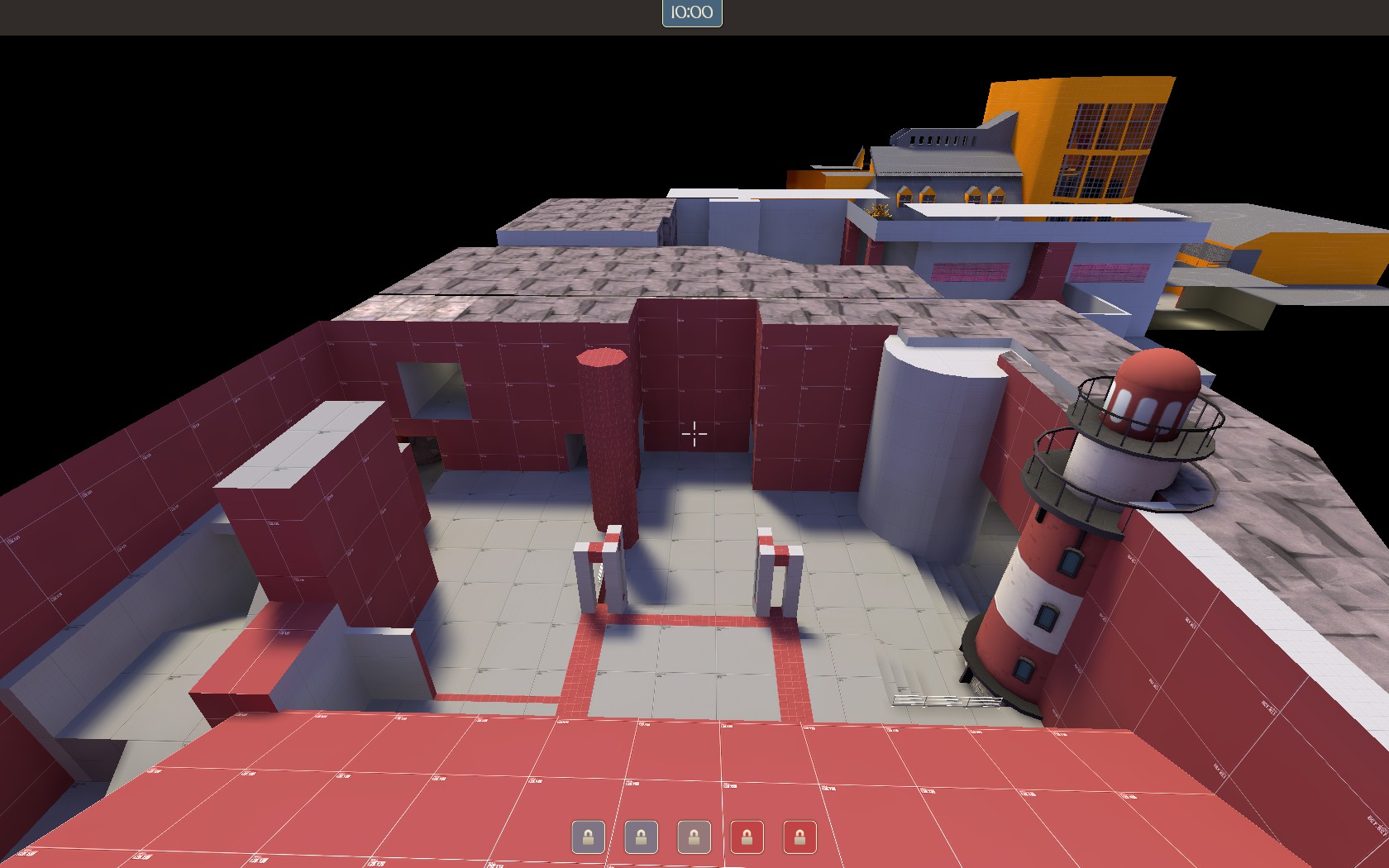
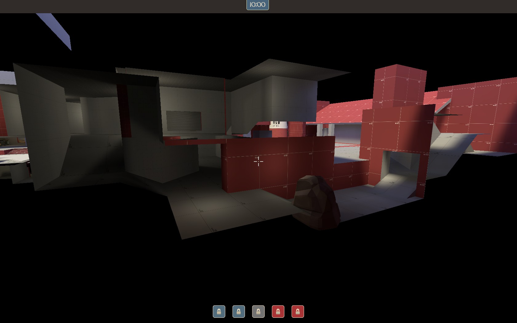
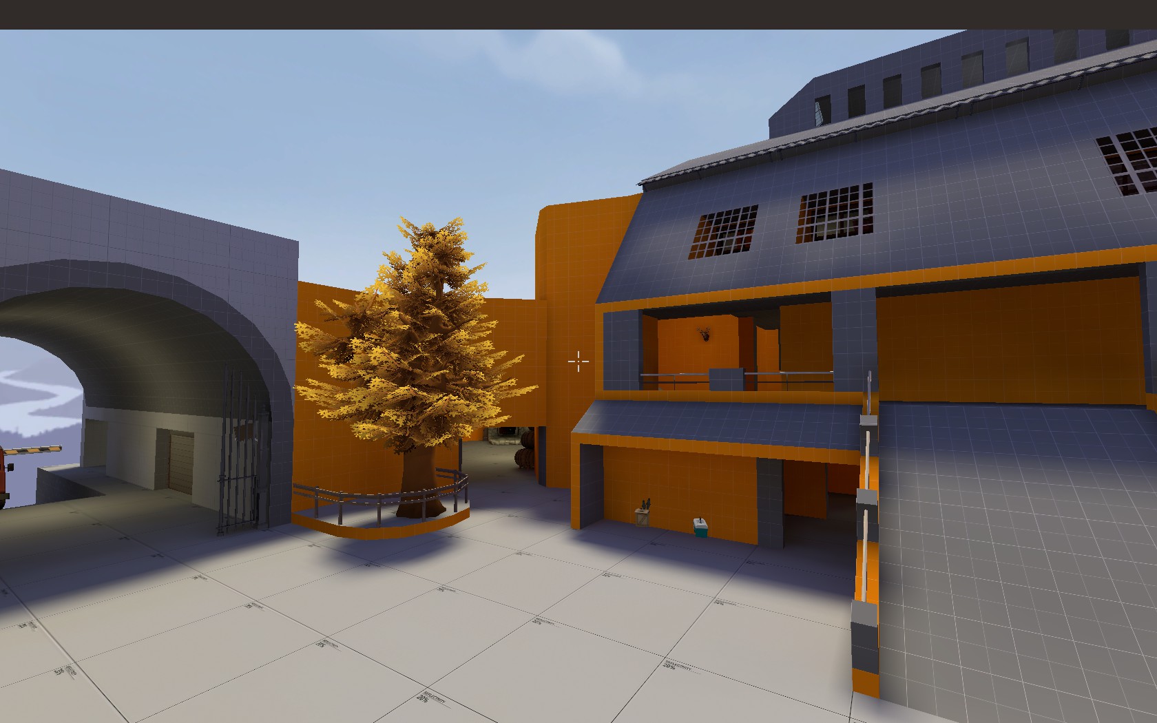
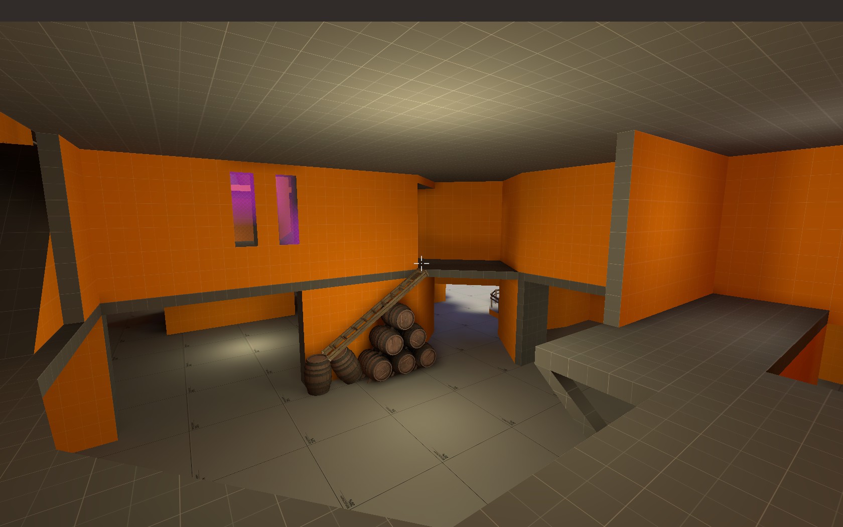
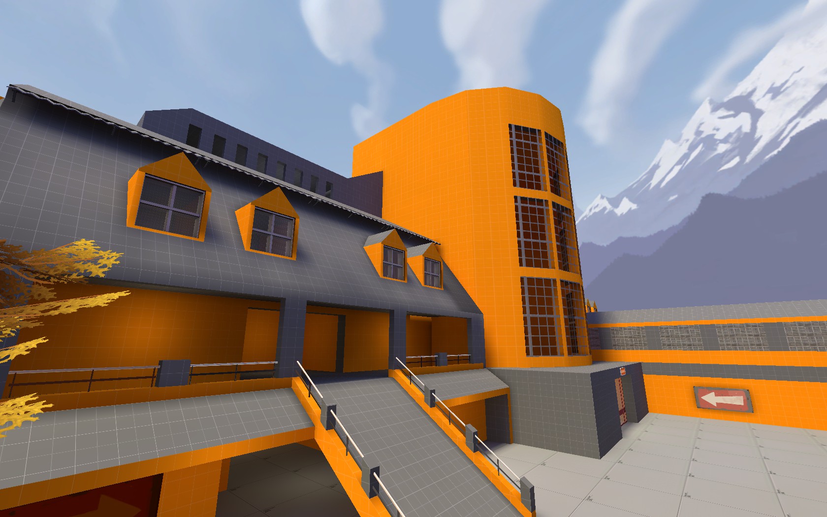
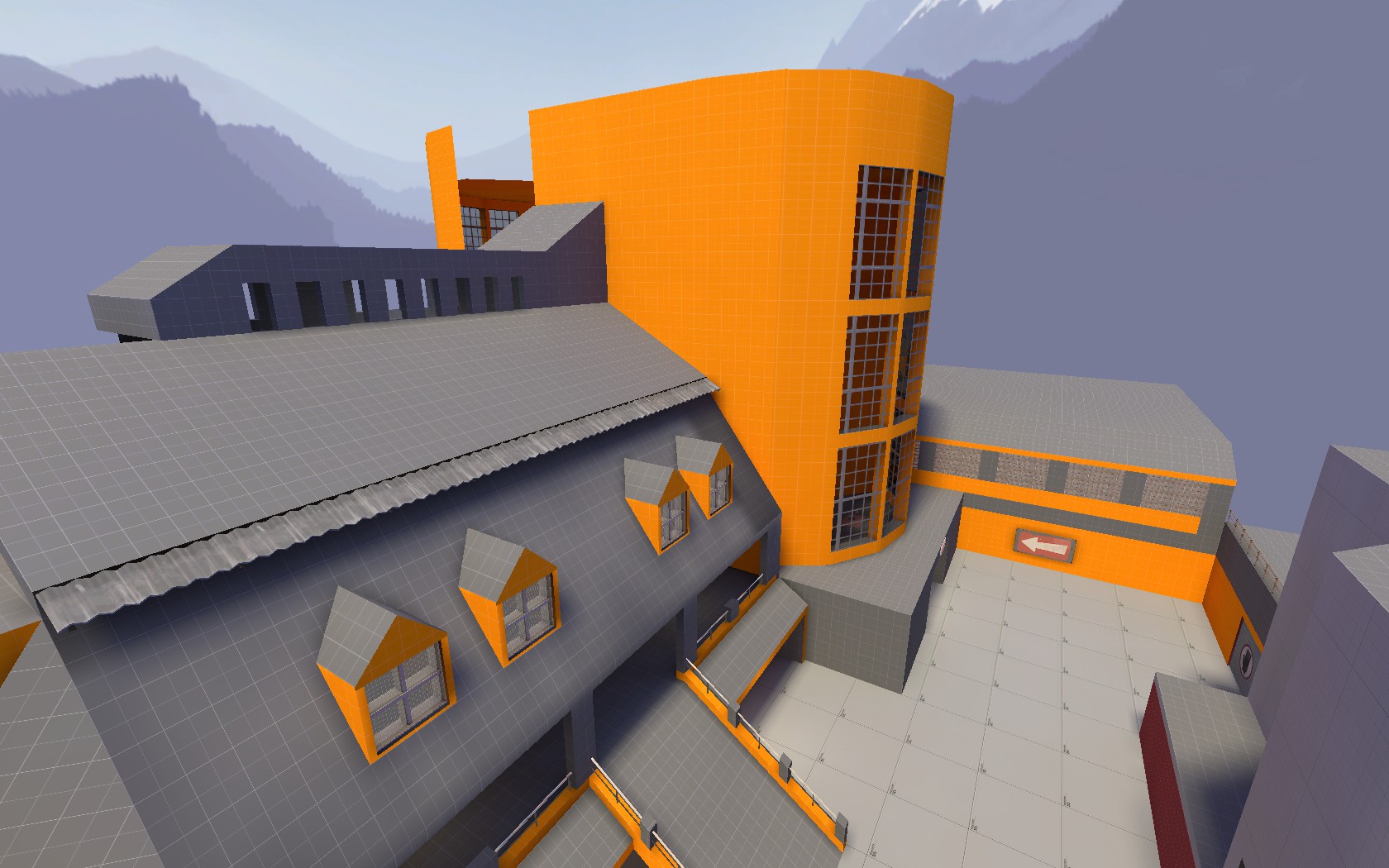
You can find a few more pics here:
http://forums.tf2maps.net/downloads.php?do=file&id=6441


Note: The first Countdown doesn't get announced and I haven't found a solution for this yet.
Only this. Also there are some pretty nasty texture-spots and some minor bugs.
 
Last edited:

JMaxchill

L5: Dapper Member
Jan 21, 2015
215
69
Ok, I downloaded this and had a run around.
* No spectator cams. Please. Use these
* This is floor-textured but clipped: http://imgur.com/klbRjiA
* You can't change class here, even though it's in the spawnroom: http://imgur.com/sx4igC2
* This exit isn't exactly obvious from spawn: http://imgur.com/S76ogSD
* This is clipped, so why do you need a space here? Your map doesn't have to be a cube with bits in - the best ones very definitely aren't: http://imgur.com/RVH9jvW
* Steep ramp. Generally, try to use 2:3 ratios for stairs (which is what I assume this will become) http://imgur.com/90zWWCc. Also, here: http://imgur.com/vy22O0w (that one could be 2:3, in which case try 1:2)
* Unused corner. Maybe put a small health and some ammo here? http://imgur.com/Els3HdJ
* This corridor is boring - there's nothing in it and no indication of where it leads. Even just a sign at the end would help: http://imgur.com/d63Ul7S
* What's the point of this bus? All it does is get in the way of players: http://imgur.com/Z3IYL25
* Liven this up! It's a space; either use it or get rid of it: http://imgur.com/iGJMhlV
* There's very little to indicate this is any more than a gimmick, when in fact it's a whole other route: http://imgur.com/IgCfKmC
* Cubemaps. Use these if you've got windows (google is your friend): http://imgur.com/MIRzPzU
* Narrow stairs, without clipping. I would suggest making them twice as wide, at least: http://imgur.com/6XcyH2k
* Nothing to indicate where this leads to. Again, signs: http://imgur.com/n7EWW0B
* You can stand right on the edge here, whereas you slide off the rest of the roof: http://imgur.com/xJKGhlj
* Floating chandelier: http://imgur.com/oOQCr98
* Maybe a small health or something here to make being there more worthwhile? http://imgur.com/BkTEOxp

Bear in mind that by reaching a1 you've already beaten me, so take this all with a very large pinch of salt, but I think this definitely has potential. Looking forward to playing this :D
 

Bud Calypso

L1: Registered
Jul 28, 2015
39
25
@ Captain_Clam / JMaxchill
Thx for taking the time having a look on it, but please also have one on my intro lines again.
I know about what I want to do with every spot on the map.
You have to see that most objects are just placeholders.
The layout itself in terms of gameplay is important before I will move on and shape it.
It doesn't really matter to me if the trees are floating, the bus seems to have no purpose or if the corridor looks boring.
There will be trees indicating playerclip, there will be some sort of cover in front of the spawnroom to avoid a spawncamping
sniper-sightline and i want a second path to the point where now a corridor is. I thought that's how an a1 works..
But believe me, if I could I would have started with all the spytech I got in mind. :)

I will adjust the signs, this might be helpful. Though I wouldn't have expected confusion with only two main routes to the point.
But maybe I got a bit blind for that. Spec-Cams I just forgot - will add!

I wonder why the cubemaps don't work. Mudpie and TurboLover volunteered to check if anything is broken before I submitted the file. Cubemaps worked for them too. But now actually not for me either anymore. I'll try it again and update the successor.
But it has to be tomorrow.. *sleepy*

Nice to see the first reactions looking forward playing this too - I haven't even with bots.

Cya there.
 
Last edited:

SnickerPuffs

(*single chuckle*)
aa
Apr 10, 2014
1,325
1,866
You should submit this to a gameday if you haven't already. I can't wait to test it out.
 

Bud Calypso

L1: Registered
Jul 28, 2015
39
25
You should submit this to a gameday if you haven't already.

The first test showed that the map is too big for the gamemode, too confusing in terms of paths/signs and generally too wide.
Maybe I'll make it to be more playable before the deadline (is there one?), but otherwise it will just turn out the same, so I would not submit it this time. We'll see..
 

SnickerPuffs

(*single chuckle*)
aa
Apr 10, 2014
1,325
1,866
The first test showed that the map is too big for the gamemode, too confusing in terms of paths/signs and generally too wide.
Maybe I'll make it to be more playable before the deadline (is there one?), but otherwise it will just turn out the same, so I would not submit it this time. We'll see..

First of all, there is no deadline. You have all the time in the world to work on Jamrock. Secondly, if your map is too big for KOTH, try 3CP, like Powerhouse. Thirdly, all you need to do to improve the map is move some things around, and add a few arrows here or there.
 

Bud Calypso

L1: Registered
Jul 28, 2015
39
25
First of all, there is no deadline. You have all the time in the world to work on Jamrock. Secondly, if your map is too big for KOTH, try 3CP, like Powerhouse. Thirdly, all you need to do to improve the map is move some things around, and add a few arrows here or there.

Hey, thanks for the cheer up! Take this for good vibrations.
No worries though: After I got out of the fetal position I started working on it again.
It will take some time though. And for the deadline I meant today's gameday - don't think I will make it.
Because by moving things around, routes that did work for themselves won't work anymore imo.
So I have to put more thought in it. I consider now making it a cp map again. KotH was more like testing the middle
point by itself - would you say this is a process that can work out like I do, or does testing one point of a cp-map
by making this one koth make no sense?
 

Lain

lobotomy success story
aa
Jan 8, 2015
723
757
I think the major problem with this map is its complicated nature and its game mode switch.
There is a trend with new designers thinking maps are modular and you can just straight up switch modes out for other ones at the first sign of resistance. For instance, without significant changes Powerhouse would make a terrible koth or 5cp map, it's not designed for the mode. Same story with Viaduct, just slapping a point in the spawn courtyard would be absolutely terrible.

Even pretty good transitions like Badlands, Coldfront and Waste all have certain problems like flow, spawns, sight lines or choke points. To get it right you need to redesign the map from the ground up to work in the new mode. If Process where to become Koth, there would have to be significant changes to choke and sewer to make the flow better for koth.

On the point of complicated map design. Try to remember the wise words of the scholar UEAKCrash "players are dogs, and won't look up.". Design your levels with a certain perceived flow to them, where someone who just started playing will automatically take the path to middle / the battlefront. Giving players a million and one options will just annoy them and make the completely switch off their brains. I know it's happened to me a few times. For examples of good koth maps that flow I would check out koth_viaduct, koth_harvest and koth_overflow.

What I'm trying to say is, stick to one mode and try to keep it simple. You'll thank me later.
 

Bud Calypso

L1: Registered
Jul 28, 2015
39
25
I think the major problem with this map is its complicated nature and its game mode switch.
There is a trend with new designers thinking maps are modular and you can just straight up switch modes out for other ones at the first sign of resistance.

On the point of complicated map design. Try to remember the wise words of the scholar UEAKCrash "players are dogs, and won't look up.". Design your levels with a certain perceived flow to them, where someone who just started playing will automatically take the path to middle / the battlefront. Giving players a million and one options will just annoy them and make the completely switch off their brains. I know it's happened to me a few times. For examples of good koth maps that flow I would check out koth_viaduct, koth_harvest and koth_overflow.

What I'm trying to say is, stick to one mode and try to keep it simple. You'll thank me later.

You just denied yourself an instant thanks. ;)

Well to the gamemode-switch:

In defense of new mappers, as I am, some may start with an design idea and then choose the gamemode that could fit.
There are plenty and add the custom ones to it, one can get confused by the multiple options and feel like in front of a bargain box.

This actually isn't the case here. My favourite game-mode always was cp. Imo it offers the best chances of a dramaturgy.
It can possibly go on forever. This mustn't be a good thing, sure. An everlasting stalemate is the worst case scenario.
But otherwise you can enjoy your chosen map with a back and forth for a longer time than some other gamemodes offer.

Like I said before, I'm not quiet sure if my strategy of using KotH to test one control point by itself works out.
But this is my idea here. Not switching it over and over. Just moving things around a bit can't work either.
The principle I'm pretty confident to follow is that alternate paths which lead to a better tactical position (high ground f.e.)
have to be a bit longer than the main path and visa-versa.
5Gorge's left path from cp2 to cp3 is the main example that comes to my mind.

That's why I actually kind of restarted the map after the first test. Quoting myself again:
The paths that worked before for themselves imo, won't work anymore after the required changes I have to make.

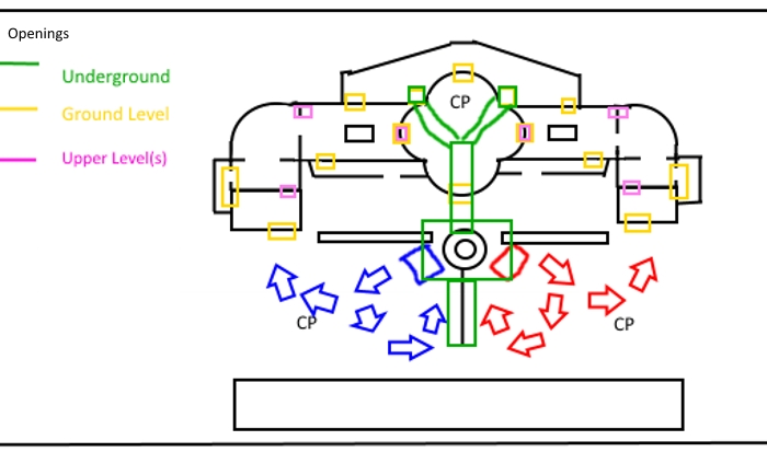
Let me show the progress the map has made since the inital idea.

Pre-Alpha, 3cp:
(I hope you have some love for ugly sketches and some pictures of the map in mind for imagination)

AW04QLl.jpg


The spawnrooms were underground. The well in the middle of the map would have been quiet big.
It would stick out on the ground level with a roof on top, as well as going two stages beneath it.
This height would form a big hall around it in the mid-cp direction and lead behind it.
The walls of the well were made of glass so you could see players swimming up and downwards by the hall
as well as by the spawnrooms. This was before I knew that it isn't possible to connect
two surfaces of water..

The next problem was the layout being asymmetric. Also teams would split up initially.
Gladly I never started this way and we should never talk about it again. :)


Post-A1

The main problem besides the signs and it being too complicated, was the wideness of the map.
The test made obvious that players are more likely to run around the point than towards it.

cglykJ0.jpg


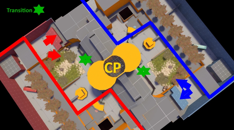
Cutting off this whole side in front of the building is mandatory. No underground anymore.
Also I work on a transition between the inner and outer routes on ground and upper ground level.
Still: This is the KotH test version for the mid-cp.

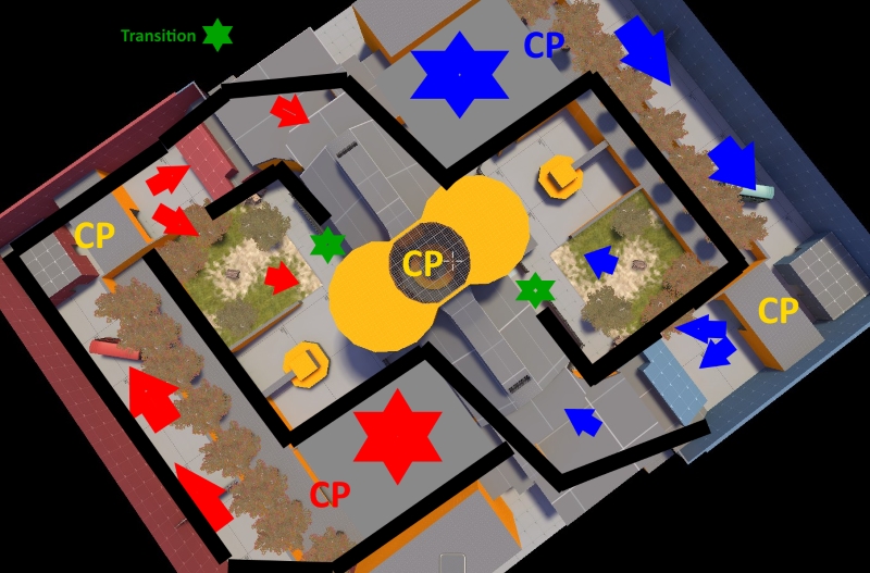
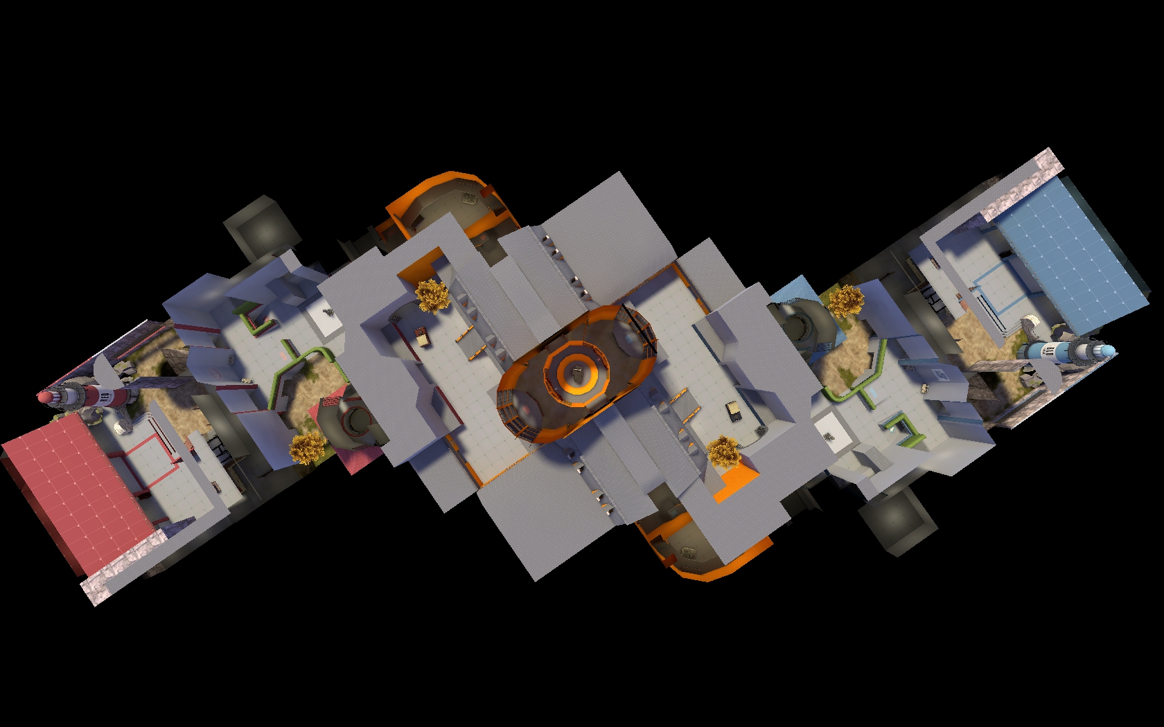
I'm a bit afraid of 3cp maps and still want it to be a 5cp in the end, kinda like this:

2PId8g2.jpg


Don't take the outer borders too seriously on this pic.
Of course the initial routes would need to be wider and more interesting in the end.
But by this layout I could use the space more effectively and still maintain the parts
that I like about the map. This is roughly how it shall end up.


What I didn't change is the main building and its hall.
The first feedback included the point itself being too small and a bit too high.
Also it was stated that you will get spammed from above.
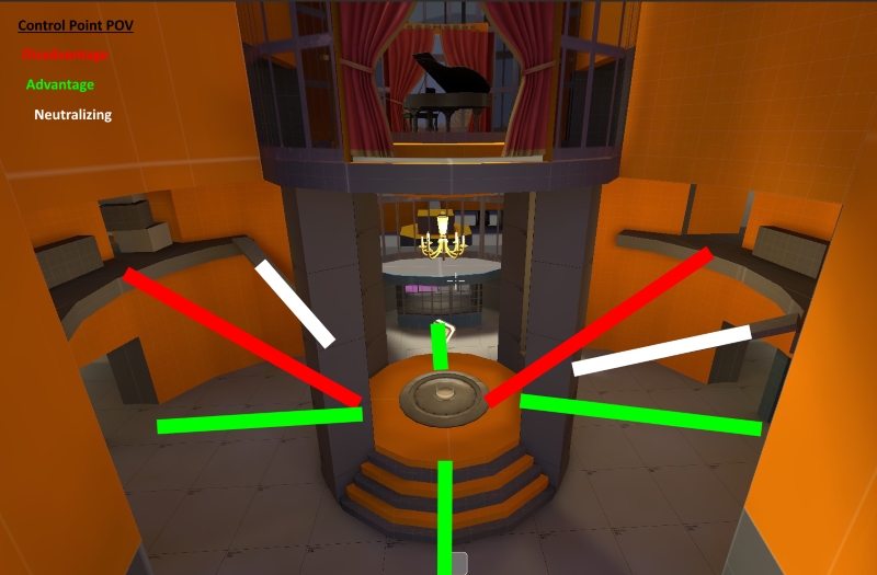
But there actually went some thought into it:

7s0FueD.jpg


I want it to be a bit small, so that players only go there for capping.
The hall itself is big enough to fight around it. The height contains advantages
towards two of three main-paths to enemy's direction.
And going with what I said before: If the enemy turns up upwards, he took a longer
way to get there and deserves an advantage for it..


This is what I go by for now. Let me know what you think.

Cheers.
 

Bud Calypso

L1: Registered
Jul 28, 2015
39
25
After more than one year on/off working on this, this is the first version I consider to be probably playable.

Here is a very long sort of dev-blog that illustrates the troubles I went into and the solutions I found so far:


I started with the layout I planned to do in my last post:

nOazqcX.jpg

UPKUYHS.jpg


You would start on the right of this pic at the big circle, move slightly upwards to the second cp on the left,make a 180° turn full upwards and find the mid point in the center of the big building.

As this is no payload, the 180° upwards turn was too hard to balance for me or just objectively wrong. While starting to realize this, it were the too long walking distances that made me ultimately scrap this layout all together.


In the next version the angle from second cp was close enough to mid to fit the common walking distances, the angle towards mid was reduced to ~90° and the height variation there by ~50%:

e93bkBW.jpg

(blocking out)

4wJXRkp.jpg

(less blocked)

The major flaw of this one was the right flank pushing to mid.

Tn6BzkZ.jpg


- as part of the water had to be playble space, it increased the possible positions players could be.

- the flank ended up completely seperated from the other routes at mid..:

PtS8z0W.jpg


.. and was even by shorten it and removing the water generally one route too much:

onlijuk.jpg


The next version made it to a complete compile but got scrapped for various minor and major flaws:

R0INJLw.jpg


While the right flank was now significantly shorter...

Utwbbnm.jpg


..and only a part of the route through the garage instead of adding one by itself..

4wSsqWC.jpg

QmjS0cr.jpg

k5AXMut.jpg


..I didn't like that the access from the second point to these routes were split by 90°,
instead of offering one that's 90° wide.

There also wanted to be a lobby in front of the last cp..

J3nl5gg.jpg

j4W5nYq.jpg


..that made this second cp feel very cramped, but ended up okayish at last:

vvZNJRq.jpg

Vw3sbKa.jpg


In the next full compile, the garage offered another access at the point, to spread as a 90° angle
and was generally redone - again:

xKjionB.jpg

TvrrQOX.jpg

1HwvTvl.jpg


With the underground part being as small as possible and a completely optional jump route:

9zwvub7.jpg


What bothered me the most were the routes leading to steady aligned sightlines players would encounter:

6HEU8yh.jpg


And though I liked the design of the building in general, the windows gave me huge troubles for optimization.


I did like some elements of each version. Some made it into future and even the latest version in different shapes.
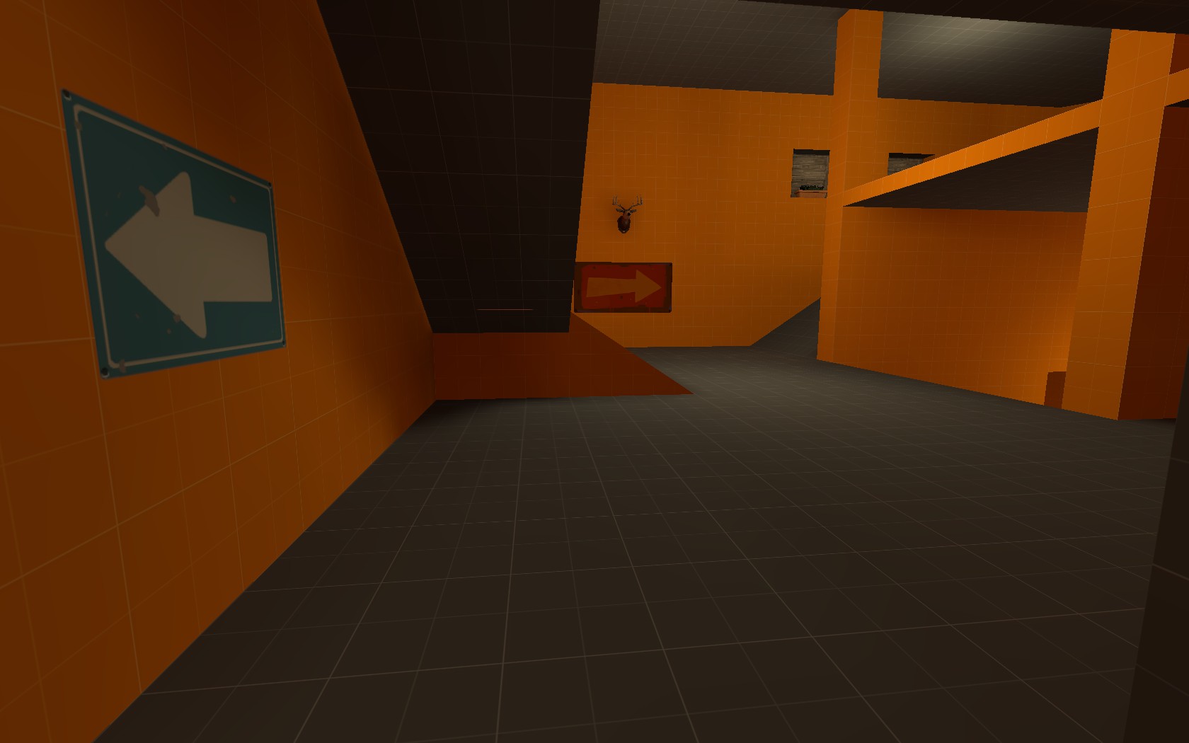
The main building kept it general shape, but was redone completely at start to fit the common hammer units. Here it was more of a concern of where to access the building to find a balance between confusing with too many entries/exits and too many walls splitting up teams by blocked visibility.
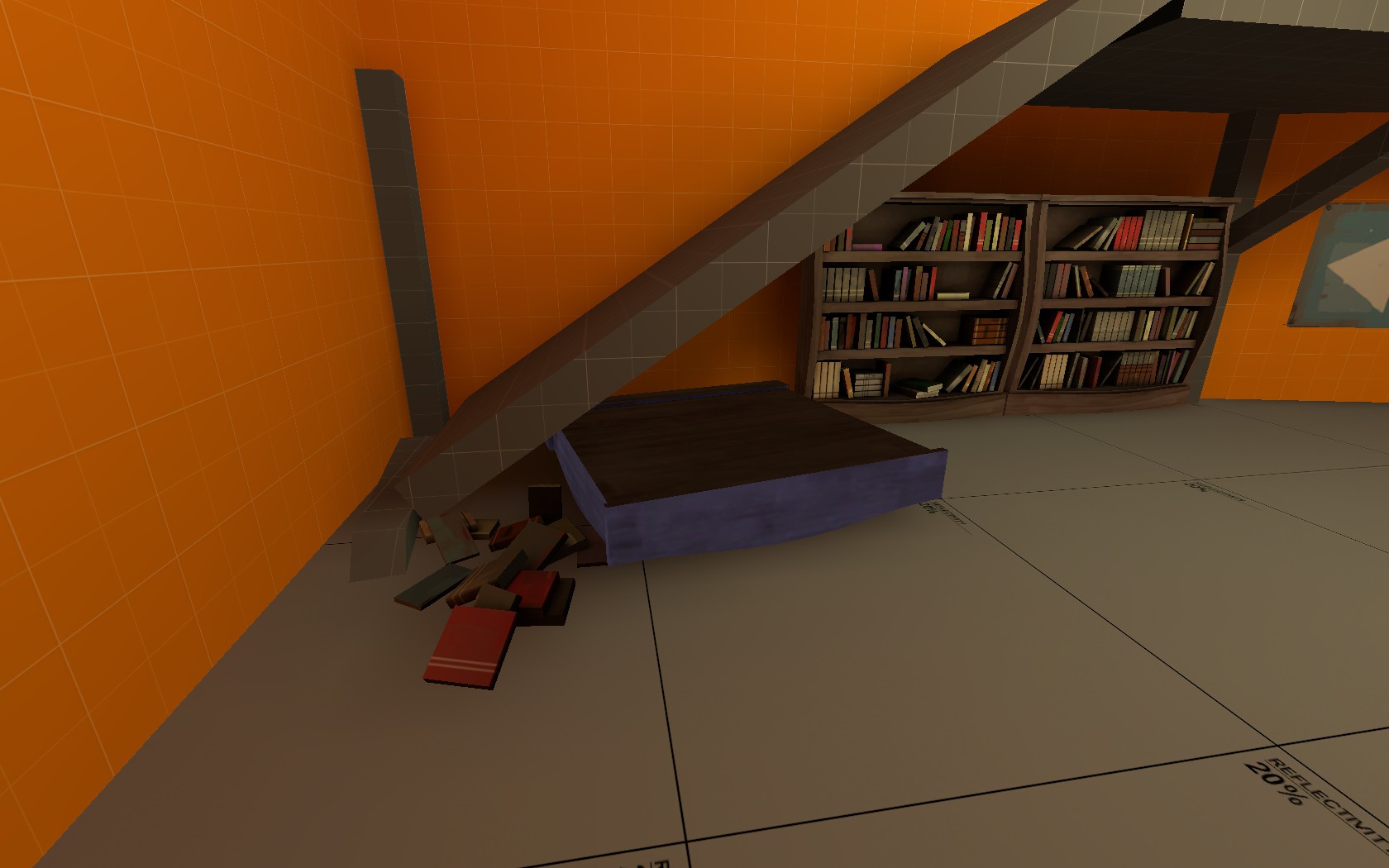
A closed front with a window for visibility:
YHr9ZT4.jpg


An additional exit in the middle of all 2+1/2 routes with a small backtracking
gQdbhFW.jpg

DpmYp0e.jpg


This exit to the balcony does connect the routes more openly but was visually confusing and bad for optimization:

v7HVrJA.jpg


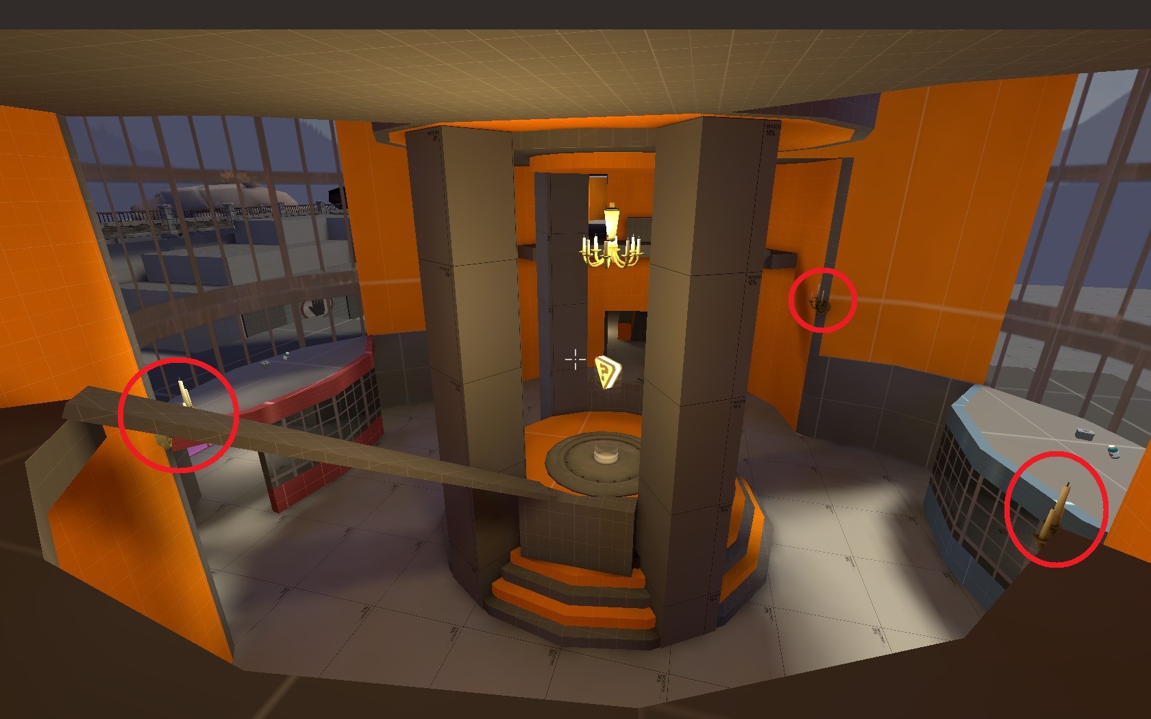
My favourite addition to the main building is pretty small with a big effect, which concluded out of the only test which the Koth-Version had as people tried to jump to the entrance roofs...

LU302Om.jpg

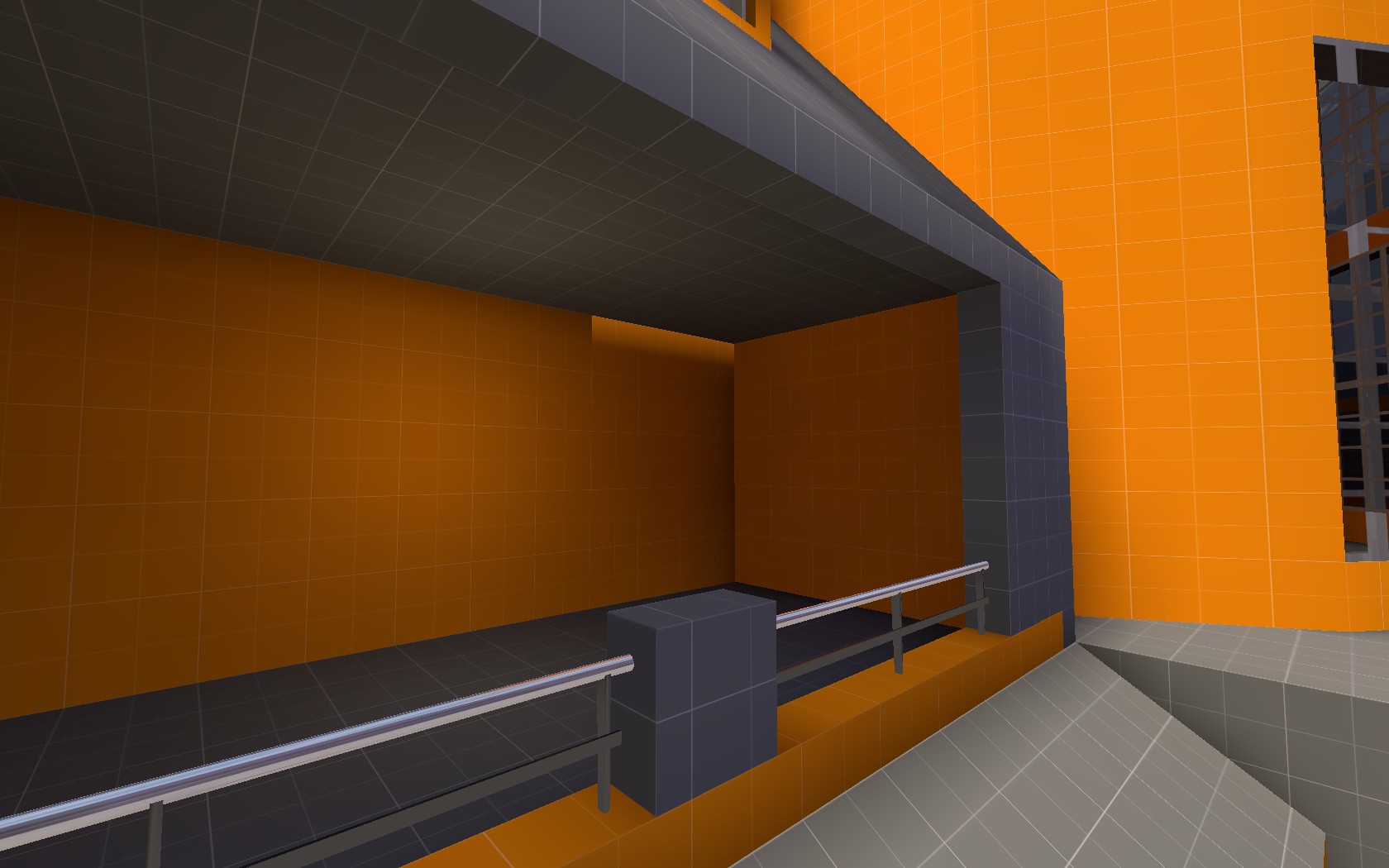
These small candleholders provide access to them from the ledge as well as to the pickups placed there which also neutralize the fall damage from the piano platform.


In general it often was a quiet sobering experience, given all the restrictions that the engine
and of course gameplay provides. I often felt like I had to make too many compromises to the things I had in mind.

I hope this map will be mediocre enough to be decently playble at some point.
As my solutions created a map that even if the general layout might work, would still have doubtalbe areas to call fun.

Here is what I'm still worried about:
- all the walls and stages could still easily be confusing and split up teams
- the "open" areas being too small - leading to fights from exit to exit for cover
- optimization: i spent quiet some time optimizing it already. but it could already be too detailed
especially mid point with the huge glass front


There are also a few unpleasant minor bugs still present:

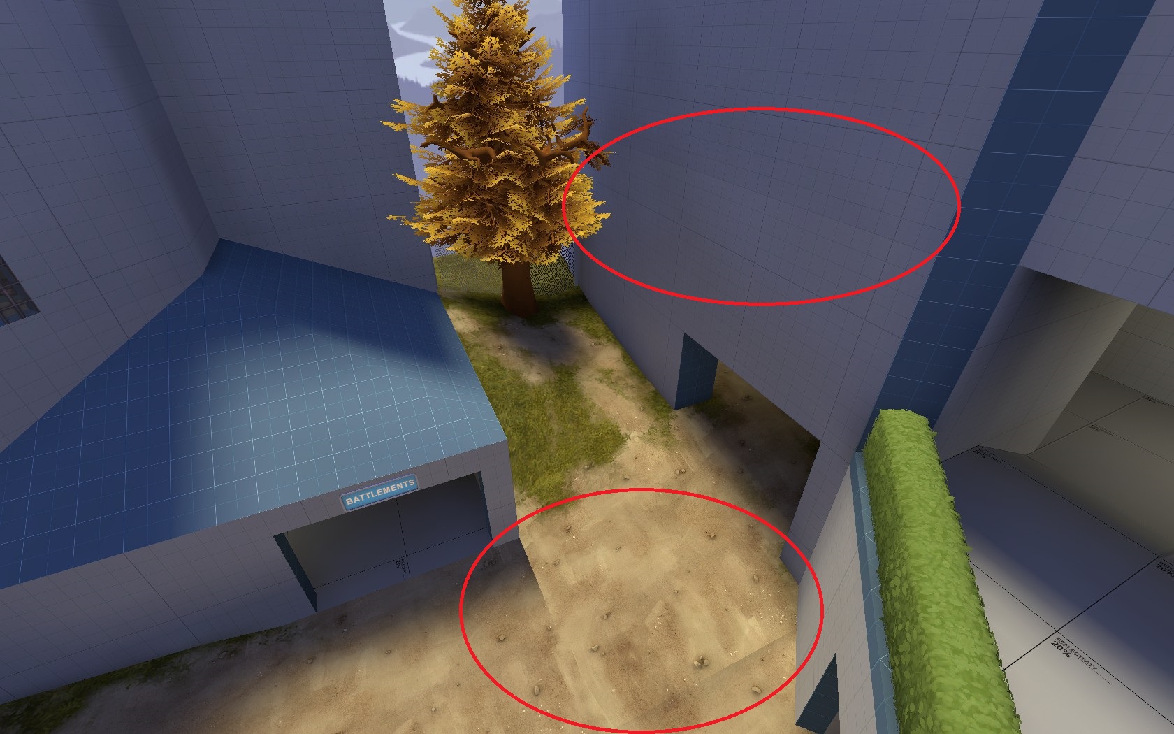
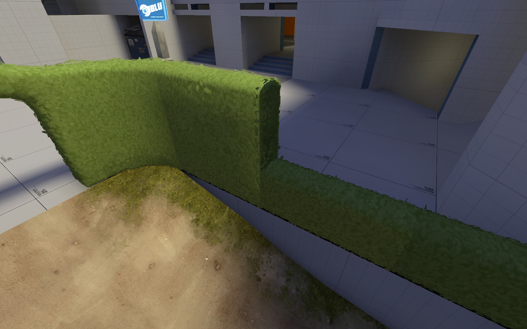
Though there is a big func_detail covering both sides of the tower, the opposite side pops in & out on different positions:

aKBldYC.jpg

A1u0VLh.jpg

PKhR4vD.jpg


This patch is a microseamer, no matter how far away its edge moves away from the brush:
8Dpuk2A.jpg


Strange lighting on props / walls / displacements:

5Fp1hEh.jpg

qE2gVJu.jpg

eLsXQ54.jpg

g7vl9xl.jpg

TYiA5vM.jpg


The lighting just achieves not being too dark anywhere but is apart from that pretty awful.
But this is a very first alpha, so lets call these failures easter eggs. Mainly because I need a break from hammer.

I know I shouldn't have detailed this much already, I should have tested earlier versions.
And this may all be right. But it's too late, so here we go.

HbfXSIj.jpg


Hope you enjoy.

You can find more recent screenshots in the overview tab.
 
Last edited:

Bud Calypso

L1: Registered
Jul 28, 2015
39
25
Ah. I remember downloading this map since you first joined. Hope you can release A2 soon.

Oh, I guess you just joined later than me then.
Well I just finished this first Alpha after a lot of work within the last year. So an A2 will take some time again.

It had its first test yesterday which revealed some general layout issues.
But it was very nice to see the map finally filled with life.. and deaths after all this time of theory.
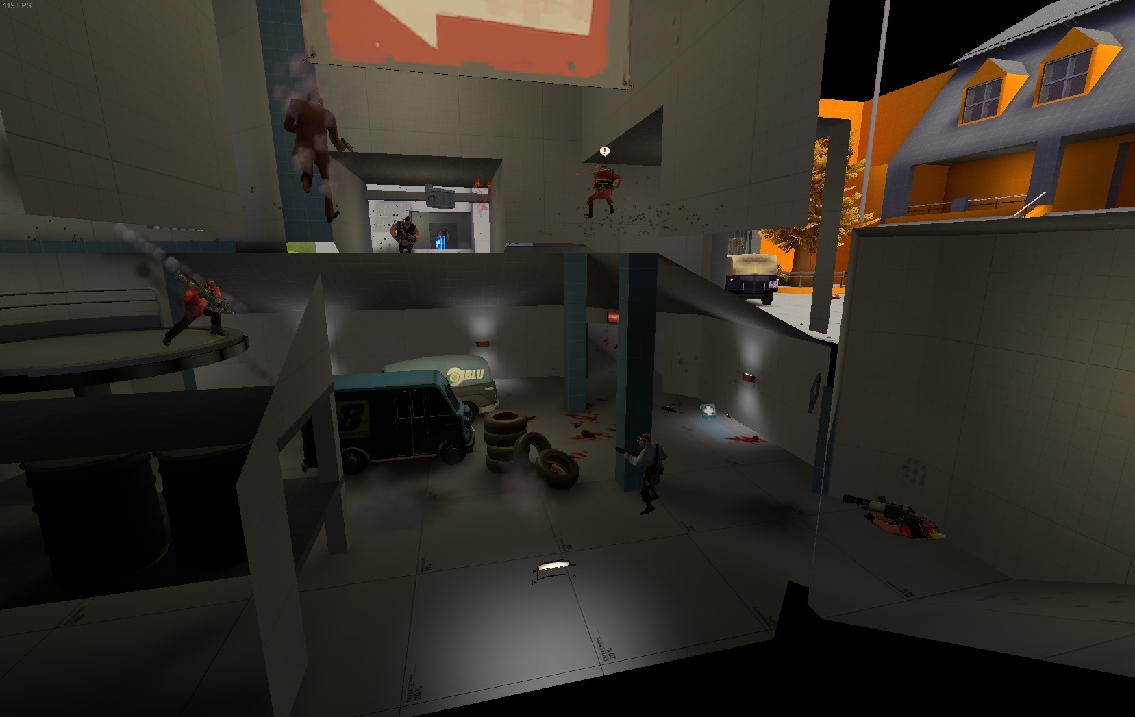
Here are a few impressions:
PmPxpyC.jpg

oWe7jyL.jpg

ntxhnVy.jpg


Thanks to everyone who participated, gave feedback and their patience !

I was glad to have a full server with more or less balanced teams.

Here is what didn't work:
  • one of my worries became true, that being that it's still too confusing and big, mainly between second and mid.
  • the left flank was barely used, so this one may get cut out or redesigned.
  • the mid point actually is hard to orientate so I will see if that can be solved by design or if it has to be by layout.
  • it became stalematey between second and last
  • most jumping parts weren't used, so their effect to gameplay vanished
  • though this wasn't mentioned I felt the pickups weren't placed optimal

But besides these admittedly partly major issues, the map stood its ground on a lot of aspects:
  • both teams were completely class-balanced over the whole time - indicating that every class has its place on the map
  • most of the areas played out as I intended them to and it didn't become a fight from exit to exit
  • the hours of polishing were worth it as 99% of the feedback concerned the layout instead of being distracted by issues like
    • Optimization
    • Clipping
    • Logic
    • elements that don't make sense in theme/gameplay
    • etc.
  • most areas for themselves were fun to play and not just for me

There's nothing that can be quick-fixed at the moment. It will take time to redesign the layout.
So to have more data I will approach a second test and see how long it takes before it gets rtv'd.

See ya there,
Bud
 
Last edited: