You are using an out of date browser. It may not display this or other websites correctly.
You should upgrade or use an alternative browser.
You should upgrade or use an alternative browser.

- Aug 6, 2014
- 1,056
- 535
A few things:
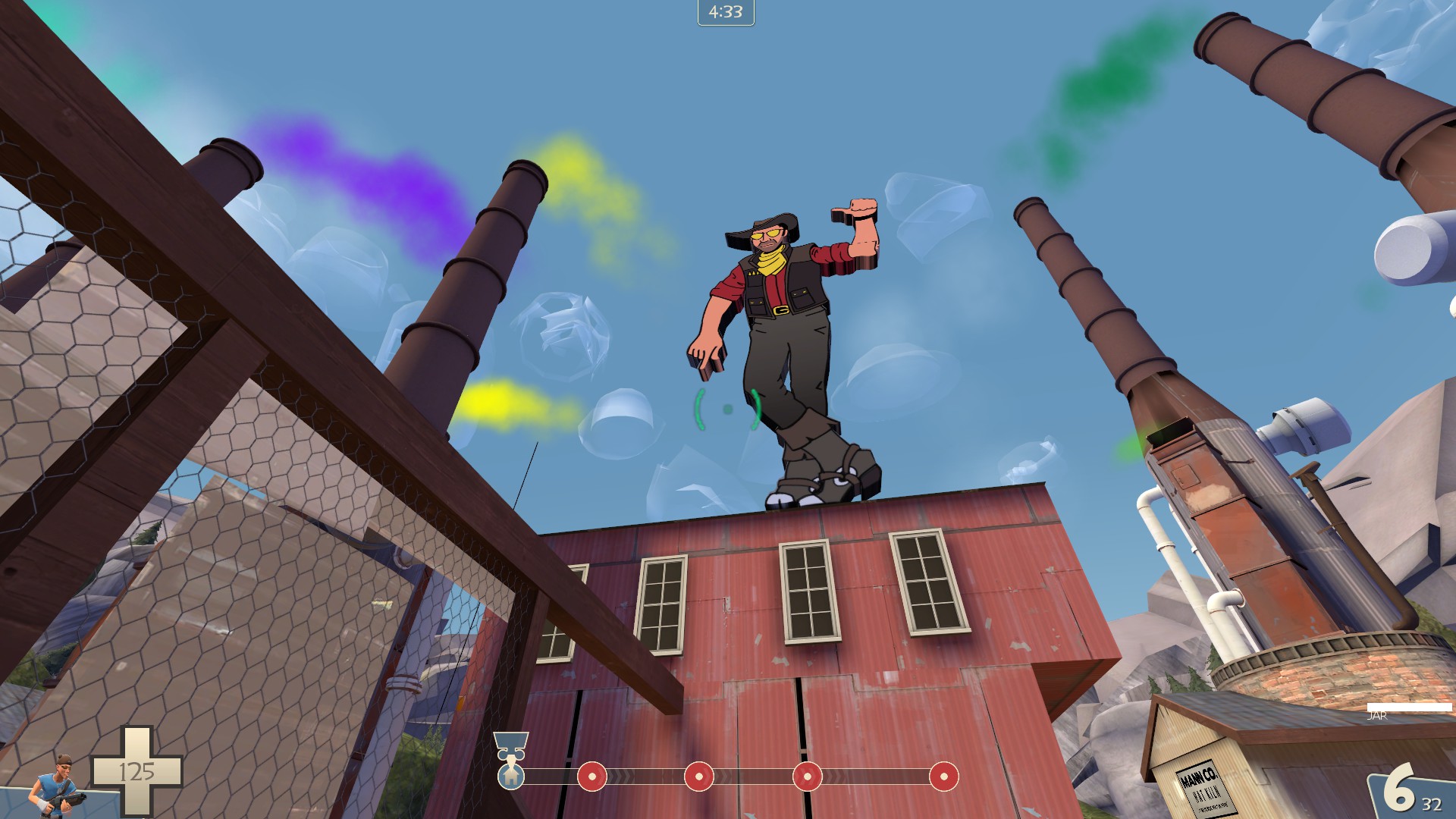
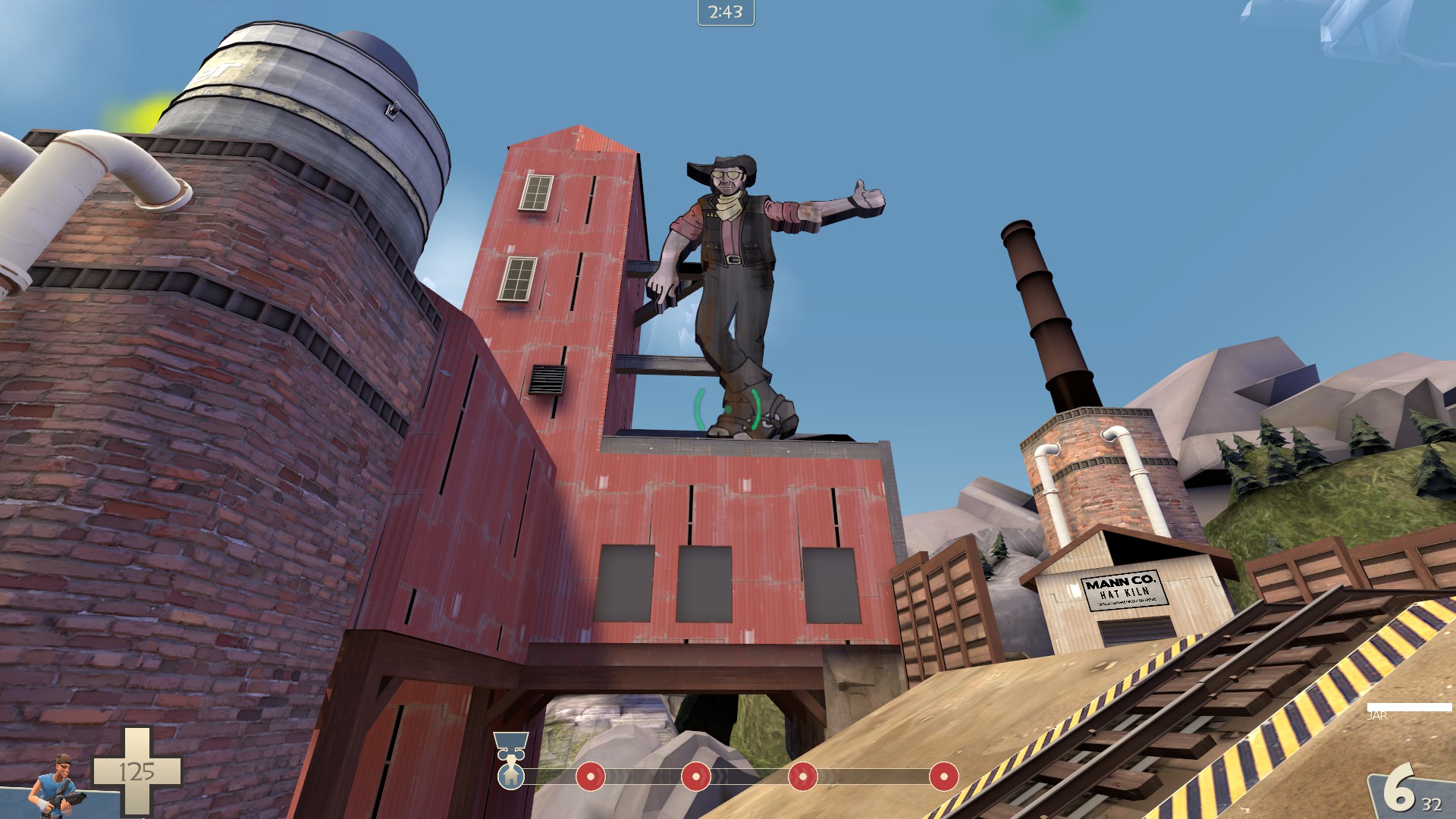
That is an ENORMOUS sign, that has absolutely nothing supporting it. Also, it stretches way back, so it doesn't even really feel like a sign, and the color clashes with the environment around it.
In other words, it sticks out like a sore thumb.


Throw some ware and tare on it, bit of supports and I think it's pretty creative. I will agree that it's a tad thick, I think, hard to really tell from that angle.

I think the sign is a good size, but it should be placed a little lower so it doesn't draw players' attention away from the battlefield so much. The angle also makes it difficult to see much of the detail you put into the upper half. As for the color, it fits perfectly into the visual style you have going, so I wouldn't change that; just add a bit of weathering like Fr0Z3n said and it'll look great. Also, I see no reason to change the thickness of the sign given that of the original Vegas Vic.
A few things:
That is an ENORMOUS sign, that has absolutely nothing supporting it. Also, it stretches way back, so it doesn't even really feel like a sign, and the color clashes with the environment around it.
In other words, it sticks out like a sore thumb.
Thanks for the comments, but it's not finished, its a work in progress. I didn't think I needed to tell you guys this as it's a workshop thread, but regardless I am now.
I think the sign is a good size, but it should be placed a little lower so it doesn't draw players' attention away from the battlefield so much. The angle also makes it difficult to see much of the detail you put into the upper half. As for the color, it fits perfectly into the visual style you have going, so I wouldn't change that; just add a bit of weathering like Fr0Z3n said and it'll look great. Also, I see no reason to change the thickness of the sign given that of the original Vegas Vic.
I got the arm waving already as well. I got the texture all worked over as well. It was the next thing i did after posting these.
I'm re-orging the last point as well, so the final placement of the sign isnt even built yet. Supports and all.
And thank god someone knows what the real Vic Sign is
")
Kill_the_Bug
aa
- Oct 6, 2008
- 1,952
- 446
put a cigarette in his lower hand and you've made that old sign from Las Vegas in the 1960's
Right sign, but he never had a cig. The hand was originally pointing down to the casino it was an sign for. It's a gift shop sign now in Vegas.Kill_the_Bug
aa
- Oct 6, 2008
- 1,952
- 446
- Aug 6, 2014
- 1,056
- 535
That's a little too grungy and wooden. I think you can turn it back a bit to make it more ecstatic. But other than that, love it!
- Mar 6, 2013
- 1,045
- 625
That's a little too grungy and wooden. I think you can turn it back a bit to make it more ecstatic. But other than that, love it!
What it really needs is a edge or border of some sort.
- Mar 6, 2013
- 1,045
- 625
Wrapped up a first pass on a new wall texture/sign this evening. The alpha needs love, but good enough for now.
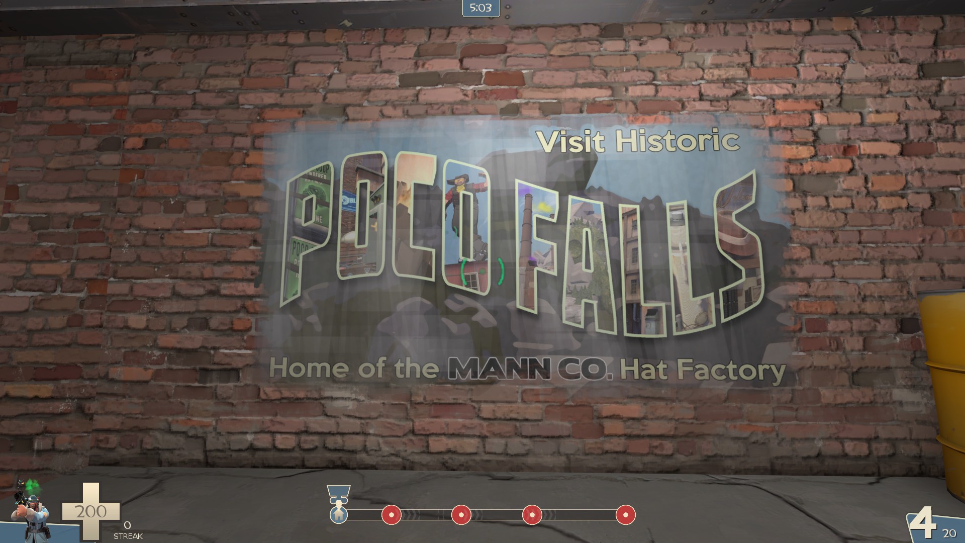
That's a really pretty overlay! One thing on terms of realism, however. That fading border just doesn't look right if it was painted. I'd go with a worn solid border instead. Look at an existing in-game painted sign, like Cracky Pop or something similar.
- Aug 6, 2014
- 1,056
- 535
The new version is available. Hit the OP for the links. It's version 34 and i've given the normal bsp in a zip file; one as well as a bz2-ed one for those that could use it.
I have a server with it running as well: 104.236.159.190
It's still there but i returned the server back to normal map cycles.
I have a server with it running as well: 104.236.159.190
It's still there but i returned the server back to normal map cycles.
Last edited:
Hey we playtested pl_hat_factory_35 yesterday, here is the feedback from the test which has a link to the recorded STV demo if you want to rewatch it:http://feedback.tf2maps.net/map/pl_hat_factory_35/
It seemed generally people felt like there were a lot of colorful details that took our focus instead of the main areas like capture points and entrance doors into areas. There were also some gnarly sniper sightlines like the one at first where someone can camp blue's fastest spawn exit by standing back behind the first point through the gate door - by some of the last rounds we played there were 4 snipers on each team staring at each other through the gate door.
Edit: Just a tip in case this is the first time you're going through a lot of map feedback (you seem like an art guy): generally you should maintain a professional opinion about where your map should be going, and there will be a lot of differing views in the map feedback. You shouldn't weigh all feedback the same since some of it will be coming from a perspective that has a different end goal than your's, however you should consider it all (why, or why not). All of the feedback posters names and steam profiles are posted there also though, so if you want to discuss it further with the person you could try to. Also, watching the demo is good because it can give you specific contexts for people leaving the feedback.
Last edited: