Tired of stupid shadows?
EDIT: rewritten - http://www.nodraw.net/2010/12/lighting-compile-options/
Ever had a prop that gives you damn ugly shadows that just don't look right, sort of like this fence here:

First off I should probably explain what is going on here. RAD uses collision meshes of props to calculate lighting, for the vast majority of props this is absolutely fine since their collision mesh closely matches its shape. But for some their collision mesh doesn't represent the shape of the opaque part of the model so the transparent parts appear to be fully opaque based upon the shadow. Some models don't have collision meshes like the mine track models which means RAD doesn't really know what to cast the shadow around and forms a rubbish little bounding box type thing, the result is a horrible shadow.
There are a few commands we can give to VRAD that make it use the static prop's outline for shadows and another that gives alpha textures the right transparency as well. But they come at a cost so I recommend you imagine their effects for all but the final few compiles of your map.
You're going to need to know which props you want to cast proper shadows of, the path and all, then open up GCFscape and extract the lights.rad file from the team fortress content GCF and put it in your /tf/ folder and rename it whatever you like (I called mine lights_youme.rad, inventive aren't I?)
Next open the rad file in your text editor of choice and add some lines at the bottom (or at the top, doesn’t really matter where)
Those two lines make VRAD cast proper shadows based on the alpha channel of any texture on the two fence models. If you find another model casting bad shadows that has an alpha channel texture add it into there. (if you don't want a load of warnings appearing in the console delete everything that was inside the rad file before adding your new stuff in, the duplication isnt needed but doesn't cause problems if you leave them in)
Now in hammer load up your map and hit run and hit the expert button at the bottom

you'll see this:

make a new compile command thing in the left hand box and paste the following into the parameters bit on the right
-lights lights_youme.rad -both -staticproppolys -staticproplighting -textureshadows -final -game $gamedir $path\$file
Then add $light_exe to the command box just above it.
make sure you check it's box (and move it up to just underneath the other $lights_exe compile command group and uncheck the original one's box so it doesn't run.
Then run your map and wait (the compile will now take a phenomenal amount of time and at the end you will end up with this:

Although for that your lightmap scale has to be at 1 which as we all know is a bit OTT so leave it at 16 and it will look like the following, which compared with the original image is far more acceptable, don’t you think?

Further explaination of -staticproplighting:
OK, so I've mocked up a little scene that might happen in any TF2 map, I've used the corrugated metal sheets because they illustrate what -staticproplighting does well because they have a high poly desnsity for their size as well as the fact they are a common problem for lighting and something people often get wrong when finding a fix.
My scene looks like this:
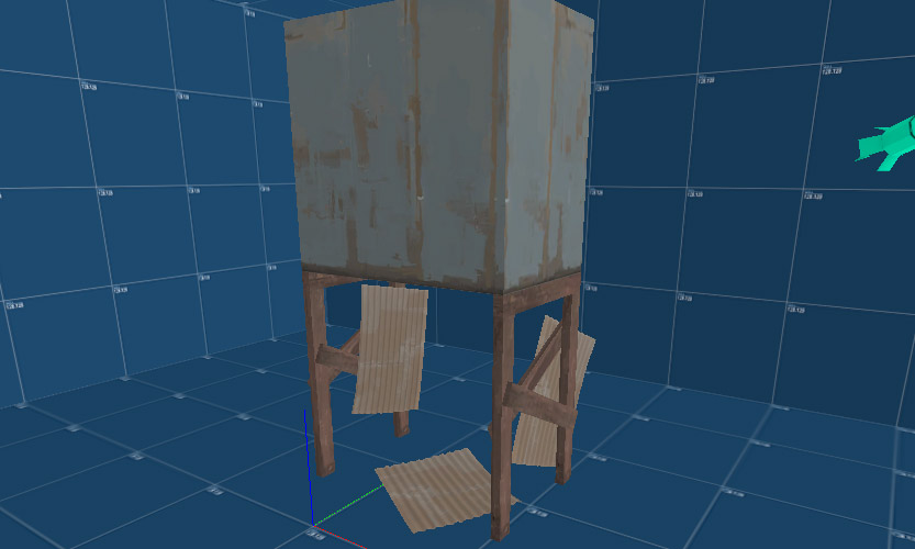
So here's what it looks like ingame, not very good is it?
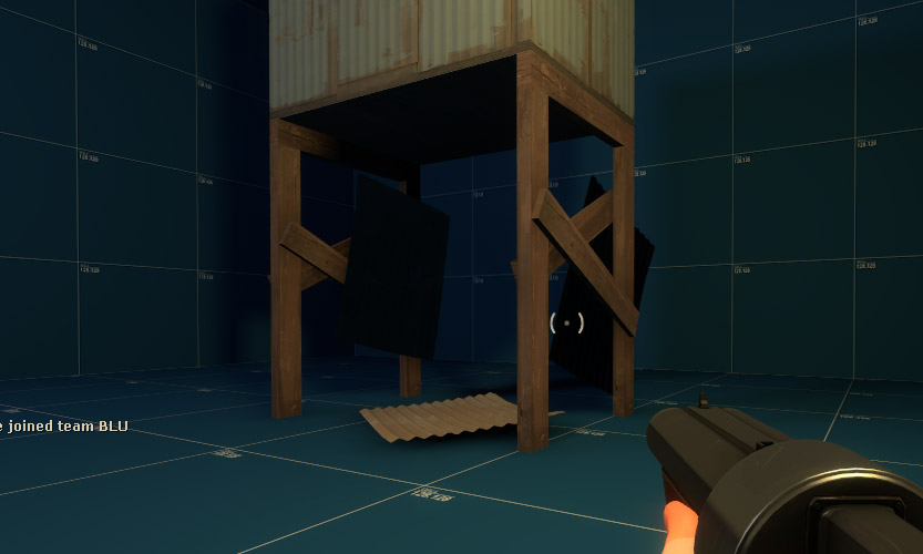
So why does it look so terrible?
well, The two metal sheets on the sides are both facing outwards and lighting is taken from their origin. These two things combined makes sure they're black in this instance. The front one's origin is right behind the wooden beam so the light is being blocked, making it dark. The back one's origin is facing away from the light source and since it's only a one sided prop it gets no light on it.
So what can we do about it?
Well the first thing to do is to make sure all the origins are facing the lightsource so that they get light falling on them. Here it is again with the far sheet rotated 180 so the origin is facing the other way (you can tell in hammer which way it's facing because there is a little yellow line once you select the prop, the direction of that line tells you which way it's facing)
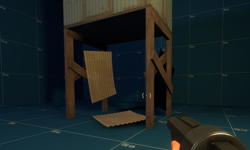
But you can see there that whilst we've fixed the back sheet the front sheet is still dark even though its origin is facing the light. We could use an info_lighting (info_target actually since info_lighting is broken) to 'move' it's origin so that it is in the light, but we can do one better than that.
In the first post there are three extra commands, -staticproppolys -staticproplighting and -textureshadows. The first and the last deal with taking shadows from the props exact outline rather than the collision mesh (great for props with no collision mesh like the payload tracks!) and taking shadows from props with alpha textures(great for chainlink fences). The middle one, -staticproplighting works out the lighting on props based on each vertex instead of the origin, so one side of a prop might be in light and lit nicely whilst the other side might have the light blocked to it so it will be dark.
Here is what it looks like with -staticproplighting on:
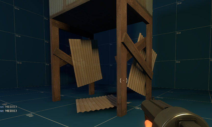
As you can see that looks much better because the metal sheets are now light where the light hits them and darker where the wood is blocking the light and casting shadows. Admittedly the resolution is a little low because the points at which lighting is done are fairly far apart and the dark patches are quite dark (that's because I don't have much ambient light in this scene) but I think you'll agree it looks much better than the first or second compile.
Here it is again showing the back of the front panel, it shows how the wood blocks the light from both sides of the sheet. and how the panel on the floor has a shadow across it in the same place the ground would if the metal sheet were not there.
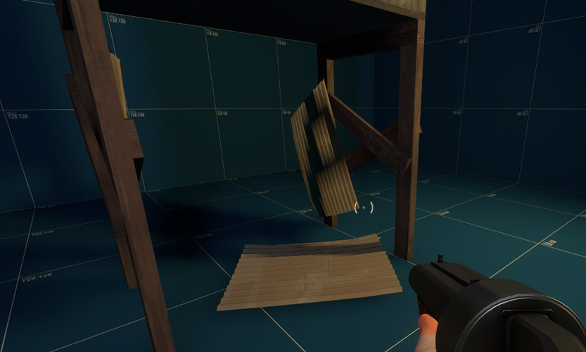
This method will also help any props that have their origin embedded in geometry, since all the prop that is outside of the geometry will be lit properly - great for those large rocks which usually have their origin below a displacement.
EDIT: rewritten - http://www.nodraw.net/2010/12/lighting-compile-options/
Ever had a prop that gives you damn ugly shadows that just don't look right, sort of like this fence here:

First off I should probably explain what is going on here. RAD uses collision meshes of props to calculate lighting, for the vast majority of props this is absolutely fine since their collision mesh closely matches its shape. But for some their collision mesh doesn't represent the shape of the opaque part of the model so the transparent parts appear to be fully opaque based upon the shadow. Some models don't have collision meshes like the mine track models which means RAD doesn't really know what to cast the shadow around and forms a rubbish little bounding box type thing, the result is a horrible shadow.
There are a few commands we can give to VRAD that make it use the static prop's outline for shadows and another that gives alpha textures the right transparency as well. But they come at a cost so I recommend you imagine their effects for all but the final few compiles of your map.
You're going to need to know which props you want to cast proper shadows of, the path and all, then open up GCFscape and extract the lights.rad file from the team fortress content GCF and put it in your /tf/ folder and rename it whatever you like (I called mine lights_youme.rad, inventive aren't I?)
Next open the rad file in your text editor of choice and add some lines at the bottom (or at the top, doesn’t really matter where)
Code:
forcetextureshadow models/props_gameplay/security_fence256.mdl
forcetextureshadow models/props_gameplay/security_fence128.mdlNow in hammer load up your map and hit run and hit the expert button at the bottom

you'll see this:

make a new compile command thing in the left hand box and paste the following into the parameters bit on the right
-lights lights_youme.rad -both -staticproppolys -staticproplighting -textureshadows -final -game $gamedir $path\$file
Then add $light_exe to the command box just above it.
make sure you check it's box (and move it up to just underneath the other $lights_exe compile command group and uncheck the original one's box so it doesn't run.
Then run your map and wait (the compile will now take a phenomenal amount of time and at the end you will end up with this:

Although for that your lightmap scale has to be at 1 which as we all know is a bit OTT so leave it at 16 and it will look like the following, which compared with the original image is far more acceptable, don’t you think?

Further explaination of -staticproplighting:
OK, so I've mocked up a little scene that might happen in any TF2 map, I've used the corrugated metal sheets because they illustrate what -staticproplighting does well because they have a high poly desnsity for their size as well as the fact they are a common problem for lighting and something people often get wrong when finding a fix.
My scene looks like this:

So here's what it looks like ingame, not very good is it?

So why does it look so terrible?
well, The two metal sheets on the sides are both facing outwards and lighting is taken from their origin. These two things combined makes sure they're black in this instance. The front one's origin is right behind the wooden beam so the light is being blocked, making it dark. The back one's origin is facing away from the light source and since it's only a one sided prop it gets no light on it.
So what can we do about it?
Well the first thing to do is to make sure all the origins are facing the lightsource so that they get light falling on them. Here it is again with the far sheet rotated 180 so the origin is facing the other way (you can tell in hammer which way it's facing because there is a little yellow line once you select the prop, the direction of that line tells you which way it's facing)

But you can see there that whilst we've fixed the back sheet the front sheet is still dark even though its origin is facing the light. We could use an info_lighting (info_target actually since info_lighting is broken) to 'move' it's origin so that it is in the light, but we can do one better than that.
In the first post there are three extra commands, -staticproppolys -staticproplighting and -textureshadows. The first and the last deal with taking shadows from the props exact outline rather than the collision mesh (great for props with no collision mesh like the payload tracks!) and taking shadows from props with alpha textures(great for chainlink fences). The middle one, -staticproplighting works out the lighting on props based on each vertex instead of the origin, so one side of a prop might be in light and lit nicely whilst the other side might have the light blocked to it so it will be dark.
Here is what it looks like with -staticproplighting on:

As you can see that looks much better because the metal sheets are now light where the light hits them and darker where the wood is blocking the light and casting shadows. Admittedly the resolution is a little low because the points at which lighting is done are fairly far apart and the dark patches are quite dark (that's because I don't have much ambient light in this scene) but I think you'll agree it looks much better than the first or second compile.
Here it is again showing the back of the front panel, it shows how the wood blocks the light from both sides of the sheet. and how the panel on the floor has a shadow across it in the same place the ground would if the metal sheet were not there.

This method will also help any props that have their origin embedded in geometry, since all the prop that is outside of the geometry will be lit properly - great for those large rocks which usually have their origin below a displacement.
Last edited:


