Persia

KotH Persia b4

  • This map is featured! Our best maps, all together in one place for your viewing pleasure.

Uriak

L8: Fancy Shmancy Member
Apr 27, 2008
543
70
Thank you :)

It has occured to me that persia_b4 doesn't feature the laser flash effect, most probably due to a packrating issue. I'll have to be more cautious with the next release.

I'll try to add some noisyness to the final release, by adding irregularity on some feature (mostly red side, of course).
There are some brushes overlapped by sand that get a rather blackish lightmap in result. I've tryed to reduce to a minimum the non lighted surface, but I consider turning them into func_brushes instead. Do you know if it has a significant overhead ?
 

entourage

L1: Registered
Aug 12, 2009
3
2
FWIW, I'm unable to download b4. I get an invalid file ID error. We've quite enjoyed the progression of this map and look forward to b4.

Might be the site, but just wanted to send you an FYI.

Great map so far!!!
 

Uriak

L8: Fancy Shmancy Member
Apr 27, 2008
543
70
My bad, I just tryed to take a shortcut when updating this link and messed up... and since I got no reaction on this thread when I released the B4... :blushing:
I've fixed this and you can get it normally.

As a real mapping news, after some exchange with people who did an "unofficial" prop hunt conversion of persia, I've agreed to make a proper ph_persia release sometimes in the future, with layout modified to benefit the gamemode.
 
Last edited:

Uriak

L8: Fancy Shmancy Member
Apr 27, 2008
543
70
I'm likely to release this prop hunt version by sunday. Some of the decorative areas will be opened (small garage, red battery test room, outskirts of control point...). I'd like to keep part of the logic involved with the winning conditions but I can't be sure of what happens in this game mode. If it doesn't work, the laser will simply fire at random intervals.

On the KOTH side, I'm still waiting for sensible feedback before working on the RC. In the meanwhile, only graphical glitches are being fixed.
 

Tapp

L10: Glamorous Member
Jan 26, 2009
776
216
This map is a testament to perfect use of custom content. With a few lighting, CC, textural and model changes you have flipped the theme of tf2 upside-down.
 

Hellfire

L9: Fashionable Member
Jul 9, 2008
601
142
overall i can say some pros and cons about the map
what i like:
-the point itself,its quite intresting to play around it
-visuals,no comments needed here
-whole central "main level" area
still,there are some things i dont actually like
-general design is square,rectangle,square,rectangle
-a rly dont like the "upper level" with its long long balconies (imo it need either some break or just more visual distraction
-for some reason i dont like custom windows (for example)

well..i think this map is ready for RC, still i recomend to break this rectangle design, by modifying balcony area for example
 

Uriak

L8: Fancy Shmancy Member
Apr 27, 2008
543
70
I'll see if I can add some variation with the balconies, in one way or another, to make them less monotonous.

The windows, due to understandable technical reasons, are not likely to change, though.
 

Uriak

L8: Fancy Shmancy Member
Apr 27, 2008
543
70
Even if I'm currently busy with my new CP map, I'm still following various community's reactions to this one.

After a while, it may seems a weaker team is getting really a hard time on the current setup, and I'm wondering whether I should tweak things a bit to avoid utter rape (not funny for at least half the players)

So, I'll reconsider some health pack placing, and mostly reduce further the respawn wave time of the team behind the other. And perhaps also reduce the capture time.
 
Last edited:

AlexanderSig

L1: Registered
Jul 6, 2010
5
1
Hey there, although I've tried loads of custom maps I created my account just for this stunningly gorgeous map.

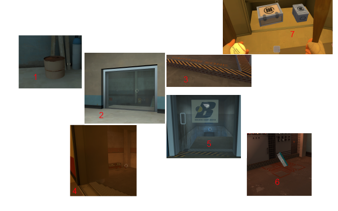
I spent about an hour looking in every nook and cranny and also playing some 12v12 with bots, here's my list of bugs and suggestions:

Visual Bugs:
8x3lnb.jpg


1.
Location: Upper corridors of blue base
Bug: Half of the barrel is underground.

2.
Location: Blue Spawn
Bug: Not as much of a bug as the other ones, I just thought the door should be made to look like a door instead of a glass pane, (kind of like no.5), I spent a few seconds walking into the door before I realized you weren't supposed to go there :)

3.
Location: Capture Point
Bug: Most Valve maps have their yellow/black capture point borders ultra-thin, it might look better if you made it thinner.

4.
Location: Red Spawn
Bugs:
1.(See no.2)
2.It kind of looks like a part of the wall extrudes a lot, make the wall thinner
3.Not a bug, but you could try adding more than a few consoles to the base :)

5.
Location: Tunnels near blue base
Bug: Some awful clipping going on with the yellow/black border, also, looks like a large part of the floor covers the stairs, bugs are probably linked.

6.
Location: Tunnels near blue base
Bug: A part of the health kit floor decal goes into the wall

7.
Location: Red & Blue Spawn
Bug: A part of the resupply lockers noticably clips into the floor, just raise them a little.

Edit:
8. (Not Pictured)
Location: Blue Spawn
Bug: 2 of the corners of the window right next to the spawnpoint are missing.

Gameplay Design Suggestions:
I agree with your last comment about the team controlling the point rarely loses it because it's pretty easy to defend, (although it could have just been the bots), my ideas are;

  • To remove the other 2 walls off the ground floor, making it more accessible for the attackers
  • Adding more sniper spots
  • Making the water behind the point more shallow since shooting attackers in the water is a bit like shooting fish in a barrel
  • Remove the 2 small medkits from the CP
  • Make the upper floors of the map more accessible, as in easier to get up to.

Edit:
RED definately seems to have a massive advantage in this map for some reason, I tried letting the game run for a while with equal teams and no players involved and the score was RED:16, BLU:5, I strongly suspect it's because red has a ridiculously good sentry spot to the right of the palm tree in the central area, it's very hard to get to because it's right next to a hill and the sentry can be aimed at the CP from that spot. I propose the possible solution of simply lowering the hill near the control point so the sentry can be more easily shot down.

Visual Design Suggestions:
-Make the control point more neutral in terms of team colors, also, use more persian-ish textures on the CP interior.

-Add more mesh clutter to the tunnels, preferably something persian-y like to pots you have.

Edit:
-Make the round-end laser effect more of a long beam that reaches outside the skybox, a laser that only reaches a few feet is pretty pointless, plus I think it would look cooler :)

Create a persian-y texture for the interiors, the maps mostly using default textures which subtract from the maps uniqueness, I suggest some patterns such as the ones in this pic: http://en.wikipedia.org/wiki/File:Kharaghan.jpg

Other:
For some reason, (as far as I know this only happens to this map and CP_Obscure) my game lags a lot for a second once the CP is enabled or captured.
-----------------------------

Phew, that took a while, sure hope you haven't given up on mapping because this map is <-> this close to becoming an official community map :)
 
Last edited:

bradboy_bimbus

L1: Registered
Feb 16, 2013
3
1
My clan really liked the theme on this map, new themes are always enjoyable! We felt like it could have benefitted from a bit more cover though, gameplay-wise.
:O :O :O :O :O :O