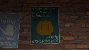
Map looks neat so far, here's some feedback:

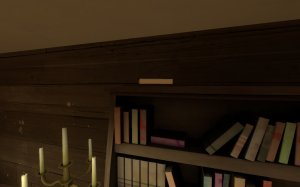
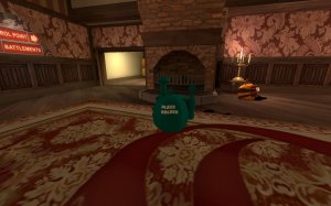
-floating book

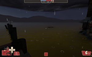
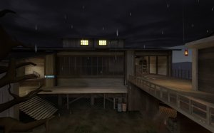
-the rain just kinda stops

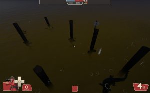
-this looks more like Jarate than water

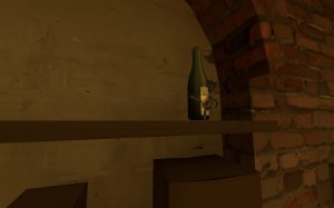
-floating bottle

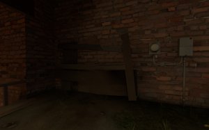
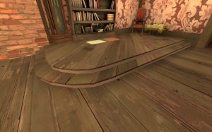
-clip wood smooth

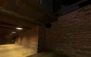
-brick looks odd with the sharp angle here

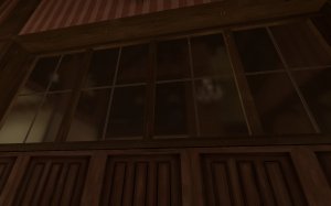
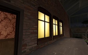
-with these big windows, would be nice to upscale the cubemaps on em

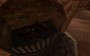
-the bars here don't have any texture on the side. With how close you can get to them, it's easy to notice

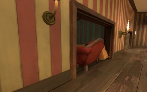
-clip the couch smooth

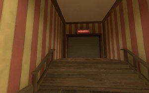
-I feel like something different than the usual metal texture shutter door would make more sense on red side's manor theme

-clip the wood smooth

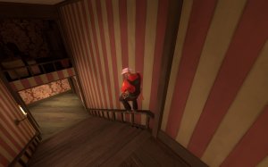
-maybe clip the railings?

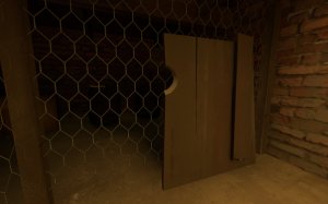
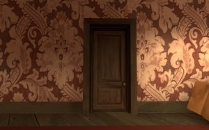
-clip the door smooth

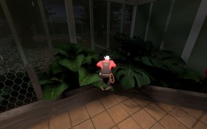
-it's weird that I can get on the wood rail here but not the area with the plants that's the same height, though getting in the plants would be bad

-I feel like blu spawn didn't get as much love as red. It looks kinda....basic

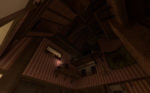
-LOVE the upper detail here

-these are the only rounded windows I found on the map and seem out of place with all the rest being square

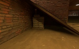
-the detail under this ramp doesn't get across that you can't access it

-never replace this prop, it's perfect. Oh and also really loud when standing next to

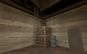
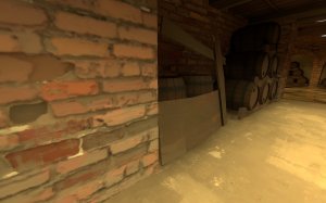
-I really, really dislike chainlink fence that's just placed hap haphazardly . It's difficult to notice at a distance and doesn't look all that good. Also, how would anyone get into that area to get stuff out?

-pumpkin bomb shadows go through geometry

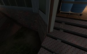
-while there is a clip here, it doesn't seem like it goes to the top of the top step

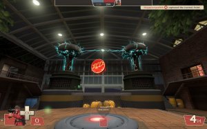
-The electric effects here are awesome but it doesn't really make sense for there to be tesla coils in a greenhouse. It's also difficult to tell what these things do when the point is capped. They just zap the ground and stuff pops up, mostly off screen. A lot of the time it seemed like nothing happened till I went looking for it.
Overall good work so far. I do wonder though, why aren't there spells in the map if it's called spellway?


