KotH siezentra a5
- Thread starter Construction Zombie
- Start date
You are using an out of date browser. It may not display this or other websites correctly.
You should upgrade or use an alternative browser.
You should upgrade or use an alternative browser.

- No longer koth_orange
- Point size enlarged slightly, no longer as killboxy
- Brought right sideroute backwards some, does not take you beyond point
- lowered left sideroute ramp
- Additional props
- larger building adjusted
- window slightly reduced
- doorframe height reduced
- brought closer to point
- smaller building adjusted to match the changed foundation
- spawnpoint adjusted
- reduced in size
- brought closer to building in-front of
- raised foundation
- third door added
Read the rest of this update entry...
- Clipped building stairs
- slightly brought back building and spawn, brings the spawn to point time up to something more reasonable
- new cover, further broke sightlines
- nobuild under building staircase
Read the rest of this update entry...


We played this map in the imp today with a nearly full server.
I left a bunch of my feedback in voice and in the feedback plugin but I feel I can expand upon it hhere.
What you have here is a good base for a map, that is reasonably solid and fun enough. What you don't have is a flair to your map that makes it memorable and sets it apart from other maps. It feels like what you have is the bare basics of what would make a map work, but you're missing the everything else that goes into a full map.
My first suggestion to fix this is get away from making your buildings boxes. This, I feel, ties a bit into the point I will make below but even then. When you exit your spawn, this is the view the player is presented with:
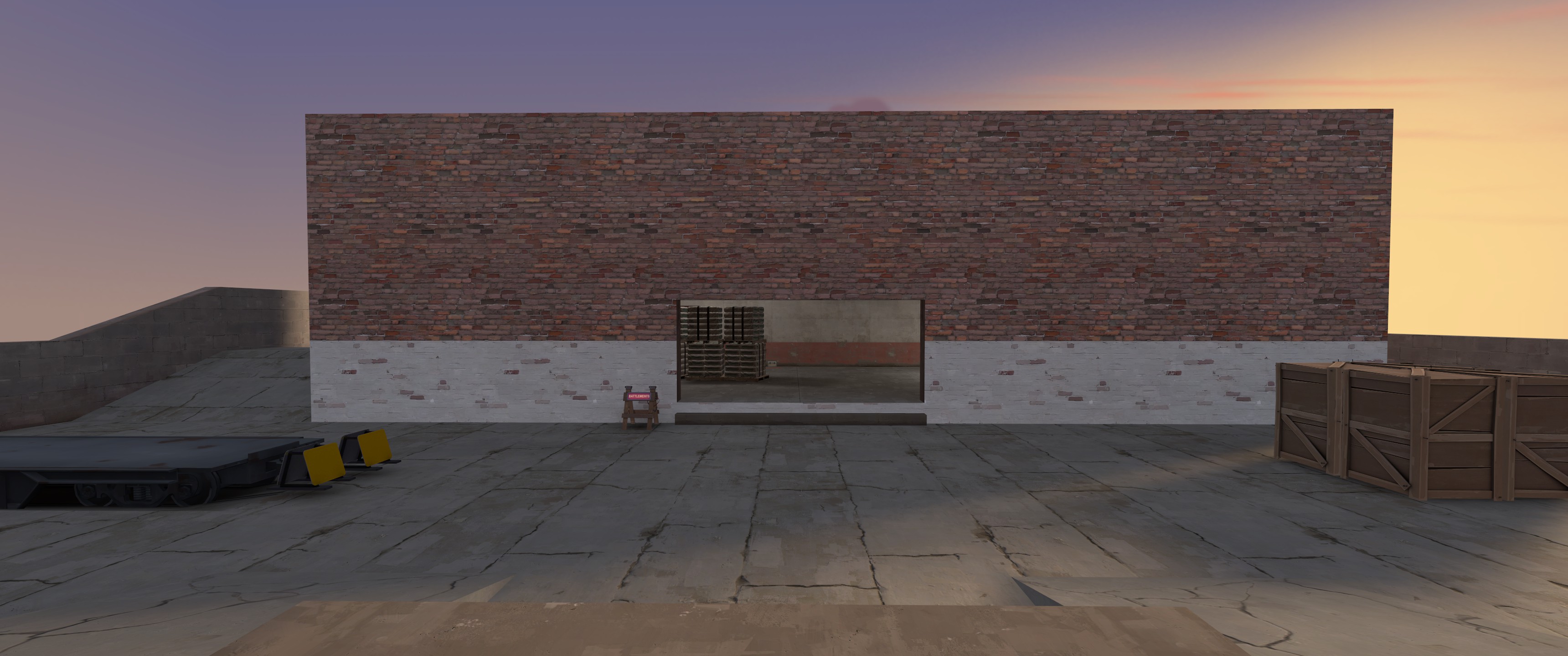
You have three options from here. The main right in the enter is the obvious answer. You also can go left around the building (offering what looks like a height advantage). There's also a right route here, but it's less obvious to the player when they exit the spawn. This is good as it offers the standard 3 routes from the spawn yard that the ViaductFormula™ wants, but the main issue is that none of these routes really offer anything different in terms of attacking the point.
The left route immediately loses it's height advantage once you get over the bump, and you're presented with a view where the enemy has a huge advantage over your position. They have three main lines of fire at your position:
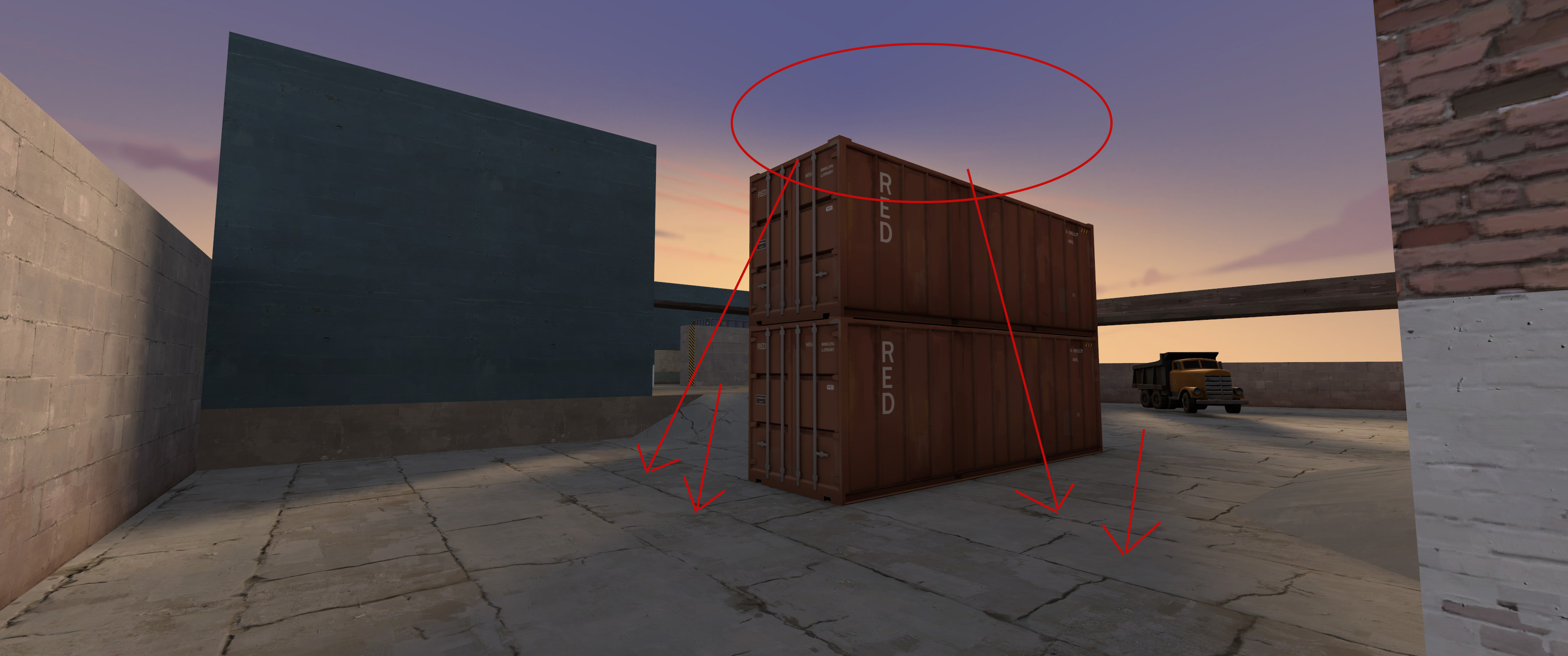
From the crate, which is a huge height advantage, from the point (where they likely are if they've captured it) and from the right. This isn't a very fun situation to approach into, and while jumping classes are given the option to jump up to the crate and gain some height over the point (something I found myself doing a lot), the rest of the classes seemed to end their combat here as they are slaughtered from the fire coming off the point or the plank above it.
Typically in KOTH maps, there's one "ground-level" exit from the spawn yard, and two that take a longer time, but attack the point from an angle and give attacking players a little bit of advantage approaching it. Think the two side routes on viaduct, or the side building (with the full health) on lakeside, or the farmstead roof in harvest.
Another issue I had with this left route is that it had no health making it even more dangerous to retreat and attack along.
Another issue I had with the spawn area is one that I feel extends to the rest of the map as well. Your architecture feels very boring and unexciting to fight around. Let's use my example of viaduct again:
Here are viaduct's 3 exits from the spawn yard. The main thing that makes this appeal to me over your map is that they are DIFFERENT. The left exit is higher, the middle exit is a turn to the left (which also helps optimization) and the exit to the right is closer to the spawn than the other two. The building that you cross isn't a big box with a big room in the middle, each route offers different geometry, with a different height level upon it's exit, different sizes.
I mentioned this in both the fb plugin and in voice chat, but your map really feels like it's lacking interesting geometry and art direction. None of the buildings feel like they have a purpose beyond offering height or a way through the map, there's no shape to the map outside of the gameplay spaces. If you notice on basically every official map, there's lots of stuff to break up the squareness of the playspace through extra buildings, pieces jutting out, alcoves in the wall...stuff that just makes the architecture feel a bit less like one big block. Detailing helps a lot with this, but even in alpha you can get this going.
Perhaps it's a bit self-centered of me to say but I feel making your map with a clear direction and idea of what it will look like and BE in the end ends up creating a lot more unique map with unique geometry.
As for the point itself; I liked the idea of the areas above that you could capture. The main issue I had with the point area itself is that there's only two small windows overlooking it, and they're directly opposite each other. This lead to a lot of the fighting taking place over the top of the point, shooting at small enemies sticking their heads out of a small opening. even widening this window so it was maybe 2-3 times as wide would serve to help this a lot. Perhaps lowering them slightly so they were level with the raised point bits would make people more inclined to use them as a way to shoot down onto the point as well.
Additionally, I feel a way for the enemies on the ground to attack these flanking buildings without going all the way around the building to climb the stairs (such a stairs in the building itself from the lower level, or some construction underneath the bridge crossing from the spawn-yard-building) would help make these buildings feel less impenetrable to the enemies.
In summary, I feel this is a good base for a map but you need to work on adding new and varying opportunities to the players in order to make it a great one.
I left a bunch of my feedback in voice and in the feedback plugin but I feel I can expand upon it hhere.
What you have here is a good base for a map, that is reasonably solid and fun enough. What you don't have is a flair to your map that makes it memorable and sets it apart from other maps. It feels like what you have is the bare basics of what would make a map work, but you're missing the everything else that goes into a full map.
My first suggestion to fix this is get away from making your buildings boxes. This, I feel, ties a bit into the point I will make below but even then. When you exit your spawn, this is the view the player is presented with:
You have three options from here. The main right in the enter is the obvious answer. You also can go left around the building (offering what looks like a height advantage). There's also a right route here, but it's less obvious to the player when they exit the spawn. This is good as it offers the standard 3 routes from the spawn yard that the ViaductFormula™ wants, but the main issue is that none of these routes really offer anything different in terms of attacking the point.
The left route immediately loses it's height advantage once you get over the bump, and you're presented with a view where the enemy has a huge advantage over your position. They have three main lines of fire at your position:
From the crate, which is a huge height advantage, from the point (where they likely are if they've captured it) and from the right. This isn't a very fun situation to approach into, and while jumping classes are given the option to jump up to the crate and gain some height over the point (something I found myself doing a lot), the rest of the classes seemed to end their combat here as they are slaughtered from the fire coming off the point or the plank above it.
Typically in KOTH maps, there's one "ground-level" exit from the spawn yard, and two that take a longer time, but attack the point from an angle and give attacking players a little bit of advantage approaching it. Think the two side routes on viaduct, or the side building (with the full health) on lakeside, or the farmstead roof in harvest.
Another issue I had with this left route is that it had no health making it even more dangerous to retreat and attack along.
Another issue I had with the spawn area is one that I feel extends to the rest of the map as well. Your architecture feels very boring and unexciting to fight around. Let's use my example of viaduct again:
Here are viaduct's 3 exits from the spawn yard. The main thing that makes this appeal to me over your map is that they are DIFFERENT. The left exit is higher, the middle exit is a turn to the left (which also helps optimization) and the exit to the right is closer to the spawn than the other two. The building that you cross isn't a big box with a big room in the middle, each route offers different geometry, with a different height level upon it's exit, different sizes.
I mentioned this in both the fb plugin and in voice chat, but your map really feels like it's lacking interesting geometry and art direction. None of the buildings feel like they have a purpose beyond offering height or a way through the map, there's no shape to the map outside of the gameplay spaces. If you notice on basically every official map, there's lots of stuff to break up the squareness of the playspace through extra buildings, pieces jutting out, alcoves in the wall...stuff that just makes the architecture feel a bit less like one big block. Detailing helps a lot with this, but even in alpha you can get this going.
Perhaps it's a bit self-centered of me to say but I feel making your map with a clear direction and idea of what it will look like and BE in the end ends up creating a lot more unique map with unique geometry.
As for the point itself; I liked the idea of the areas above that you could capture. The main issue I had with the point area itself is that there's only two small windows overlooking it, and they're directly opposite each other. This lead to a lot of the fighting taking place over the top of the point, shooting at small enemies sticking their heads out of a small opening. even widening this window so it was maybe 2-3 times as wide would serve to help this a lot. Perhaps lowering them slightly so they were level with the raised point bits would make people more inclined to use them as a way to shoot down onto the point as well.
Additionally, I feel a way for the enemies on the ground to attack these flanking buildings without going all the way around the building to climb the stairs (such a stairs in the building itself from the lower level, or some construction underneath the bridge crossing from the spawn-yard-building) would help make these buildings feel less impenetrable to the enemies.
In summary, I feel this is a good base for a map but you need to work on adding new and varying opportunities to the players in order to make it a great one.
Thanks freyja, although I may not have shown it directly, I am doing what I can to take into consideration of what everyone has been saying on the map. Being from what is said in the feedback plugin, to what is said in the demos, where I watch them x8+ over to get several povs of varying characters. I appreciate it all 
At the time of this posting however, I haven't gotten the chance to take a look at the demo (2am and computer elsewhere). I feel it would be a good idea to elaborate more on my intentions that I may not have been good enough to convey in the map itself.
My intended theme and design for the map is meant to be a trainyard, similar to how the Well series of maps look with it's parallel running tracks and more level-grounded playspace. I quickly found out that this leaves much more room for expanses for sightlines and attempted to correct this in A2 and 3, but have neglected other classes that can't gain height advantage of this sightline breaking cover. On top of this, it has also created two different play fields of which one is based on high ground, simply put anything 200~ hu above the point platform aligning with the back building windows. From what I am hearing and have been seeing, these windows have become more of a peek fight than anything else and I will most likely do something else with them as they have been making some hard to account for sightlines. This should make for a lesser insane height advantage for left side attackers to fight against (no more double stack containers).
I have not been doing anything with the back building and it has been a rectangle (regrettably) intentionally because I was unsure on how it would turn out when designing routes. What I initially wanted out of it was a form of building fortification (medics and uber, engineer and sentry, some sort of an ambush point) and after seeing what happens with it, design around it as a focal point for the strengths that it would present. I would like to see if I can keep the interior in some way intact while giving the outside the face lift it needs to shape it into something that does not make the player say "rectangle".
As for right route, I believe it's going to change so much that I'm not sure what I could say about it, other than in some positive form it will provide a longer, advantageous yet counterable way to the point.
Sounds good! I wish you luck with it! Well is definitely a theme that has blockier buildings but it gets still uses geometry to break up the edges (as well as a lot of train cars and stuff to break up the shapes). Using the train theme a bit more might benefit your map like the 2nd-mid yard in well uses them to break up the space
Last edited:
I've been working along at a comfortable pace, and believe it's time this map gets looked at.
Read the rest of this update entry...
- Divider added between big storage and spawn
- Completely changed far left and right routes
- Reworked building exteriors to look less oversized
- Big storage interior changed
- Tons of other lesser things
Read the rest of this update entry...
Handful of changes, many of the glaring mistakes rectified
-Sun now points directly downward.
-Optimized big warehouse.
-Slight changes to courtyard between big warehouse and point.
-left flank now covered (no wierd-looking out of bounds area, instead it's a tunnel).
-Many doorway height and widths changed.
-More cover on point.
Read the rest of this update entry...