Moorage

KotH Moorage a9

Jul 26, 2015
697
822
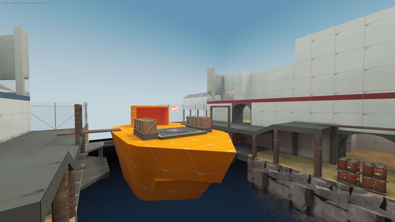
Moorage - Koth map centered around a docked ship

After many hours of grumbling over cubemaps and content packing, I am finally ready to release my first map on TF2Maps! It's a king of the hill map centered around a ship docked at a boathouse of some sort. I've tried to experiment with a bit of everything so I can get a bit of experience. Let me know if you find something wrong or have any suggestions on something I should change!

Special thanks to tyler for his tutorial and to the makers of the bulletcrops pack!
 

Aerodynamic

L1: Registered
Jul 29, 2015
24
5
Well fuck, I knew I should've released it. I have a koth map I've been detailing that is centered around a docked fishing trawler.
 
Jul 26, 2015
697
822
That's alright, I won't sue you. :p

Judging from the size of the trawler, I think the creators must have designed it in mind for control points anyway.
 

Kube

Not the correct way to make lasagna
aa
Aug 31, 2014
1,342
1,850
Oh cool, the first version of my 72-Hour map had its mid-point on a boat!

2015_07_18_00029.jpg


Yeah, the boat was a LOT uglier. The final version just had it on a platform in the middle.
 

Aerodynamic

L1: Registered
Jul 29, 2015
24
5
Well thanks, but I'm not using the prop. I painstakingly built my own, I just wanted the originality points. Although now I see it is far from a new idea.
 

Kube

Not the correct way to make lasagna
aa
Aug 31, 2014
1,342
1,850
Well thanks, but I'm not using the prop. I painstakingly built my own, I just wanted the originality points. Although now I see it is far from a new idea.

Well, the important thing is that my idea never panned out. You've got a whole new map with what looks to be a cool layout. I give you 200% permission to use what's not really mine anymore.
 

Aerodynamic

L1: Registered
Jul 29, 2015
24
5
Well, the important thing is that my idea never panned out. You've got a whole new map with what looks to be a cool layout. I give you 200% permission to use what's not really mine anymore.
I appreciate it man. It might be a while before I release it, however, I'm letting it sit for a week or two so I can come back with some fresh eyes, right now I'm dabbling in another koth idea I had.
 

JMaxchill

L5: Dapper Member
Jan 21, 2015
215
69
Is it bad that I read the title as "moo rage"?
e: useful point: did you playerclip your stairs?
 

ErickShock

L1: Registered
Aug 23, 2015
20
10
I made a quick run through your map and found some small issues that might interest you - this is my first time doing this kind of feedback so I hope I don't say anything too stupid.

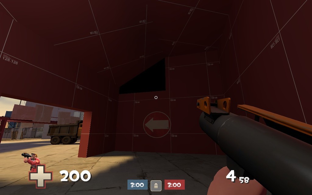
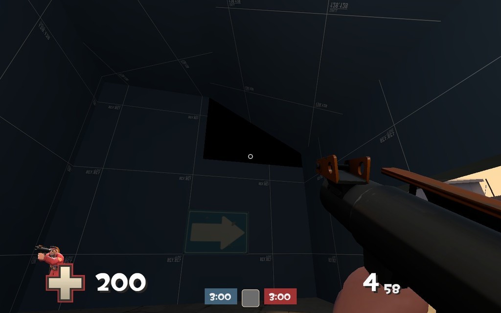
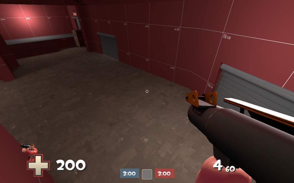
First, there's this texture/lightning bug (?) on both BLU and RED sides for me.

2015-09-27_00002_zps29dbfnwc.jpg

2015-09-27_00004_zpsa9f0j6yu.jpg


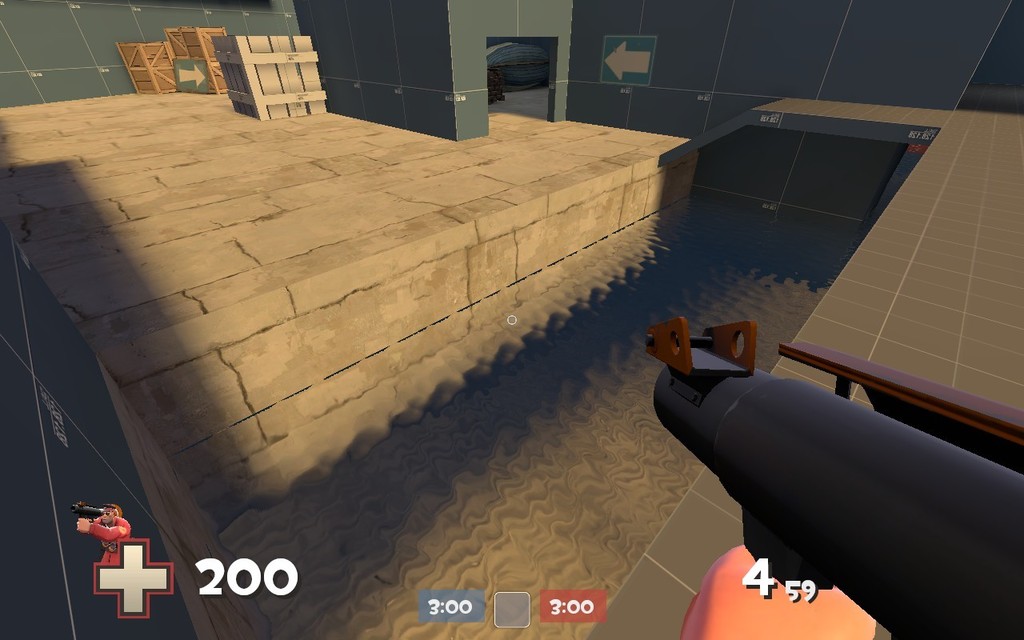
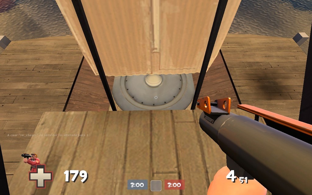
I think this should receive a ramp/stair connecting the water to the top ground - this makes a faster flanking route for spies and a way to return if someone accidentally fell there.

2015-09-27_00003_zpslmpsrchs.jpg


This gap between the metal barrier and the wooden roof can trap players. Please, put a clip brush there preventing this issue.

2015-09-27_00005_zpsjguaszqo.jpg


This area looks a bit open and uninteresting. Yeah, I know the spawn is right close to this, but drop some more props or make some walls and smaller doorframes to close a bit the area. I dunno if this area is important for gameplay, but it definetely needs some tweaks.

2015-09-27_00006_zpsi2uczvle.jpg


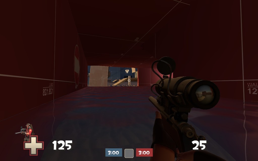
Now about snipers' sightlines, I think this one is bit strong. A sniper sitting here is very protected and has a good sight of the control point. Maybe a solution is pushing the wall on the left more to the left and then move the exit to left with it (hope you understand what I'm saying =P). Do this with the BLU spot too!

2015-09-27_00007_zpszkupoty9.jpg


Well, the map looks very cool. The brushwork is fine and looking good. Unfortunately, since I live far from the US and EU, it's hard for me to play on imp's and gamedays, and I really wanted to see how the gameplay is (oh, and have you already signed your map for a gameday?).

Good work and keep improving! =)
 
Jul 26, 2015
697
822
Thank you very much for the feedback! I noticed those lighting glitches, not sure what's causing them. I'll look into it though, along with those other issues. I'll be sure to sign up for the next game day as well.
 

ErickShock

L1: Registered
Aug 23, 2015
20
10
I'm glad to help! :D

I've experienced some lightning issues like these on some tests I made some time ago. If it's textured, try putting a new light entity closer to the wall, that area is bit dark in any case.
 

gastrop0d

L3: Member
Apr 22, 2009
110
33
I've had that exact lighting problem before. It was a very strange bug that I blame on something going wrong in CSG or BSP converting the brushes into mesh. I had 1 brush that appeared as both the wall of a cliff in an exterior and the sloped ceiling of a passage. I think it was something so do with it appearing in 2 areas at weird angles.

I deleted the big brush and made 2 new ones, one specifically for the cliff face and one for the roof. If that makes sense... Delete the brush you have an issue with an try remaking it.
 
Jul 26, 2015
697
822
Update version a2:
  • Turned the boat around and moved it closer into the boathouse
  • Extended the land out and added some cover around the point
  • Made water near spawns shallower and added ramps to get out
  • Added some crates, etc in buildings near spawns
  • Adjusted health and ammo packs
  • Adjusted spawn points to focus less on one exit
  • Attempted to optimize with hint brushes and areaportals

Read the rest of this update entry...
 
Jul 26, 2015
697
822
Updated to version a3:
  • Major layout changes
  • Redid building at mid
  • Added small windows to the walls near sniper balconies at mid
  • Adjusted health and ammo packs
  • Fixed areaportals in doors

Read the rest of this update entry...
 
Jul 26, 2015
697
822
  • Did some basic texturing
  • Placed patches underneath health and ammo kits
  • Added nodraw surfaces to smooth out displacements in basement areas so engineers can build there

Read the rest of this update entry...
 
Jul 26, 2015
697
822
Updated to version a4:
  • Edited spawns to be more centered
  • Replaced boat model with a collisions fix by DioJoestar (no longer blocks bullets in odd places)
  • Moved crates around mid so they don't block view of the point coming from the middle route
  • Added fences around mid
  • Decreased point capture time by 17%

Read the rest of this update entry...
 
Jul 26, 2015
697
822
  • Changed layout around northern side of map and some of mid
  • Tweaked lighting in some areas
  • Tweaked capture zone and added hazard tape around the point
  • Added a few areaportals
  • Nobuilded water at mid

Read the rest of this update entry...
 
Jul 26, 2015
697
822
  • Made capture zone slightly larger
  • Lifted the boat up a bit
  • Tweaked lighting around the map
  • Moved walls near northern spawn entrances and closed one of the doorways to the "rowboat" room; experimenting a bit with the layout

Read the rest of this update entry...
 

ErickShock

L1: Registered
Aug 23, 2015
20
10
Hey man, it's great to come back and see how your map changed and evolved. Keep going forward! :D

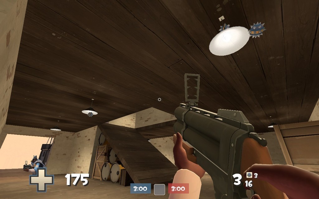
I think, however, that you could do some smaller changes in your map to make it better. Since you're probably getting closer to beta version, I think you should turn off the collisions in the lamp props. You see, many times a player gets airblasted or thrown in mid air, and having those props with collisions turned on may frustrate such movements. Inside spawn, however, this is not needed since it doesn't affect gameplay. =)

2015-12-04_00001_zpsezpnybns.jpg


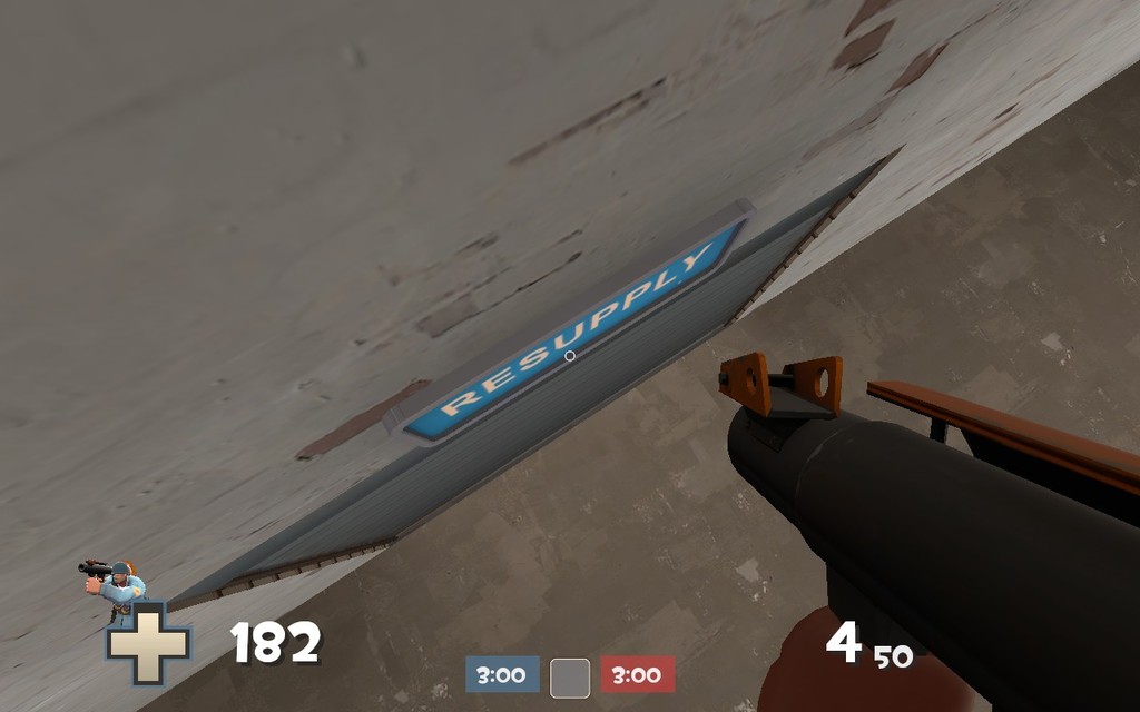
Other thing I'd recommend turning of the collisions is the "Resupply/Control Point" signs. See how a player can get up there and completely take by surprise a player that just exited spawn. No one likes that.

2015-12-04_00003_zpsly3zhhoy.jpg


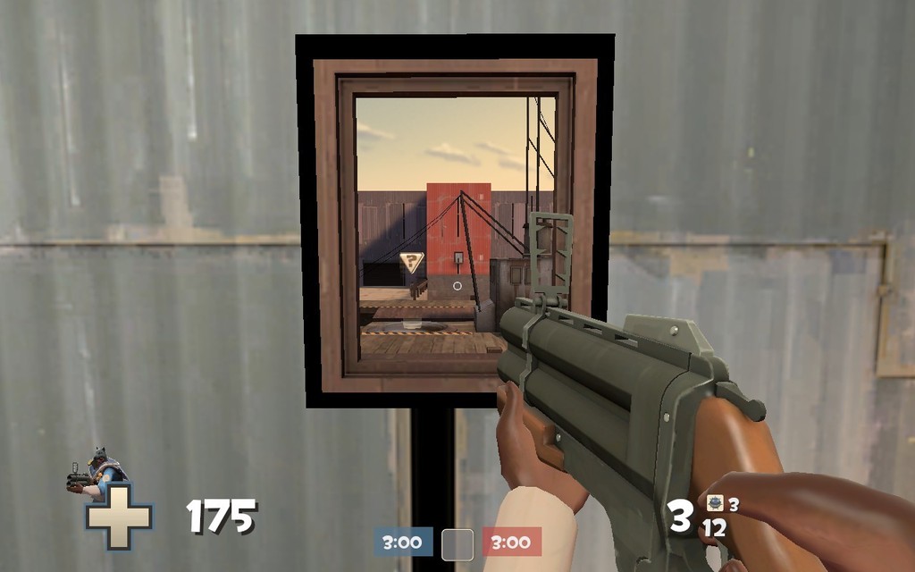
And just a thought of mine, isn't this window a bit OP? Let's say, it has a great view of the point and pratically covers the entire player. Yeah, I know there's another one on the other side, but I think that by having both of them you end up forcing players to play Sniper to counter another Sniper there. There's already a balcony to the right that solves all the problems quoted above.

2015-12-04_00002_zps4lsrtghv.jpg


Anyway man, great map and good luck on your future projects! I'd be glad if I could help in the final stages with clipping the map out, since it's something very neat to have later on. :D