Forklift

KotH Forklift b4

Sep 19, 2010
475
499
koth_forklift started as my entry to the 2014 Winter Mapping Classic 72hr Contest.

Special thanks:
  • TF2Maps.net staff, members, and playtesters.
  • All the UGC teams (.knd, GWMI, PvP, FastCo.) that have playtested and provided feedback.
  • A Boojum Snark for his Ultimate Mapping Resource Pack.
  • Contributors to the Construction Pack.
  • Rexy for his forklift model.
  • Fubar for his gypsum texture.
 
Last edited:

Berry

resident homo
aa
Dec 27, 2012
1,056
1,898
I hope you didn't fix the falling out of the map thing

it was fun. kind of.
 
Sep 19, 2010
475
499
2014-02-02_00005.jpg


a5 - February 2, 2014
- Changed theme from desert to alpine
- Reworked building around control point
- Raised floor and displacements near the point
- Removed building to create a more open route
 
Last edited:
Sep 19, 2010
475
499
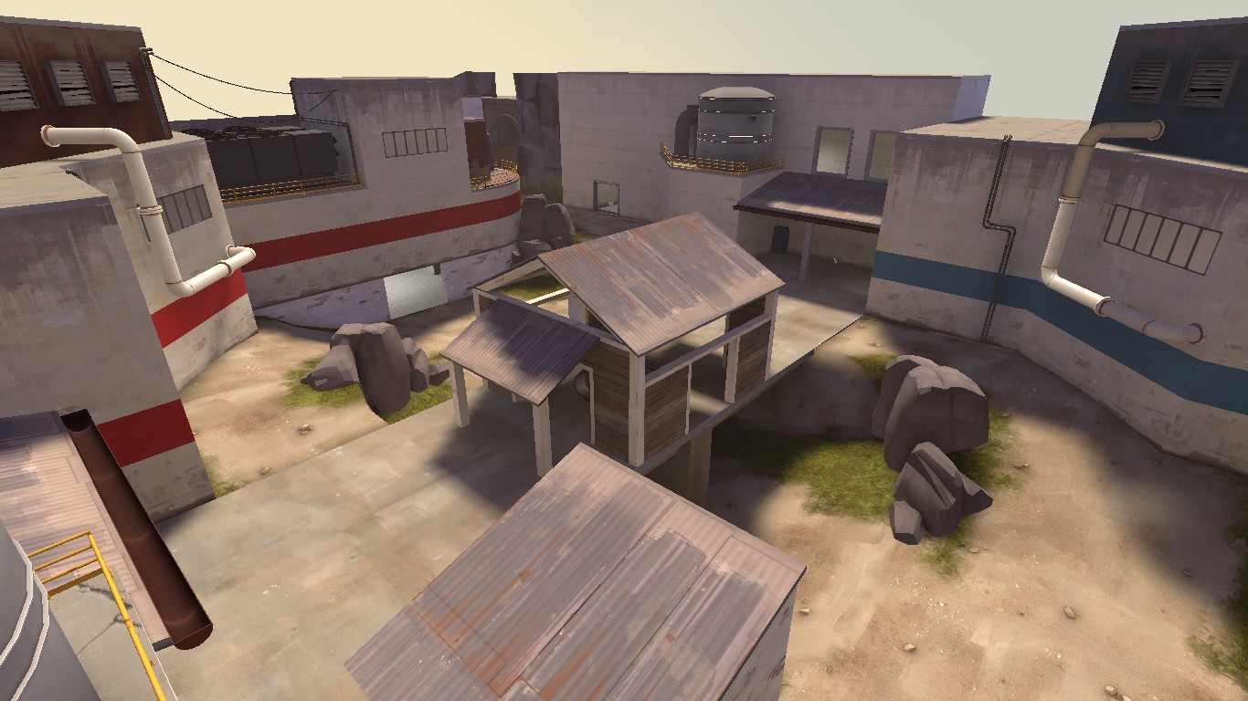
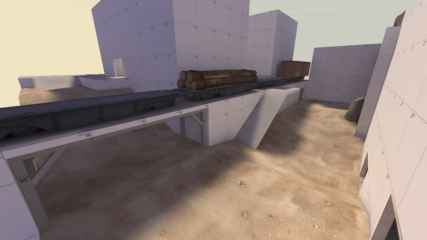
Been working on the area between spawn and mid lately. A lot of people weren't too fond of it, and I can't say I was either. All suggestions are welcome. I've also stripped away the textures on most brushes. Might be going for a little re-theme. Still sticking with Alpine, but maybe more Lumberyard-y than Gorge-y.

Here's what the area is looking like currently:
2014-03-01_00001.jpg
 

seth

aa
May 31, 2013
1,019
851
Can't. I've made some layout adjustments on it, so if I were to enter it, I would have to go back to the previous version.

That's what I meant. So you're just planning on building and detailing this on your own time and not detailing the c10 version for the contest?
 
Sep 19, 2010
475
499
That's what I meant. So you're just planning on building and detailing this on your own time and not detailing the c10 version for the contest?
Yeah, no point in detailing the same map twice. :p There are a few things I need to work out as well, so I'd hate to spend so much time working on the contest entry when I could be working on those.
 

seth

aa
May 31, 2013
1,019
851
Yeah, no point in detailing the same map twice. :p There are a few things I need to work out as well, so I'd hate to spend so much time working on the contest entry when I could be working on those.

But you can't submit the layout-adjusted one into the contest, so it's not entirely pointless to detail both.
 
Sep 19, 2010
475
499
But you can't submit the layout-adjusted one into the contest, so it's not entirely pointless to detail both.
Well, I wasn't really planning on detailing my own map for the contest anyway. I was going to detail another entrant's map, but I haven't gotten around to it.
 
Sep 19, 2010
475
499
a12 released:

a12 - July 8, 2014
- Raised spawn area
- Raised left route coming out of spawn
- Adjusted doorway on right route to eliminate sightline

Got some feedback from last night's test. I raised the left route 64 units, so hopefully that's a positive change. The sightline on the right side was ridiculous, so I made some adjustments to eliminate that as well. Content is packed this time. I checked. :p
 
Sep 19, 2010
475
499
a17 released

001.jpg


I've been fiddling around with this map a bit over the last several months. Not much has been accomplished. At one point I was planning on going for a complete theme overhaul due to multiple people who weren't fans of the Process/Gorge theme.

After trying to switch directions, I realized a lot of my structures had been built with the Process/Gorge theme in mind and this made it difficult to transition. In the end I decided to go back to the original theme, and as a result wasted a lot of time. But! Here it is, a17. Still no official name, but I think things are coming along nicely.
 

RubbishyUser

L7: Fancy Member
Feb 17, 2013
414
488
Nice to see this again - I always had some fun with this map. Are you testing it on your server at all?
 
Sep 19, 2010
475
499
Nice to see this again - I always had some fun with this map. Are you testing it on your server at all?
My server is for completed maps only. :p Maybe I'll put it up when I'm done if I deem it worthy. Looking to get some competitive testing, but my work schedule is all over the place right now, so we'll have to see.
 
Sep 19, 2010
475
499
a21 released:

a21 - June 23, 2015
- Removed doors connecting side routes
- Deepened water at mid
- Fixed clipping issues

download

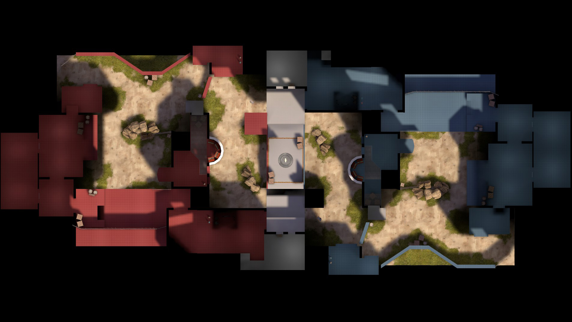
Just updated the map thanks to some feedback from Saturday's gameday. I made a major change by removing the doors that connected the side routes, so the map will definitely play differently. Hopefully this will funnel all the action towards mid and players won't be upset by such strong flanks. Special thanks to Phi for giving me additional feedback outside of the gameday. Thanks to everyone who tested. :)

koth_grizzly_a21%20(6).jpg
 

seth

aa
May 31, 2013
1,019
851
Hey Grizzly, I haven't played in a few versions but I was excited to read about a21 so I've done a little run-around. Here are my thoughts in the order I notice them.


GENERAL

The triggers for your spawn doors aren't very long. I run into them opening as any normal speed class. Just lengthen them maybe 64hu.
http://puu.sh/iCIrb/146838ea3f.jpg

Crouch jumping onto this barrel causes me to get stuck underneath this dev-textured railing here. Just flush it with the wall or remove the barrel and use the standard 2-crate method so I don't have to crouch jump.
http://puu.sh/iCIFY/03df11582e.jpg

Unsure why you didn't block off this area. You have health and ammo right next to it, why not throw them in there and give that little space some meaning!
http://puu.sh/iCINR/2c53f5e4cb.jpg

Obvious nodraw behind these crates.
http://puu.sh/iCIW6/1a3f5936bb.jpg

I assume you made this as deep as it is to allow people to extinguish themselves? Feels odd to walk through and be submerged for a half step then suddenly be completely out of the water. But I don't know how else you could do it if you want people to be able to extinguish themselves, short of widening the water. Also, the middle support structure in this screenshot is off-center of the actual bridge. Looks like it needs to be moved to the right maybe 16hu.
http://puu.sh/iCIZY/365c633586.jpg

Doesn't look like you're using areaportals in any of your doors as you're rendering a lot of stuff areaportals would fix. They are extremely useful and don't take much time to setup. You could even add some areaportalwindow's to the windows overlooking the point and the semicircular computer room windows with a black textured buddy entity. Alpha is always a good time to start optimizing.
http://puu.sh/iCLCQ/724eda52cb.jpg
http://puu.sh/iCLBT/9e8833048d.jpg
http://puu.sh/iCM39/6e599e4f60.jpg


MINOR

Even in alpha, I'd really like some ambient noise. Just sprinkle a few env_soundscape's around using Gorge's outdoor soundscape with the radius at -1. Should take five minutes. Going off on a tangent here, I don't know if you've done soundscapes before but once you get to the point where you're polishing things and refining your soundscapes, I'd highly recommend using triggerable soundscapes. Way easier to control.

Not a big deal at this stage but dynamic shadows have a tendency to render on the opposite face of brushes they're supposed to render on. Just disable shadows on your resupply locker props. They won't be missed.
http://puu.sh/iCKcT/257dcdb900.jpg

A small clip brush here would be nice.
http://puu.sh/iCKj5/513d4ee002.jpg

Your displacements don't reach the ramp to spawn on either side.
http://puu.sh/iCKkX/bc0b873d96.jpg
http://puu.sh/iCKn6/e4e5927386.jpg

Nor do they reach this wall, but only on Blu side.
http://puu.sh/iCKn6/e4e5927386.jpg

All the barrels on the point are slightly floating.
http://puu.sh/iCM07/067afebeb7.jpg


I'm itching to play a21, I hope you toss it up on a gameday soon!
 
Last edited:

tyler

aa
Sep 11, 2013
5,100
4,621
Please don't randomly add visclusters to maps. They can decrease compile times pretty easily (because it basically tells VVIS to not bother with an area) but it can also, very easily, lead to decreased performance. Visclusters aren't talked about because their true, useful applications are few and far between. They make it so entire areas are rendered at once when a player looks at only a part of the area, which is almost always not what you want. And when I say almost always, I mean essentially never.

Adding random visclusters to speed compile time WILL lead to a decrease in performance in game if not done correctly. In TF2, usually you only use them in your 3D skybox. I'm not sure about the Lumberyard example, but I don't think there's an area on Lumberyard that would actually benefit from being clustered.

Edit: To be clear, it's true that often large outdoor areas can benefit from being put in a func_viscluster, but it's dangerous, because it's very easy to cause things the player can't see to render, thus reducing performance. It's typically wiser to just design around such a need in TF2. For other Source games, it's a lot more usable.
 
Last edited: