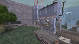
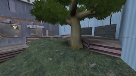
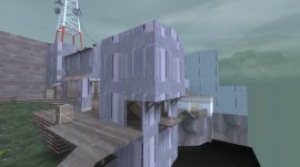
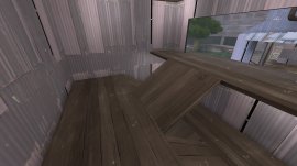
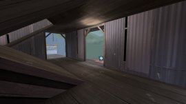
Washout

KotH Washout a12

gastrop0d

L3: Member
Apr 22, 2009
110
33
Hi all, first post of mine in a long time. This is a quick map I've thrown together in the last couple of days.

I love the Borneo jungle theme and want to make something with it, so my plan at the moment is to have a dusk or early morning jungle setting once this layout has been tested and polished.

Special thanks to Heyo for creating and sharing the Borneo jungle assets!
 
Last edited:

JMaxchill

L5: Dapper Member
Jan 21, 2015
215
69
Ok, I had a run around your map and found some stuff:
* No spectator cam, so dead people are forced to look at the edge of your map. I recommend one overlooking the point, but it's personal preference really
* No cubemaps. Generally, you don't need these in alpha but if you've got windows or something put a few down: http://imgur.com/H1h1lUG
* The control point is pretty dark, maybe add some lights or just turn the env_brightness up: http://imgur.com/GX6EGkw
* You might wanna add another flank route down here (maybe an island with health or something) to liven it up. This one's kinda eh, tho - your layout's really solid as it is: http://imgur.com/qHXVepX
* No markers on the point, so you don't know where to stand to cap.

Overall, this looks like a great map!
 

gastrop0d

L3: Member
Apr 22, 2009
110
33
Thanks guys.

Thanks JMaxchill for taking the time to run around and provide feedback. I agree with you about the low route needing something to make it more interesting; I'm still giving it some thought. Maybe ideas will become clearer after some testing.

I've updated the map to a new version. Spent a fair bit of time reworking the lighting to be balanced for both teams and provide better visibility in the key combat areas. Also dropped the Borneo environmental effects in; these are largely temporary as I plan to ultimately change the time of day but keep the jungle setting. Just really there to give a better impression of the setting.

EDIT: Updated map again. Have increased the size of the map, made the main route to the point more team-friendly, added a tower overlooking the point that is accessible from the lowest points on the map and made the spawns more defensible.
 
Last edited:

gastrop0d

L3: Member
Apr 22, 2009
110
33
Thank you to everyone that tested and gave feedback on the gameday and Friday impromptu. The map seemed to play alright, but lacked variety. Defending the point seemed too easy and people were frustrated trying to attack. Also there were some sentiments that the map was small and areas cramped. With these points in mind I'm implementing these changes for a9:

koth_washout_a09_000000-jpg.2733


- The point has been lowered to have no height advantage over the garage doors.
- The roof is still accessible but has been limitted. You can't access the other team's side of the roof from your side and there's very little room to dodge while on there.
- A ramp has been added to the middle wall of the point to provide another route to it. This opens the point up more to all the classes.

koth_washout_a09_000004-jpg.2734


- There is now sleight height advantage (64 units) for people coming out of the garage doors. Hopefully this will help them attack the point better.

koth_washout_a09_000001-jpg.2735


- The middle tower has been expanded in size to allow for a bit better combat within.

koth_washout_a09_000002-jpg.2736


It's just an extra 64 units but it seems to feel much better.

koth_washout_a09_000003-jpg.2737


- Reduced the amount of health available in the base of the middle tower to 1 medium kit. It has been placed in a more exposed area.

And I did a very basic texture pass and added a few details mainly because I was bored. :)
 

Attachments

  • koth_washout_a09_000000.jpg
    koth_washout_a09_000000.jpg
    412.8 KB · Views: 673
  • koth_washout_a09_000004.jpg
    koth_washout_a09_000004.jpg
    408.1 KB · Views: 727
  • koth_washout_a09_000001.jpg
    koth_washout_a09_000001.jpg
    284.9 KB · Views: 716
  • koth_washout_a09_000002.jpg
    koth_washout_a09_000002.jpg
    304.4 KB · Views: 630
  • koth_washout_a09_000003.jpg
    koth_washout_a09_000003.jpg
    215 KB · Views: 652
Last edited:

gastrop0d

L3: Member
Apr 22, 2009
110
33
Thanks Vincent :). What was your name in the demo? I couldn't seem to find you...

I've released a9 for download; gon' need some tests!
 

gastrop0d

L3: Member
Apr 22, 2009
110
33
@Vincent oh yeah you made a good mauling or two :)

I've gone a little crazy and deleted nearly the entire map and rebuilt it :eek:.

koth_washout_a10_010005.jpg


Bleg, ignore the 3d skybox. My goals for this rebuild are to address the lack of variety and the small size of the map.

The changes I've made are:

koth_washout_a10_010001.jpg


- Moved the bottom route that passed under the "bridge" to instead wrap around the middle tower. Added water to the route, which is closer to my original concept. I wanted a more powerful option for flanking classes like pyro, spy and scout. This route allows flanking straight into mid or up into the enemy's battlement. The water also allows people up on the catwalks to bail safely and soldiers to perform big rocketjumps.

koth_washout_a10_010002.jpg


- Enclosed each teams' battlements in more cover. In the old map I felt like snipers needed a more varied perch and engineers found no real use for the battlements, so I buffed them (I think).
- Flattened the main area around the point. To make combat feel less exhausting.
- Separated enemy and friend access routes to the battlements into 2 distinct routes. Mainly to allow the battlements to be reached on equal terms by each team so any battles over it happen within it rather than in some hallway.

koth_washout_a10_010000.jpg


- Directly bridged the battlements with the middle tower. This is probably crazy, but feels cool so we'll see how it tests :).

koth_washout_a10_010004.jpg


- Closed off middle tower's direct access to the point, replaced with a glass view port. With the addition of the catwalks a vantage over the point felt excessive, but allowing people to peek out on the action seems good.
- Removed direct access from ground to mid tower. This felt poky and uninteresting, so it got the chop.

koth_washout_a10_010003.jpg


- Added a route that wraps around the point with small side yards for each team. This is my main attempt at opening up the options for the map. It feels like there's much more a player can choose from with this added route.
- Added a staging yard for each team between their spawn and the main battle area. Again, this aims to increase options. Teams can pull away from the main area and switch routes.
- All the health and ammo has been replaced. I'm very unsure about my choices on these, am interested in feedback.

So yeah, still working on it, but I'm very keen to try to land this in a test soon!
 
Last edited:

tyler

aa
Sep 11, 2013
5,100
4,621
I left you a lot of feedback today; if any of it is confusing or you don't know what I meant, don't hesitate to ask. Also don't hesitate to think I'm wrong, and just do something else.
 

gastrop0d

L3: Member
Apr 22, 2009
110
33
@tyler You're a legend! I think the points you've made are right on the money. A lot of the geometry between spawn and mid was very vague in my head, but now I feel like there's much more clarity around what's needed.

Thanks to everyone for testing and providing feedback today. I've been picking through all the feedback considering what changes are best and are coming to some pretty clear ideas. Will be sharing progress soon!
 

gastrop0d

L3: Member
Apr 22, 2009
110
33
Okay here goes the progress:

koth_washout_a11_010013.jpg

Cut the route joining the two side yards, which were allowing a very direct push to the enemy spawn. Added a doorway to a new room, following:

koth_washout_a11_010018.jpg

This feels like it was really missing. This goes from the side yard (light in the bottom right of the shot) through to mid and up to the battlements. Also has some much needed health. Also this area appears to be a strong position for engineers to set up, which was an issue in the test.

koth_washout_a11_010020.jpg

Added some height for the attacking team and added cover. This, plus the health pack inside the doorway should make direct attacks on the point more viable. Also it's not apparent in the screenshot but the fence does a lot of work cutting long sight lines from a couple of angles.

koth_washout_a11_010019.jpg

This is how the area around the point looks now. Oh I also changed the small ammos in mid (off to the bottom right in the image) to medium ammos.

koth_washout_a11_010025.jpg

I removed the confusing-as-hell clipping in this room, creating a drop-down to the water route. Upped the health to a medium pack. Fixed the glass texture on the window, though to my defence the texture I was using is tagged as a "tf" texture in hammer ;)

koth_washout_a11_010022.jpg

Added a full health pack to the water route; combined with being able to exit from mid tower here should hopefully make it more interesting.

koth_washout_a11_010021.jpg

Attempted to make water route's access to the battlements a little more obvious.

koth_washout_a11_010014.jpg

Now the area after spawn. It's difficult to capture in a single screenshot, but I've attempted to really kill the enemy's ability to push this area. The health has been removed, the home team has height advantages and good angles. The home team also can set up sentries in the area that cover everything and hopefully are quite tricky to take down. This shot also shows the new, much more open route up to the team's battlements.

koth_washout_a11_010015.jpg

Replaced the single incredibly chokey hallway leading up to the battlement with a more open area. This should hopefully give each team actual command over their battlements.

koth_washout_a11_010016.jpg

This new area also has a drop-down that leads directly to the water route for slipping into mid unnoticed.

koth_washout_a11_010017.jpg

This is how the interior of the battlements looks now. I've also changed the large ammo in here to a medium ammo.

koth_washout_a11_010023.jpg

Another view of the staging area. The two passages come from red spawn.

koth_washout_a11_010026.jpg

It's getting kind of tricky to show all the routes in one overview, but hopefully this illustrates the most important changes.

It was also mentioned in the feedback that the spawns are a bit bungling at the moment, so I'll be working on tidying them up as part of the next version as well...
 
Last edited:

Vel0city

func_fish
aa
Dec 6, 2014
1,947
1,589
I like this map just based on the water material.
 

gastrop0d

L3: Member
Apr 22, 2009
110
33
Thank you to everyone that tested today in the game day. I'm really pleased with the feedback and feel the map is close to moving to beta, where I will bring yet more sweaty jungle beauty... to the skybox.

However, there are a couple of other experiments I'd like to try with the layout. If they make it worse I'll roll them back, but I think they're worth trying. Will be making a post later detailing them.

One thing I'm concerned about at the moment is whether or not there's enough interesting jumps & play for soldier and routes for scout. I know @worMatty mentioned a lack of interesting soldier play around mid. I'd like to dig into that a bit more, but don't have a clear idea of how to address it at the moment.
 

tyler

aa
Sep 11, 2013
5,100
4,621
I'd definitely say you're at a point where testing each version more than once is a good idea.

Good job improving this so quickly, by the way. Looking forward to what else you make.
 

worMatty

Repacking Evangelist
aa
Jul 22, 2014
1,259
999
Actually I said "Not much opportunity for a soldier to do soldier things in the map." I mean all over the map not just mid.

When I was playing Soldier I didn't feel like I was being used to my full potential throughout. I think it's because of the kinds of areas you have. You have small rooms with small doorways and narrow passages, or tall and imposing medium-width passageways (like the ones that make up the outside). Soldier feels fun to play in medium-large open areas that have some parts that are higher up, reachable by rocket jumping, that feel like they give you a game play advantage, such as taking you to the objective quicker. At the moment, every class is forced to walk to the point and the only places you can rocket jump up are the enemy sniping balconies, but you'd have to be dominating the point to be able to make an advance like that. Perhaps you might consider reducing some of the height of the architecture that leads up to the point, making some rooftops available, and expanding the width of at least one of the routes from spawn.

The lower roof of the point building is perhaps the most interesting place for a Soldier to find himself, but offers no game play advantage other than hiding in wait for the enemy. That building also has a compact footprint but is quite tall so it blocks visibility across the point area, which reduces one's ability to make sense of what is happening in the map. If you changed it in to something that allowed players to see more through it (such as some machinery like a housed crane or hoist, or a room with large windows on both sides) that would help. You could also extend that lower roof around the front of the building so that a Soldier or demo could walk around it and use the opposite side as a high platform from which to attack the enemy. Obviously you would need to make sure it wouldn't be unfair.
 

gastrop0d

L3: Member
Apr 22, 2009
110
33
@worMatty That makes a lot of sense, thank you! I'll have to give that a good ponder.

@tyler Thanks, though I attribute the majority of this map's play-ability to the excellent feedback I've gotten. Also the many great articles within the community. I feel like I might have lucked out with getting these updates as "right" as I have. Time will tell, I suppose. I really want to work on an A/D map as the next project, need me some of dat asymmetry.