Respect the Geneva Convention

Overlay Respect the Geneva Convention A1

dryerlint

L5: Dapper Member
Mar 28, 2016
204
190
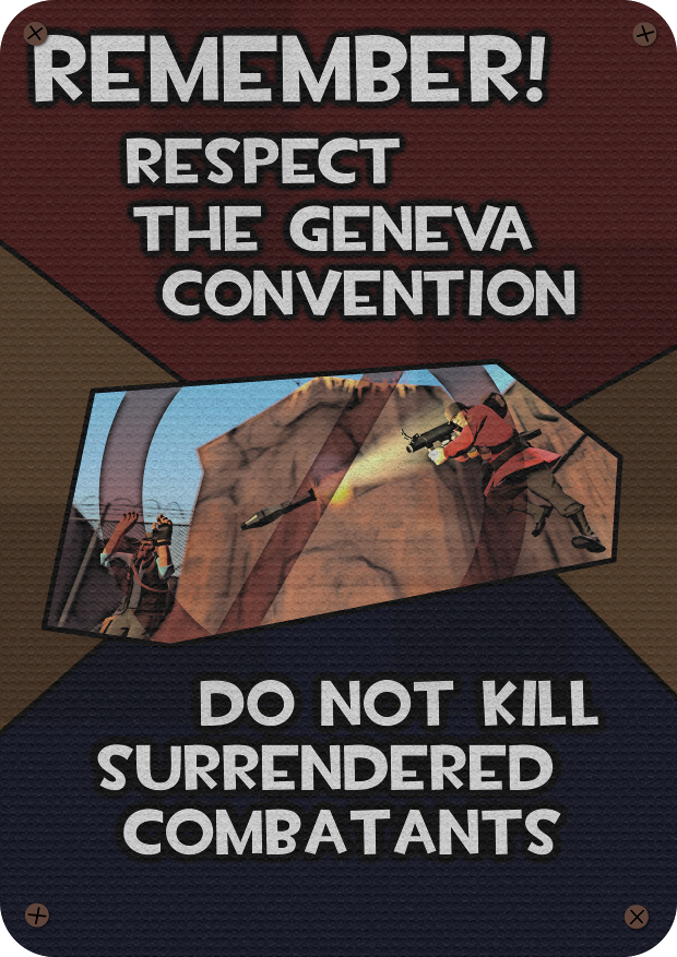
Respect the Geneva Convention - My first attempt at making an overlay. It reminds players to not commit war crimes.

I've finished my first attempt at making an overlay. It's a metal sign reminding players not to commit war crimes.

eEZJpGq.png


In case anyone wants them, here is the "clean" version:
LIltDo6.jpg


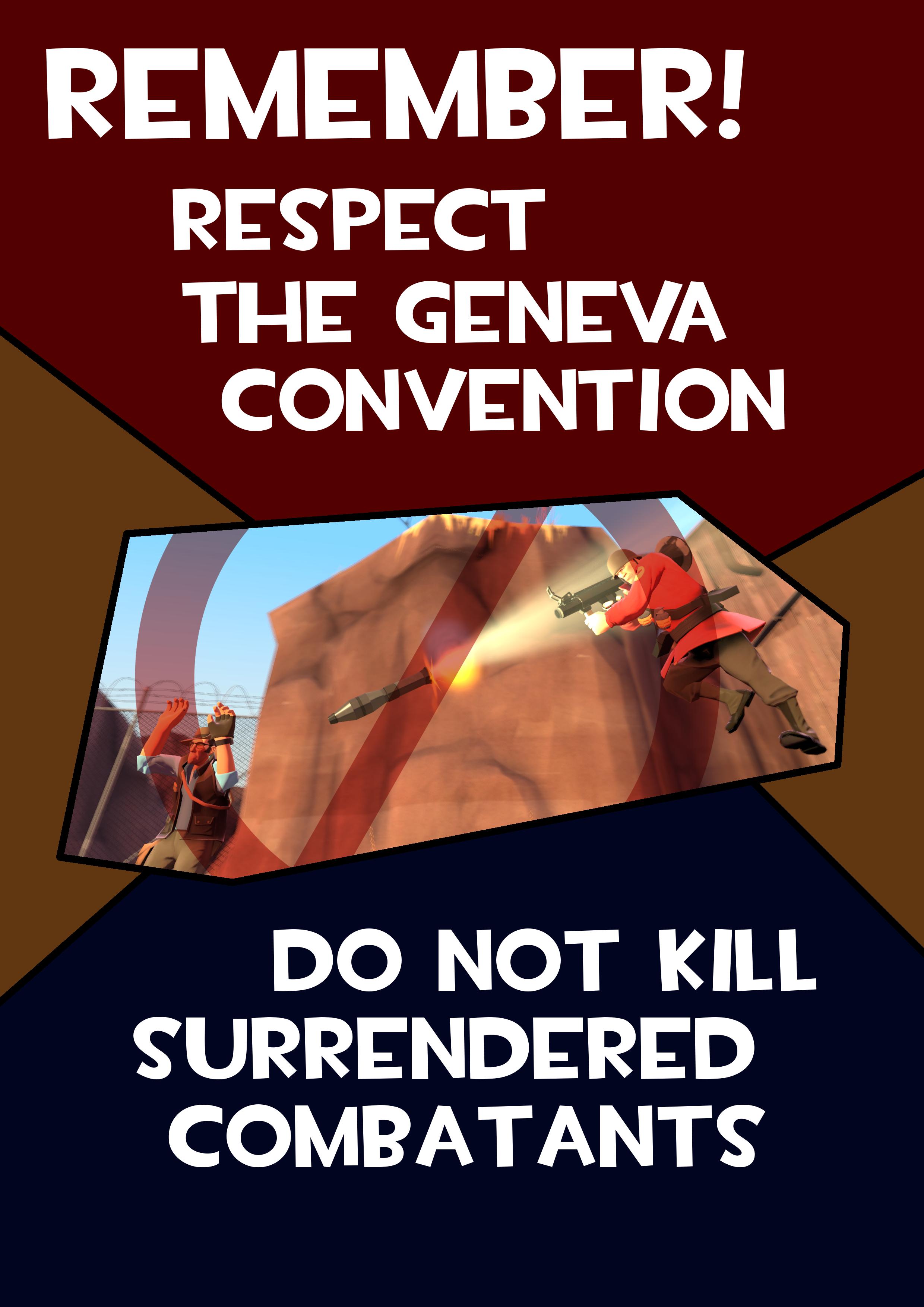
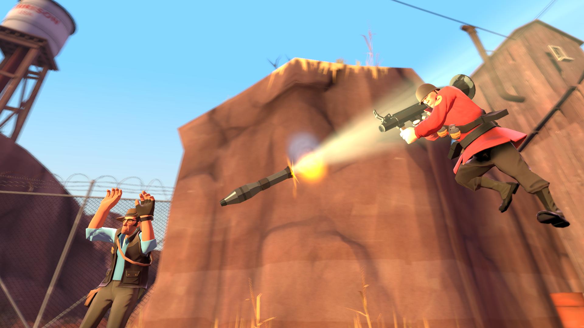
And the full SFM render:
suyCch4.jpg


The VTF and VMT files should be placed in materials/signs

Enjoy! Please let me know in the comments if there's anything I could have done better. I would appreciate credit if anyone uses this in their maps, but it's not strictly necessary or anything.
 
Aug 30, 2015
359
451
Condescending Pro Amateur Tip: The UI font looks good in very few places outside of the UI. Consider using one of these fonts
I personally also like Molot, Futura,* Oswald, Roboto, Deftone Stylus, Great Lakes and League Gothic & Spartan
I've never been a fan of SFM images in posters either

*This font does not have a free license
 
Last edited:

dryerlint

L5: Dapper Member
Mar 28, 2016
204
190
Thanks for the feedback! I'll try and stay away from the TF font in the future.

And yeah, it does look pretty bad with the SFM image. I tried to "cartoonify" it a bit with the GIMP filter, but it seems I didn't go far enough.
 

devvon

L1: Registered
Aug 17, 2016
6
3
What about using a silhoutte of the Sniper and Soldier, instead of a SFM Poster? I think that the silhoutte fits better for a poster.
But this is a awesome idea, you're very creative!
 

dryerlint

L5: Dapper Member
Mar 28, 2016
204
190
What about using a silhoutte of the Sniper and Soldier, instead of a SFM Poster?

I considered trying it, but I'm not sure how it would be done. I would probably have to use a green screen in SFM, and the rocket effects would come out all weird... maybe next time though. Thank you for the feedback!
 

Berry

resident homo
aa
Dec 27, 2012
1,056
1,898
When designing posters, it's much better to add effects to create the effect of it being a poster yourself rather than applying an effect. I'm going to use something I made previously as an example for you; I'm no pro at this and it's not by any means amazing but it proves anyone can make posters that fit the art-style without paying megabucks for Photoshop (I use a combination of GIMP and Paint.NET).

465599e2d5.jpg


1. Font choice
This has already been mentioned, but to keep things neat I bring it back up and reiterate. Never make use of TF2 UI fonts as not only is it odd (and are they overused) but it also breaks the immersion of the game. Make sure to try and pick something suitable and not use too many different fonts (not that you have done that, just to add).

2. Colour choice
Rather than taking guesses at colours and hoping it looks good, try to follow the TF2 palette as otherwise your poster will stick out far too much and not blend with the rest of the environment. Here's a copy for your reference.

palette.jpeg


3. Additional effects (Edgewear and in the case of my example, water damage).
First (as with any TF2 materials or textures) you're going to want to make sure you have square brushes installed as details within TF2 are generally square-based and using circles will make your work look odd. There are various different ways of doing this, but this is the way I do it and it ends up turning out OK so here goes:
For edgewear you want to have a decently small brush and apply strokes around the edges very thinly that darken it noticably (but not in a way that's striking, or very apparent without looking for it). This will lead up to a thinner layer of grey strokes which sit much closer to the edges. It's hard to explain what I'm trying to get across so looking at the first image might make this easier for you to see.

5967e4b625.png


And to add an extra touch to my poster (this isn't necessary if you want it to look clean), I added some large strokes which add a slight green tint on top of the image (I may be remembering wrong, but with the brush being set to Multiply on a dark grey with a hint of green in it) and applied these across the centre of the image just to add slight visual noise to represent damage and decay.
 

dryerlint

L5: Dapper Member
Mar 28, 2016
204
190
That was very helpful, thank you! I didn't even know there was a TF2 color palette. And thanks for the advice on poster wear/damage. I tried to implement that but wasn't really sure how to do it.