- Dec 9, 2014
- 41
- 6
My first guide here, so hopefully it'll be helpful to some people!
Colors are important in all forms of art and media, so it won't surprise you that they're also very important in video games, whether used to make a game look pretty, thematic, immersive, or act as visual cues.
If you're at all familiar with TF2, I'm sure you've noticed how incredible its art-style and presentation are. Color usage in TF2 is no exception, and that's what this guide is focused on.
1.) Team Differentiation
 TF2 is built around this "color denotes team" idea. Instead of denoting the two teams by some proper noun or Greek letter (Destiny's alpha/bravo, or Dirty Bomb's attacker/defender) they're simply named after the two contrasting colors. In maps, this let's the player know what side they're on and in what general direction to go. You want the map to guide the player without requiring any strong thought (player's have questionable intelligence) as without these colors, it could be confusing to traverse the map.
However, you can't just start slapping on red plank textures on RED side and blue concrete on BLU. Depending on the map's theme, implementation of these colors changes. Industrial map? Use team colors in props like signs, vehicles, and containers. Jungle map? Use team colors in stained wood and strips of paint on stone ruins.
 It's also important to understand neutral colors. This is done well in Powerhouse, where central areas outside of the team's sides are less saturated and closer to a grey/white concrete. It's important to decide on a few similar neutral colors, depending on the map's style (Harvest's is orange/yellow, Borneo's is tan/green, Turbine's is cream/dark grey). Read more about this in Basic Facades and Your Map.
TL;DR: Use team colors to denote respective team sides/areas.
2.) Points of Interest
 This one isn't used nearly as much as it should. Strong colors can also be used to lead player's eyes to important areas. This includes control points, doorways, respawn rooms, arrow/letter/number signs, choke points, etc. In the above, I tried finding instances where the first thing your eyes are attracted to are highlighted by an important color. This doesn't always have to be a team color, but also any color that sticks out easily, like yellow (particularly in industrials). These colors can be utilized in textures, signs, overlays, or even lights (like in spytech or moonbases). Read more about this in Functional Lighting.
TL;DR: Use vivid colors to highlight control points, doorways, respawn rooms, etc.
3.) Fortify Aesthetics

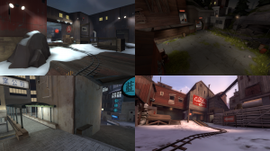
Lastly, colors are useful in fortifying a strong aesthetic in a map, whether in textures, props, overlays, etc. However, make sure they aren't distracting. Colors are supposed to assist the gameplay, not conflict it. TF2 colors strive when they, above all else, complement visibility, allowing every class, building, and pickup to be not just visible, but practically blatant. Above are some good examples of maps that have attractive yet unobtrusive colors/aesthetics. View a list of themes at TF2 Theme Inspiration.
TL;DR: Use colors to complement aesthetics, while remaining unobtrusive.
Well, I hope this guide was useful! If you have any extra tips/information on the topic, you're welcome to mention it in a reply.
Colors are important in all forms of art and media, so it won't surprise you that they're also very important in video games, whether used to make a game look pretty, thematic, immersive, or act as visual cues.
If you're at all familiar with TF2, I'm sure you've noticed how incredible its art-style and presentation are. Color usage in TF2 is no exception, and that's what this guide is focused on.
1.) Team Differentiation
However, you can't just start slapping on red plank textures on RED side and blue concrete on BLU. Depending on the map's theme, implementation of these colors changes. Industrial map? Use team colors in props like signs, vehicles, and containers. Jungle map? Use team colors in stained wood and strips of paint on stone ruins.
TL;DR: Use team colors to denote respective team sides/areas.
2.) Points of Interest
TL;DR: Use vivid colors to highlight control points, doorways, respawn rooms, etc.
3.) Fortify Aesthetics
Lastly, colors are useful in fortifying a strong aesthetic in a map, whether in textures, props, overlays, etc. However, make sure they aren't distracting. Colors are supposed to assist the gameplay, not conflict it. TF2 colors strive when they, above all else, complement visibility, allowing every class, building, and pickup to be not just visible, but practically blatant. Above are some good examples of maps that have attractive yet unobtrusive colors/aesthetics. View a list of themes at TF2 Theme Inspiration.
TL;DR: Use colors to complement aesthetics, while remaining unobtrusive.
Well, I hope this guide was useful! If you have any extra tips/information on the topic, you're welcome to mention it in a reply.