Devil's Half Acre

PL Devil's Half-acre Final release

Ida

deer
aa
Jan 6, 2008
2,289
1,372
For the final, please make sure you playerclip ALL stairs. Doesn't matter if the steps are low; if you jump while running up a non-playerclipper staircase, you will jump straight up because you collide with the step in front of you.

pl_halfacre_rc20002.png

For the sake of polish, you should use trims on all your doors. Floorplates too.

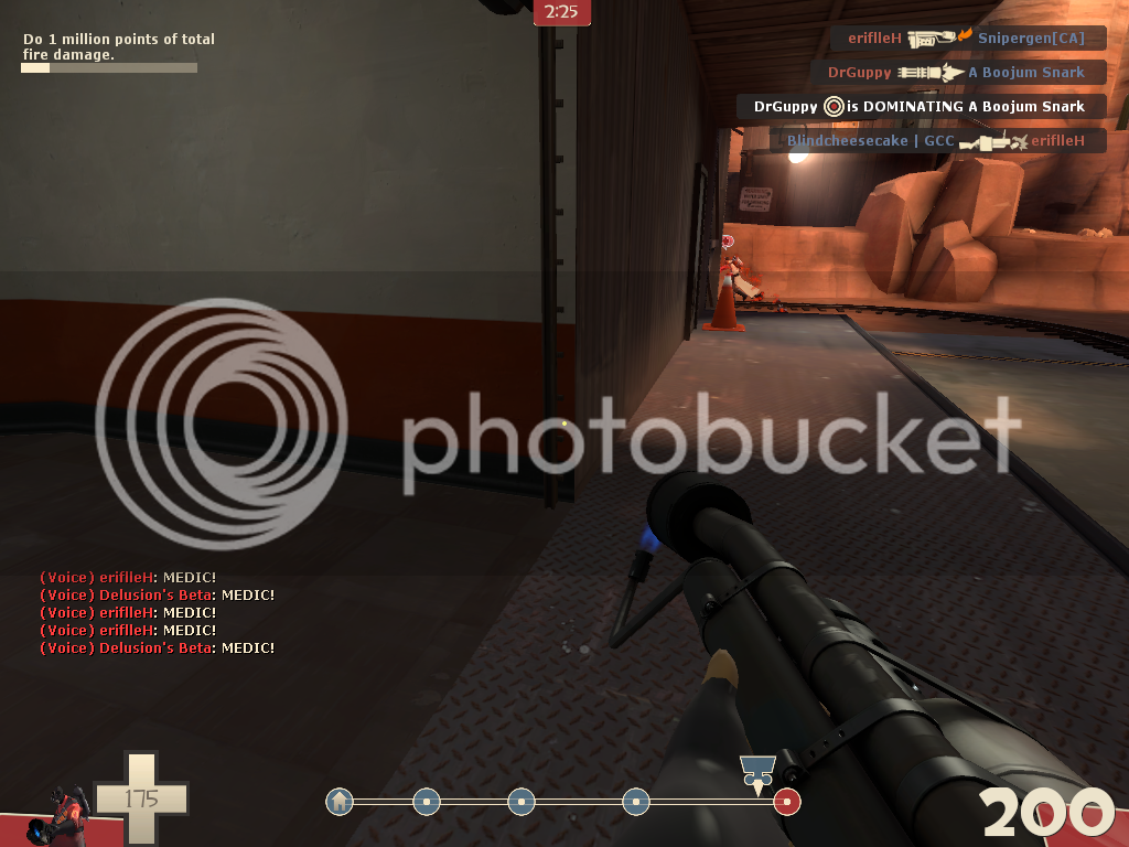
I forgot to take a screenshot of this next problem, but I'll try to describe the building. There's a building next to the final point, which is blue and houses on of RED's spawns. Earlier, you allowed people to go up there using a ladder on a bunch of crates (or something like that), but now you removed the ability to get up there. The crates are still there, though, making it look like you can barely make a crouch jump up to the blue building by using the crates. You should remove them so people won't just sit there and hump for no good reason.
 

HeaH

L8: Fancy Shmancy Member
Oct 2, 2008
553
102
I love the jumproute between the blue building that the muffin is talking about and the high defender ledge. Details like that makes the map fun to play for long time.
 

Ida

deer
aa
Jan 6, 2008
2,289
1,372
Another thing I remembered: Unless I'm mistaken (because I might be thinking of another map), you can stand on the...thing in the explosion crater. A trim of some sort. It should be playerclipped.
 

Apom

L6: Sharp Member
Sep 14, 2008
366
65
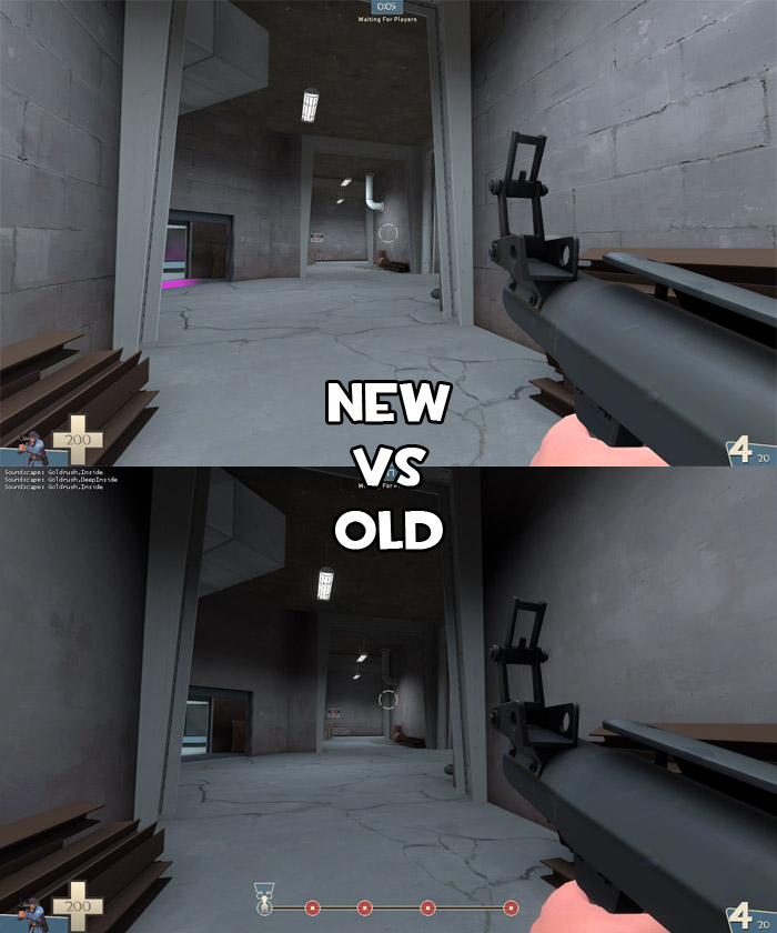
Old was better in my opinion. It's dark, which is cool for ambience, and generally bad for game play - since it's a spawn room and hence gameplay is not an issue, go for the dark version.
 

Mar

Banned
Feb 12, 2009
607
63
I like the new wall texture better.
 

Icarus

aa
Sep 10, 2008
2,245
1,210
I like the old texture better.

The new one is just so generic... it totally does not give the same 'underground' base impression as the old one.
 

Cerious

L420: High Member
Aug 10, 2008
455
133
Old, though out of the both I'd much prefer the dirty Blu Badlands Concrete texture (the Blu, dirty concrete wall prominent on the Blu first point and forward spawn).
 

Annihilatorza

L1: Registered
Apr 8, 2009
30
0
I like the change the wall looks good, much better defined, did you also change the lighting as well, I noticed the pipe in the back ground is better lit.
 

YM

LVL100 YM
aa
Dec 5, 2007
7,135
6,056
umm...is this the almost trivial difference in lighting we are comparing? as there is almost no difference...though the new one has pink in it <_<
Its a far from trivial change, the whole area is so much brighter, can't you tell? There's also the change in texture from the smooth concrete to the concrete blocks (same base texture though)

I've heard so many complaints from people that the intro area is too dark and that the wall texture is so bland its kinda a supprise to see anyone say otherwise :confused:
 

Apom

L6: Sharp Member
Sep 14, 2008
366
65
Oh, I hadn't really noticed the texture change. The new one looks more interesting then, yes. I still like the old lighting better.
 

laghlagh

L6: Sharp Member
Jul 15, 2008
389
53
The old one matched the ground texture better.
 

Icarus

aa
Sep 10, 2008
2,245
1,210
I've heard so many complaints from people that the intro area is too dark and that the wall texture is so bland its kinda a supprise to see anyone say otherwise :confused:

The complainers are usually the more vocal ones. Satisfied players usually don't say a word.
 
Aug 19, 2008
1,011
1,158
personally i think the ground is too bland, purely layed out concete looks boring
you could spice it up by sinking in a beam into the ground, so that visually, the ground gets broken down into several pieces


(sry,used the old screenshot for the quick manipulation, but you get the idea)
 
Last edited: