[WIP] cp_caldera

Shaar

L3: Junior Member<BR>toboruin
Aug 7, 2008
231
206
[WIP] cp_caldera [updated 8/3/09]

Map type: Attack-defend, control point.
Number of capture points: 7
Stages: 3

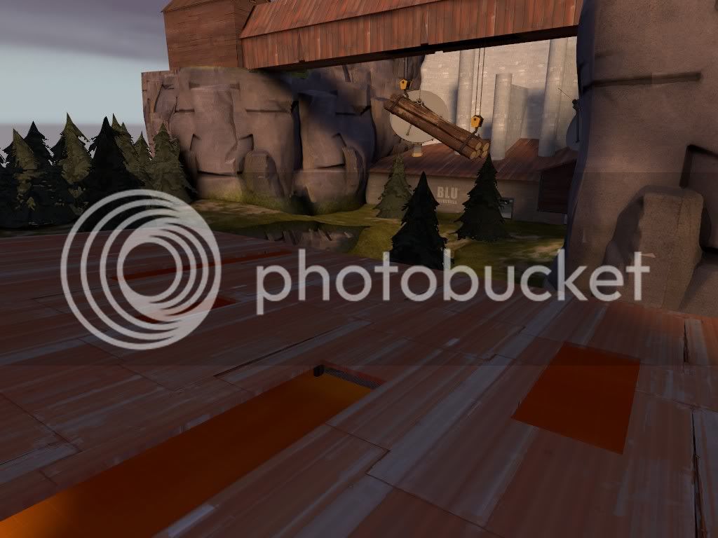
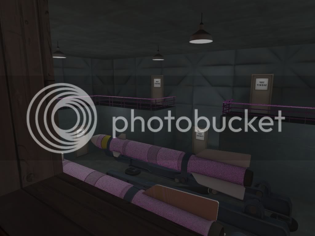
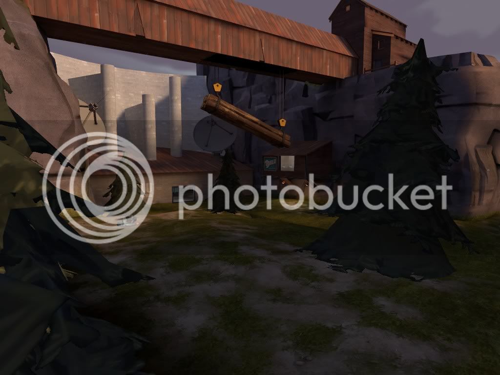
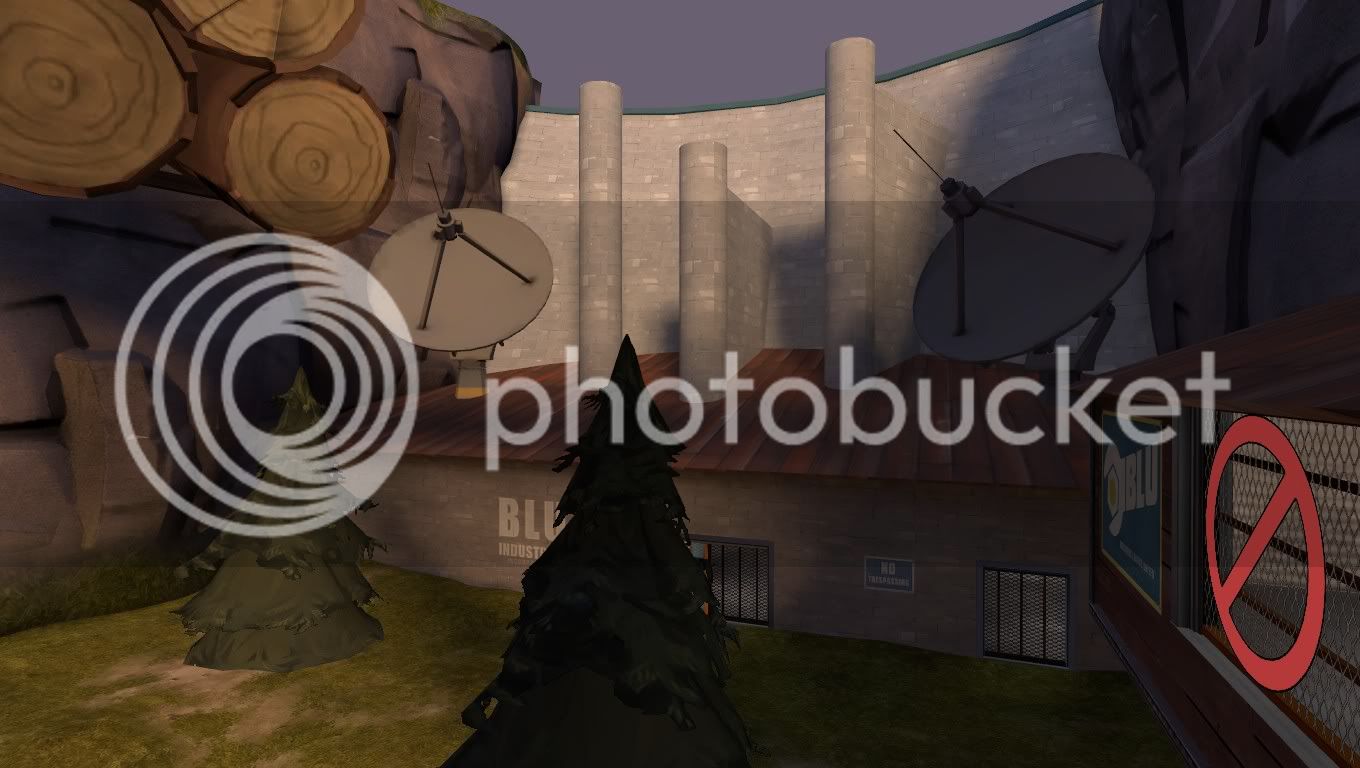
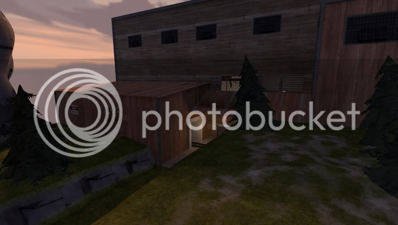
The idea behind this was to create an alpine attack defend map which is set in an alpine area, where by the Blu team push from the mouth of a dam and push further downwards into a red base - Meaning there is a focus on height in this map. Stage one and two are standard dustbowl style areas - as in two caps each. Stage three on the other hand opens up in a similar way to a mini-gravel pit, I.e. Two small caps then the large final one.

Stage one will be in an upper part of the map which is fairly forested. Stage two moves into more enclosed cave like areas. stage three progresses from a cave opening to the Red base deep in the cave.

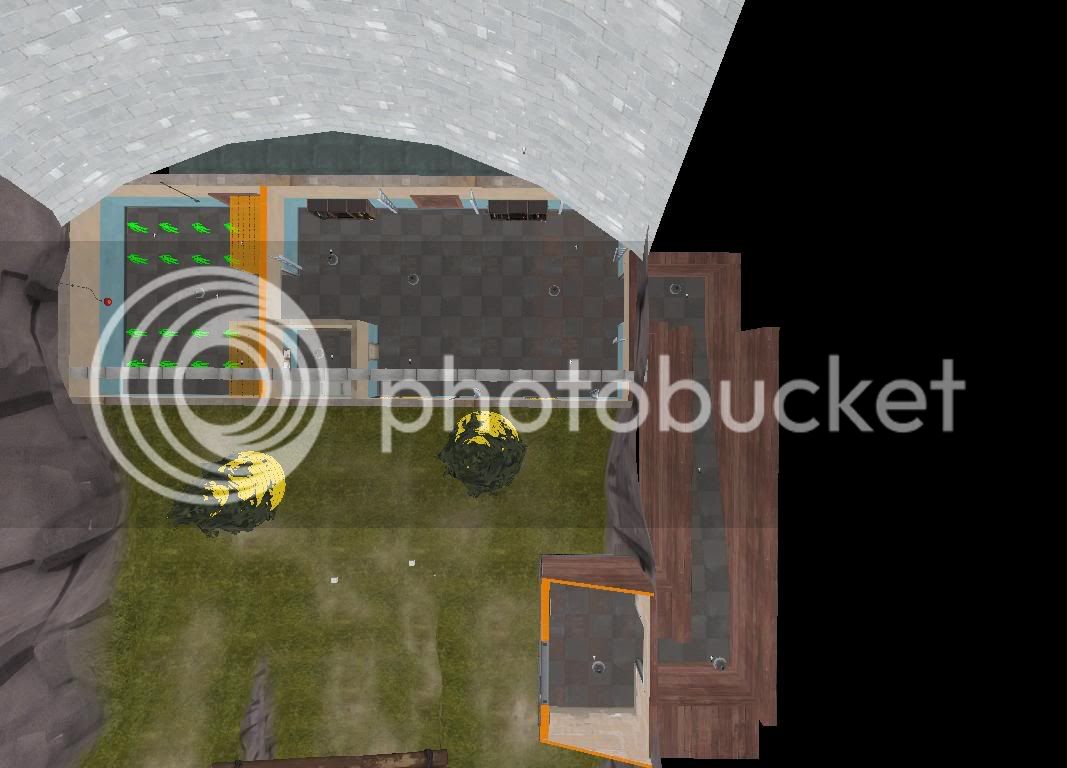
Blue spawn, and the outside area.
http://i85.photobucket.com/albums/k52/ulf2/map0000.jpg
http://i85.photobucket.com/albums/k52/ulf2/map0001.jpg
http://i85.photobucket.com/albums/k52/ulf2/map0002.jpg
http://i85.photobucket.com/albums/k52/ulf2/map0003.jpg
http://i85.photobucket.com/albums/k52/ulf2/map0004.jpg
http://i85.photobucket.com/albums/k52/ulf2/map0005.jpg
http://i85.photobucket.com/albums/k52/ulf2/map0006.jpg
http://i85.photobucket.com/albums/k52/ulf2/map0007.jpg

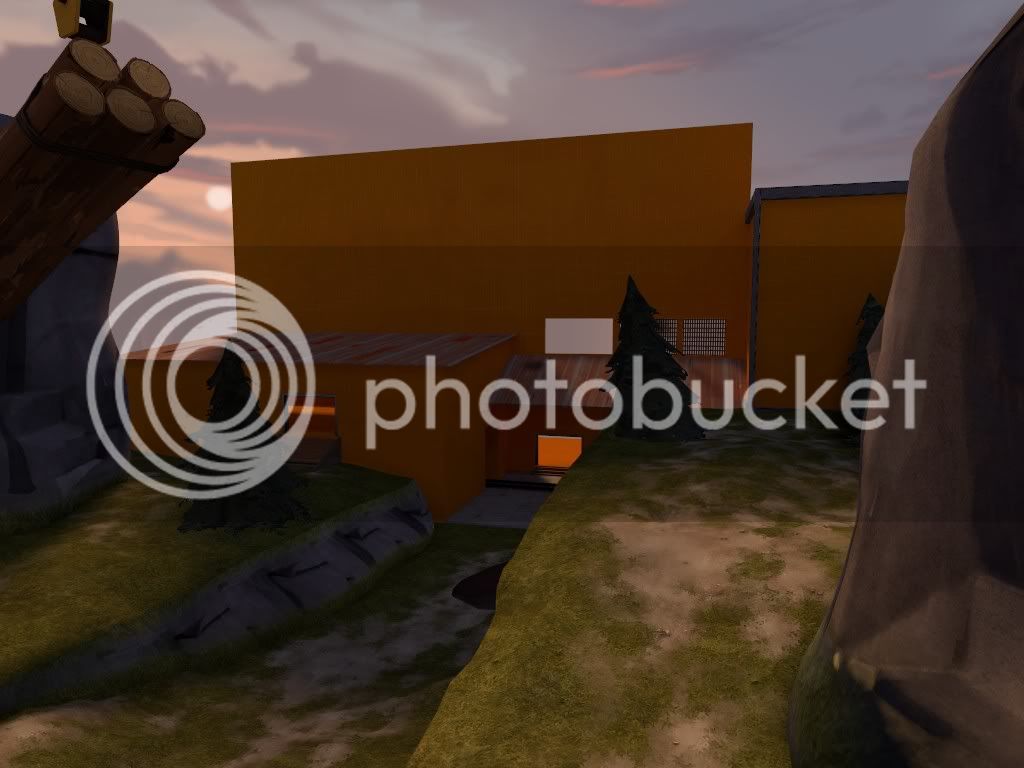
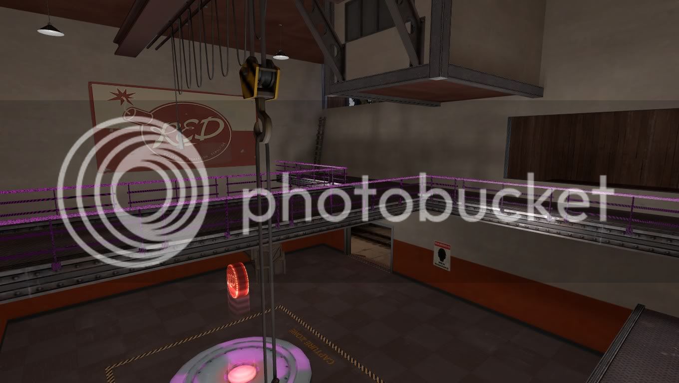
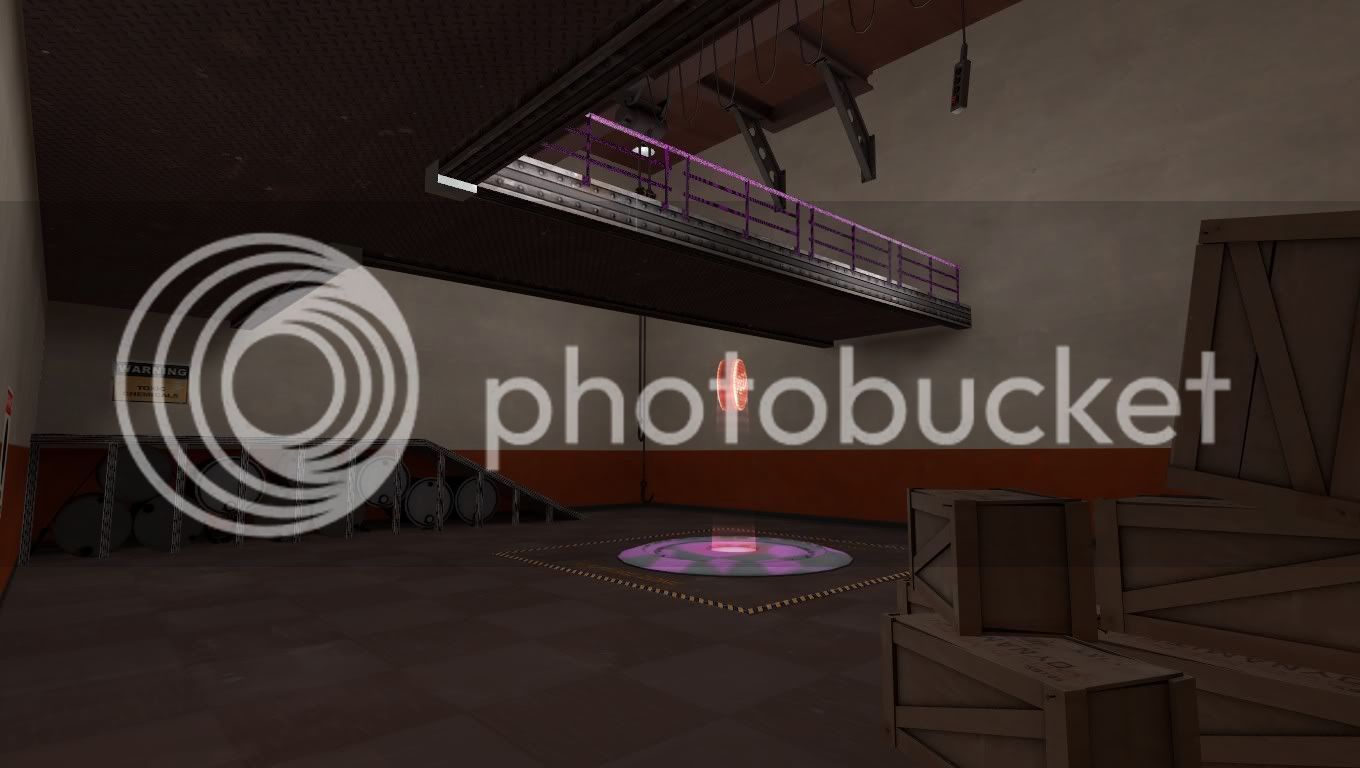
I need to add some more decals, and a few more props into the main respawn area, but aside from that, I can't see any major problems in it, unless you can bring them up for me.

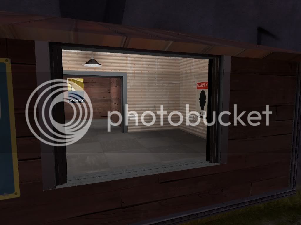
Currently I'm working on capture point 1, if you can add any suggestions as to what I can add to the area which would be between the Blu spawn and first capture point, it would be appreciated. I'm drawing a blank on it.

C+C would be appreciated. Thanks (y)
 
Last edited:

flubber

L4: Comfortable Member
Nov 16, 2007
171
35
You shold put at least on overview, the screenshots aren't very clear to see the map design.
 

Shaar

L3: Junior Member<BR>toboruin
Aug 7, 2008
231
206
I'm working on the map section by section. building up one section to completion, then moving onto the next section, instead of having to do everything in large chunks.

I created this so I could get some C+C on the blue spawn before I start any major work on the next area.
 

Ezekel

L11: Posh Member
Dec 16, 2008
818
245
for future reference: it's generally easier to build the map 1st and then detail it bit by bit afterwards. this lets you focus on gameplay/layout/balance and detailing seperately.
it also means that when building the map and working on the balance, the compile teams remain as short as possible.

regarding your pics:
the rocks in the 1st pic are very shiny... almost makes them look like fake rocks. similarly, they appear to be growing out of the the structural supports, rather than being supported by them.
in the 4th pic the rocks actually look more like overfilled binbags. again they look like they are growing out of the artifical structure around them, rather than being supported by it.

in the 2ndlast pic, there's a gap between the 2 walls, on the left of the sat-dish.
it also looks very dark, i can only barely make out what the darker walls are textured with.

for a fairly forested map, there's a distinct lack of trees.

overall, i suppose the spawn room(s) itself look fine, but i have no idea of the layout of the spawn room, as you haven't taken any screens where you're standing in one corner of the room, and looking out across to the far corner, nor have you given any overhead shots.

finally: the sun/ambient colours seem a little iffy to me, unless you're trying for a sunset type time, i'd say you've put too much red into it. although red can make the map feel warm and comfortable to look at, if you overdo it you got more of a "lackluster" effect - i.e. it feels like the photons/light itself is low on energy, and has a draining effect on a person's attentiveness/interest. this is accentuated in this particular case, as the alpine theme is more vibrant than the dustbowl/desert/other themes that valve have produced.
when i look at the final pic, i don't see vibrant/alive, i see tired and old instead.
so make the sunlight a tad whiter, and perhaps even a lil brighter too.
 

Ida

deer
aa
Jan 6, 2008
2,289
1,372
Yay, attack/defend Control Points. :D

It looks very nice, although that rockwall in the first image looks like frozen poop. Or, to say it in a nicer way, it looks very shiny and bumpy. You might want to use something a bit more flat- and simple-looking, like Valve's rockwalls.
 

Sgt Frag

L14: Epic Member
May 20, 2008
1,443
710
I agree, the rocks look very odd. Plus all the metal tex around them is the vent texture, looks a little weird used as is but more importantly it's a VERY specular material, that whole room is gonna be VERY shiny, I don't know if you want that.

Then there is the wood window trim around the spytech computer room. You should use metal there.

The dam face looks pretty cool. Overall I think the biggext thing is lack of details. You said you need some decals and a few more props. I'd say you need decals and ALOT more props. (vents, wires, pipes) there are tons to use.
DL the ABS_props library (there's a sticky at top of mapping discussion thread). You gotta have it, open it up and you can see all the props for TF2 and just copy/paste them into your map. It's preobably saved me hours on one arena map so far not having to search for 'chimney, stairs, door....'.
Boojum did us all a great favor with that one.
 

Shaar

L3: Junior Member<BR>toboruin
Aug 7, 2008
231
206
Okay, thanks guys.

I'm in the process of adding more props to the spawn room. I've removed those rocks, seeing as most people saw them as an issue, as did I, when I first used the prop, I didn't expect them to be that glossy.

spawnoverview-hammer-1.jpg


That's an overview of the blue spawn for those enquiring. sorry I forgot to add one in earlier :(
 

Shaar

L3: Junior Member<BR>toboruin
Aug 7, 2008
231
206
Building which houses capture point #1
map0015.jpg

3rd exit to blue spawn
map0014.jpg

view looking from the right
map0013.jpg

redesigned 'vista' (Lacking cubemaps)
map0011.jpg

view from left towards blu base
map0009.jpg


I hope that's improved the area
 

Ezekel

L11: Posh Member
Dec 16, 2008
818
245
overall i'd say it's improved. one thing that strikes me is that the top of the dam/curvedwall(is it a dam?) should have some kind of lip/parapet (i.e. an 8 unit tall different coloured ridge on top of it that sticks out about 2-4 units from the wall itself)
 

Shaar

L3: Junior Member<BR>toboruin
Aug 7, 2008
231
206
map0016.jpg

map0017.jpg

map0018.jpg

map0019.jpg

map0020.jpg

map0021.jpg


Just a small update, on my behalf, before I go away for the week. So far, I have all capture point 1, and the blue spawn working. I intend, when I get back to solve any issues which people have when I get back, and then proceed to work on the final part of stage one (E.g. capture point 2, and red spawn).

Then I'll possibly release an alpha version of it, so I can get C+C on the whole of stage 1, improve it more so, then move onto stage two.

Plus, just to be 100% sure, cubemaps should only be run when you've got the final version of the game ready right? I remember reading somewhere, that if you continuously re-run them, it makes the file size huge