You are using an out of date browser. It may not display this or other websites correctly.
You should upgrade or use an alternative browser.
You should upgrade or use an alternative browser.
-Added more portals to the underworld, and added more times that they spawn
-Fixed cart floating
-Fixed improper signage
-Fixed displacement seam
-Fixed tilted spec cam
-Fixed grass sprites showing in shack near Blu Spawn
-Removed Gargoyle spawns
-Minor visual tweaks
-Minor optimization tweaks
-Fixed zfighting
Read the rest of this update entry...
-Fixed cart floating
-Fixed improper signage
-Fixed displacement seam
-Fixed tilted spec cam
-Fixed grass sprites showing in shack near Blu Spawn
-Removed Gargoyle spawns
-Minor visual tweaks
-Minor optimization tweaks
-Fixed zfighting
Read the rest of this update entry...
To expand on what I was saying during the test, here's why I think you need another pass at the detailing for readability. Apologies if you already know some of this, I just like to cover all my bases.
1) Most of the map feels samey and areas aren't very distinct. This is the core issue I take with the artpass right now and the rest of my points are basically just expanding on that point.
2) I don't think the lighting does a great job of directing the player's attention to important gameplay elements. I often found myself missing doorways or not intuitively understanding the layout, and I think the lighting is to blame for a lot of that. There are cases where its fine, but on a nighttime map where visibility is a little more difficult, the lighting needs to be good.
3) Without the sun, you lose a lot of good detailing as well as wayfinding cues. The angle of the sun casts unique shadows (which looks nice and creates unique lighting automatically) and also reminds the player what direction they are facing (good for wayfinding / sense of direction). In addition, the whole feel of sunlight/ambient is unique and automatically creates contrast with indoors areas. Without the sun, you need to somehow make up for what you're missing, and currently most of the lighting in the map is pure white, which is pretty much worst-case scenario. (Where there is color, it looks nice!) Try using subtle yellow light to distinguish indoors from outdoors, and take advantage of angled spotlights to create more interesting shadows. Getting this right is tricky, since you want visible shadow lines while also keeping the shadows bright enough to keep players visible, but it can add a ton when done well.
4) Most things need to be a bit brighter. Most of the map is lit enough for players to be visible, but the relatively low and consistent lighting level makes everything kinda dark and grey. The grey dirt and rocks compound the issue. Brighter lighting means more contrast between textures, which I think you need in a map with no sun. I would maybe consider using a dirt/rock texture with more color, but I'm not sure.
5) I can tell you've put thought into the progression of detailing through the map, but I think you can go further. Whatever progression you do currently have is unfortunately a bit hampered by all of my previous points about lighting.
6) Pretty much every level boundary in the map is a tall wall. I know this isn't an appealing option because you're already up against framerate issues, but I would recommend (where possible) to replace some of the level boundaries with chain link fences. Open area vs. building is a very strong contrast and helps a ton with wayfinding / visual importance. When everything is a solid wall, you aren't always sure which buildings have gameplay and which ones are just for detail. Even Foundry and Mannhattan, two of the most industrial maps in the game, use fences for this purpose.
Hope that helps. Hit me up here or on Discord if you have questions.
Attempts at fixing optimization near Blus first spawn
Added skeletons and more portals to the underworld
Using new particle effects and replacing old portal design to be without the caskets
Read the rest of this update entry...
Added skeletons and more portals to the underworld
Using new particle effects and replacing old portal design to be without the caskets
Read the rest of this update entry...
TheMightyGerbil
L2: Junior Member
- Dec 23, 2012
- 79
- 21
Was running through your map testing it and got caught in the ground here. Looks like a terrain misalignment https://steamcommunity.com/sharedfiles/filedetails/?id=2565515540 . Just a friendly FYI.
-Attempts to fix some flickering buildings near last
-Fix to bad displacement seams
-Fix to teleport trigger for reds 2nd spawn being sent to the incorrect info_destination
-Fix to ldr and hdr
Read the rest of this update entry...
-Fix to bad displacement seams
-Fix to teleport trigger for reds 2nd spawn being sent to the incorrect info_destination
-Fix to ldr and hdr
Read the rest of this update entry...
-changes to prop placement
-minor optimization tweaks
-fix to red spawn door getting players stuck
-tiny changes to reds final spawn
Read the rest of this update entry...
-minor optimization tweaks
-fix to red spawn door getting players stuck
-tiny changes to reds final spawn
Read the rest of this update entry...
Time for some Feedback Yo!
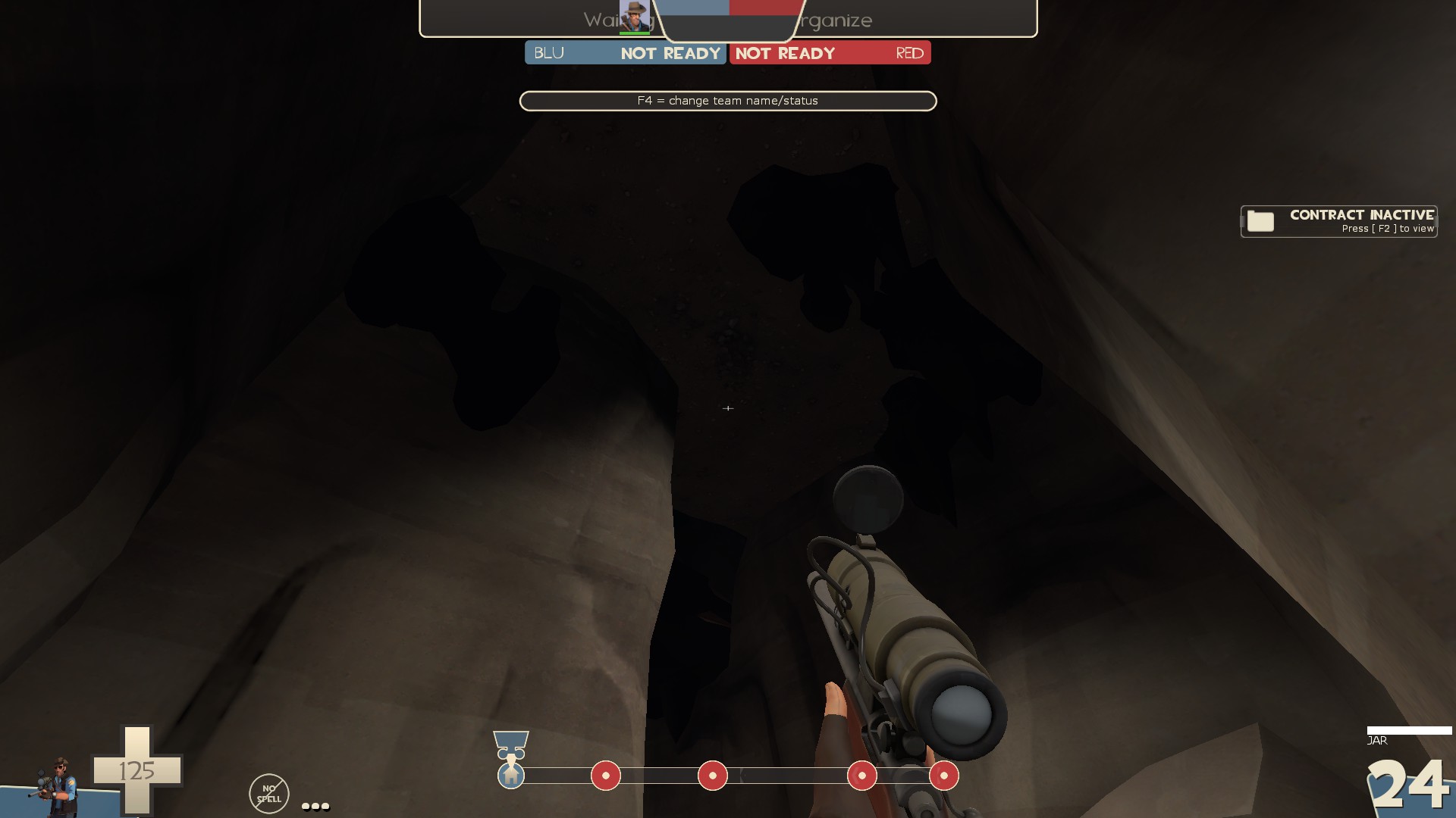
-the stalactite/stalagmite props are super black compared to the stuff around them
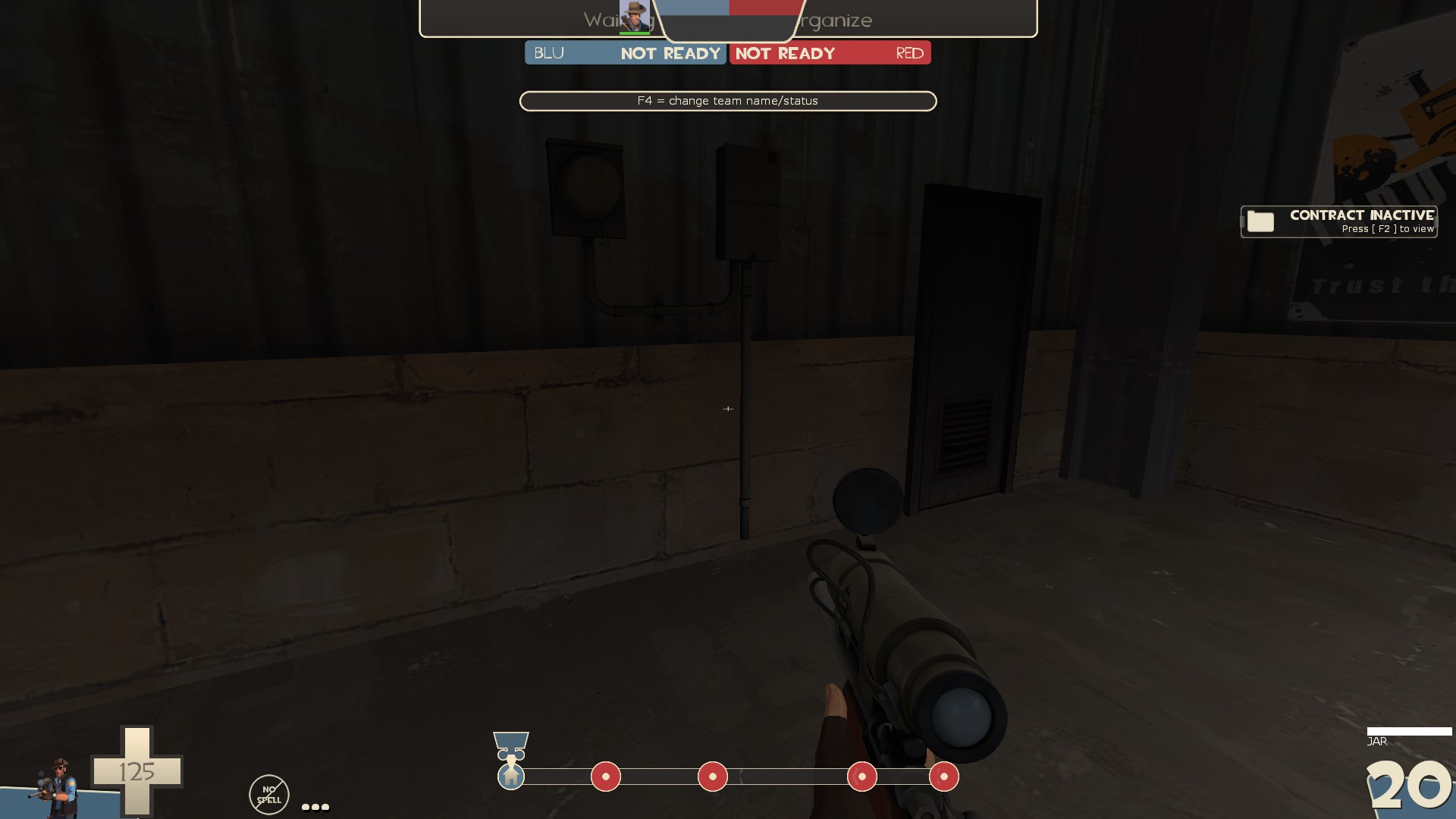
-floating prop, also remove collision for it
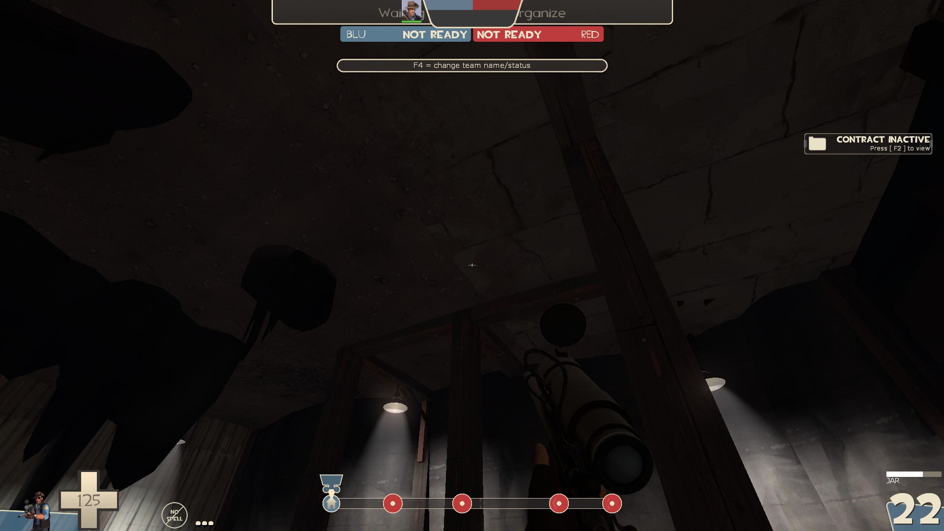
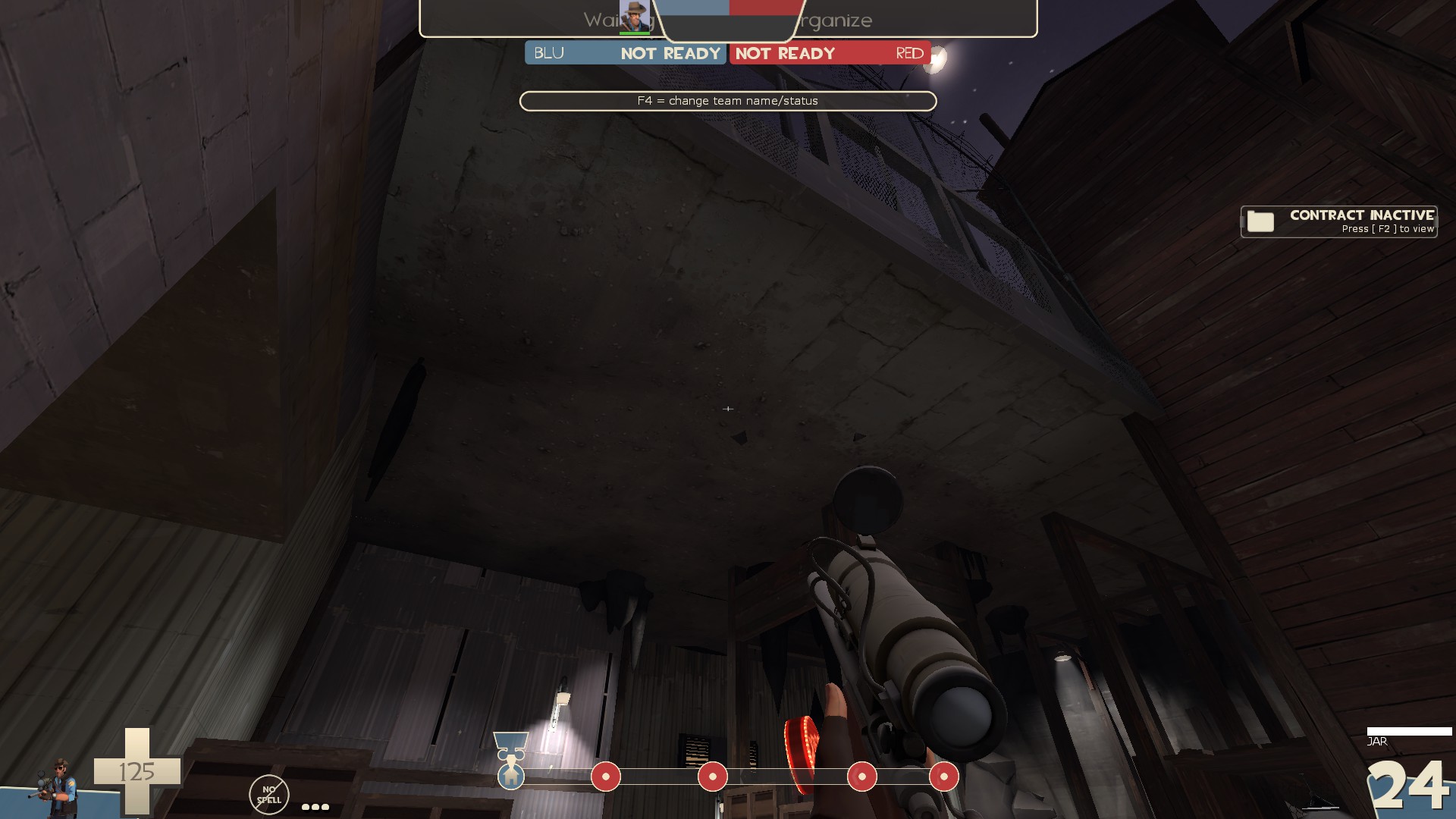
-I really dislike this mix of cave roof and concrete. It doesn't fit together all that well imo and I feel it should be either one or the other. Either cave or not
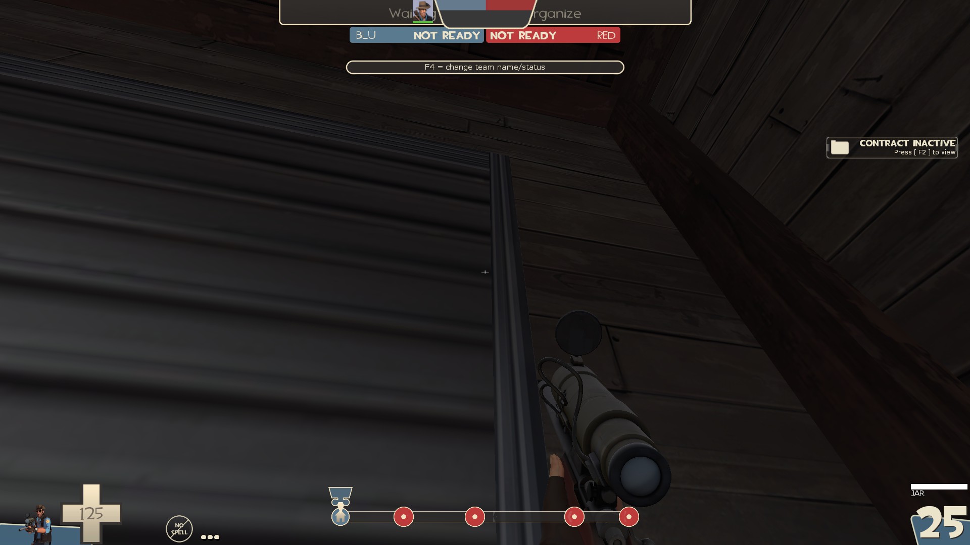
-the floor plate texture on the frame here is an odd choice to me
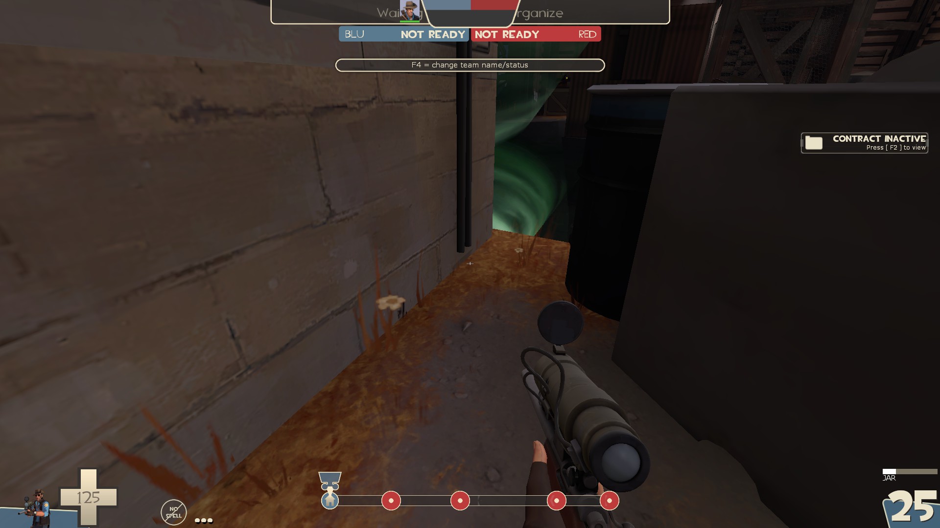
-I really like how you can see to last through here. It's neat.
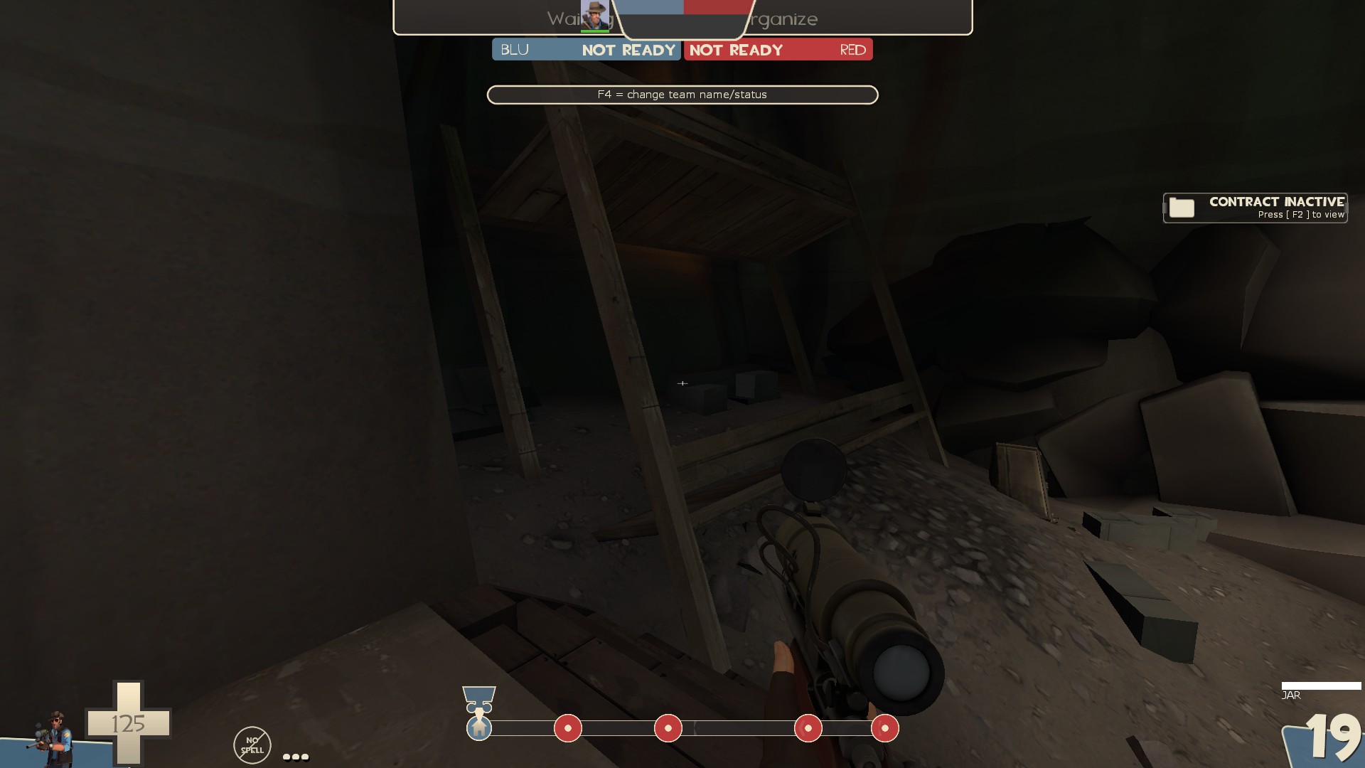
-This thing is big enough it looks like you can go in there except it's all clipped off. I don't think people should be able to get in there so maybe this whole detail area would work better pushed out of bounds
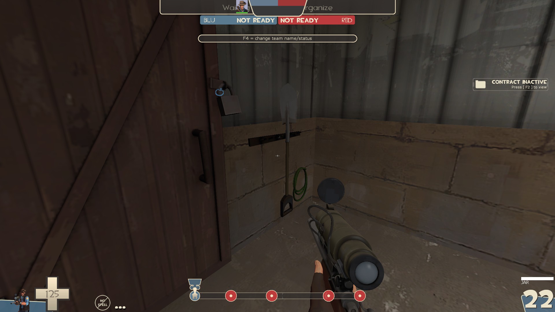
-floatin' props
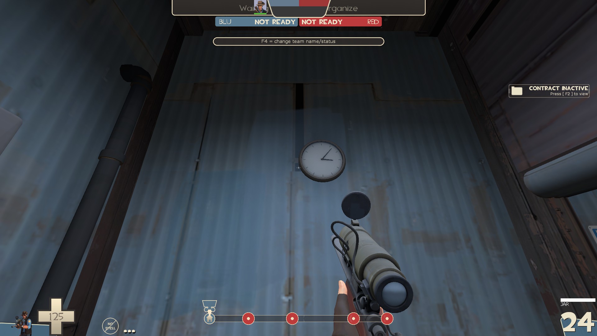
-paint patch over the hole in the texture?
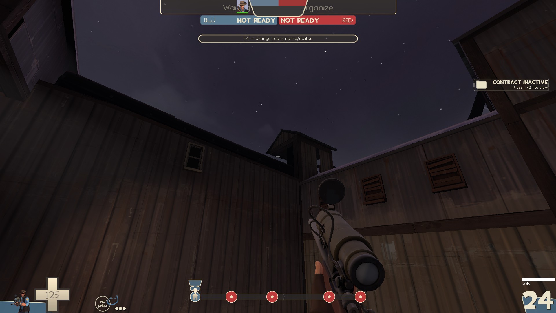
-I don't think this stuff at the top is supposed to look like that
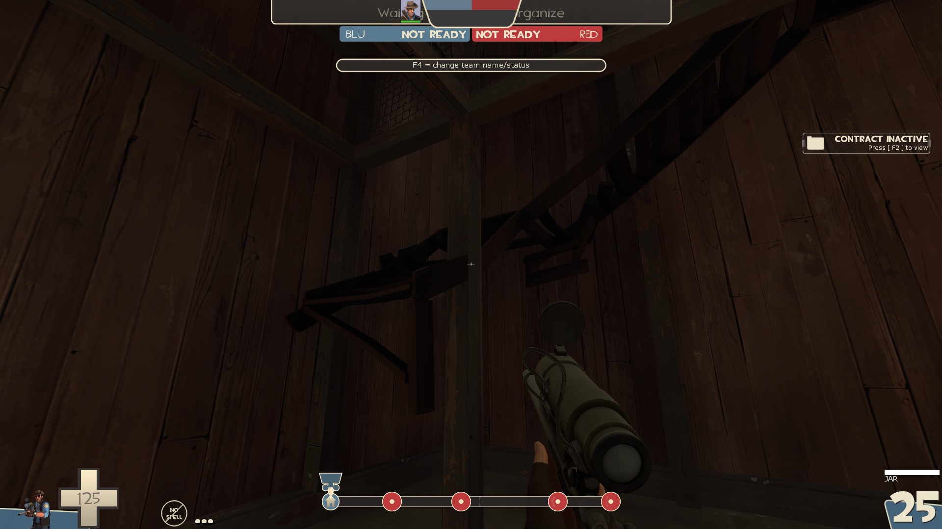
-prop in the brushes
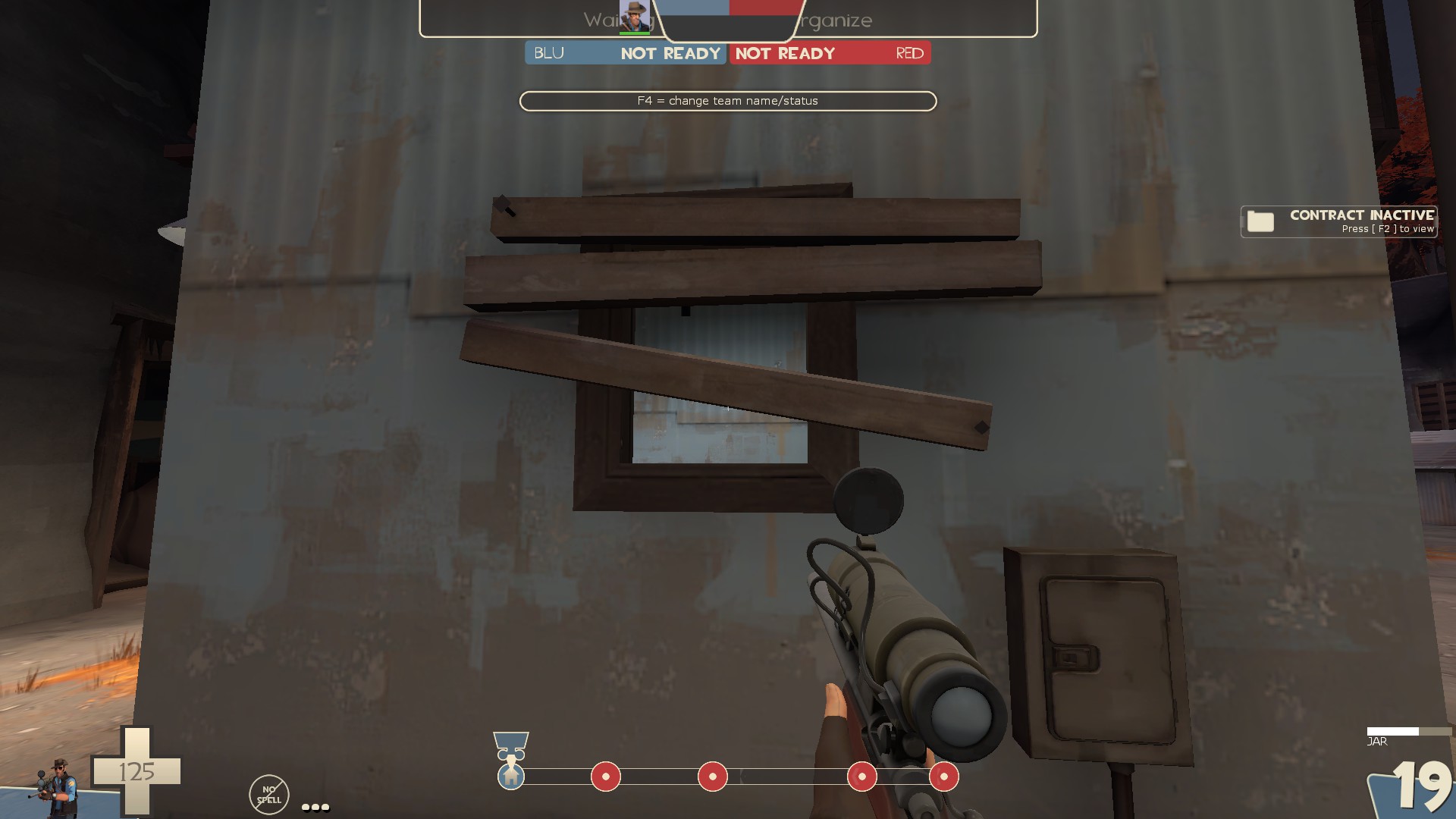
-even though this window is mostly open, you can't shoot through it. Maybe put some chicken wire in it so you can quickly tell it's solid
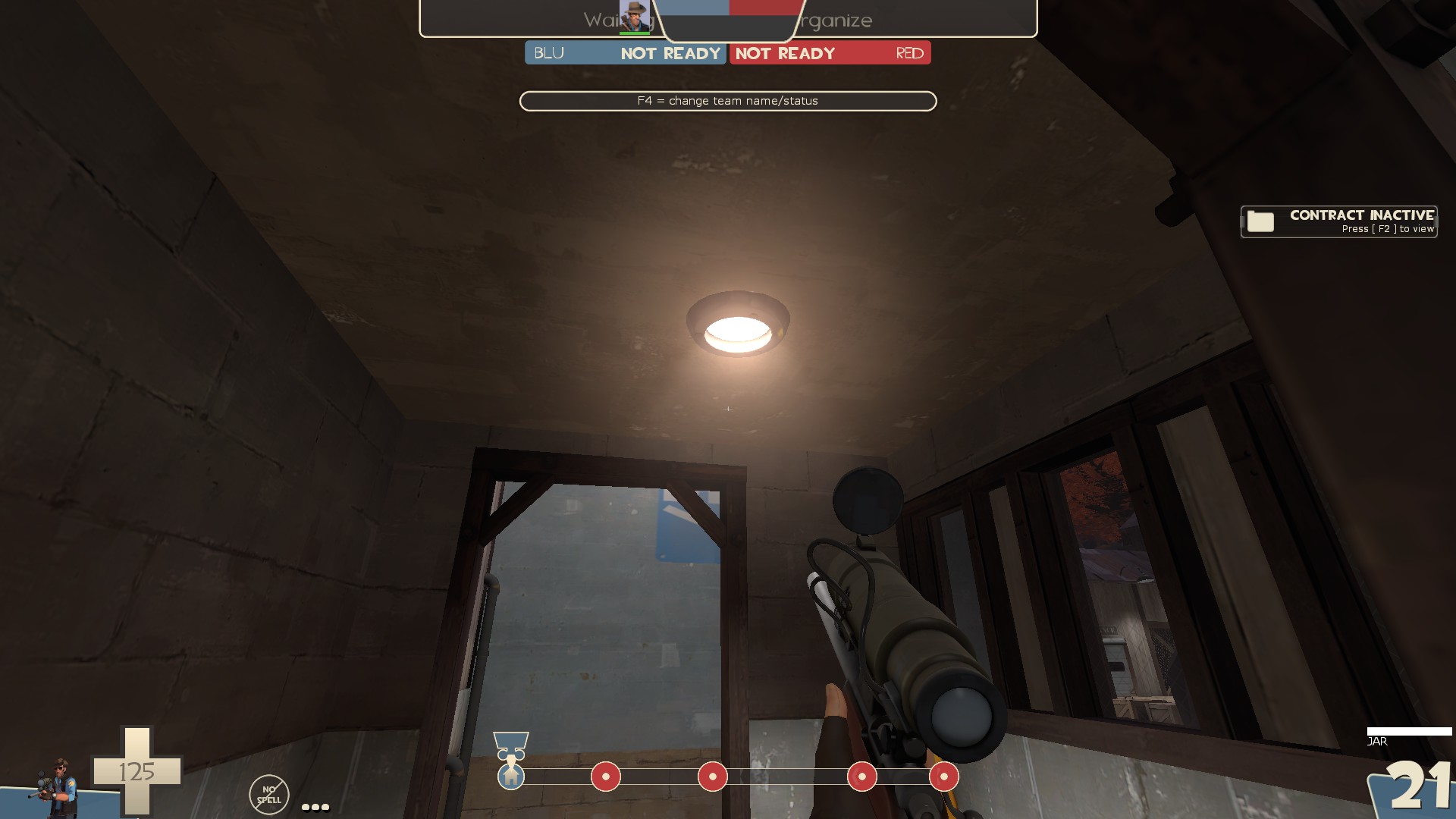
-this light prop doesn't fit the shack theme of this....well...shack
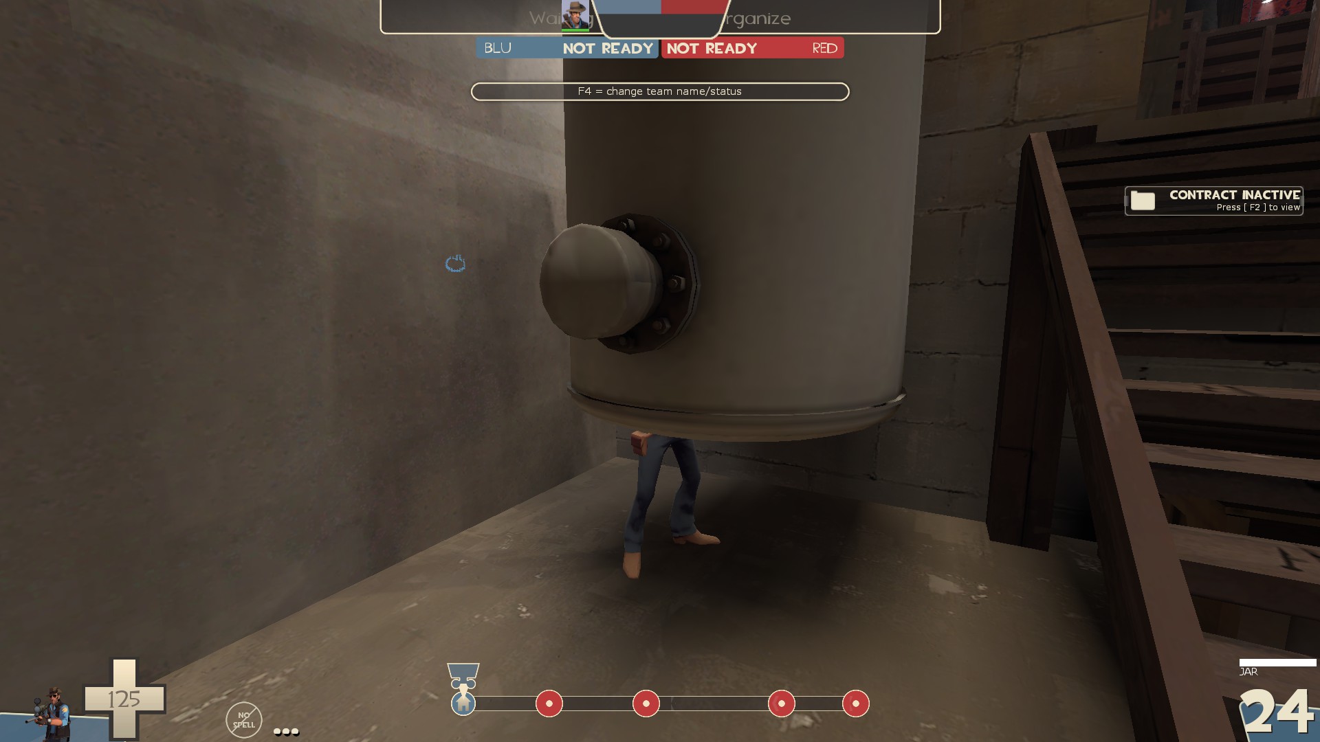
-no collision on this tank prop
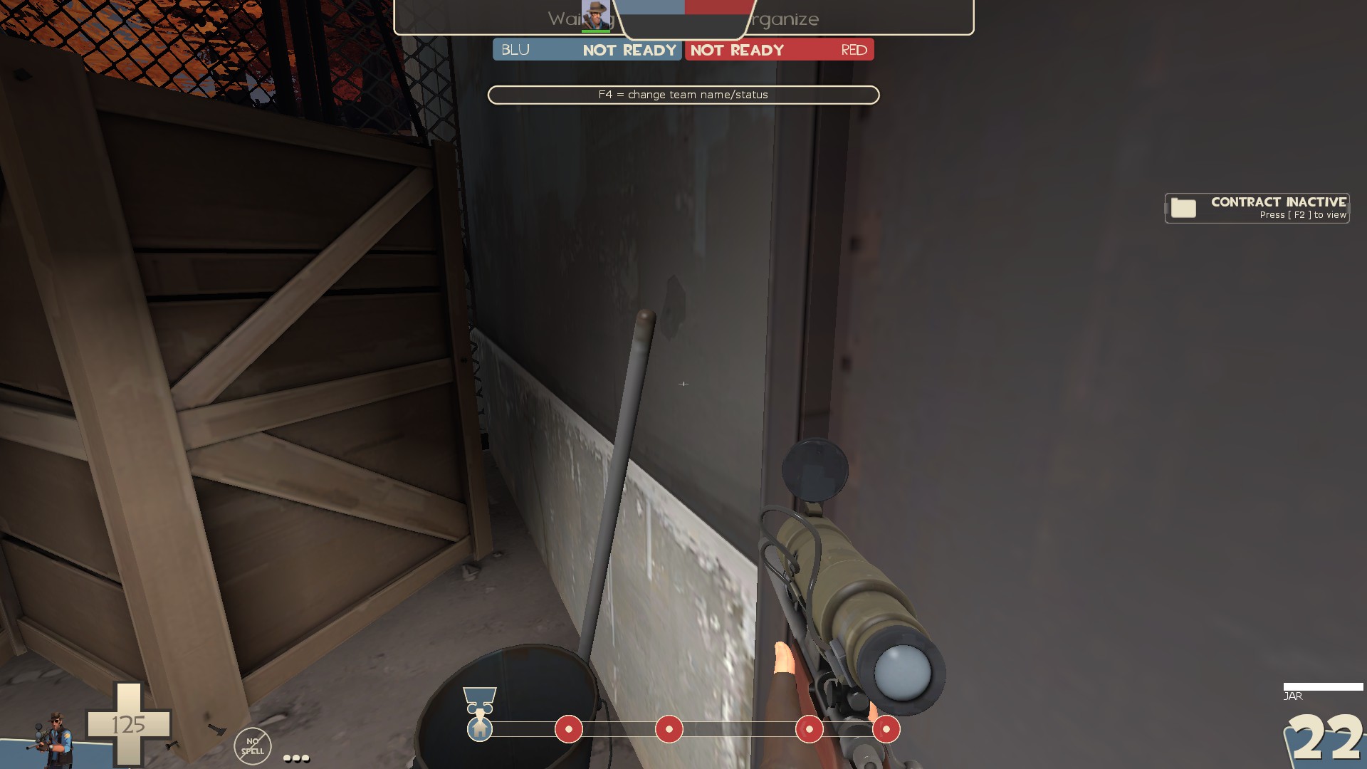
-the mop isn't touching the wall
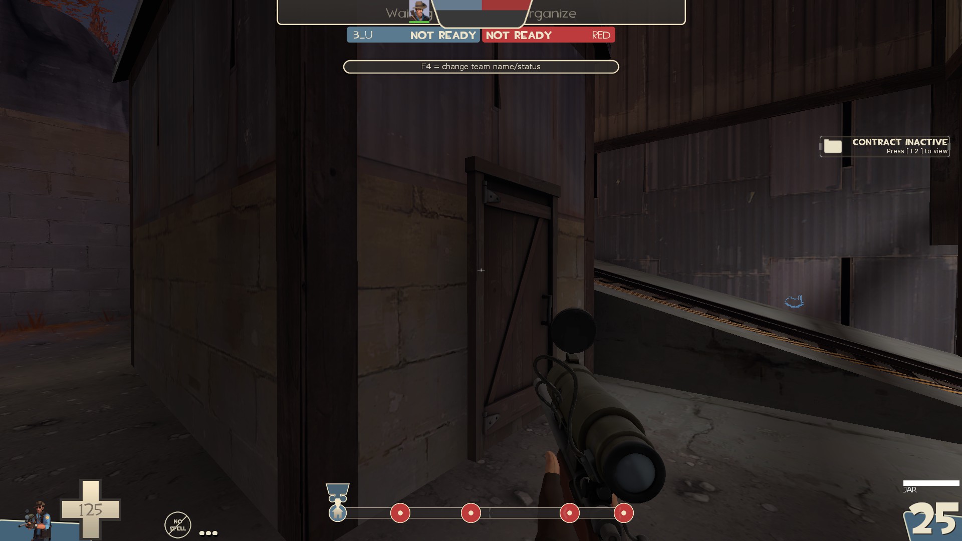
-remove collision
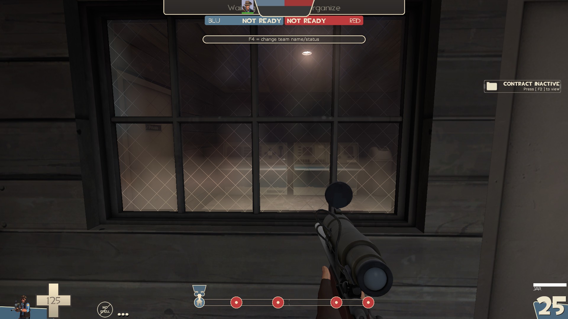
-I think this window is using the wrong cubemap
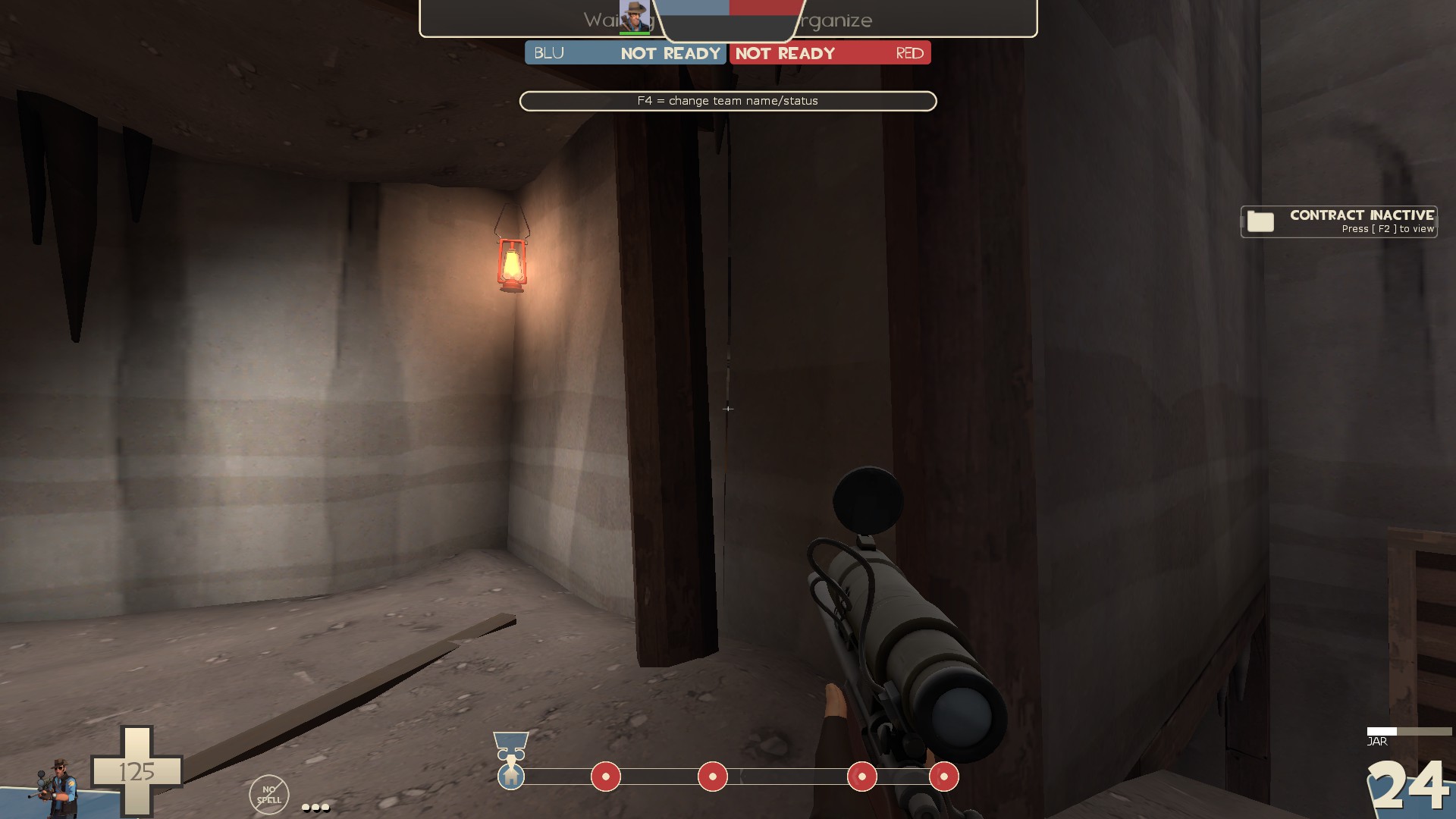
-seam in the displacement
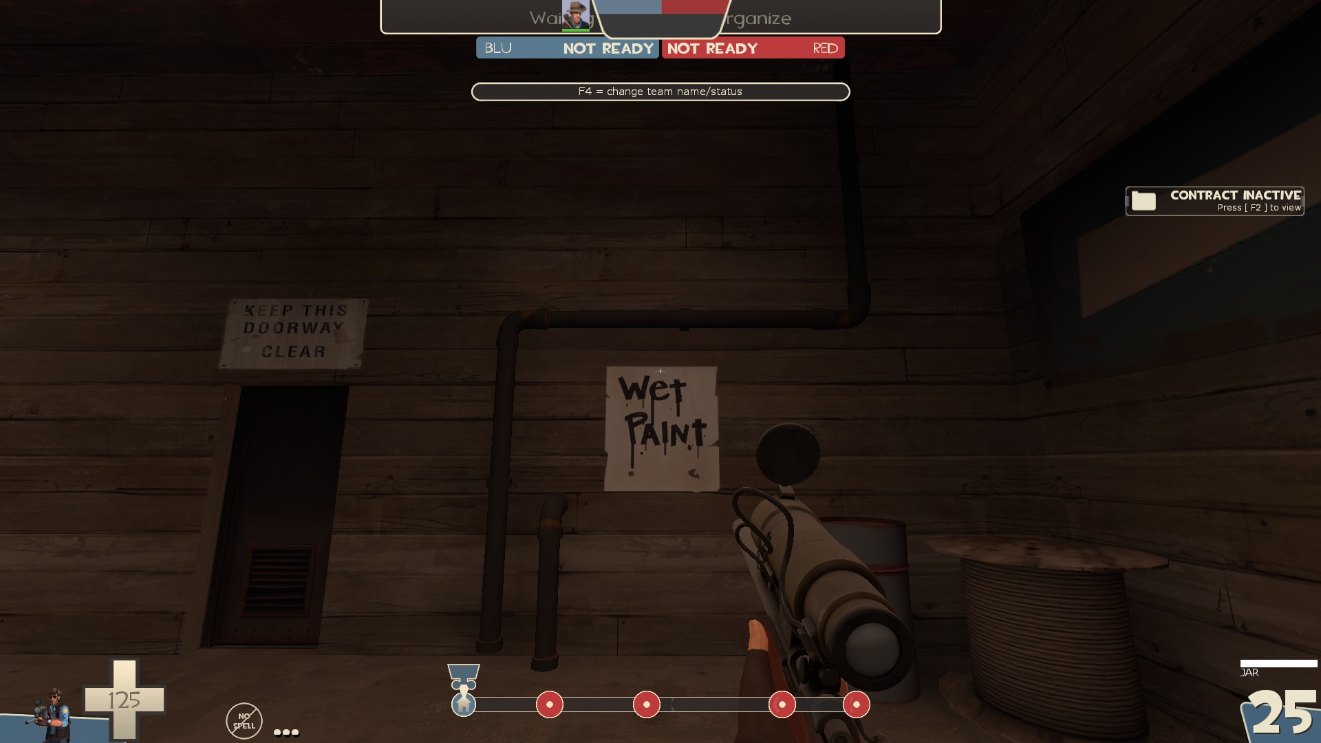
-these pipes lack collision even though other pipes in the map used in a similar way do have collision. It's inconsistent. Also why is there a wet paint sign when there's no paint nearby?
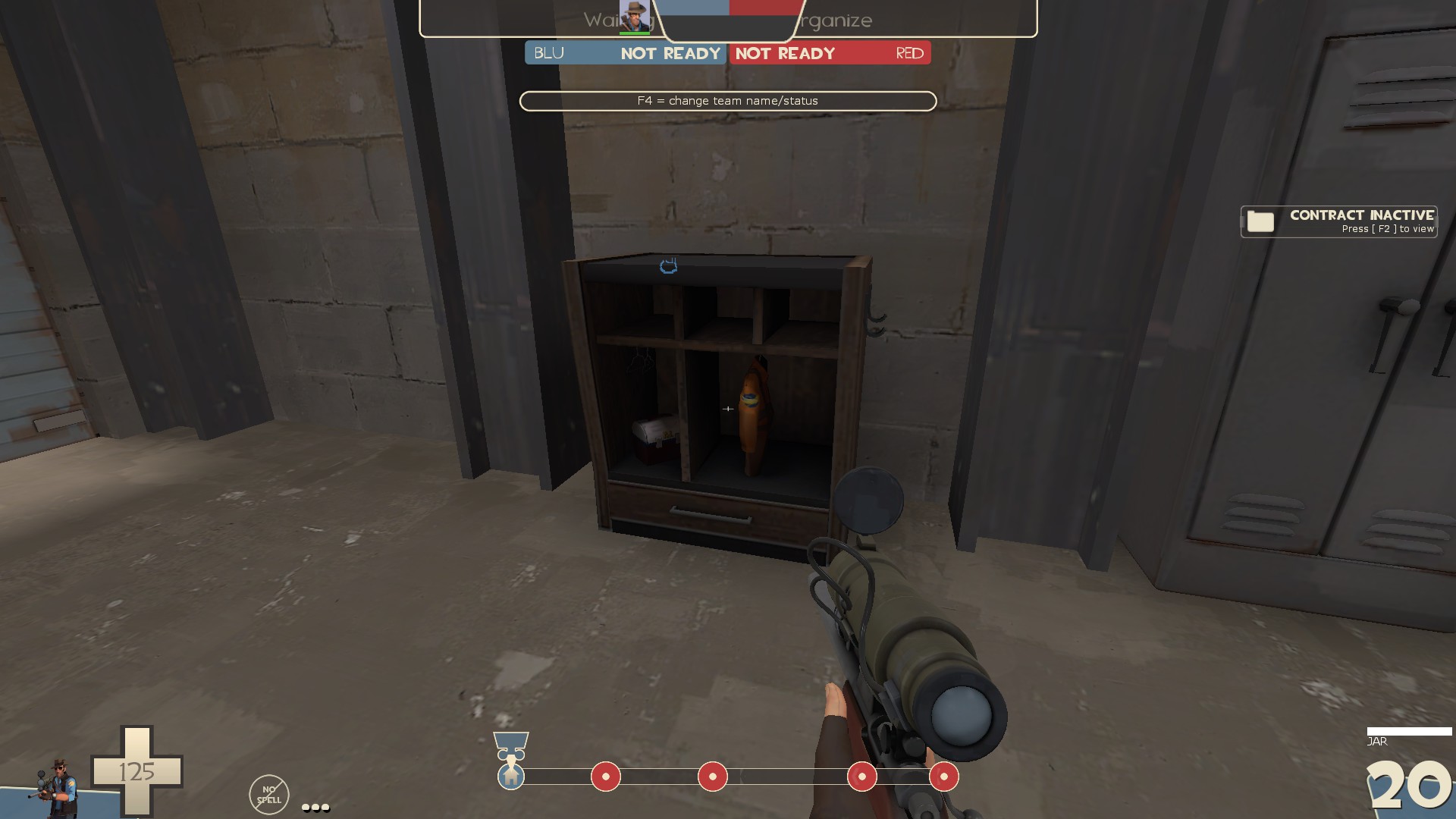
-The monkeynaut locker does not fit the rest of the map
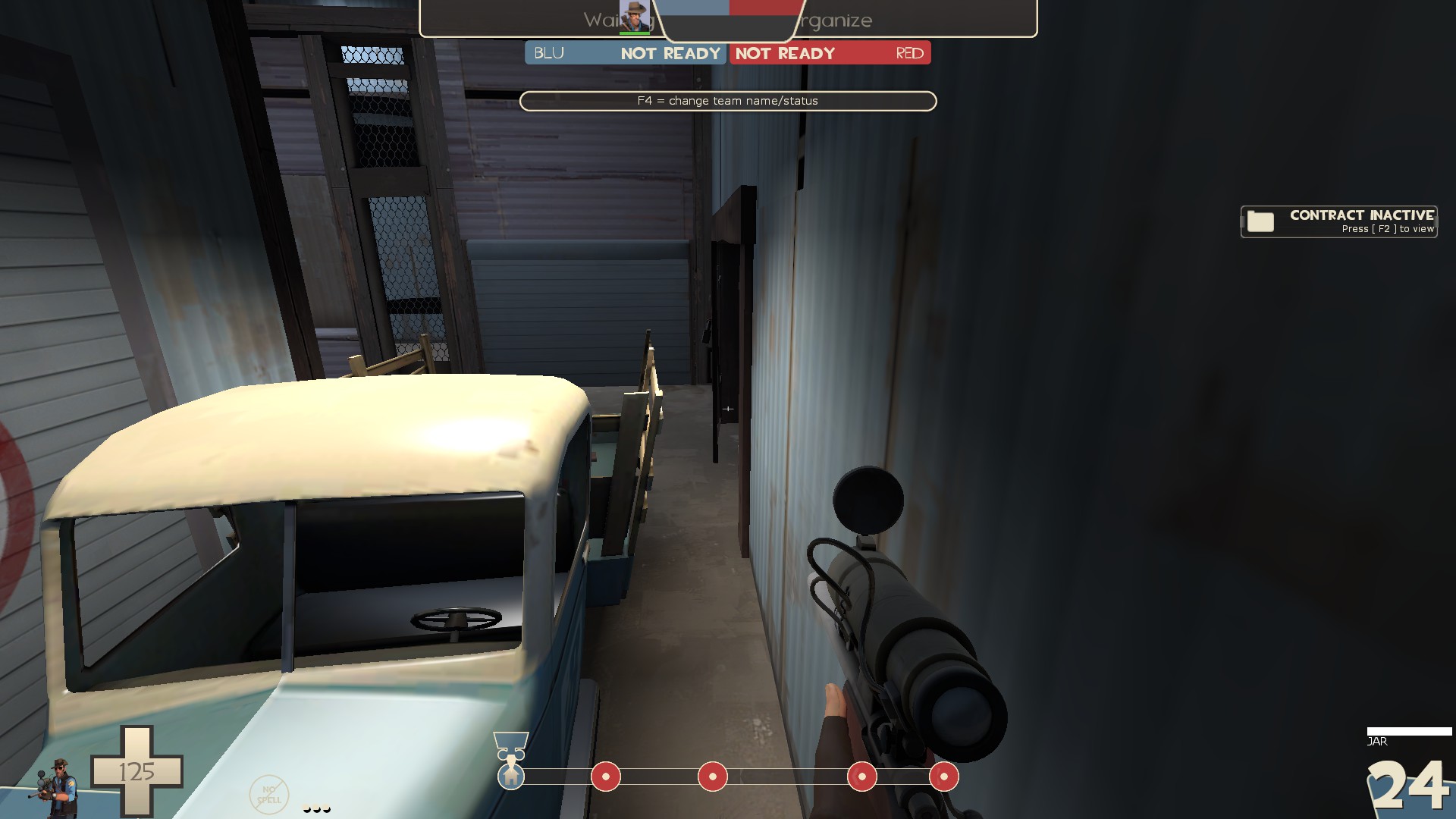
-you can see behind the door prop from here. Maybe just clip off this whole area with the truck
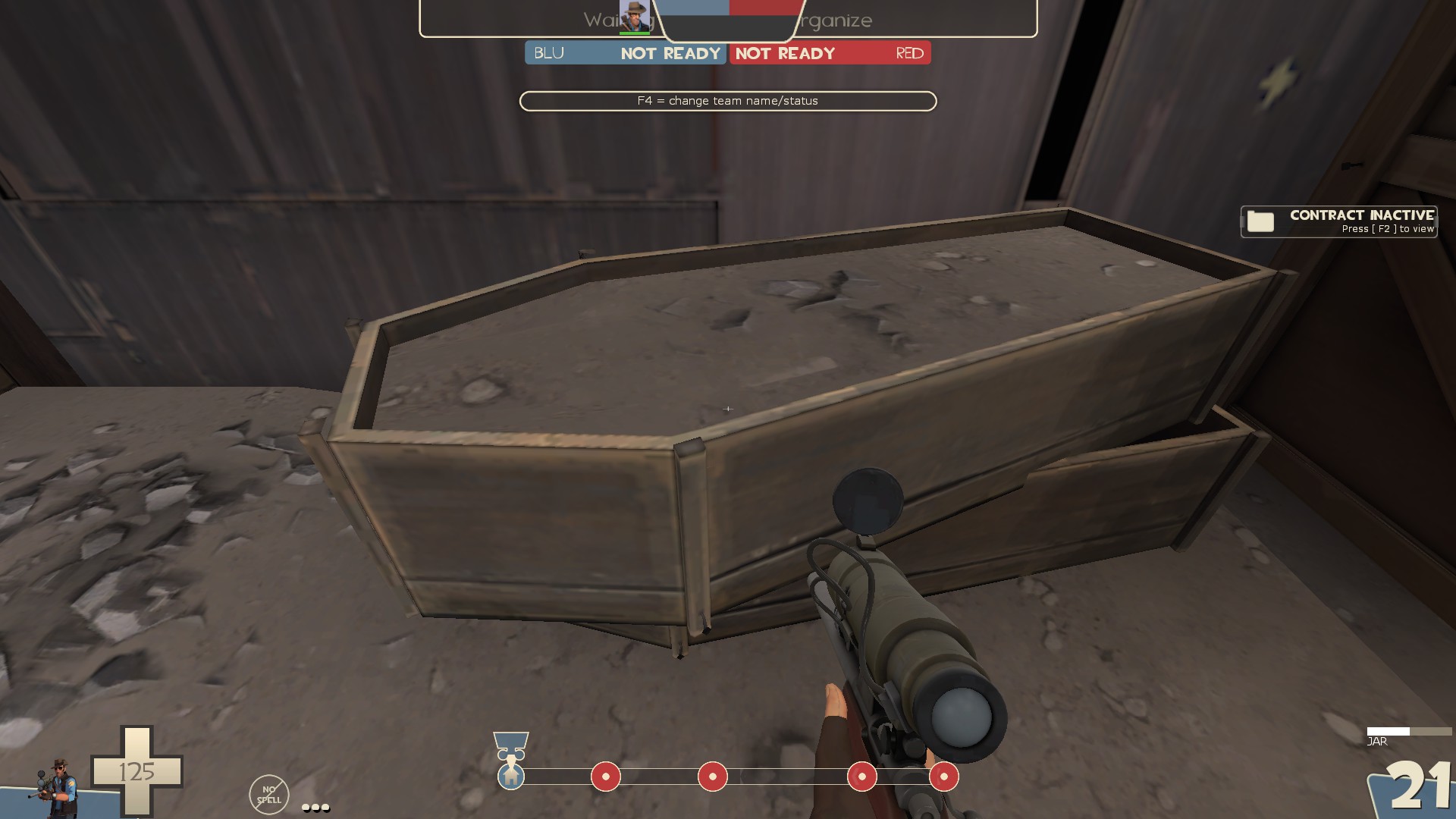
-this might look better as just gravel instead of gravel and dirt. Also make it a displacement so you can give it some curve so it's not as flat
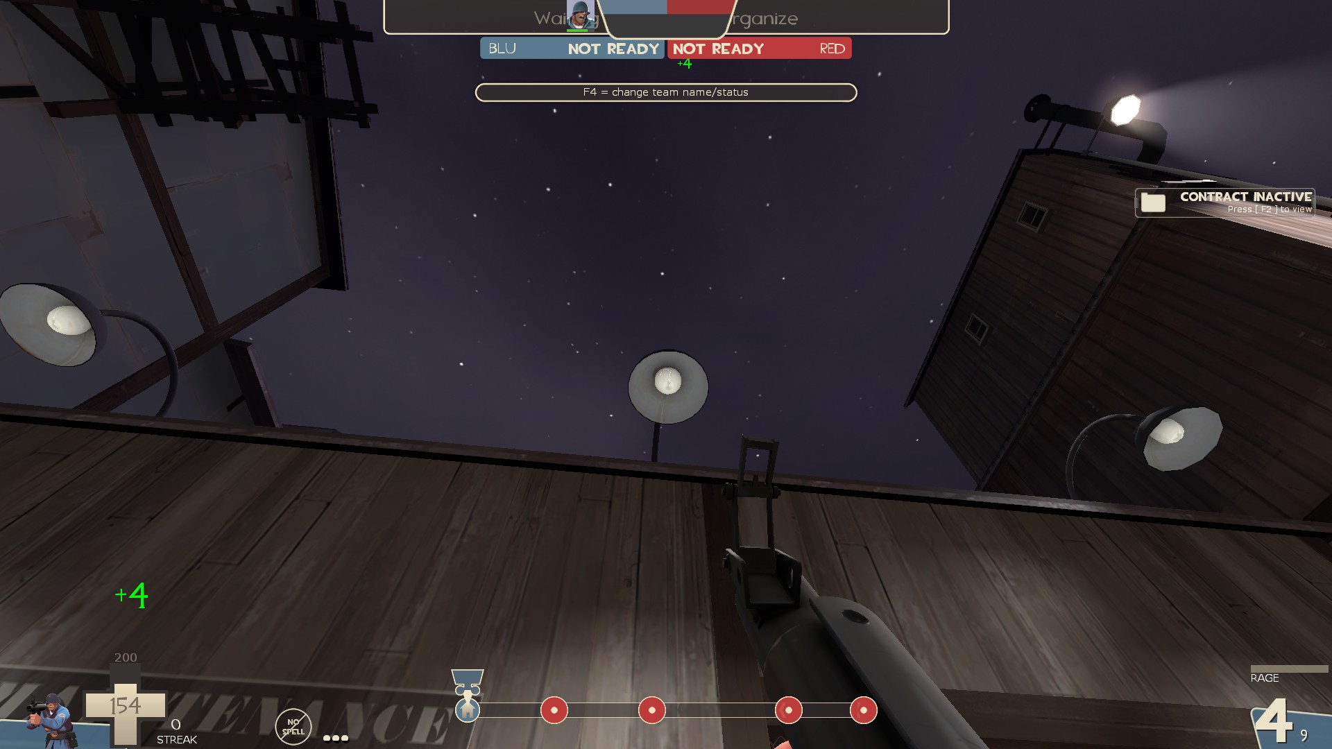
-I can stand on these
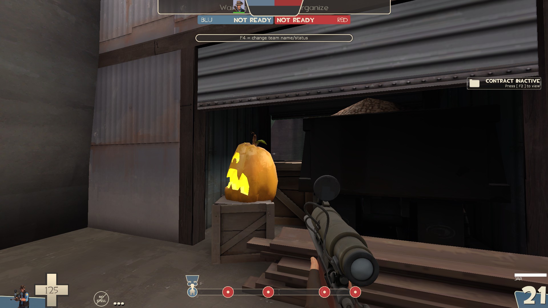
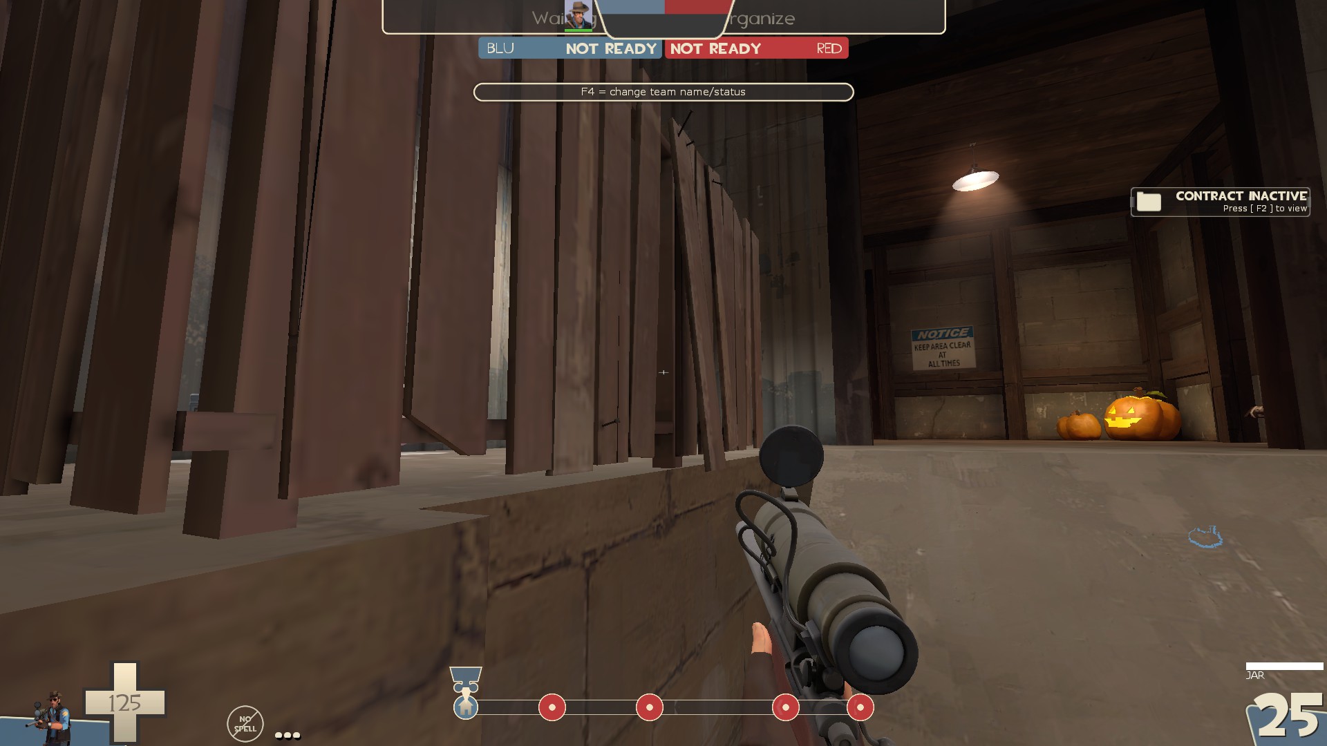
-can get caught on this sticking out board
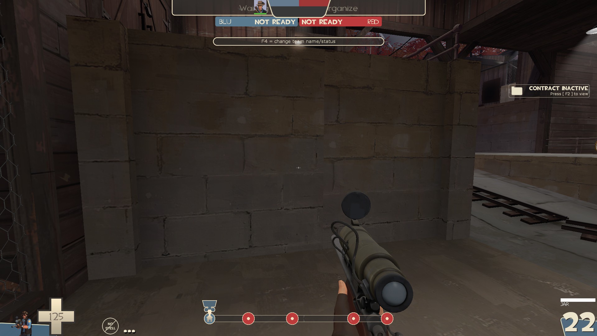
-misaligned texture here, also clip it smooth
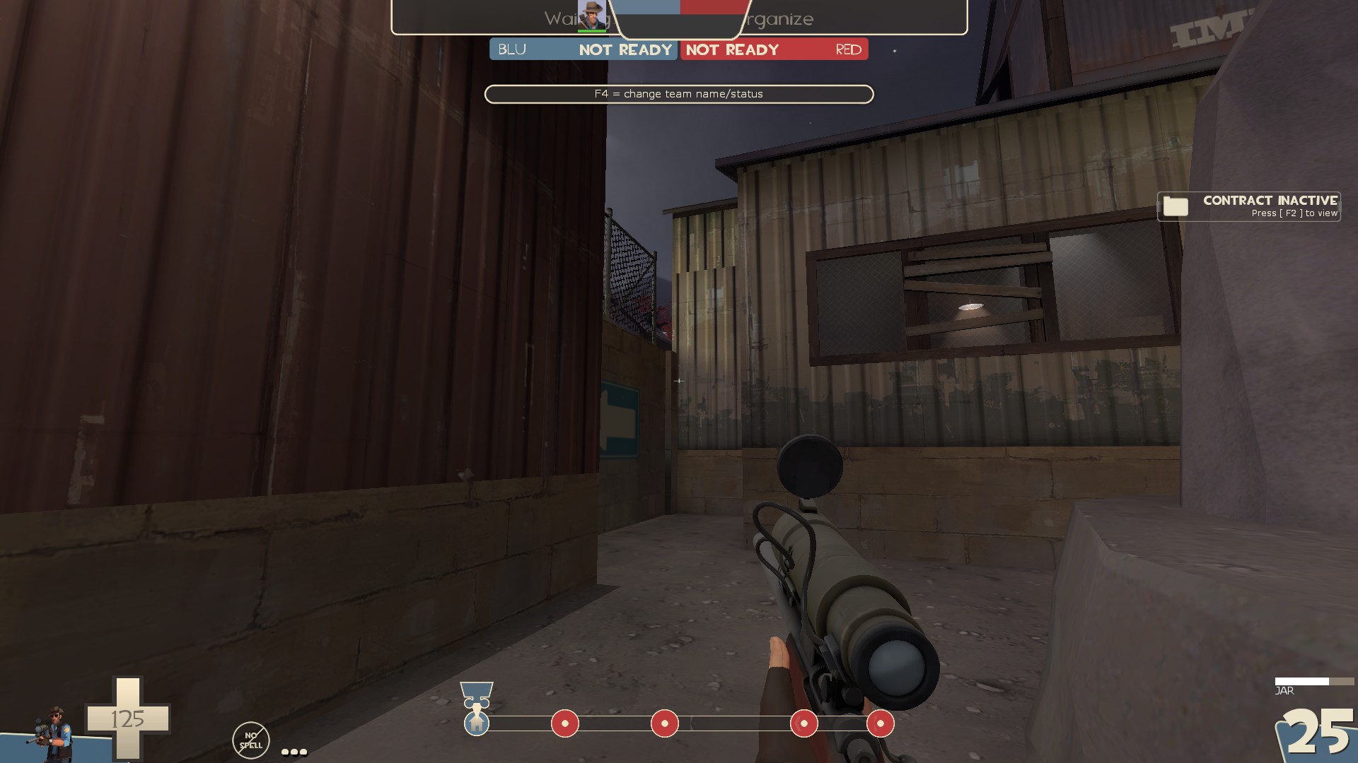
-misaligned texture again. Also I don't really like how thin the space between walls are here. It's awkward.
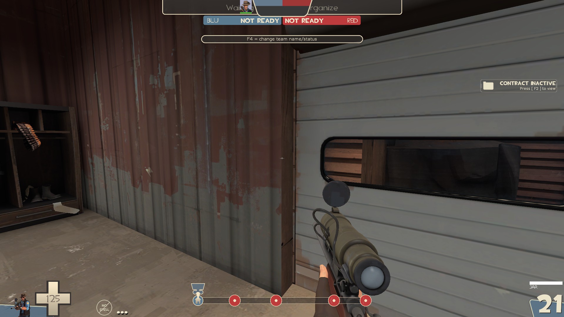
-Use a wooden door frame here instead of having the side of the brush
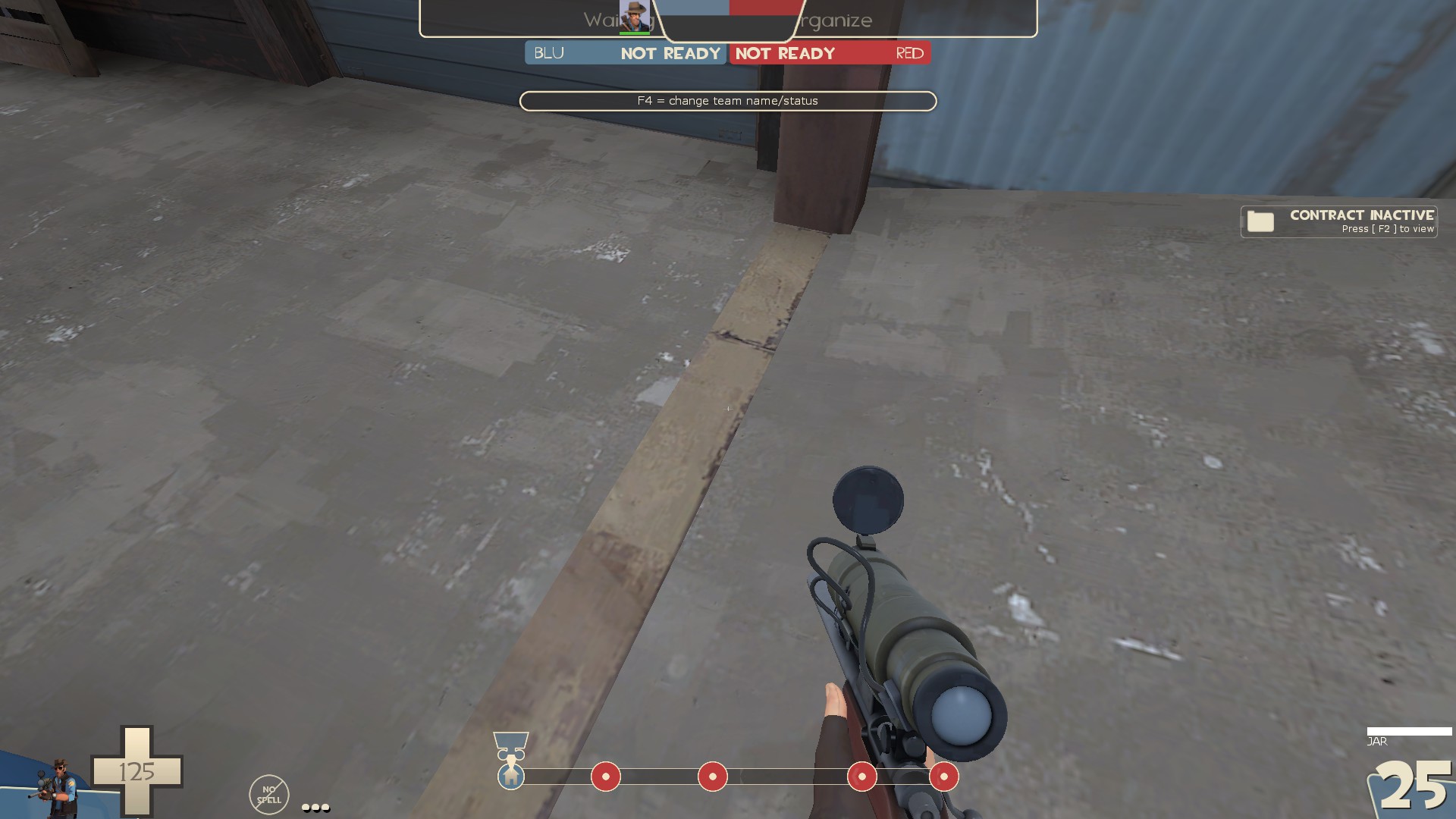
-this break in the texture on the floor here looks a bit odd
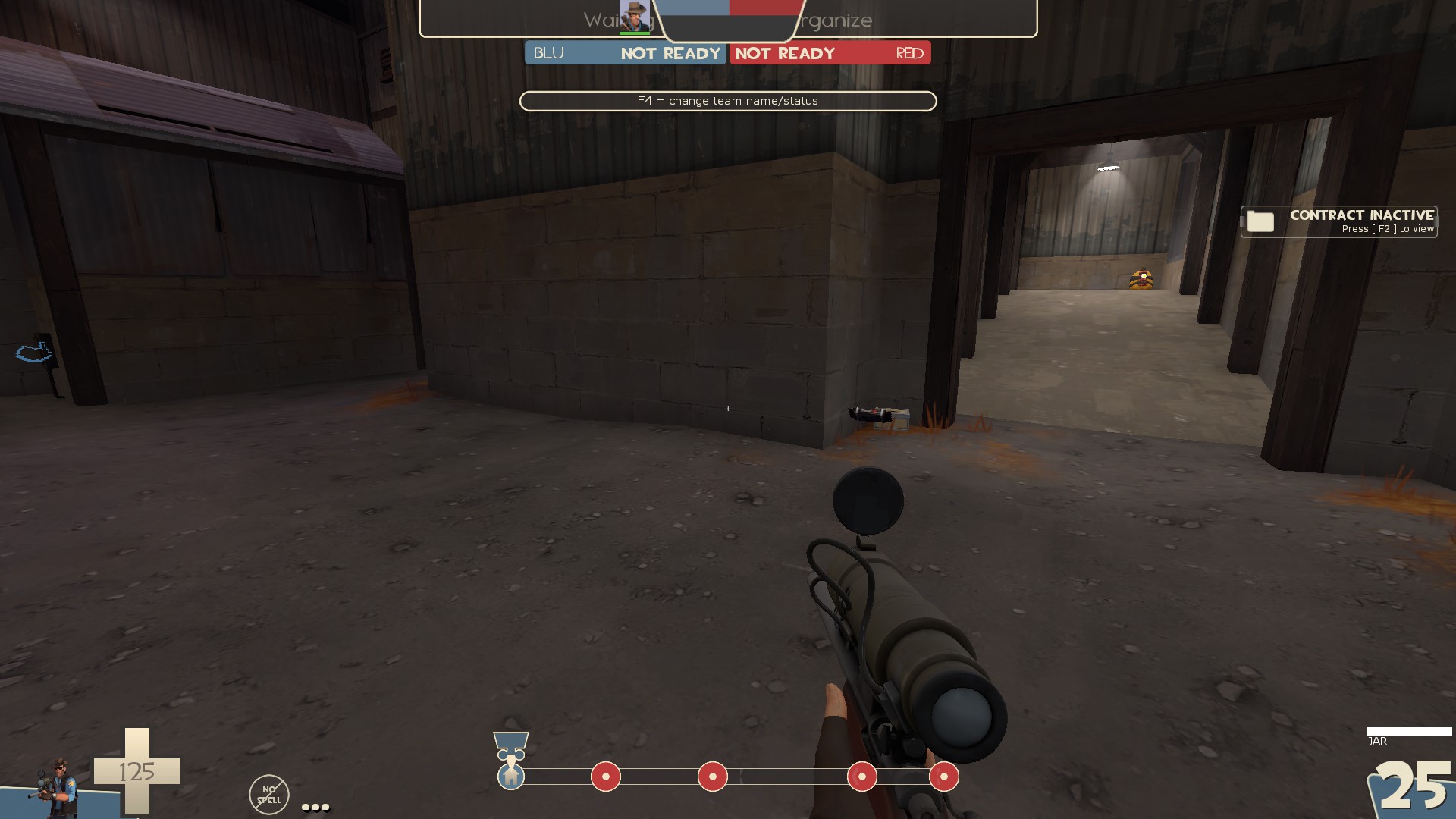
-I'd suggest moving these pickups over to the larger flat wall instead of the weird corner thing
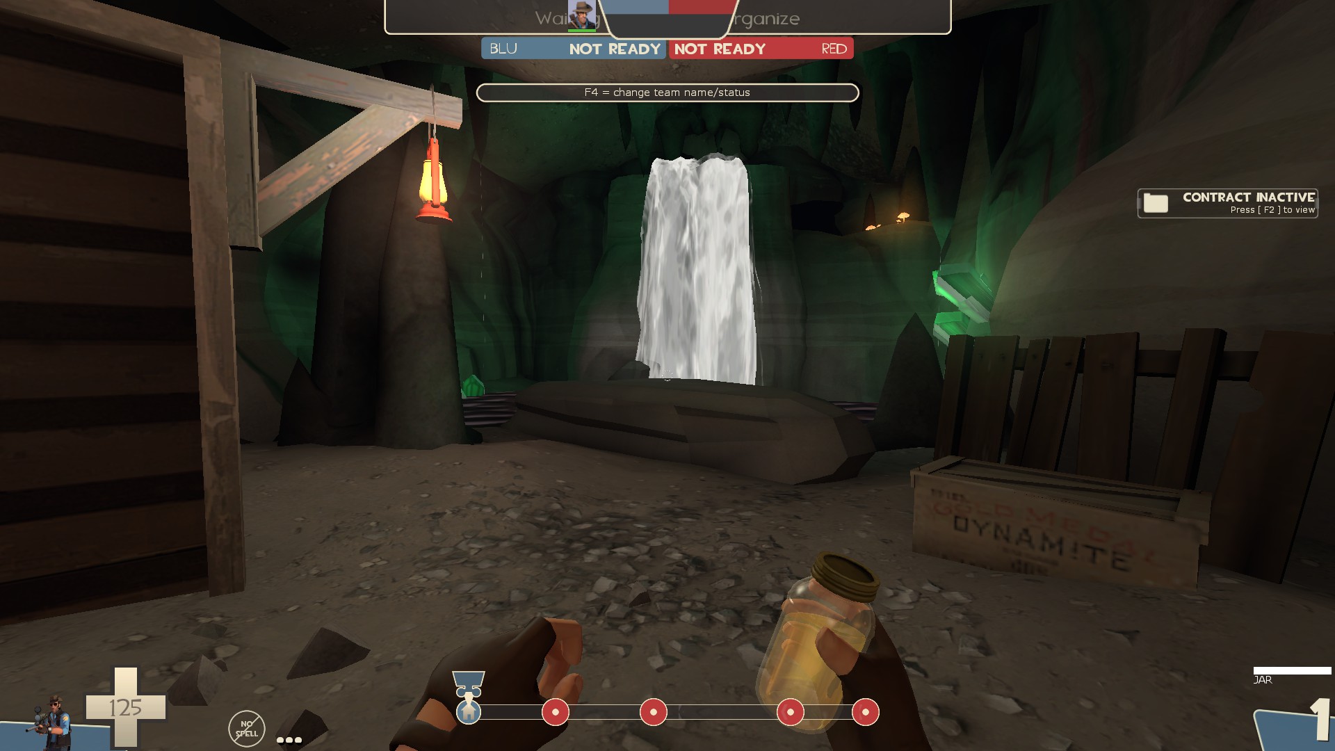
-This looks neat. Seems like I should be able to get closer to the water than the clipping allows
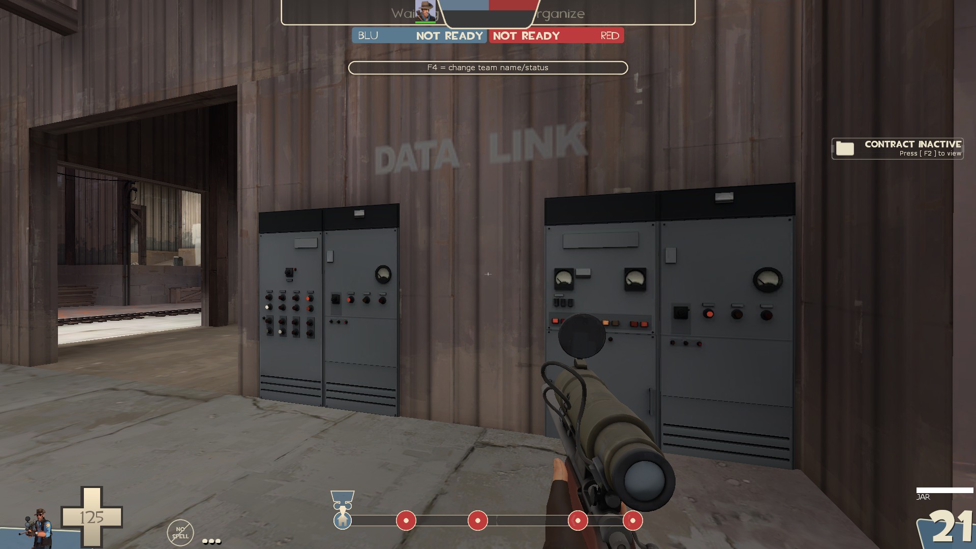
-remove collision on these props
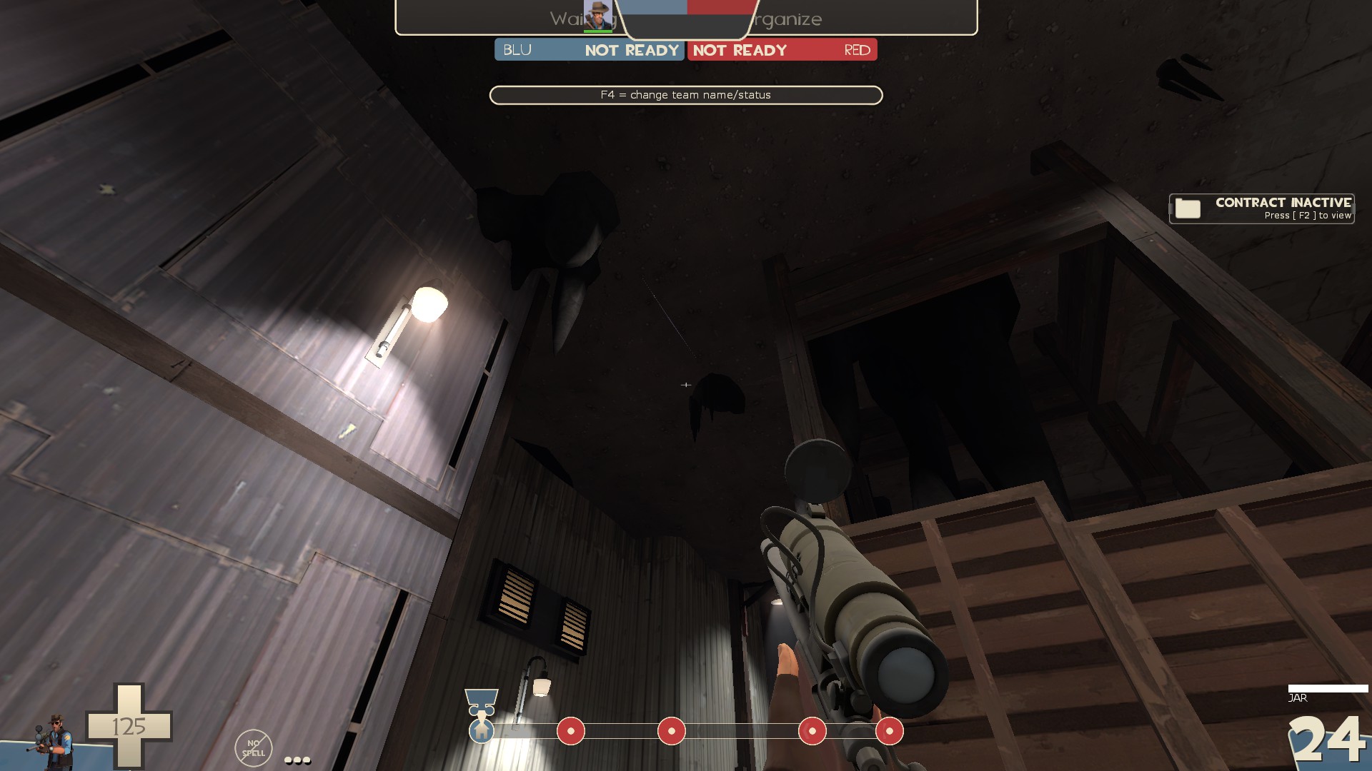
-displacement seam
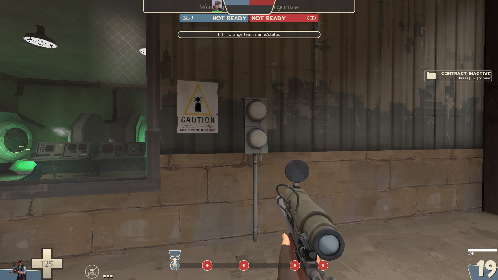
-remove collision of this prop
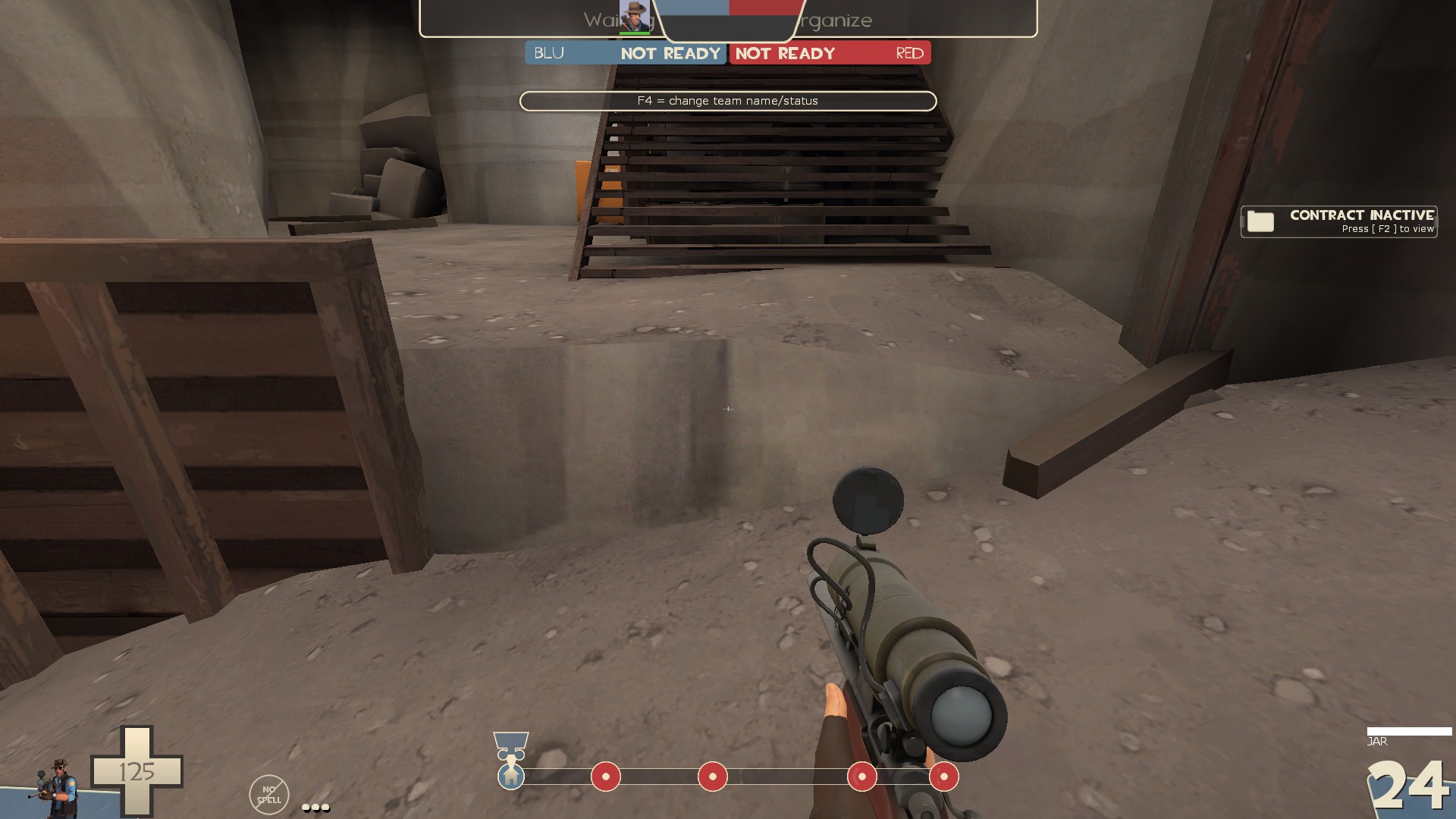
-clipping on this ledge leads a lot to be desired
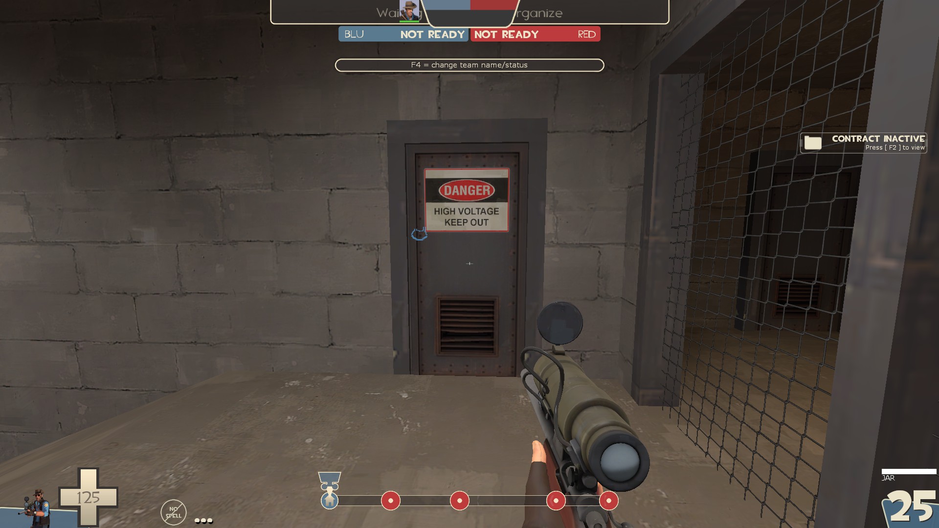
-clip it smooth
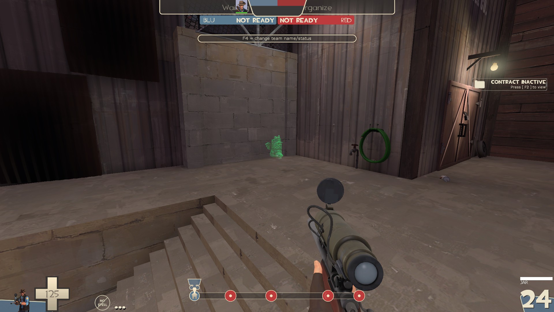
-the gargoyle spawned 3 times while I was looking around and each time it showed up in the same spot here
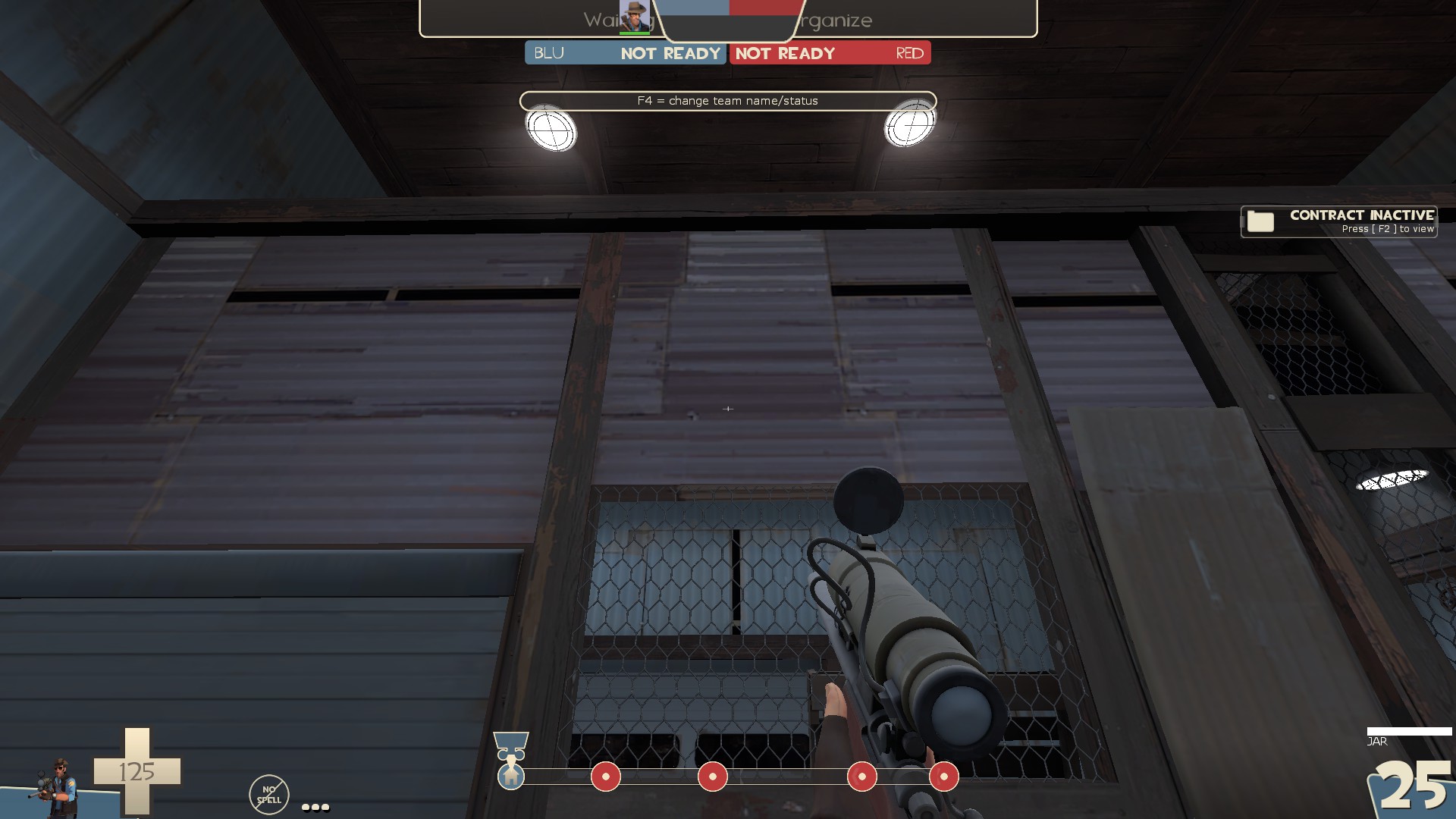
-odd to have the flat holes in the metal textures here when it's a thin wall you can easily see both sides of
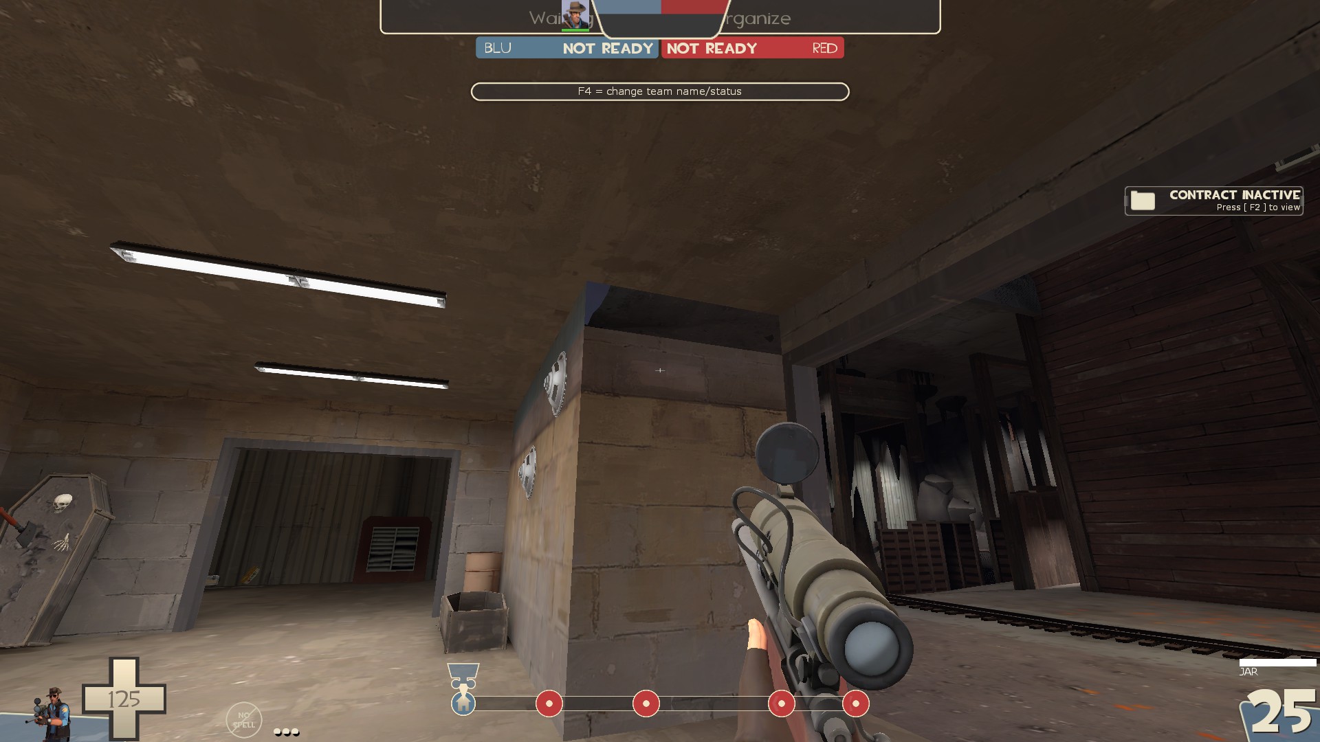
-visible no draw
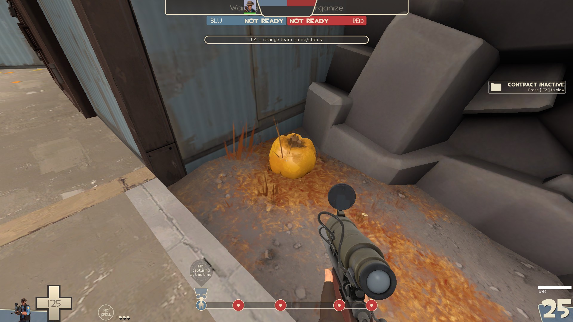
-detail sprite inside the prop. You can see detail props in hammer++ to easily find these
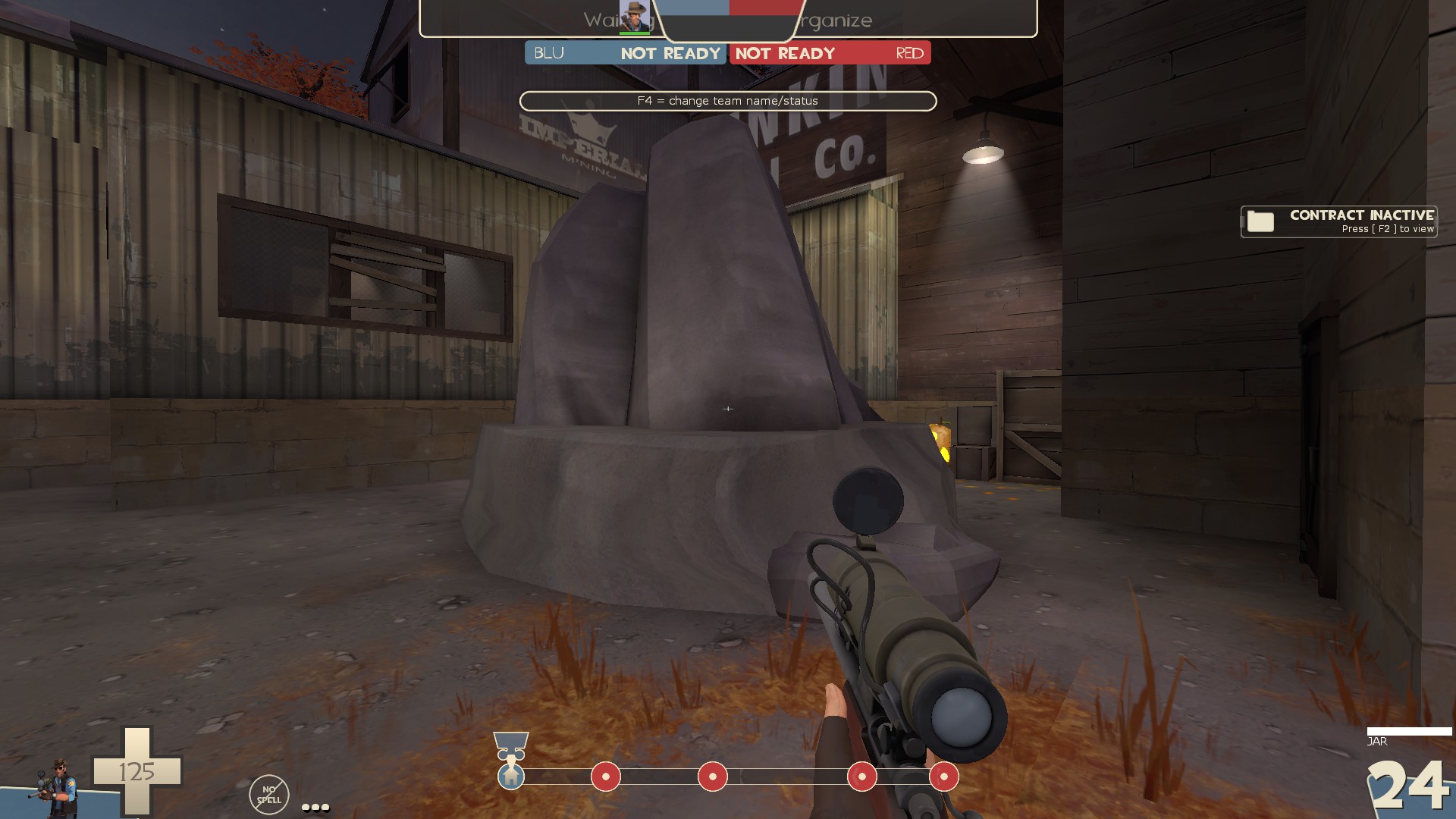
-this rock in the displacement here is just odd looking to me. Also misaligned texture on the left
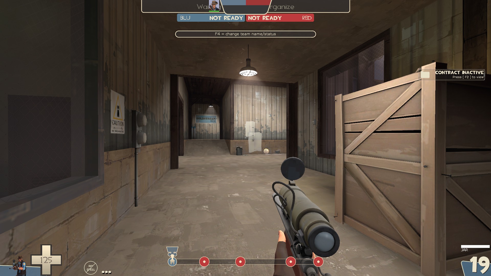
-easy to see fade on the light switch by the white patches here
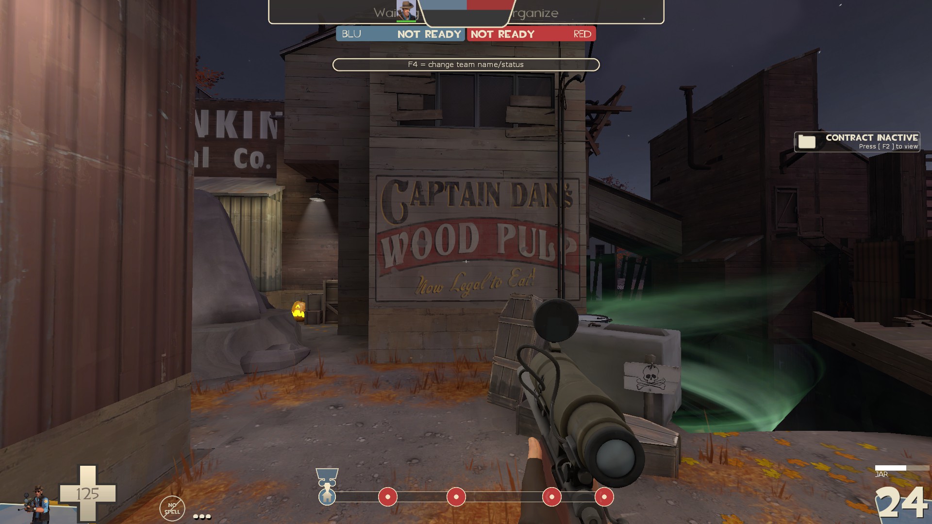
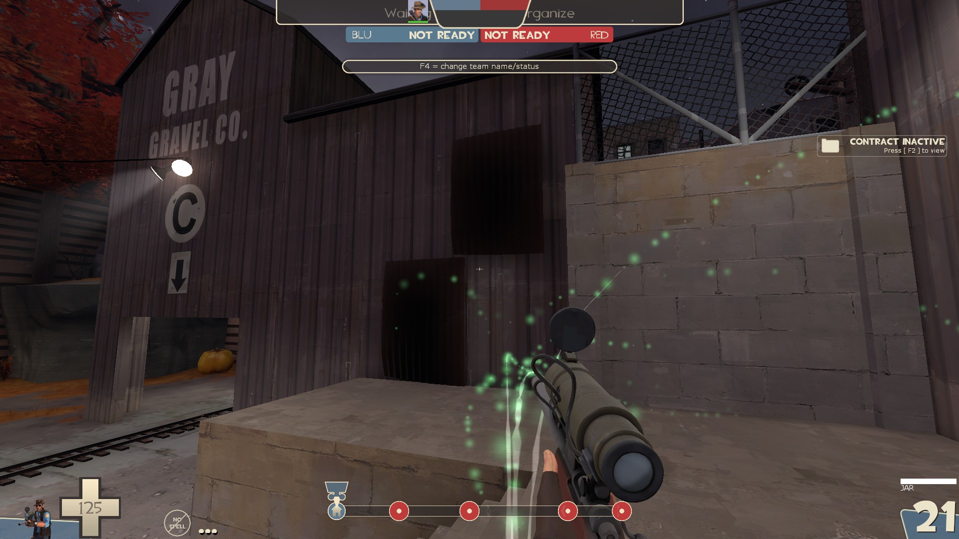
-remove shadows on the metal props
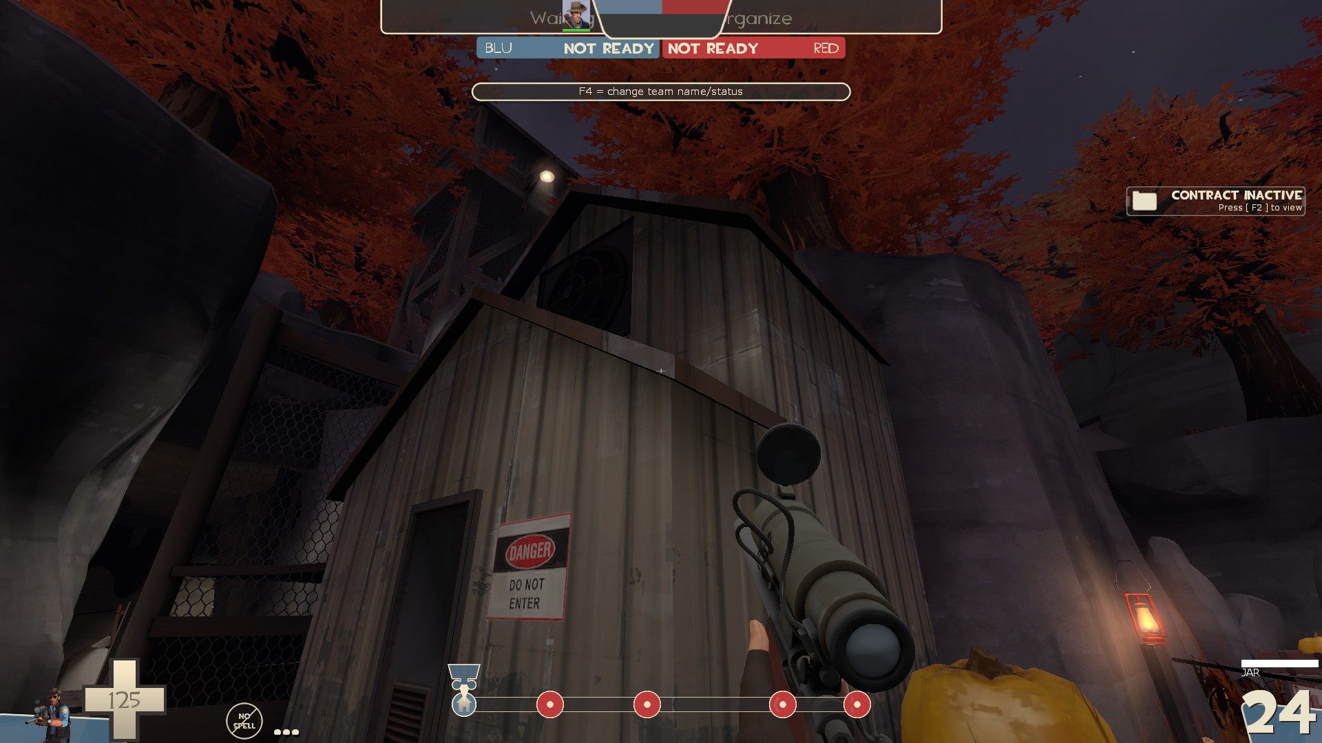
-you're rooves are really thick all over this map. I usually keep mine around 4hu
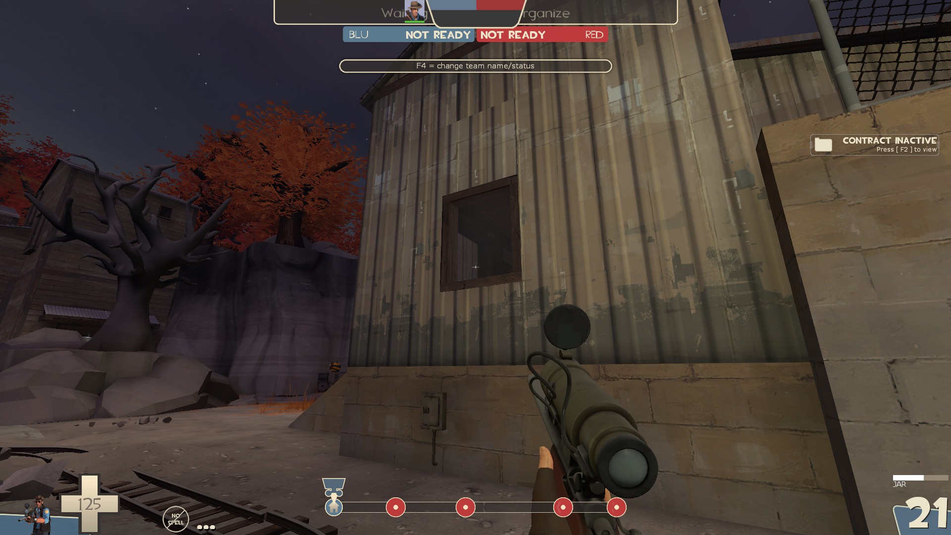
-hard to see that there is glass in this window, also misaligned texture
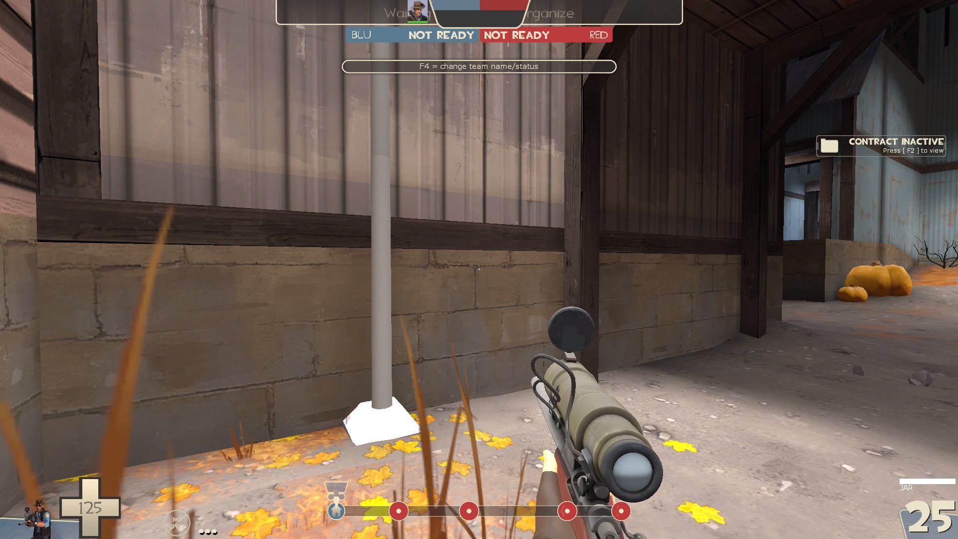
-clip the light post smooth like the beams near it
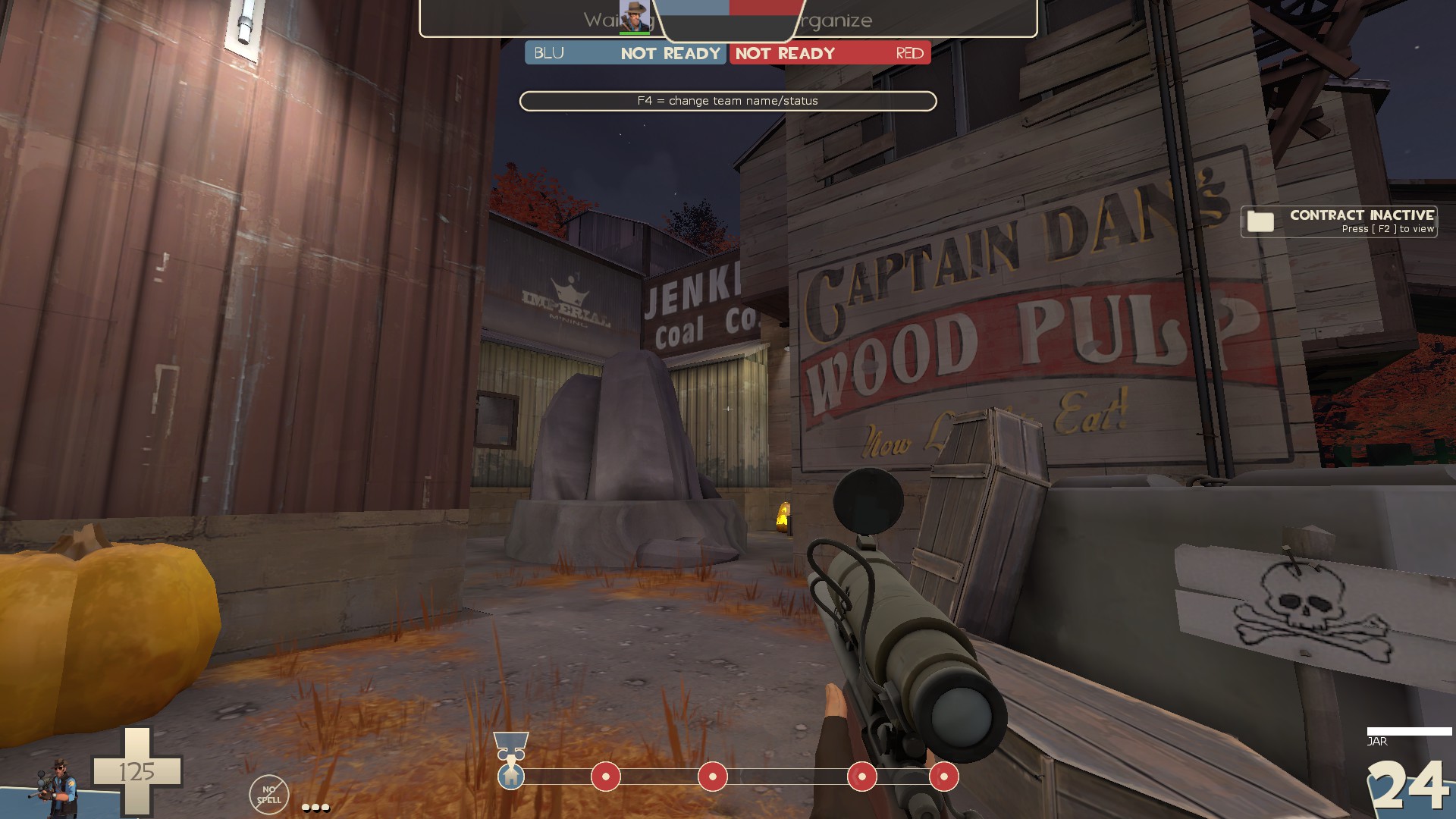
-There is such a thing as too many signs. In this spot you've got 3 separate companies, only 2 of which have something to do with the mining theme of the map. That said, I like the Captain Dan's sign where it's at, so I'd suggest removing the other two so the area doesn't look as messy
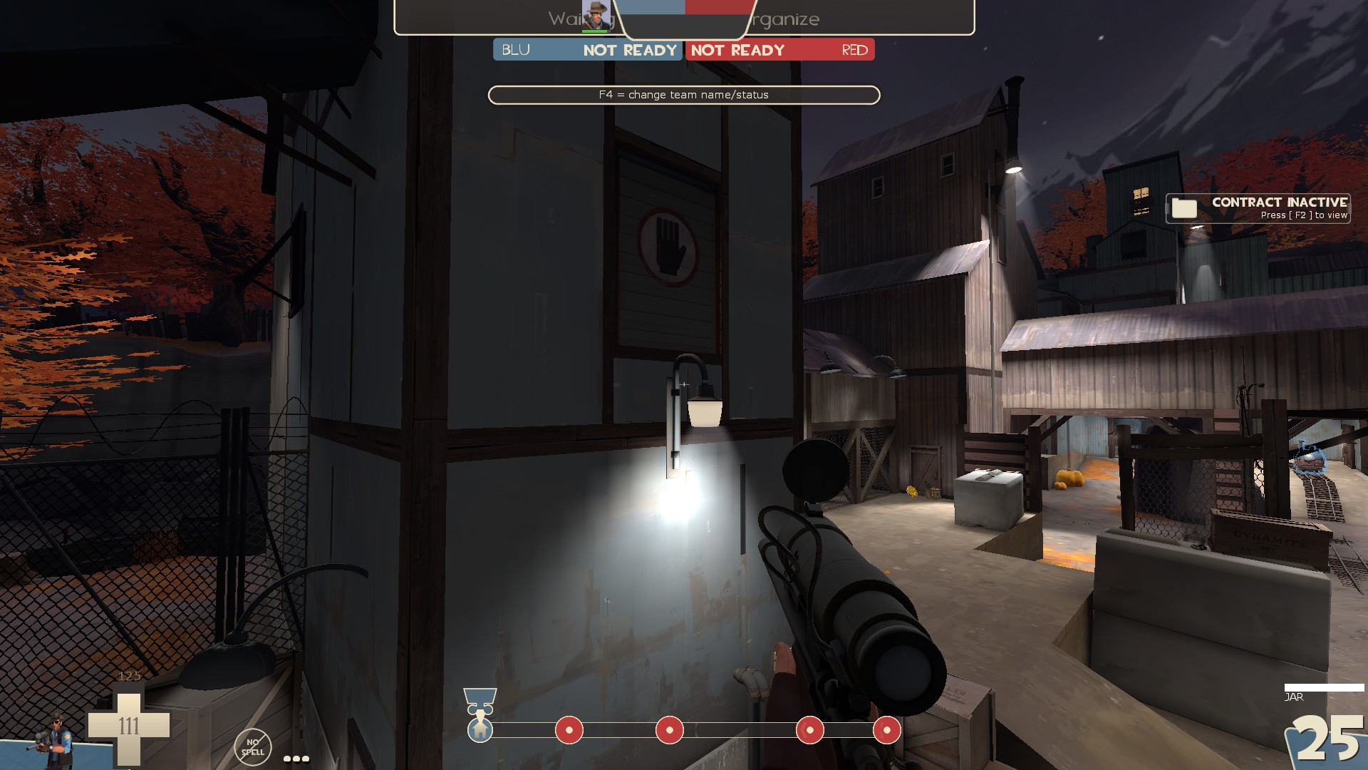
-I'd put the light fixture here above the door instead of below it. As it doesn't have any collision it's very obvious that players go through it
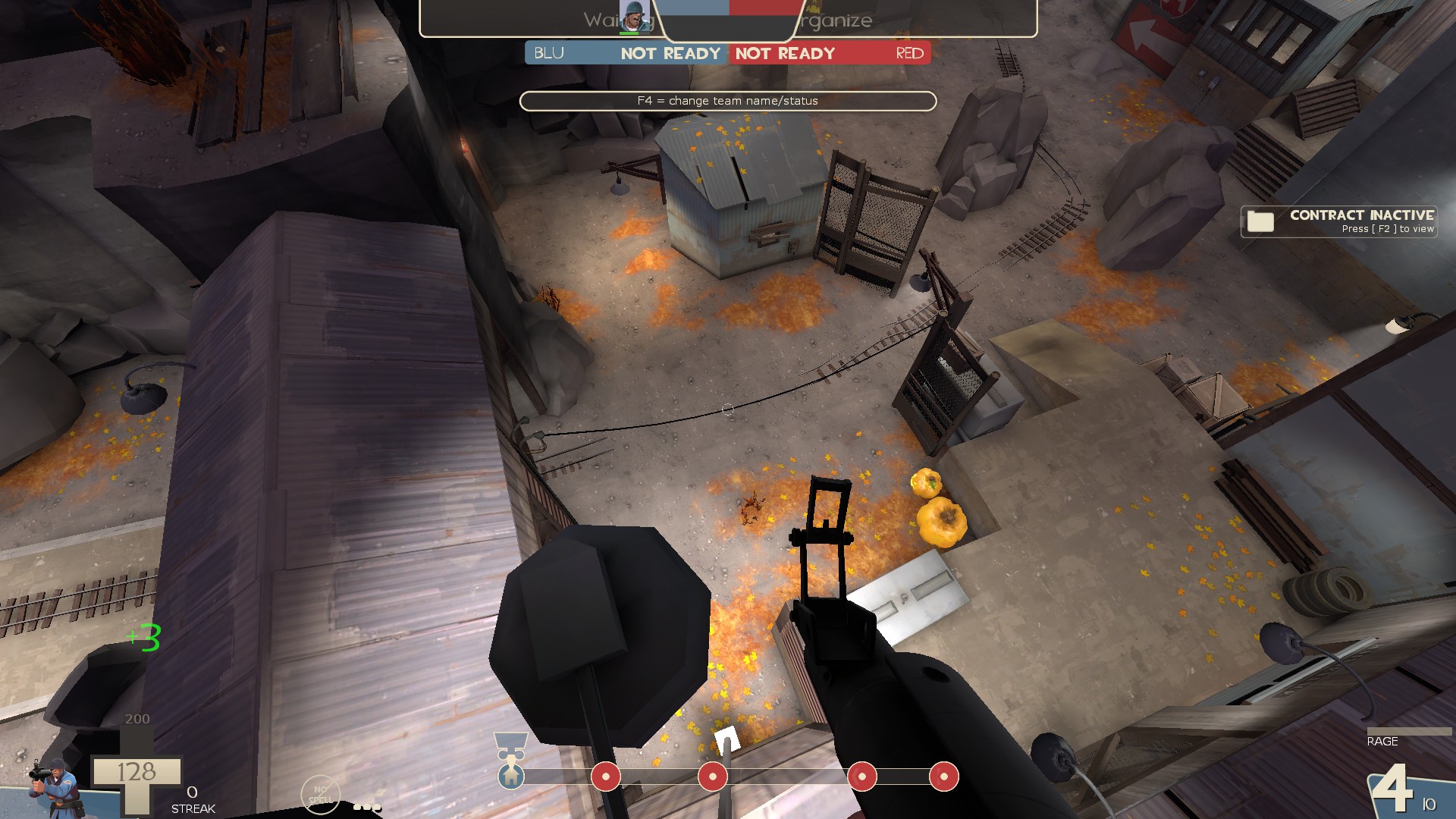
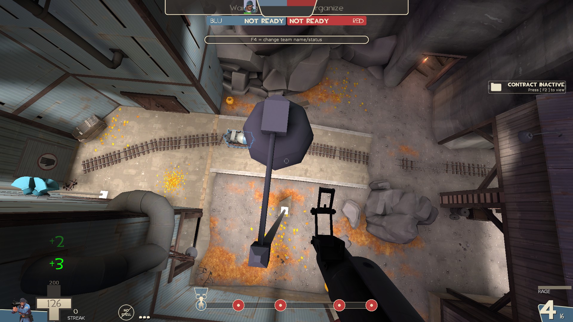
-I can get on top of these light posts
And that's it. Last thing to add is that I noticed some env_shake going on while walking around the map but there wasn't really any explanation as to why that was happening. I guess it has something to do with the vortex at last BUT unless you are at last, you can't see the vortex. Even when at last there still isn't much to give a reason for the shake, at least not yet.
-the stalactite/stalagmite props are super black compared to the stuff around them
-floating prop, also remove collision for it
-I really dislike this mix of cave roof and concrete. It doesn't fit together all that well imo and I feel it should be either one or the other. Either cave or not
-the floor plate texture on the frame here is an odd choice to me
-I really like how you can see to last through here. It's neat.
-This thing is big enough it looks like you can go in there except it's all clipped off. I don't think people should be able to get in there so maybe this whole detail area would work better pushed out of bounds
-floatin' props
-paint patch over the hole in the texture?
-I don't think this stuff at the top is supposed to look like that
-prop in the brushes
-even though this window is mostly open, you can't shoot through it. Maybe put some chicken wire in it so you can quickly tell it's solid
-this light prop doesn't fit the shack theme of this....well...shack
-no collision on this tank prop
-the mop isn't touching the wall
-remove collision
-I think this window is using the wrong cubemap
-seam in the displacement
-these pipes lack collision even though other pipes in the map used in a similar way do have collision. It's inconsistent. Also why is there a wet paint sign when there's no paint nearby?
-The monkeynaut locker does not fit the rest of the map
-you can see behind the door prop from here. Maybe just clip off this whole area with the truck
-this might look better as just gravel instead of gravel and dirt. Also make it a displacement so you can give it some curve so it's not as flat
-I can stand on these
-can get caught on this sticking out board
-misaligned texture here, also clip it smooth
-misaligned texture again. Also I don't really like how thin the space between walls are here. It's awkward.
-Use a wooden door frame here instead of having the side of the brush
-this break in the texture on the floor here looks a bit odd
-I'd suggest moving these pickups over to the larger flat wall instead of the weird corner thing
-This looks neat. Seems like I should be able to get closer to the water than the clipping allows
-remove collision on these props
-displacement seam
-remove collision of this prop
-clipping on this ledge leads a lot to be desired
-clip it smooth
-the gargoyle spawned 3 times while I was looking around and each time it showed up in the same spot here
-odd to have the flat holes in the metal textures here when it's a thin wall you can easily see both sides of
-visible no draw
-detail sprite inside the prop. You can see detail props in hammer++ to easily find these
-this rock in the displacement here is just odd looking to me. Also misaligned texture on the left
-easy to see fade on the light switch by the white patches here
-remove shadows on the metal props
-you're rooves are really thick all over this map. I usually keep mine around 4hu
-hard to see that there is glass in this window, also misaligned texture
-clip the light post smooth like the beams near it
-There is such a thing as too many signs. In this spot you've got 3 separate companies, only 2 of which have something to do with the mining theme of the map. That said, I like the Captain Dan's sign where it's at, so I'd suggest removing the other two so the area doesn't look as messy
-I'd put the light fixture here above the door instead of below it. As it doesn't have any collision it's very obvious that players go through it
-I can get on top of these light posts
And that's it. Last thing to add is that I noticed some env_shake going on while walking around the map but there wasn't really any explanation as to why that was happening. I guess it has something to do with the vortex at last BUT unless you are at last, you can't see the vortex. Even when at last there still isn't much to give a reason for the shake, at least not yet.
Attachments
-added portals to hell that are more accessible to red team
-added negative point_push to allow non-mobile classes to enter hell
-lots of fixes
-optimization tweaks
-detail changes
Read the rest of this update entry...
-added negative point_push to allow non-mobile classes to enter hell
-lots of fixes
-optimization tweaks
-detail changes
Read the rest of this update entry...
d3adfin
L4: Comfortable Member
- Jul 21, 2019
- 177
- 71
i just had a look at the map, haven't been here for the imps so i have no idea if this map plays just fine and i'm crazy but i figured i would give my 2 cents on various things in it so take this with a grain of salt i suppose
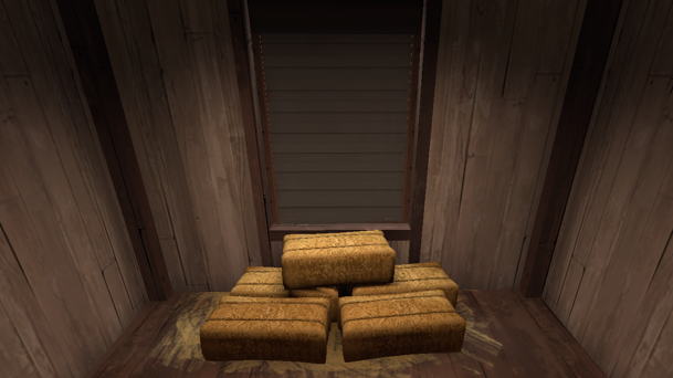
- the positioning and size of these hay bales makes me automatically assume that i don't have to jump on them, it's a bit frustrating to go up the stairs and then run into a tiny wall and not realise for a second
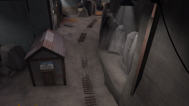
- this part of the track feels so uncomfortable and tight
- there is only one way around this bit and it is also super tight
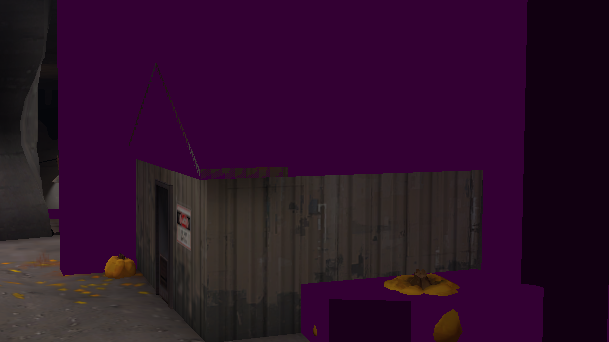
- not a fan of the clipping on that tiny left roof here, seems like it would be fun to jump off of as a soldier
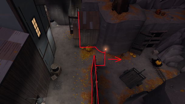
- this side area in general would be so much better if you just pulled the wall outlined this way i think, you'd have space to stand if you're just deciding to sit there and take a bit of cover
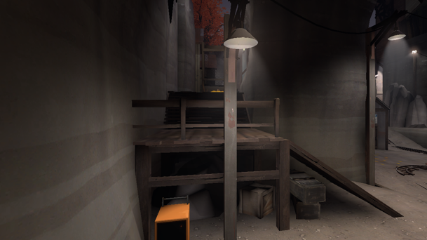
- if you removed this tiny fence navigating around this area would be so much nicer because i could just drop off of the platform when i'm moving forwards through the flank
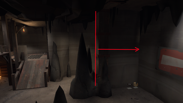
- i really like this area because it's one of the best parts of the map to move around but i think you could create more space and make it more fun by doing 2 things
- move the wall to the spot outlined, the sightline it blocks could be blocked a lot more easily i feel and you wouldn't get spammed out instantly going into this point through the flank
- remove the stalagmite next to it, it feels really weird and unweildy and it takes up space that i think it doesn't need to
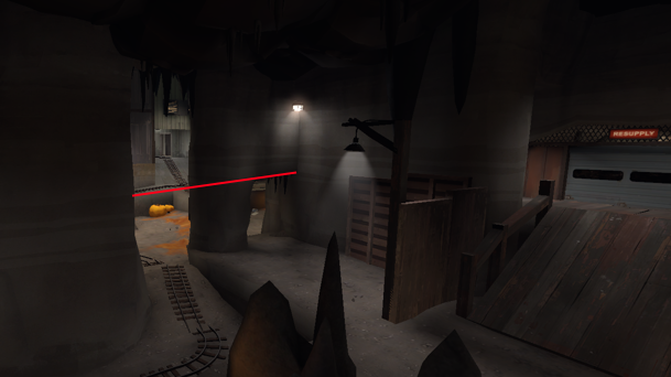
- to block the sightline you'd be opening up by moving the wall i think you should just have the ceiling of the left choke to the level it is in the choke to the right of it
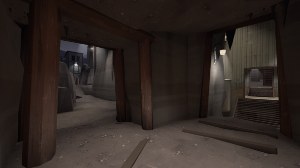
- this area really needs clipping it is so easy to get caught on the doors
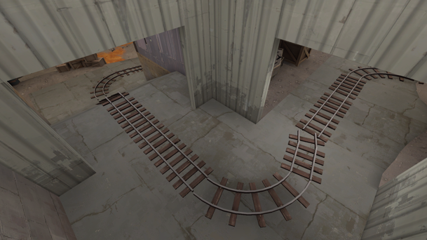
- the cart here is going through 3 really tight chokes so this area seems like it's just a meat grinder to me
- i can't say how you accomplish this but i really really think you should open up this area more to like the width of tunnel on badwater
- also i think you should remove that middle door i don't see why it's there
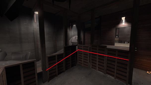
- i honestly do not see the necessity for the walls and pillars on the line, to me it seems like they're just taking up space that could have some fun movement on and off of the bridge
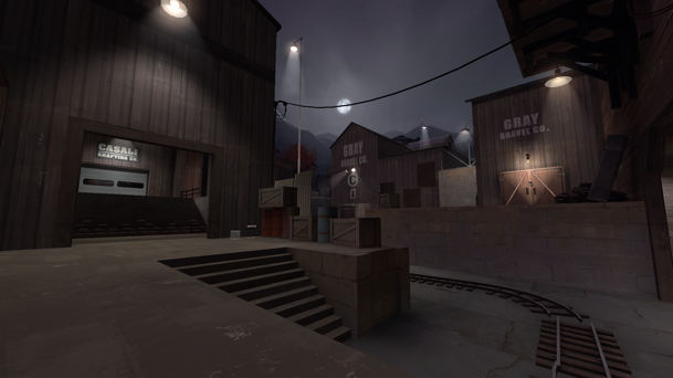
- the flank to the left is inaccessible for anyone except a spy if they're holding the right side platform
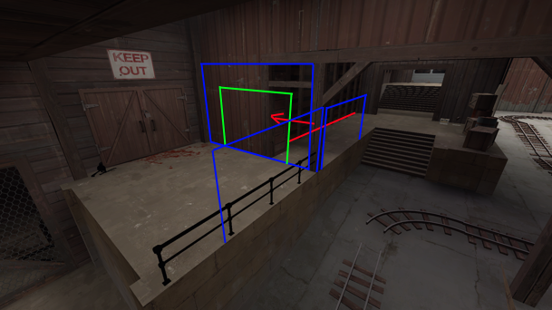
- i think you could make it a lot more accessible by having stairs up to the left platform here, moving the wall in red to the left more to give more space there, add the walls i highlighted in blue and add the doorway in green
- should allow you to sneak a certain distance to that flank to make it usable
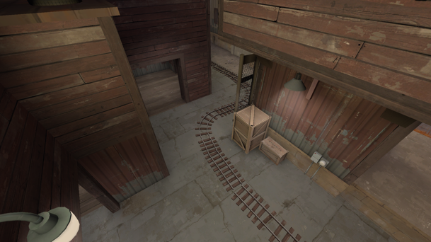
- this choke is so tight and if i were you i would simply make it less so
hopefully this helps you out
- the positioning and size of these hay bales makes me automatically assume that i don't have to jump on them, it's a bit frustrating to go up the stairs and then run into a tiny wall and not realise for a second
- this part of the track feels so uncomfortable and tight
- there is only one way around this bit and it is also super tight
- not a fan of the clipping on that tiny left roof here, seems like it would be fun to jump off of as a soldier
- this side area in general would be so much better if you just pulled the wall outlined this way i think, you'd have space to stand if you're just deciding to sit there and take a bit of cover
- if you removed this tiny fence navigating around this area would be so much nicer because i could just drop off of the platform when i'm moving forwards through the flank
- i really like this area because it's one of the best parts of the map to move around but i think you could create more space and make it more fun by doing 2 things
- move the wall to the spot outlined, the sightline it blocks could be blocked a lot more easily i feel and you wouldn't get spammed out instantly going into this point through the flank
- remove the stalagmite next to it, it feels really weird and unweildy and it takes up space that i think it doesn't need to
- to block the sightline you'd be opening up by moving the wall i think you should just have the ceiling of the left choke to the level it is in the choke to the right of it
- this area really needs clipping it is so easy to get caught on the doors
- the cart here is going through 3 really tight chokes so this area seems like it's just a meat grinder to me
- i can't say how you accomplish this but i really really think you should open up this area more to like the width of tunnel on badwater
- also i think you should remove that middle door i don't see why it's there
- i honestly do not see the necessity for the walls and pillars on the line, to me it seems like they're just taking up space that could have some fun movement on and off of the bridge
- the flank to the left is inaccessible for anyone except a spy if they're holding the right side platform
- i think you could make it a lot more accessible by having stairs up to the left platform here, moving the wall in red to the left more to give more space there, add the walls i highlighted in blue and add the doorway in green
- should allow you to sneak a certain distance to that flank to make it usable
- this choke is so tight and if i were you i would simply make it less so
hopefully this helps you out
Boonie
L2: Junior Member
- Sep 22, 2015
- 77
- 54
(traps) Clips needed
1928 2895 -993
2624 1814 -944
-660 1784 -420 (Non-solid window frames)
Out of map
-2269 -534 -608
3675 -1533 -193
1703 -2843 517
1483 67 635
func_respawnroom missing
-2094 -3675 -1114
-2223 -2904 -1115 (small gap allowing to build)
1928 2895 -993
2624 1814 -944
-660 1784 -420 (Non-solid window frames)
Out of map
-2269 -534 -608
3675 -1533 -193
1703 -2843 517
1483 67 635
func_respawnroom missing
-2094 -3675 -1114
-2223 -2904 -1115 (small gap allowing to build)


