


I am managing fine with the current size and have locked into a design that cannot expand very easily at all, so an expansion would be a little frustrating since I cannot make full use of the new available space. I would prefer no change, but it would not be the end of the world if there was one.
Dusk till Dawn - Detailing Contest 2019.
- Thread starter Freyja
- Start date
-
- Tags
- detailing contest
You are using an out of date browser. It may not display this or other websites correctly.
You should upgrade or use an alternative browser.
You should upgrade or use an alternative browser.

Voting is now live. Sorry for the delay, I hope you've all been taking notes so you can enter it now!
~~~ Click here to vote! ~~~
Voting will stay open for 2 weeks and one day from this post. That means the 31st July, 8:00 AM UTC+0.
~~~ Click here to vote! ~~~
Voting will stay open for 2 weeks and one day from this post. That means the 31st July, 8:00 AM UTC+0.
- Mar 23, 2017
- 1,339
- 994
[parsehtml]<link rel="stylesheet" href="/styles/font/CaviarDreams.css?t=1">[/parsehtml]
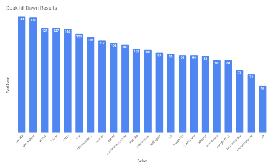
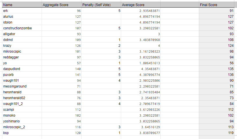
Full scores:
Prizes:
First place:
$20 USD Steam Gift Card
Mapper's Medallion
Finishing Thoughts:
Nice work everyone! Puxorb steals the show again but this time it was really close!
Sorry for the delays with voting and putting up the results, I greatly apologise, but I hope you all had a good time.
I will be processing all the feedback and putting it in this thread within the next few days. There's a lot of posts so I don't want to distract from this results page right away.
Dusk till Dawn Detailing Mini-Contest
Results!
1st Place:
Puxorb
With 136 points
2nd Place:
Da Spud Lord
With 135 points
3nd Place:
Alurius / Idolon
With 127 points
Puxorb
With 136 points
2nd Place:
Da Spud Lord
With 135 points
3nd Place:
Alurius / Idolon
With 127 points
Full scores:
Prizes:
First place:
$20 USD Steam Gift Card
Mapper's Medallion
Finishing Thoughts:
Nice work everyone! Puxorb steals the show again but this time it was really close!
Sorry for the delays with voting and putting up the results, I greatly apologise, but I hope you all had a good time.
I will be processing all the feedback and putting it in this thread within the next few days. There's a lot of posts so I don't want to distract from this results page right away.
Last edited:
- Mar 23, 2017
- 1,339
- 994
Bruh. Now that's an epic gamer moment.2nd Place:
Da Spud Lord
With 135 points
Seriously, thanks so much to everyone who voted! I'm super proud of these results--I genuinely didn't expect to rank this high--and I'm really glad everyone enjoyed seeing my entry as much as I enjoyed making it.
there's a chance some people missed this, I'll post it here for posterity
https://www.twitch.tv/videos/454198293
https://www.twitch.tv/videos/454198293
Erk:
Ailurus:
Idolon:
Really pretty, but not much to explore, sky box transition was really clean.
- intriguing scenery, but my interest was lost quickly.
- obvious skybox seam.
- bit too dark
- obvious skybox seam.
- bit too dark
Very barren and empty, with the pool of water being the most detailed thing around. The skybox detailing is nice but there's still barely any of it. This could have been a spectacular entry if there was just... more
This entry creates a very unique and interesting atmosphere. My only issue with it are the few areas that feel a little empty, especially when compared to the excellent detail work on the scaffolding.
I really like the night time Egypt setting. I think the lighting is nice. I really like the dustmote fireflies over the small pond, its really cute. The use of textures is really nice and the skybox looks great. There is a small seam where it transitions on one side however, and its pretty obvious.
very cool ambiance. a bit small and there could be more to see/take in
My and the feedback of many others will be submitted in video format.
Didn't quite understand why the gate was blocking off another gate that leads to the city in the sand. I'd have preferred to see the city right outside the wall, teasing you that you can't get in.
Although I enjoyed the almost seamless outer environment that convinced me there was an outer world, the sand tangles jarred me slightly. The displacements could definitely be smoothed, if you were trying to create Sand dunes. Either way, pretty well made map.
It is 1 displacement and few props. Really poor
Attractive, but surprisingly empty. More usage of the vertical space would have been nice, such as a way to climb onto the city wall or some underground tunnels. Seams showing at the skybox edge, unfortunately.
Pleasantly atmospheric and straightforward, though with a few imperfections, notably being able to easily see the bottom half of the skybox and one side's displacement having a small black seam
- Desert skyboxes generally aren’t the most exciting things, but I like that you’ve added some points of interest in the distance to break up the dunes. The cliffs in particular are well made
- Oasis is pretty. Cute idea making the moon’s reflection using the light on the water, if that’s what you were going for.
- I like that you only see a glimpse of the city through the gate, but not entirely sure why this outer wall is here so far away from the main city wall. Having some stuff in between to look at, like more buildings/tents would make the space more interesting. (Although I realise that the skybox starts pretty close behind the wall.)
- Overall fairly simple but well made.
Overall feels a bit empty but I do like the water. Imo the trees sway too much, looks unnatural and the "pointy" (low poly looking) sand dunes also look somewhat unnatural, sand naturally lays very smoothly as it's able to roll off any high peaks.
Pretty basic. Theme was consistent it could have been explored in more depths. I do not agree with the placement of the sprite. Maybe it would have worked if you placed it inside the water completely? Mountains in the skybox look blocky. Skybox transition is unfortunate but I don't know how you can make better transition in this context.
dusktilldawn_erk: 4/5
-I like the overall use of simplicity
-The skybox buildings looked decent, although the lighting on one of them looked strange
-The map lines up to the skybox seam well; there are a few shadow differences, but I'll mostly forgive those because suorc(tm)
-My biggest gripe is the glow of the pond. I get that it's supposed to be reflecting the moonlight, but it still feels off somehow... Maybe it's the env_sprite in the middle? Is that supposed to be the moon itself reflecting off the pond? If so, why is it visible from any angle, even when the moon is behind me? It's cool in concept, and it sorta looks cool? But it also sorta breaks immersion...
Da Spud Lord
oh yeah I made this one
I love the theme, a far border of a desert town. The skybox transition is top-notch and the general aesthetic is fantastic. Excellent job!
Wish I could explore inside! Also, noclipping reveals some more detail on one side of the wall that can't be seen from the side I spawn on.
Did a good job of making it feel like a large environment. Good use of space. I felt it could have been darker but overall very good.
Ailurus:
so much hidden detail
Soda
- very interesting aesthetic
- fps drops
- never felt like it fit tf2
- fps drops
- never felt like it fit tf2
This entry is great, I thought it was just a japanese shrine until I found the elevator. Then, wow. The sound set it back a little though, still hearing the waterfall VERY CLEARLY on the lowest level of the facility was very annoying.
The sense of immersion and overall detail is immense. The only real complaint I could find would be a few of the displacements feeling a little off, namely in the aboveground cliff faces.
This entry is pretty nice. I think the lighting is mostly good, except that props seem to be lit inconsistently; some are pure black while others right next to them are lit appropriately. The sprites above the water look really bad and are killing my fps. I love the underground areas and I think they look really beautiful. I especially like the elevator logic and how it can stop at multiple floors. I wish there were more soundscapes though; its jarring to hear cars underground as loudly as if you were right next to them.
hugely detailed, lovely props. buggy elevator but otherwise super cool and lots to see. great ambiance and sets up a nice narrative.
Very cool map, lots of attention to detail and fun narrative storytelling with props and interior design, however the elevator felt like too much of a gimmick for me.
This was one of my Favorite Maps. It definitely felt professionally made, and the underground spy-tech base was really cool and easy on the eyes. Overall, extraordinary map.
The water is too loud! Really cool working objects (elevator, soda machine). Outside is too dark. The base is cool. What on earth is making that terrible honking noise? I like the skybox props used as toys/models.
I really like all the detail and small things, however it sometimes feels a bit cluttered and the detailing within the themes doesn't really come together or feel as coherent as it could be, e.g. props being placed without feeling like they should be there in the first place
- Loud water!
- Loads of little details that I loved. The water lapping the beach shore stood out as one of those little touches that make the place feel more real.
- A few areas were a little too dark, namely the areas only lit by glowing mushrooms.
- Natural spaces are pretty, particularly the waterfall and all the plants on the left after the bridge. Interesting architecture underground, good use of angles and circles
- There’s a whole lot of map here
- The transition from Japanese temple to underground pyroshark base feels a bit random and only connected by the elevator that happens to be next to it. Almost to the point where it may as well be two entries. I guess there’s also the lil shark friends swimming in the water above ground, but I think more could have been done to link the two areas and make it seem more like a hidden base using something above ground as a front rather than a completely separate thing.
Looks really nice, like very VERY nice, the outside area feels very cozy I'd like to fall asleep there dispite the shrieking noises.
Really nailed the asian asthetic also nice use of sound. Another good thing is that there are lots of little details and things to look at which makes it very interesting to walk around and explore.
I also got stuck between the 2 doors by the elevator.
Really nailed the asian asthetic also nice use of sound. Another good thing is that there are lots of little details and things to look at which makes it very interesting to walk around and explore.
I also got stuck between the 2 doors by the elevator.
Contrarily to Erk's entry, your entry suffers most from having lack of clear focus, and overcomplication of the theme. There are simply too many themes put in to this small map and it includes japan, spytech, shore and harbor(?). Your effort is worth a praise however, since this is a pretty big map and you managed to keep the level of detail more or less consistent through out the level. However, the quality of the details was disappointing. For example, you got wooden doors from manor in concrete walls, thick wooden beams, clipping props and etc. Next time, try having one or two major theme and making sure that the themes you selected are explored enough before bringing in another theme.
Why's the round table made of cracked up concrete?
dusktilldawn_ailurus_v5: 4/5
-Displacements are whack in a couple spots
-Why does the waterfall glow but not the water
-The water wake animation on the shore does not look good
-The water glows visible from the shore are... alright? They feel a tiny bit uncanny
-Some parts of the map are a bit too dark, in particular I can't see anything in the tunnel bend near the shore except the glowing mushrooms (which are admittedly nice but why don't they cast light onto the surrounding cave?)
-Overall the lighting seems unpolished in a few areas; some areas are too dark, while at least one prop is too bright
-Elevator logic seems broken? I hit the up button, but nothing happened, so I hit the down button, the elevator door opened, but while the door was opening the elevator was already going up without me, and then the elevator door closed again, and then opened again without the elevator? Also where'd the elevator go? There's no up area, I was on the top floor- in other words, the elevator phased through the ceiling. Why is there an up button at all on the top floor?
-A higher lightmap resolution would really help the map in a few places
-Alright, the hidden spytech lair/pyroshark factory is cool. Very extensive, there's a lot going on and I like most of it.
-I somehow noclip through the floor and get stuck while trying to view the falling halloween crates and neon anihhilators in the lowest basement area? Not gonna dock points for that, but perhaps you shoud figure out what causes that...
-Strange cubemap on one of the floors?
-I can tell a lot of effort went into this, and it mostly paid off, but there are some areas that clearly needed a slight bit more attention... I'm torn between a 4 and a 3, but I'm leaning towards 4.
Da Spud Lord
Holy shit dude. What's the actual fuck. Good fucking job.
really bad fps, detailing all over the place, visually and literally loud
Ignoring the low framerates, the map looks good. When you're in the main area you feel confined and almost cramped. The horn sound effect you used also changes pitch between doots thanks to the fact that it's a game sound instead of a the raw version, the bio-luminescent algae looks odd, it doesn't fit tf2's style. Overall I think it's a nice looking entry, but it could have been better in some spots
Quite nice, I really enjoy this entry. What stops this from being a 5 are some props not being lit correctly and soundscapes not working (by this I also mean the horns don't fit the environ at all, and soundscapes don't switch from area to area).
Nice space with an interesting theme. Good use of sound. Very good overall.
Idolon:
really nice map I love the theme and the weapon shop was amazing. ^-^
fantastic detail, can't say anything negative without being nitpicky
I can definitely see that architecture experience in this entry, woah. The whole place looks like something out of the TF comics which I LOVE <3. The floors above groundlevel however are all the same, which is quite disappointing.
This entry is extremely well executed. Great job with mixing the Soho and Mhankö themes in this one. I'm a particular fan of the little touches, such as the Shipping and Receiving and the miniature model of the building in the lobby. If anything, the 3 highest floors felt a little repetitive.
Oh man, Idolon, this entry is fantastic. Your knowledge of architecture is on full display here. The roof details and large feature window are especially nice. I like how the hazy city lights stream in from outside. This has a perfect night time feeling to it and fits the theme of the contest well. One of my favorite areas is the weapons showcase, especially the fluorescent fixtures and spotlights overheard. A lot of thought was put into how every part of this building fit together. Its an absolute joy to walk around. The basement area is a lovely additional detail. No complaints.
very richly detailed, architecturally strong. some missed opportunities with detailing in the server/meeting rooms. otherwise very well done
Didn't enjoy the wasted opportunities to tell a story with the multiple rooms you used to just copy/paste the same server room, as well as the conference rooms that ended up the same way. However, the architecture and outside detailing were very cramped and corporate feeling, complementing the intent.
Even though the area was really good looking, when going up, i felt I was going in circles. some places were simple and I saw many returns, but still, good map!
Incredible attention to detail. I love, for example, that the entryway to the store has dividers that don't touch the floor or ceiling but are attached to a pillar. The downstairs is very impressive; it's one of the most realistic spaces I have seen in TF2. I really wish there was something new on each of the upper floors, but the vista of computer banks is beautiful.
Very solid, great use of detail and geometry on all surfaces, I absolutely love it - only criticisms are that the lack of colour variation makes it a little blander than I feel it ought to be, and the lighting feels it could be touched up a little for similar reasons
- Nice range of lighting, my favourite bit being the area around the weapon display cases. Good combo of floor lighting, the spot lights, and the angled ceiling tiles letting more light in.
- Loads of realistic details that make it feel like an actual lived in building. The Staircase and overall shape of the building is interesting.
- Even the street outside is interesting to look at, it makes me want to walk out and explore.
- If I had any criticism, I feel you could have done more with the side rooms rather than filling them with computers. The symmetry of the three floors looks nice, but it’s not as fun to explore as it could be.
I'm sure you've already gotten this a bunch but I'll say it anyways the trolleys in the basement are missing their textures, apart from that small mistake the map is well made my favourite areas are the out of bounds that can be seen in the basement and outside the main entrance.
While I do like it a lot I feel like there could have been a bit more to it, maybe by opening up some of the meetingrooms and putting some interesting details in there, something that tells a bit more of a story.
While I do like it a lot I feel like there could have been a bit more to it, maybe by opening up some of the meetingrooms and putting some interesting details in there, something that tells a bit more of a story.
Seeing the waffle ceiling and the ceiling lights in the showcase room or the gigantic mannco sign outside made the place feel more real than any other tf2 maps I've seen before. Even the bathrooms are in the place you'd expect them to be. The art dedicated to the CEO is excellent for giving it a complete typical mega-corp reception feeling. (and the obligatory miniature model of the building) You did a great work at using the theme that was only hinted in mvm_mannhatten with new assets in combination with the hong kong district theme. It's easy to start over-detailing but this entry kept the level of detail appropriate to tf2's artstyle. (except that this map has ceiling details which are avoided in playable maps)
Though my score is 5, there are some minor things like clipping, or the empty secondary reception thing in the showcase area that could be improved. I'm not sure if you needed to have four mannco signs visible at once in the reception area. The floors above the ground floor are essentially the copy each other which was pretty disappointing given the anticipation you created by having a huge staircase and the elevator. Same dashboard models being used twice only breaks the immersion. A retextured one would have been nice. The placement of the doors for the bathrooms on first, second, and third floors were a bit unusual as it felt a bit too close to the staircase. Also the doors are placed in a way that makes the whole bathroom visible from outside since those are parallel to the walls. Minor nitpicks, still worth a full score.
Though my score is 5, there are some minor things like clipping, or the empty secondary reception thing in the showcase area that could be improved. I'm not sure if you needed to have four mannco signs visible at once in the reception area. The floors above the ground floor are essentially the copy each other which was pretty disappointing given the anticipation you created by having a huge staircase and the elevator. Same dashboard models being used twice only breaks the immersion. A retextured one would have been nice. The placement of the doors for the bathrooms on first, second, and third floors were a bit unusual as it felt a bit too close to the staircase. Also the doors are placed in a way that makes the whole bathroom visible from outside since those are parallel to the walls. Minor nitpicks, still worth a full score.
dusktilldawn_idolon: 5/5
-This looks absolutely amazing. The brushwork is very detailed and well-done. Skybox looks neat0. Everything fits together really well.
-The sprite glow effect on the MHANKO sign outside looks awkward at extreme angles
-The upper 3 floors are effectively identical; I feel like some potential for variety was lost there. I was also disappointed to find that there was nothing past the top floor. It just feels like there should be more up there than just repeating floors... Almost gave the map a 4 for this.
Da Spud Lord
lags a little but pretty good
The office building aesthetic is a real neat one, especially for a nighttime theme. I wasn't aware I could get into the basement until I tried to jump past the barrier, I think if there was no barrier it would have reduced some of the chunkiness of entering the basement. The showcases are real neat but the area across from them is boring and blocky, I think it could have benefited from some little details. The 1, 2, and 3 floors look nearly identical and copied, of course that would be how a real building is, but it feels like you only need to be on the first of these floors to experience the visuals of all 3, something that keeps me from making this entry a 5 is that the Dusk til Dawn theme feels almost haphazardly thrown in, the map would feel nearly the same if it was day which retracts a bit for me.
Really cool. Only wish there were more interactivity.
I though this map was probably one of the best environments from a detailing and tehcnical standpoint. My only gripe is that its primarily an interior envoinment and I felt that was dodging the brief. That said, it did convey the feeling of being in a commercial building late at night.
Construction_Zombie:
AsG Alligator:
Dotmd:
crazy light shafts ^-^
couldn't find the words for this map, there were so many positives and negatives conflicting
The lighting seems quite flat, and lacking depth in the skybox. The displacements looked good enough, but could have used a bit more work. Also, more loud water. The lightshafts look good but are overused. Overall, good, but not great.
A unique atmosphere, something which the light shafts help to build quite a bit. Good use of timber beams and the texture choice was excellent. However, the seam between the map and the skybox was very obvious at certain points and broke a little immersion.
This is a great example of less being more. It would have been nice to see more detail inside the buildings, but there is a certain feature that OUTSHINES the rest. I'm of course talking about the bright sun sprite and the custom lightshafts. I feel that the two go together wonderfully and turn what was pretty understated map detail-wise into something unique. I think my only complaint is the flowing river being broken up in several places. Its jarring and breaks immersion. Other than that, the skybox looks really nice and the detailing is pretty.
really nice ambiance, sets a great fun autumnal mood. god rays look warm and lovely. almost actually playable
I enjoyed the smart and conservative use of fun godray lighting, however it felt as though some parts of the map felt disconnected from others.
This execution of the warm ~Autumn feel is gorgeous in this map. This map also feels the largest, which I'd say is a pretty large feat. Pun intended, if there is one. Overall, Love the geometry, natural environment, and interiors on this map. good job with this one!
A pretty entry. The light shafts might be a bit overused, especially in the control point room, where they are almost perpendicular to the window. It just looks weird. Detailing is rather basic, and the area feels randomly arranged. Can see skybox seams. The displacements are fairly basic, but alright. The detailing that is here is competent and good; there's just nothing that pushes it above and beyond. The big river is pretty cool, as is the metal... elevator? above it. I think there are probably too many leaves scattered around. This seems to have taken the same couple ideas and repeated them throughout the allowed area without thinking about what makes any of it interesting.
Good aesthetic and nice use of micro-detailing and texture work, however it's let down by the obvious skybox transitions, as well as the displacement work - the hills in the skybox are too obviously displacement-y, and the cliffs suffer from the same, feeling like curves with textures on them. The rays are a nice touch but are a tad overbearing!
- I worry some people will think that this doesn’t fit the dusk/dawn criteria because it’s not as dark as overs, but I’d say the overall lighting is orange enough to make it dawn.
- Some structures outside of the fence might make the area feel more alive and less an isolated cluster of buildings on a cliffside.
- Rays of light coming through the windows are reaaall nice, good job with those. Particularly above the capture point where it goes through the ceiling beams.
- Definite tf2 feel to the buildings, could easily see all of them fitting into a standard map.
- Other than the rays of light, there’s not many other interesting lighting techniques.
- The little leaf piles stuck in the gutters is cute and made me laugh.
Not much to say about this one for me, it's nice, lightshafts might be a little intense but meh they're cool though. Not overly scattered with props which is a good thing, in some cases less really is more.
Like you stated, the light shafts are the most memorable part of the map and it serves to remind me that the map is set in dusk which may not be super obvious from the bright lighting.
This, however, means that the indoor details were quite forgettable. There was a particular floor made out of wood and you can sort of see through which was unique but that is such a small part of the map. The other parts felt generic. I'm not really sure the purpose of this facility as it was not clearly shown through details even though you said it's a lumbermill. I am not convinced how an elevator into the river is useful to a lumbermill. Speaking of river, it is the weakest part of the map. The rock walls have repetitive pattern and so does the river itself. You somehow managed to make the river flow convincingly but it still feels amateurish. The skybox transition was very obvious with the building. Maybe if you put the buildings closer together, you might have been able to fit the whole building inside and have less boring open space.
This, however, means that the indoor details were quite forgettable. There was a particular floor made out of wood and you can sort of see through which was unique but that is such a small part of the map. The other parts felt generic. I'm not really sure the purpose of this facility as it was not clearly shown through details even though you said it's a lumbermill. I am not convinced how an elevator into the river is useful to a lumbermill. Speaking of river, it is the weakest part of the map. The rock walls have repetitive pattern and so does the river itself. You somehow managed to make the river flow convincingly but it still feels amateurish. The skybox transition was very obvious with the building. Maybe if you put the buildings closer together, you might have been able to fit the whole building inside and have less boring open space.
You could've given the saw an indoors cubemap.
dusktilldawn_constructionzombie: 2/5
-I feel like this map doesn't really qualify for the theme. There's just too much natural light shining on the map; the outdoor areas are too well-lit by the sun. Which is a shame, because this map does a lot of cool stuff. The sunbeams are awesome, the buildings are well-made, I like the detail of the gutters being full of leaves... But it doesn't fit the theme. It'd be unfair for me to rate this one properly when it broke the rules while everyone else followed them. Assuming this map did fit the confines of the theme, I'd probably rate it 3 or maybe 4, but since it doesn't, I have to dock some points. (One person said that the point of the contest was to do fancy stuff with lighting. While that's certainly one aspect of the contest, I think the main point is to create an interesting scene using a nighttime or near-nighttime setting [hence the name], especially using artificial [non-sun] lighting to light up areas that would normally be lit up by a light_environment entity. Certainly there are plenty of interesting ways to use lighting during the day, but I don't think that's what the contest organizers had in mind when writing the rules.)
-There aren't enough trees in or near the playable space to account for all the leaves everywhere- needs more autumn trees.
-While the buildings are well-made, nothing aside from the sunbeams is outstanding. Don't get me wrong, the sunbeams are awesome... But there's only so long one can stare at those before getting bored. As a normal map, this would be fine; in fact, I think with some layout adjustments this theme would make for a nice KOTH map or something of the sort (you've even already got a control point! But the building needs opening up if its gonna be a main gameplay space). But detail contest entries must necessarily be held to a higher standard of detail than normal maps, and in that case I don't think this map stands up. So I stand by my decision to rate this map a 3 (if it fit the rules).
Da Spud Lord
Doesnt really feel dark enough, most of the areas lit up via the sun, pretty good theme, too many rays of light imo
I thoroughly enjoyed the autumn + sunset theme of this entry, the oranges and yellow/greens blend together perfectly. I think the God rays inside are a bit much, and they don't feel very realistic without dustmotes inside them thanks to how sun rays work. The river is real neat, I like it, but unfortunately it has some notable lighting issues in some spots. The 3d skybox is very flat and boring when it comes to lighting, the shed transition is cool but the poor lighting of the 3d skybox clashing with the great lighting of the playspace feels odd. I enjoy the porch area overseeing the river, it looks good, but I think the railing is too high. Overall, a neat entry, I'll give it a 4
Very pretty and looks like a good start for a playable map, but needs more going on.
I felt the space could have been used better. It had a nice 3d skybox but was overall too bright and because of this I felt it missed the brief.
AsG Alligator:
Very nice. :3
- very believable tf2 environment
- rather boring
- rather boring
Looks quite nice, a lot like something i'd make. However it's pretty much only the ground floor that's been detailed. The skybox detail is good, and the sound design is great.
A unique theme and effective use of both TF2 and custom assets. Great lighting choices were made in this entry. If anything, the skybox was perhaps a little too simplistic and certain textures repeated fairly obviously.
This entry is lackluster. It doesn't seem to have a cohesive color theme. Everywhere I look I see a bunch of different colored props and objects and its a little confusing. The lighting isn't too great and I can barely see out of the window, so I don't have a good view of the 3D skybox. This map doesn't take advantage of the large amount of space we were given. I think the rocket should have been a bigger focus with more lighting cues and props. Also it seems like most of the lights on this map are pure white, which is never a good thing. Off-whites, yellows, and oranges can add a lot of character to a scene and are more realistic.
Kind of empty and not much to see. Cool structuring/detailing but wasn't terribly fun to explore. Nice skybox and lighting, but feels hollow
Severe lack of detail, multiple floors on your way up the building had ZERO detailing or interesting things to look at.
Even though the feel and idea was cool, this map felt confined, and was weirdly hard to navigate. I won't mark off for that though. The singular window, even with its size, didn't do much justice for the idea of an out of bounds world. Some details were also a bit bland, but I understand the color pallet would be difficult to work with. Maybe a colour stripe somewhere would do it some justice.
Really nicely lit space, with a great realistic element. I like that you used the rocket parts and various stairs to create a space that looks like it's actually used. I only wish this had a little more: either some underground element or a hidden easter egg to find. Also, for a contest about twilight, we really don't see a lot of the actual sky. Would have been nice if we could see out the window better and if there was more to look at outside as well.
Overall good and nice to look at, but a tad too simplistic in a lot of places
- Cool idea with the rocket assembly, but I think you could have developed this further to maybe show different parts of the rocket being built on different levels
- Kind of hard to explore on foot, especially trying to look out of the window which is slightly too high up.
- Nice colours
- I like the use of spotlights to highlight the rocket
- Kind of hard to explore on foot, especially trying to look out of the window which is slightly too high up.
- Nice colours
- I like the use of spotlights to highlight the rocket
I like this one a lot. The textures and models used in this work really well together. Also the outside looks really cool although you can barely see it without getting higher.
The bottom of the rocket is a bit too dark which makes it a bit weird looking (maybe a construction spotlkight or something could have been used to light it up a bit more)
The bottom of the rocket is a bit too dark which makes it a bit weird looking (maybe a construction spotlkight or something could have been used to light it up a bit more)
Impressive scenery that falls flat quickly as I look away from the rocket. The composition of window, rocket, and the ladder is stunning and creative. It utilizes the beautiful skybox to create the scene. However, the upper levels are pretty much empty. I can tell that you tried to give immersive details around the first floor, for example the rocket shell which I like, but seeing the empty floors makes me wonder what could have been there. I give a score of 3 since although the scene of rocket and the window is memorable and distinct, there is much to be desired. This could sound weird but the double fan under the window makes the scene even better by breaking the potentially repetitive pattern. 3d skybox hints a possibility of letting me see the rocket launch pad but unfortunately, it was unused. 3d skybox could use a bit more work.
I like the ksp shutter VAB door.
dusktilldawn_asg_alligator: 2/5
-This looks quite good. However, given how indoors it is, the actual dusk theme seems inconsequential to the map's overall appearance. The only window is quite high up and tough to see out of from ground level.
-The skybox is quite bland and boring.
-The paint markings are quite detailed and well-done, I think.
-The rest of the map just... doesn't have a lot to offer visually, though.
-The windowframes to the spytech area have improperly rotated beam textures.
Da Spud Lord
Pretty uninteresting honestly, was expecting a lot more from asg tbh. It's done well, but doesnt explore any new areas that asg hasnt covered. Mostly just spytech
What an entry! I enjoyed the theme of the map with the rockets, and the general warehouse aesthetic. The map has fantastic ambient noises and little details, although the 3d skybox is pretty bland up close. Getting into that little shed at ground level is a little choppy, I think a double door that was open instead of a single, non-enter-able door and can only enter through a single window, aside from these nitpicks, it's a beautiful map
Interesting, but I wish there were more detail and more content.
The environment is entirely an interior of a buidling. Apart from a window that showed it was dusk outside it could have been any time of day. I also felt there was missed oportunity to build up into the upper floors and make better use of height.
Dotmd:
Fire breathing dragon. :3
- very appealing aesthetics
- some brushwork could've been props for an even better look
- some brushwork could've been props for an even better look
That dragon is sick. Love the gong lol
This entry shows excellent brushwork and a lot of skill in Hammer. The interactivity added a lot. However, there were some small nitpicks that added up. A seem between the skybox and the map was present at the complex's entry. The skybox fog did not mesh well with the skybox's tree cards. The dragon, while very impressive, did not feel particularly like it would fit into TF2's universe.
This entry looks pretty nice. The displacements are good, the buildings look good even if they are a little under detailed. I like the 3D skybox but wish the fog fade wasn't so close since it obscures a lot of the detail. The sounds are pretty nice here too. I like that the dragon breathes fire, but I don't really like how blocky the dragon is. I guess its okay since its made of wood but it just looks silly to me. I also don't like how none of the torches are casting any light. I think the map is a little dark in some areas and having a few bright lights in key spots would break up the monotony.
great lighting, lovely ambiance, very tranquil. wish there was more detail/small building interiors. couldve used skybox more. love the theme and the waterfall, and of course the dragon.
I enjoy the theming and the overall aesthetic, however I feel there are several missed opportunities with the outdoor small buildings that could have been opened up and given some interior design. I also felt a little disappointed when I saw there was a hole in the map that a non-cheating player could walk over to and fall through.
This was one of the coolest maps, and handled it's gimmick well. The dragon was very nice to look at, and the environment around the temple served well for the theme and idea. The Temple also looked very cool,a dn I might want to steal some ideas from it.
A nice scene. Reminds me of Sekiro for some reason. The fire effect when you hit the gong is cool. Using wood to simulate hair on the dragon is smart! I would have rated this higher, but the waterfalls have very visible fades and a few clearly float above or clip into displacements. You also can't go inside anything, and the outside is too dark. Would have been nice to see you use the animated displacement technique for moving water to sell the streams a bit better. It's really cool, but needed some extra polish.
While it gets the theme down, it doesn't feel like it really does much apart from be a themed map in terms of specific nice detailing, unfortunately - and the dragon is too obviously brushwork to be more than a gimmick; more attention also needs to be given to skybox transitions, with a few clear errors from within the main area
i made this ")
The architecture is really good looking but I would have enjoyed being able to enter atleast one of the smaller buildings. Some clipping in certain places could have made walking around a bit more easy and limit access to areas where you can see things that you shouldn't see.
I also dislike the skybox area, it feels boring and flat. The dragon is cool though.
Also there is a displcaement seam that hasn't been sown properly to the right of the first building.
I also dislike the skybox area, it feels boring and flat. The dragon is cool though.
Also there is a displcaement seam that hasn't been sown properly to the right of the first building.
The details are pretty adequate. The dragon is well made considering that it’s brush-based and not a model. A model version would have gave this entry more polish and I would have given this a 4, if it included a well-designed model of a dragon. No overdetail but at the same time, nothing except the dragon really stands out. It is certainly a well-executed temple theme. I’m not sure if the dragon is supposed to be alive or be part of the temple.
I didn't notice the dragon before it breathed fire.
dusktilldawn_dotmd: 5/5
-The waterfalls are glowing but the water is not
-The tile texture on the stone tile stairs would look better if properly rotated
-Honestly, not much for me to say except for: excellently done. GG. Take your 5/5.
Da Spud Lord
-The waterfalls are glowing but the water is not
-The tile texture on the stone tile stairs would look better if properly rotated
-Honestly, not much for me to say except for: excellently done. GG. Take your 5/5.
Da Spud Lord
The dragon breathing fire is a really nice touch!
interesting dragon sculpture. the difference between skybox and actual map looks obvious. Looots of waterfall noises.
I genuinely love how many little details you placed into this map, the fire inside the lamps, the gong, the freaking dragon that breathes fire! It's fantastic. I do wish some paths were blocked off when there's just an abrupt stop thanks to the size restriction, but besides that, what an entry!
Sublime! Needs just a wee bit of polishing.
Nice gimick with the gong and dragon. Feels like a bigger space. Fits brief well.