Sorry about the messed up images, the uploaded ones are in order of comments
I ran through it, and came up with a few pointers. Nice looking first map! However, there are some gameplay issues that take priority. Usually mappers start in an alpha stage where they just focus on gameplay and use dev textures without detailing at all, and I think that could help you a bit.
A general bit of feedback is that the map is symmetrical both red/blu but also lengthways, which to me is unnecessary, and probably limited your geometry options. Mix it up a bit!
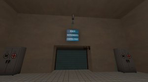
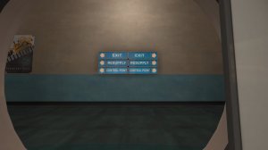
Having three signs is confusing. It's the only way to go, but especially without arrows it's not helpful
This is a better example IMO. Where should I be going, and what goes where? You also generally don't need to mark forward spawns with signs. The "battlements" as I would call them are very way away as well, so I wouldn't bother with those either
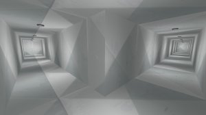
Try to have at least 2 main ways to get to any point, and the vents are too small and minimal to count as a main route (it's why everyone hates turbines vents)
On a related note, these vents are so small and cramped. You could have short vents that lead into an attic or something, but these are just long and if you see an enemy in the vent, there is no way to maneuver around them.
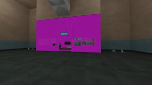
Missing texture, did you pack it correctly?
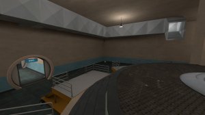
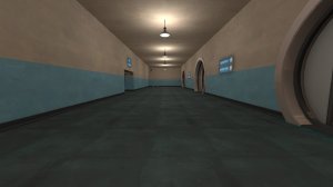
All your geometry seems flat with little to no height variation. Adding some other layers, higher curbs, or boxes can really help a map feel less bland. It also makes for more interesting gameplay
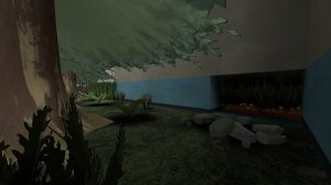
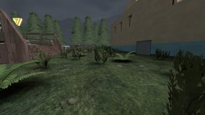
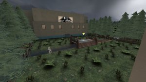
Cute entrance, but to get there it looks like you're breaking out of the playable area, and players generally HATE fighting in trees
Adding some grass could help this area
https://developer.valvesoftware.com/wiki/Displacement_Grass
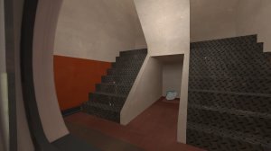
Two things here. Firstly, the stairs are really narrow, I tend to use at least 128 Hammer units. wide. In addition, they seem to be 1:1 which can be uncomfortable to play on. Try a 1:2 angle at maximum
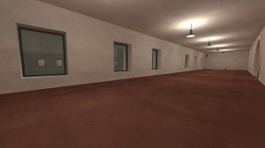
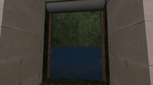
The 6 windows seem excessive to me and a symptom of too much symmetry, 2-3 is fine.
The windows are also really thick which just means snipers are likely to stand in the instead of behind them.
The windows also let you see the entire midpoint which would not be fun for anyone trying to cap mid
The waster spawn is a neat idea but it gives some funky graphics try to enter it.
All in all, it's way better than my first map was. Keep going!