WiP in WiP, post your screenshots!
- Thread starter Arhurt
- Start date
You are using an out of date browser. It may not display this or other websites correctly.
You should upgrade or use an alternative browser.
You should upgrade or use an alternative browser.


a) i usually try to avoid using that wall texture indoors, its noisy and dirty and kinda gross overall. personal taste though, feel free to ignore me-snip-
b) i think its less that you're spamming details so much that its that each detail is calling too much attention to itself. The Out of Order garage door, for example, has no less than three things telling you that the door is out of order (blood, a sign, and the broken-ness of the door itself). in most situations, doors don't need signs (in games at least. real world doors all have their own special numbers for a lot of reasons). i write more about this on g) but i cba to re-organize this wall of text
c) metal comes in thin sheets, kinda like glass but really flexible and strong, unlike brick and concrete which are volumetric. if you can see the thin edge of a piece of metal, it should probably only be 4 or 2 units thick.
d) less is more - you don't need to use red metal to differentiate the stairs from the ceiling. i'd recommend trying to keep your material palette limited - use as few different textures for any given physical material in a given area as possible. 2 is ideal, but you'll probably need more for specific cases. feeling this out mostly comes from experience
e) i would recommend changing the ceiling to concrete. unless you're very specifically making a basement, it's rare to have two neighboring floors of a building that are made of different materials. you can also add columns to the walls where the ceiling beams run into the walls, which is more or less "free detail." having columns in your walls also forces you to be more specific with where you place doors and whatnot (which is also a problem that Real World Architecture deals with a lot and therefore it will make your buildings feel more real probably)
f) consider where light fixtures will go. i assume you haven't put them in because you're not ready to compile things, but they're still part of the detailing even if you don't have any light entities in.
g) repeating multiple props next to each other is also another way of getting "free detail." cabinets rarely sit on their lonesome. it's also generally good practice to cluster props near each other if they're attention grabbing, that way things appear less noisy - there's a distinct "busy" and "empty" part of the scene and it feels more comfortable i guess? scene composition is a hard topic.
h) if the stairs are "dropping" out of the ceiling then they need to be a lot less heavy. this is what i think you're going for. try and make a single-flight set of stairs (no 90 degree turn) at a steep angle. maybe use the 16x16 stairs you had before, but make each stair 2 units thick, and add two pieces on either end to hold them in place? up to you. another fun detail might be splitting it into two stairs that move independently of each other (so that the stairs can "telescope" to save space) but that would be pretty difficult to figure out so don't beat yourself up if you can't figure out how that works. you could also have it so that the stairs simply rotate up and attach to the bottom of the ceiling instead of sliding up into the doorway - this would probably be the easiest to make work, and it makes the most sense for the space imo (attic ladders probably slide up into the attic because having a set of stairs on your ceiling would look bad in a home, but your scene is an industrial area where looks don't matter so much)
the door texture isn't even 64 units wide lolYeah, and they are 4 hu thick, not... 64?
Thanks, this will really help me.a) i usually try to avoid using that wall texture indoors, its noisy and dirty and kinda gross overall. personal taste though, feel free to ignore me
b) i think its less that you're spamming details so much that its that each detail is calling too much attention to itself. The Out of Order garage door, for example, has no less than three things telling you that the door is out of order (blood, a sign, and the broken-ness of the door itself). in most situations, doors don't need signs (in games at least. real world doors all have their own special numbers for a lot of reasons). i write more about this on g) but i cba to re-organize this wall of text
c) metal comes in thin sheets, kinda like glass but really flexible and strong, unlike brick and concrete which are volumetric. if you can see the thin edge of a piece of metal, it should probably only be 4 or 2 units thick.
d) less is more - you don't need to use red metal to differentiate the stairs from the ceiling. i'd recommend trying to keep your material palette limited - use as few different textures for any given physical material in a given area as possible. 2 is ideal, but you'll probably need more for specific cases. feeling this out mostly comes from experience
e) i would recommend changing the ceiling to concrete. unless you're very specifically making a basement, it's rare to have two neighboring floors of a building that are made of different materials. you can also add columns to the walls where the ceiling beams run into the walls, which is more or less "free detail." having columns in your walls also forces you to be more specific with where you place doors and whatnot (which is also a problem that Real World Architecture deals with a lot and therefore it will make your buildings feel more real probably)
f) consider where light fixtures will go. i assume you haven't put them in because you're not ready to compile things, but they're still part of the detailing even if you don't have any light entities in.
g) repeating multiple props next to each other is also another way of getting "free detail." cabinets rarely sit on their lonesome. it's also generally good practice to cluster props near each other if they're attention grabbing, that way things appear less noisy - there's a distinct "busy" and "empty" part of the scene and it feels more comfortable i guess? scene composition is a hard topic.
h) if the stairs are "dropping" out of the ceiling then they need to be a lot less heavy. this is what i think you're going for. try and make a single-flight set of stairs (no 90 degree turn) at a steep angle. maybe use the 16x16 stairs you had before, but make each stair 2 units thick, and add two pieces on either end to hold them in place? up to you. another fun detail might be splitting it into two stairs that move independently of each other (so that the stairs can "telescope" to save space) but that would be pretty difficult to figure out so don't beat yourself up if you can't figure out how that works. you could also have it so that the stairs simply rotate up and attach to the bottom of the ceiling instead of sliding up into the doorway - this would probably be the easiest to make work, and it makes the most sense for the space imo (attic ladders probably slide up into the attic because having a set of stairs on your ceiling would look bad in a home, but your scene is an industrial area where looks don't matter so much)
the door texture isn't even 64 units wide lol
About the door, the blood is just a little joke, not a sign that the door is broken, more or less why its broken or what happened to it. Just something to grin at.
I considered colums were the cieling bar things are, and I didnt like how it looked for whatever reason, I'll give it another go with something different.
Probably just going to delete that stupid stair case and cieling thing, there isnt enouph room in the hallway for it and it makes no sence. (If I set it in a basement, why are there like 5 doors, one with dirt?)
Thanks again for the feedback, this will really help me.
Malachite Man
L6: Sharp Member
- Oct 16, 2015
- 345
- 198
TheClaudioAmericano
L1: Registered
- Mar 27, 2013
- 46
- 16
First attempt at making a KotH map, here's the result so far.
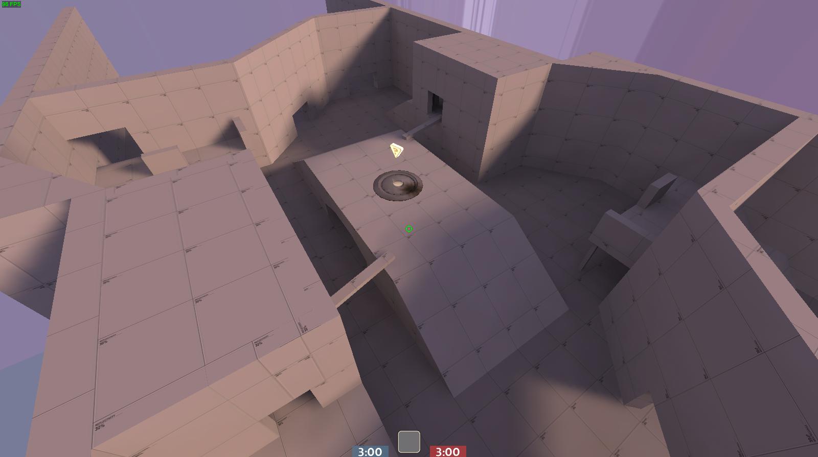
I plan to work on this in the upcoming week so hopefully I can finish this for an A1 test, I'm aiming for the gameplay to play similarly to Viaduct.
I plan to work on this in the upcoming week so hopefully I can finish this for an A1 test, I'm aiming for the gameplay to play similarly to Viaduct.
i want to see a game where rocket jumping does no self-damage, the floor hurts you, and only air-shots do damage. Would make for some amazing movement-oriented gameplay imo.
p.s., that fov makes me want to die
Last edited:
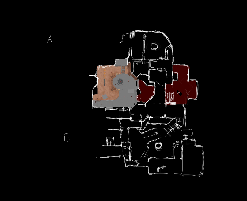
designing a map based on steel's basic routing without it becoming a carbon copy is harder than it sounds.
Thats part of why I'm not planning (just doing it).
The other part is that I'm out of paper...
Whats your gimmick for the E point going to be?
Whats your gimmick for the E point going to be?
A&B will cause bridges to extend making it easier to access the point area, C will cause the spire to lower allowing standard mobility classes to be able to cap, D will increase the size of the cap area.
at least that's the plan
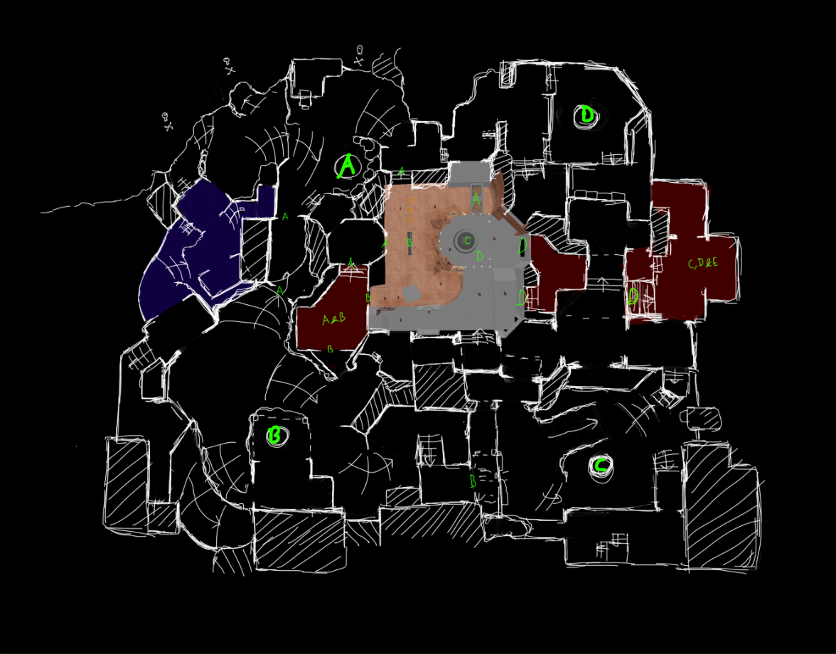
Opening bit of a longform payload because fuck it, it wouldn't be a major contest if you were doing a project you were remotely prepared for


Last edited:
Adjust the alpha paint on that blend texture so that it follows a sorta path. Right now it's not very easy on the eyes being in a pattern and could affect vision of players. Also it just looks kinda like puke.Opening bit of a longform payload because fuck it, it wouldn't be a major contest if you were doing a project you were remotely prepared for