The Letter Before A
Cool Idiot
- Jul 15, 2016
- 292
- 196
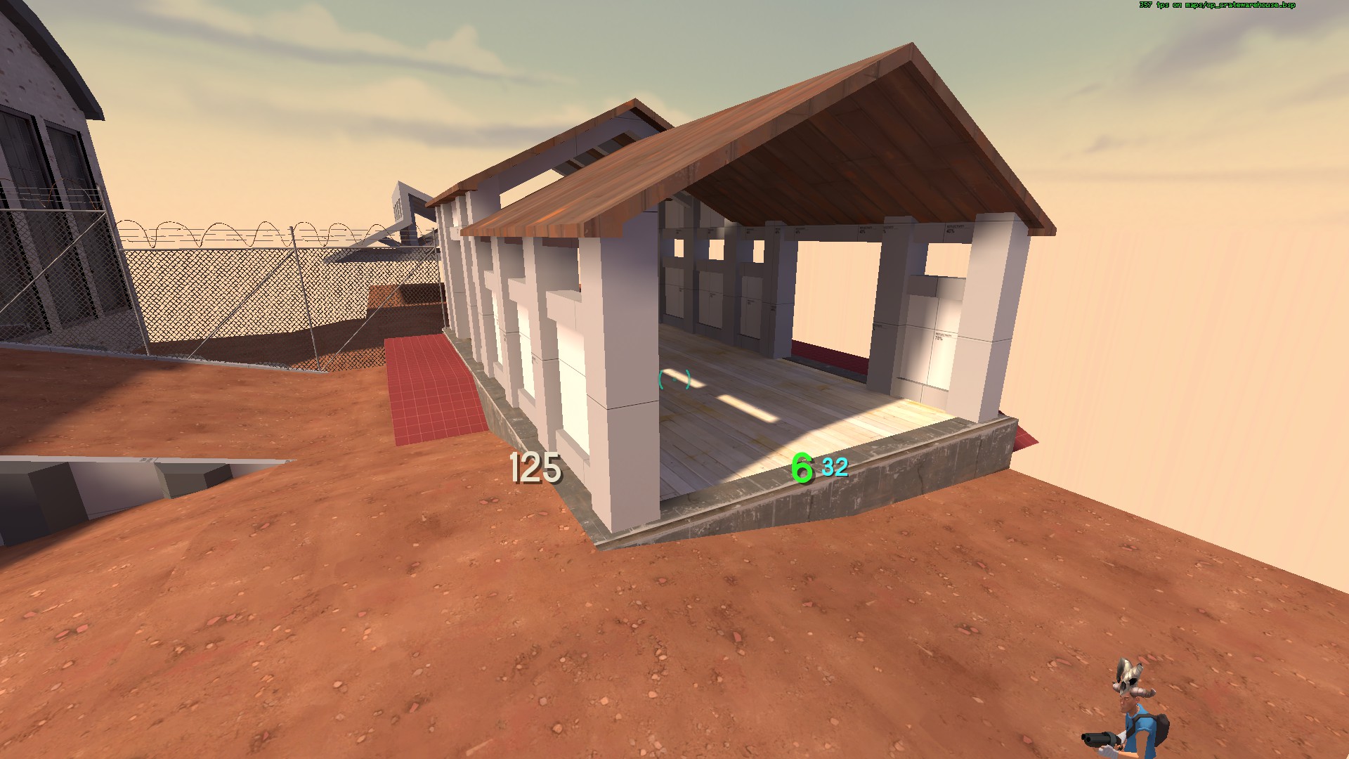
Please tell me that spot is clippedjust one list drink to myself befor the map is live.

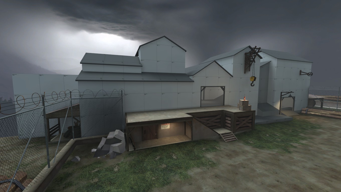
the official name is kill zone express ("kill zone" for the unconventional battlefield and "express" because trains.
of course! as bad at mapping i am i'm not that bad. if a player could get up there they would immediately have an advantage over everyone!Please tell me that spot is clipped
It's hard to keep things nice and clean when you're working with a 15 year old engine with tons of garbage and a 20 year old editing program for it.


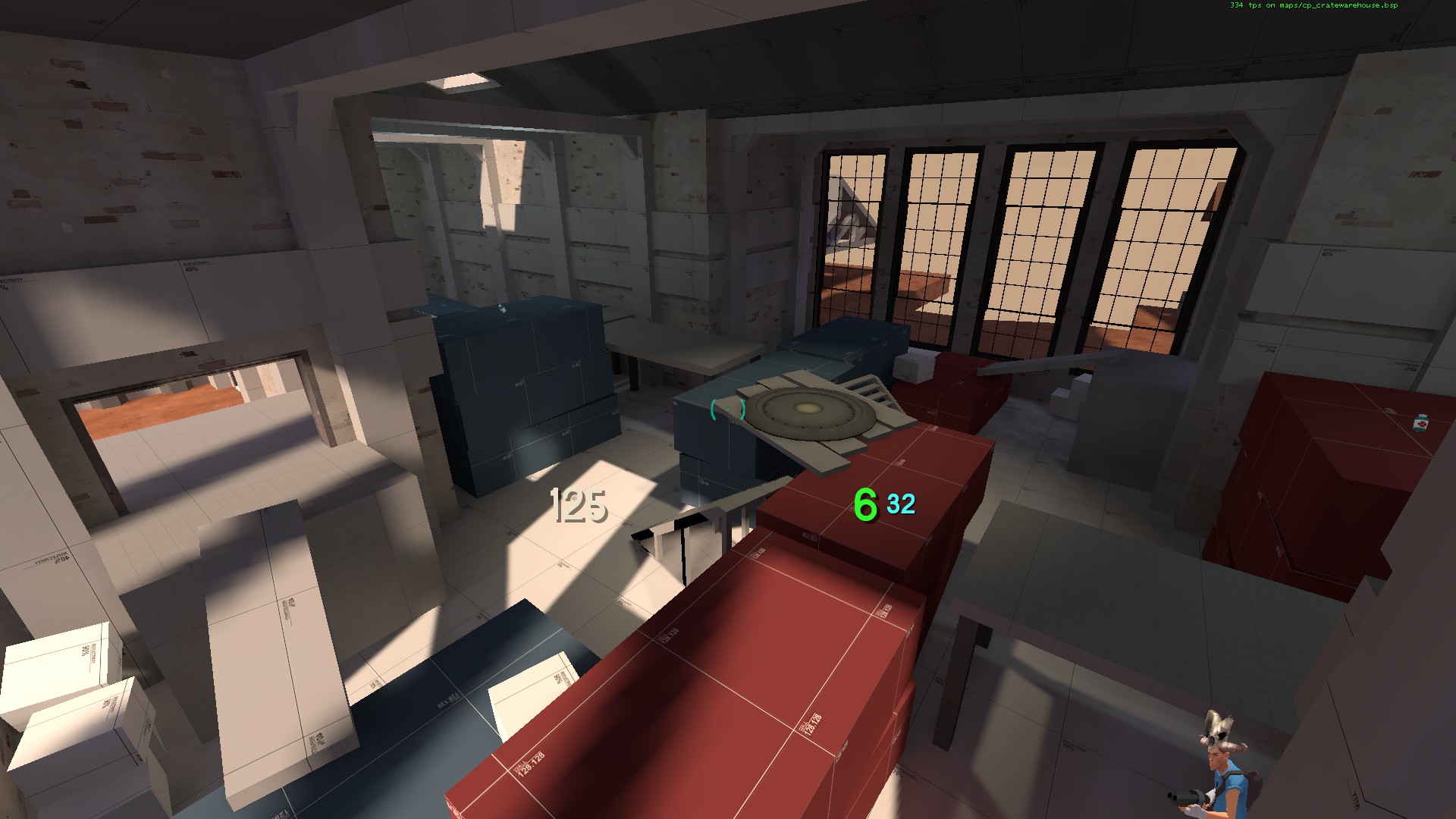
I'm not sure I'm on board with the way you're using the corrugated metal texture. Those textures are best suited for makeshift, shanty-like structures, but you're using it like it's some form of masonry, especially in picture #2.3 with the juts between the windows.
Okay, no more detailing now. I promise.
Also, a map I've been working on lately:
-snip-
Lighting on the inside areas is very WIP
Also, a map I've been working on lately:

All of your detailing is really gorgeous but you should consider the realism of your materials. It's unlikely that concrete floors would be supported by wood, with the concrete overhang looking particularly precarious.