

Typography and Promo Material for Your Map
Typography is a really important tool in advertisement. Typography takes text and extends its meaning, it conveys emotion, it sets a tone and it serves as an alternative form of punctuation. Maybe you have an excellent alpine themed map that's lacking a bit personality when it comes to its visual presentation. Problem is, a strong sense of identity is one of the most important thing when it comes to making your map stand out on the workshop. That's where typography comes in.
here are a few example of strong typography that are currently on the workshop:
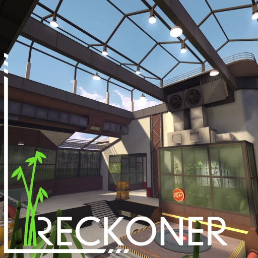
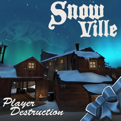
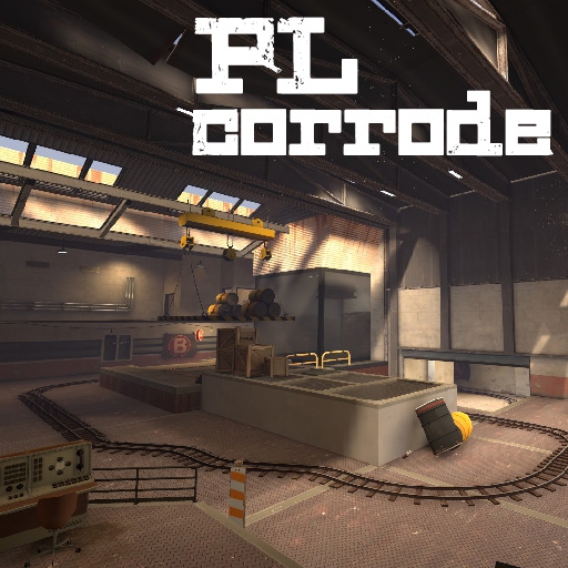
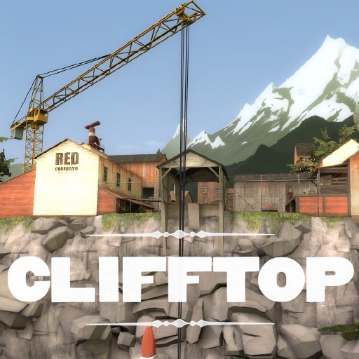
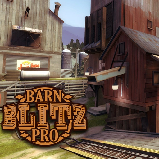
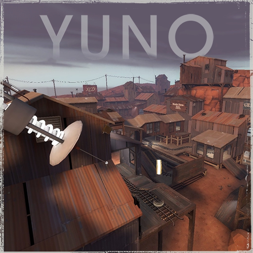
(you can do better than this, this is just to give you an idea)
For typography, anything goes really. The only thing you should NEVER do, is use the TF2 fonts. Not only those fonts are butt-ugly, they will only blend you in with the crowd and will achieve nothing other than convincing people that your map has nothing different to offer. "Oh, here's an other map that emulates TF2 without really adding anything to it." they'll say.
Here's a couple easy tips to help achieve good typography:
Contrast - If you have many words to play with, use different fonts, different sizes, different colors. Mix and match to have a dynamic look. If you're working with a single word, Try and make the First letter bigger, change its line height
Line space - If you have text on multiple lines, reduce the space between the lines to a minimum. The eye will naturally gravitate towards it more.
Kerning - Not all fonts are good out of the box, this is especially true with cheap fonts from dafont.com. A good font is supposed to have the correct spacing between most combinations of letters but exceptions happen all the time. Remember to adjust this spacing between each letters if you can spot bad kerning.
EFFORT - A common misconception is that great typography is achieved simply by picking the right font and calling it a day. Most people will stop there but it is never that simple. You need to put work into it and figure out all the little tweaks needed for your text to look amazing. The right font is not always the flashy ones. Simple fonts can be used to great effect and be far more powerful when in the hands of the right people.
All that being said, typography is a very complex topic that cannot be completely covered in a single post. You'll need to spend some time educating yourself on its intricacies if you want to become proficient with it. This topic is only to kick start your reflection about the importance of typography and open your mind to a couple approaches that can take you a long way.
Further readings:
The Graphic Art Of Film Title Design Throughout Cinema History - This especially relevant to tf2 since it is heavily inspired on movies.
Typography Deconstructed - This site will introduce you to the staggering amount of little details that people look at in a font.