I'll try and list some of the errors and what i intend to do about them.
1. PMavers pointed this out and i'm on it, i'll have to do some tweaking or just remove them as there is nothing visably wrong with the portals.
2. I hadn't really noticed, i'll take it into consideration. slower classes shouldn't have much as a problem as the scout does. I'll watch this closely in playtests.
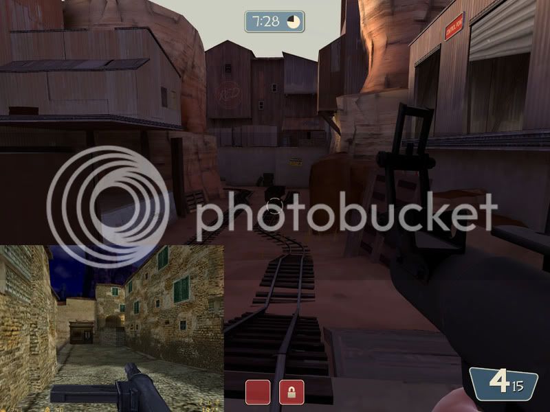
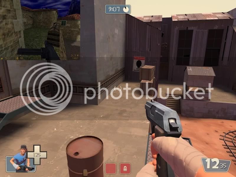
3. There's supposed to be a world map there but i deleted the other version, must have effected this one too. I might remove it all together as it takes up a fair amount of vertical space. You could say, the 4th cp is still under construction.
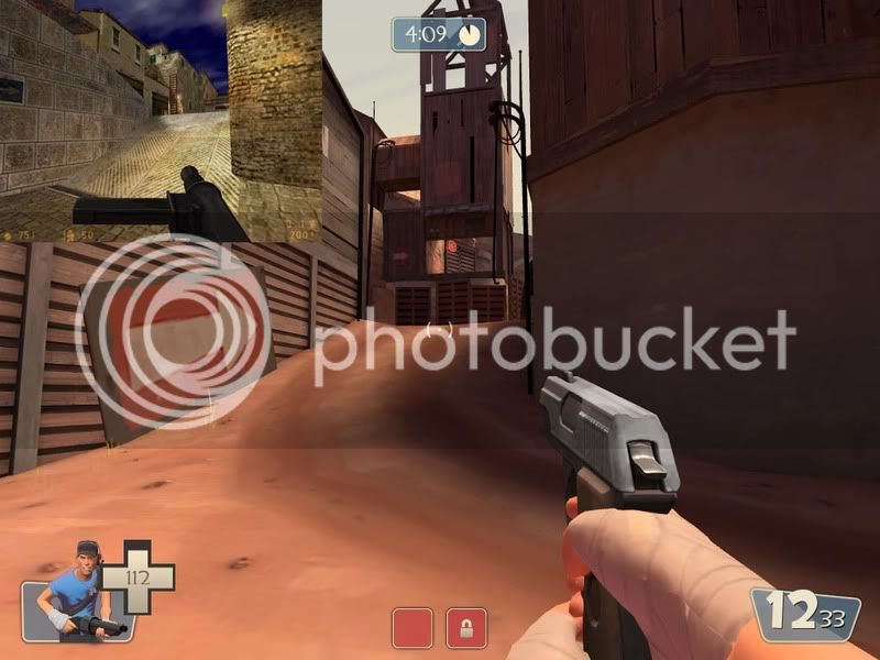
4. I mentioned already that lighting is sparce at the 4th cp and i am working on it. I released it in the hopes for gameplay feedback before i finalise anything, obviously visual feedback is welcome too.
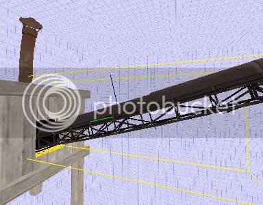
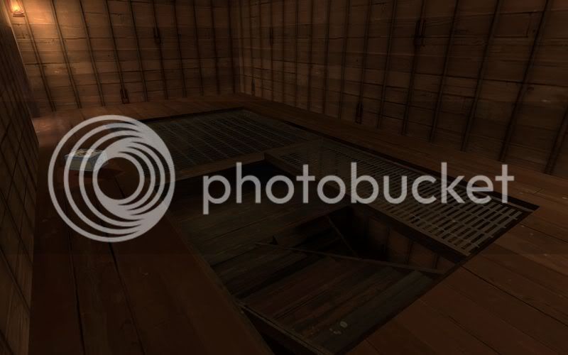
5. I don't believe it has a physics mesh, i'll clip it.
6. Ok. (you repeated this image btw)
7. I clipped this off as i didn't want "those sorts of people" sitting back lobbing spam at the team below as they steam roll the rest of the team doing their job. I'm not sure why a scout would want to get their either. I will add more props there to deter the impression that it is a useful accessable vantage point.
8 & 9. On it.
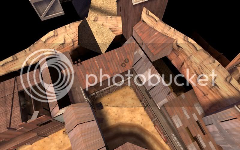
10. I was aware of this from the start but unaviodable because of the prop in the other room. In the next beta i intend to remove said prop and have a prop room visable through the floor, this will also allow me to widen that doorway.
11. It was lowered because of some venting details i had, but decided to remove it. I havn't bothered fixing up the spawns with detail yet. Expect this area to be different in the next beta.
12. Fixed.
13. This wont be noticable when i compile with youme's lighting parameters.
14. I'll remove the arrow, it did bug me but the wall was bare (without it). I'll add another overlay there but probably leave the sign where it is.
15. This has been bugging me from the start, it is because the displacements overlap. Hopefully youme's lighting parameters will fix this, if not, i'll have to seriously edit the displacement set up of the surrounding area. I was happy leaving this for the early Beta's. Though it is high on my priorities.
16. I will add more lighting here on the wall behind the prop.
17. It's supposed to be yellow, i actually took that light right out of valve's own gold pit. I'll make it more yellow.
18. Point taken though i'm not sure i agree; and i need it that tall to block an areaportal behind it.
19. It is clipped. The shack you're on seemed too low to clip without making it seem weird. Hopefully, the fact that people will be rushing towards the next cp that this wont be much of a map issue. A lot of the time i run through valve maps i see things like this, but rendered irrelavent because people pay attention to map goals. I will keep an eye on it in play tests though.
20. I have been considering this. Though completing layout was first priority, and then gameplay. It is on the "to do list".
21. this area is incomplete in Beta1.
22. Ok.
23. Are you pointing out that it's broken? See 1.
24. Fixed
25. On it
26. It shouldn't show for blue, i don't know why it's doing that. I'll take a look.
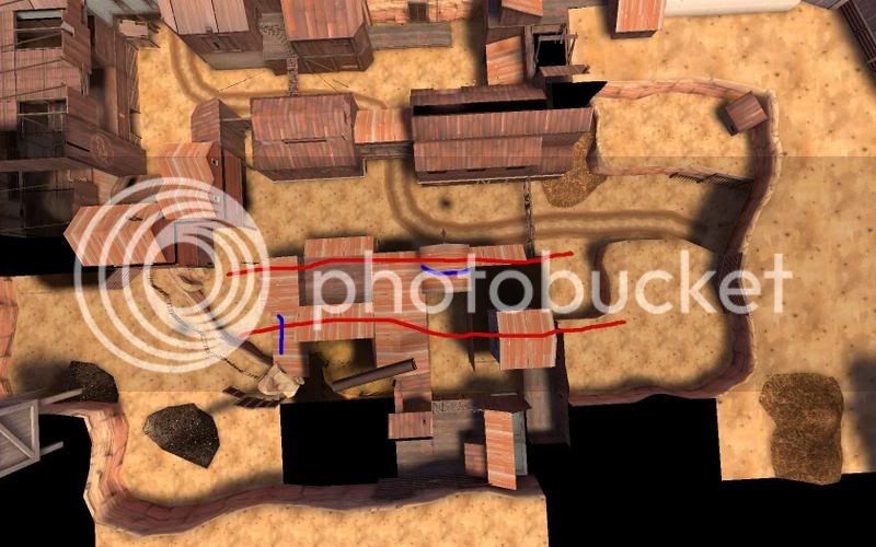
27. I'll widen the door to help. Anyone who played the original will be aware of this route and where it leads, those that don't will hopefully realise this soon enough. I predict this wont be an issue as players learn the map as we all have to with new maps. I will add an arrow on the left wall if i have to. The doors position on the right is for optimisation reasons.
28. See 4.
29. See 1.
30. See 13
31. Fixed.
32. I'll consider it. I understand what you mean, and i have actually removed them and added them multiple times through development. But i am hoping the arrows will thrust the players forwards rather than have them spew out at the top of the stairs in multiple directions.
33. Fixed.
34. I've added arrows to pathways with only one destination, the final cp. I understand that the left hand side could be overlooked as you sort of need to turn around, but there's 2 arrows and a sign pointing in the right direction if it wasn't obvious enough. Follow the arrows and you should be fine, i will watch this closely however in playtests seeing as i already know the layout; having created it.
I will make an effert on the clipping side of things which i have missed trying to get the first beta out. I had mentioned pointing out lighting issues may be a waste of time as i intend to sort that out in the final beta's and am aware of what needs to be done. Most of this is menial but some very helpful points are made.
edit: i'll get some comparison shots for you.