CP meltdown_p1

What do you think of the map?

  • Poorly designed. Need some major redos of certain areas

    Votes: 2 20.0%
  • Could do better. Bit of tweaking needed

    Votes: 1 10.0%
  • Good Attempt for a First map.

    Votes: 5 50.0%
  • Well done! Can't wait to see how this develops.

    Votes: 1 10.0%
  • You sir, deserve a cookie

    Votes: 1 10.0%

  • Total voters
    10
  • Poll closed .

Megascatterbomb

L1: Registered
Jul 9, 2014
21
6
An Attack/Defend map that works like steel. As this is my first map, Im looking for feedback on how I can improve the layout. The spawns feel too close to the points (esp at A) so I would like to hear your opinions on this. Vote on the poll what you think of the map.
 

Bunbun

aa
May 18, 2014
401
782
Not bad for your first map!

Here's some feedback judged by your screenshots:

Pic 1. those bridges look a bit weird and may attract sentries and snipers but we'll see.
Pic 2. the point feels to cramped, could consider making it wider.
Pic 3. everything looks pretty decent except for that pointless payload point on the tracks.
Pic 4. all those barrels look VERY ugly, keep the amount of props at a minimum, 1 respawn door is enough, delete the other 2 (unless they are is the ONLY respawn doors)
Pic 5. even though the spawn exit is a little close to the point, it's still a pretty cool looking E !
Pic 6. the stair props aren't connected to the floor, unless you have a player clip ramp that's something everyone will complain about.
 

Zed

Certified Most Crunk™
aa
Aug 7, 2014
1,241
1,025
Point D looks really cluttered.

Point C just looks gross. You've built it entirely out of dirt displacements, and that green lighting is really rather unappealing when cast onto it.

That bridge running on top of Point B looks very bizarre. It's narrow, and trains are not meant to go up such a sharp incline (You did say you'd have a train running through there, right?). Plus, the area around it doesn't look particularly interesting either.

Can't really say much about Point A or E, other than it looks like there's only one way onto Point A.

These are just my first impressions. I'll definitely take a closer look at this soon and keep an eye on it for when you submit it to a gameday.
 

Megascatterbomb

L1: Registered
Jul 9, 2014
21
6
Thanks for the feedback. Ill probably change the lighting around C to a more orangey, cave-light theme. As for the dirt displacements, I used those to represent a cave. Do you think a rock displacement would be more suitable around C?

I also need to widen point A and redo that part. Ill probably have to move blues spawn back quite a bit to accommodate said widening.

Also, the p1 is planning stage, where nothing is finalised. Think of it as a proof of concept :)
 

radarhead

Basically? Kind of a Huge Mess
aa
Mar 6, 2013
1,045
625
Thanks for the feedback. Ill probably change the lighting around C to a more orangey, cave-light theme. As for the dirt displacements, I used those to represent a cave. Do you think a rock displacement would be more suitable around C?

I also need to widen point A and redo that part. Ill probably have to move blues spawn back quite a bit to accommodate said widening.

Also, the p1 is planning stage, where nothing is finalised. Think of it as a proof of concept :)

'Planning' is usually used to denote a non-playable edition of a map. If you can host a server with it, and people can win, it's alpha.
 

Bunbun

aa
May 18, 2014
401
782
Checked out your map, some important feedback here:

Too dark, add a light here
SItdgvB.jpg


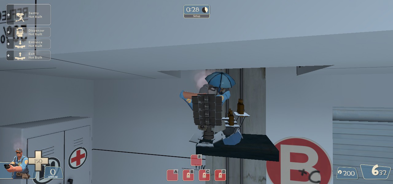
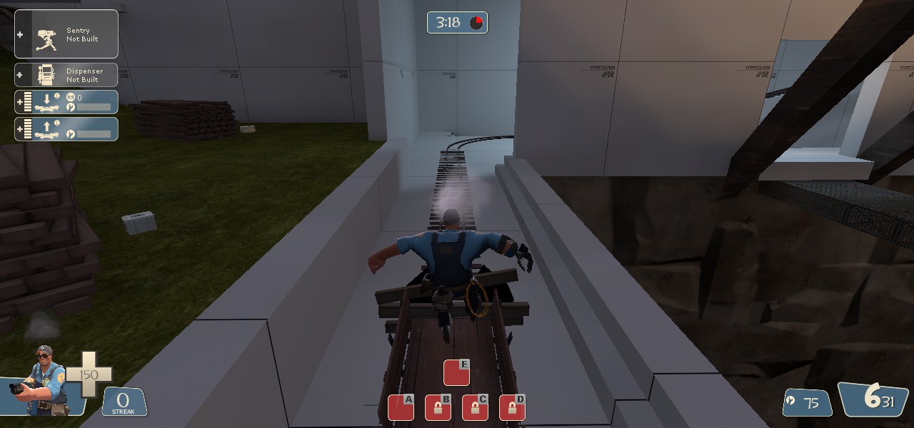
Doing this lags the whole map.
8FMvnKB.jpg


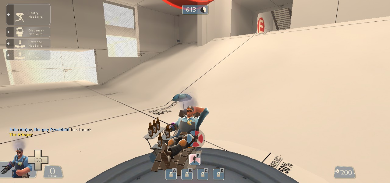
This is stupid, but it's kinda fun been driven thru the whole map, but it lags the whole map.
dODXG7x.jpg


Too close to red.
v2QJxGu.jpg


Too close to blue.
LmoZGbP.jpg


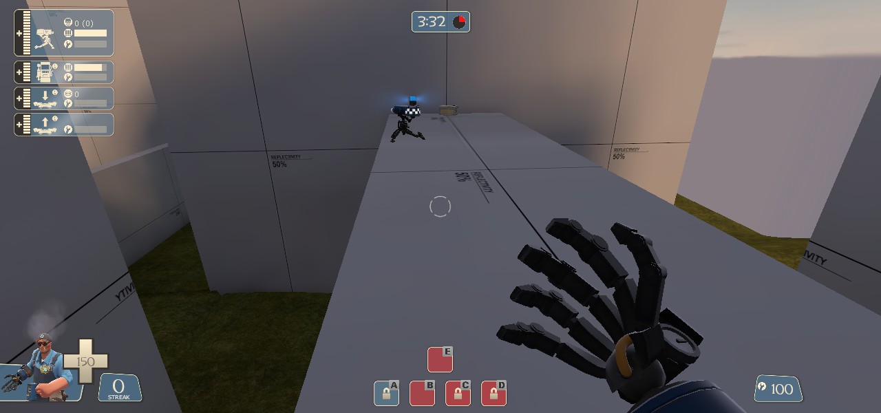
This area is too big, snipers and market-gardener soldiers are one heck of a problem
PGht2m5.jpg


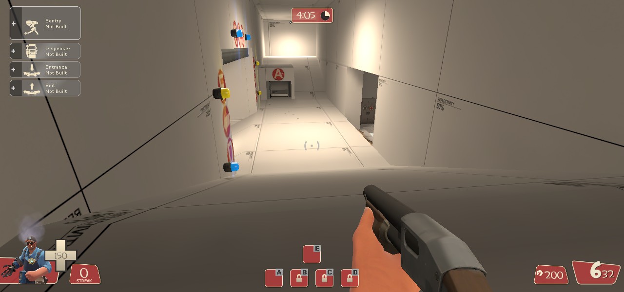
Remove this walkway, 4 sentries here could destroy the blue team.
UYqsfwy.jpg


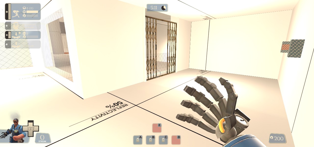
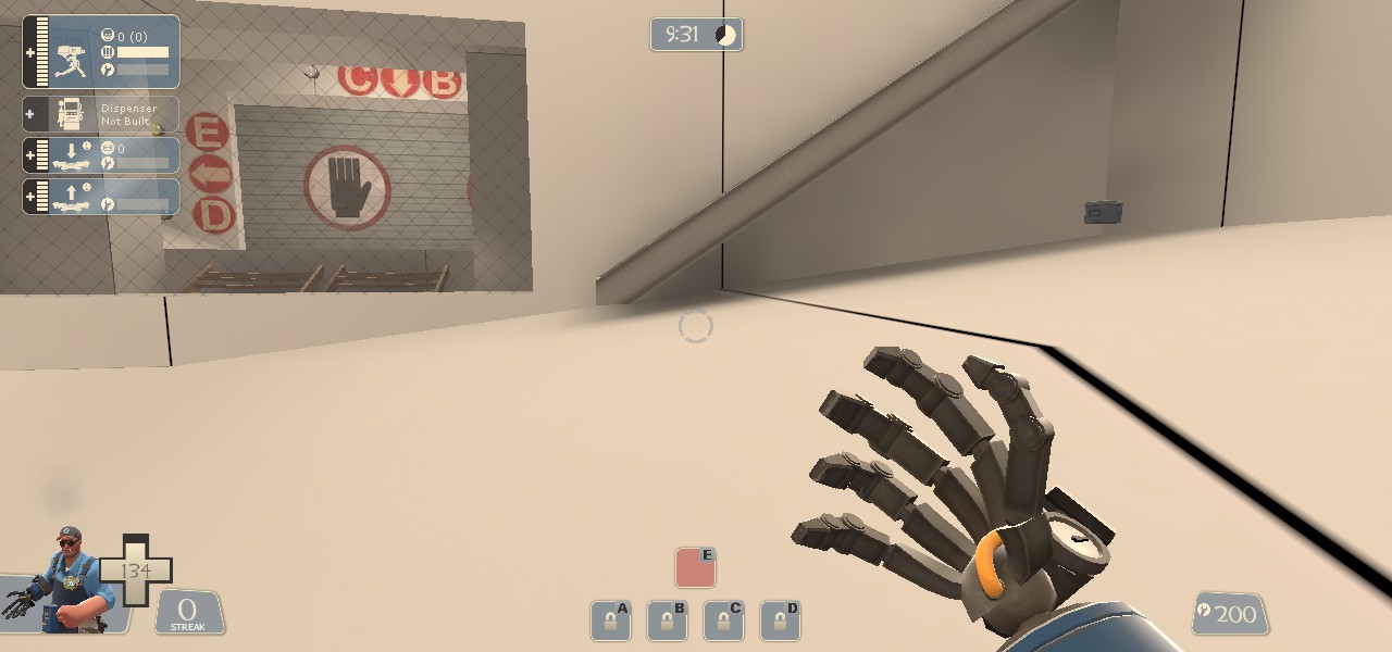
Doors don't open together.
iSegsu8.jpg


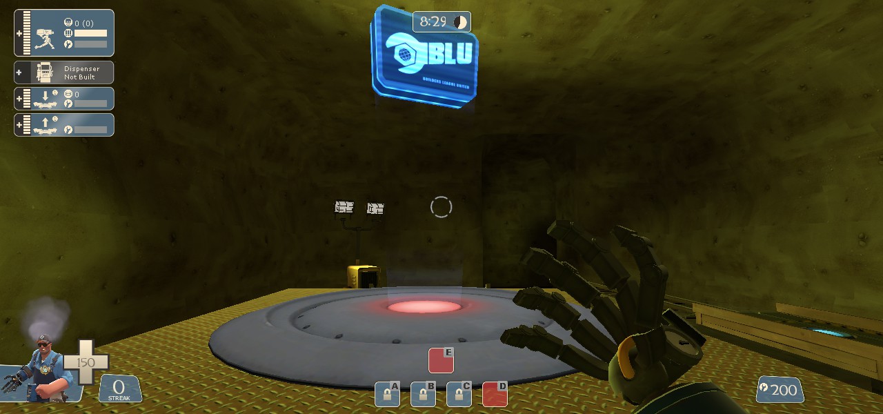
Cap prop should change to blue.
qt4DB6l.jpg


This.
K19eq5Q.jpg


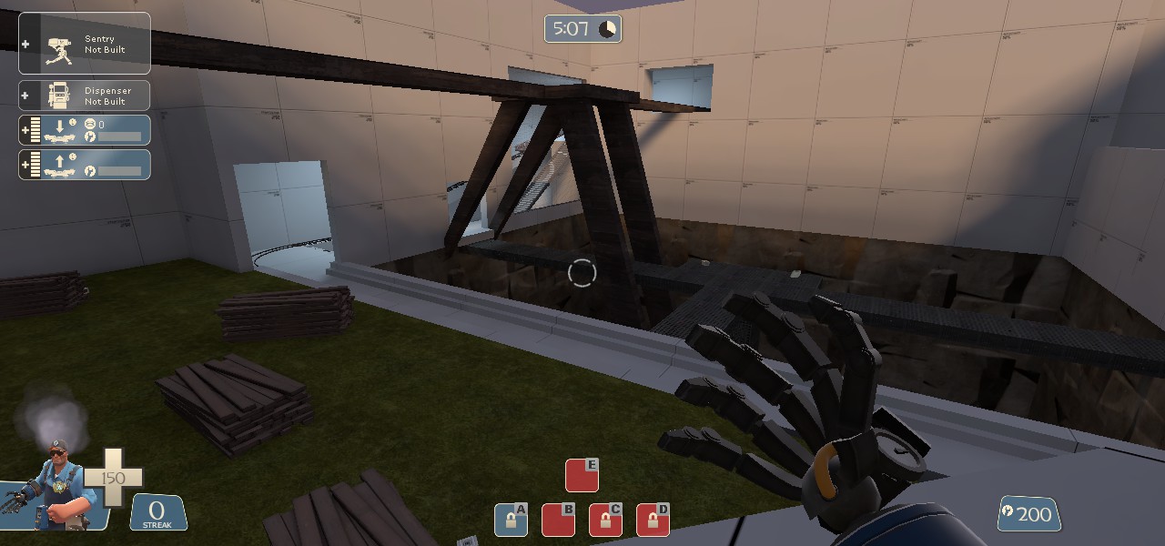
The elevator is pointless, leads to useless observation deck that could be used as sentry nests.
pSVcyYa.jpg


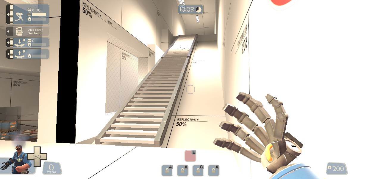
Add the stair props to the right side.
fsFvrcV.jpg


This.
U7PASpO.jpg


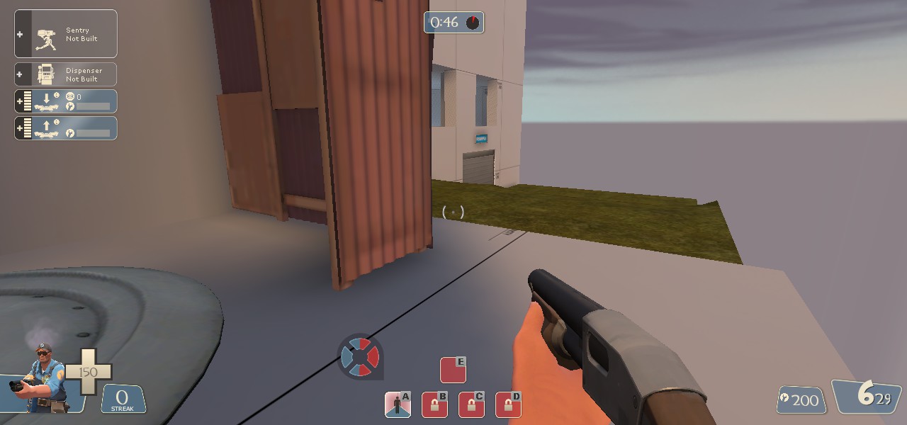
I like E very much, except for that bridge sticking out of the red spawn.
YKLxC5S.jpg


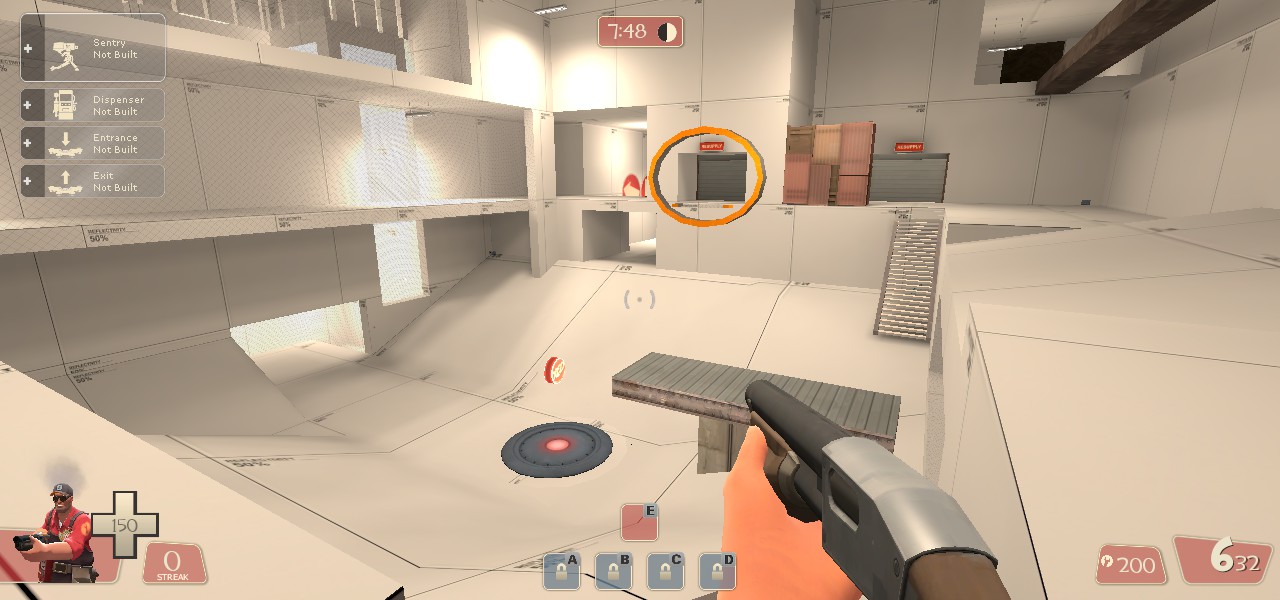
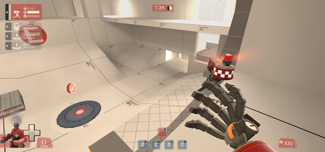
This sentry spot is too powerful.
QAp1uvl.jpg


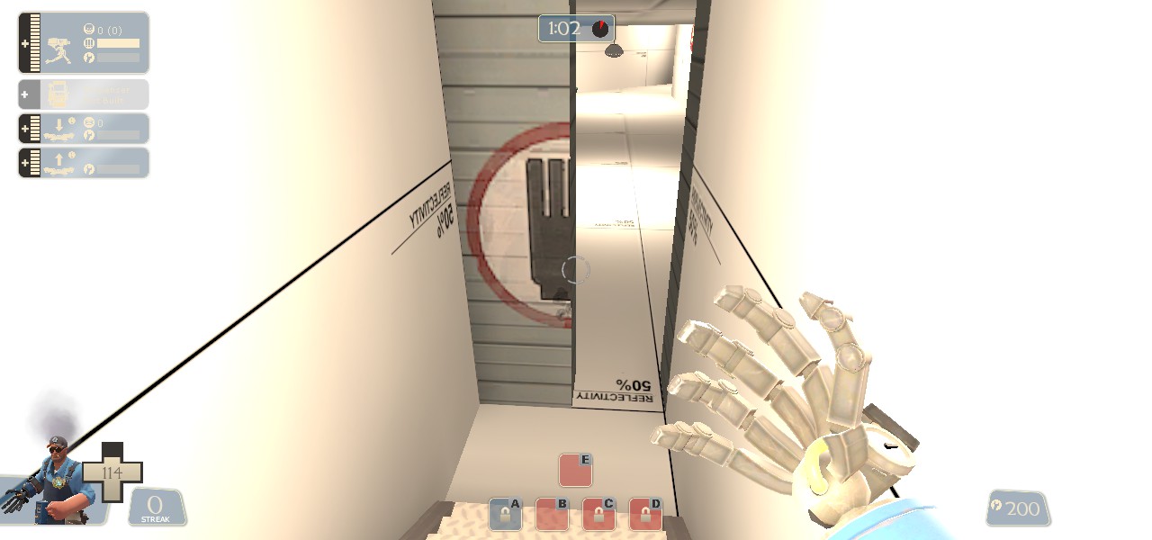
Bad sightline, probably add a prop here.
IjlkEF0.jpg


All the points take forever to cap
1YMcP9k.jpg


This.
UOgSwiD.jpg


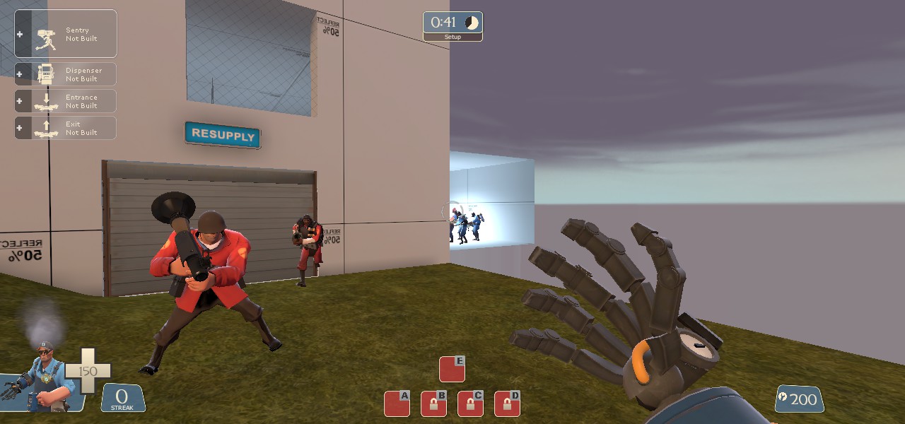
Red spawn is too big and too complicated, i suggest splitting it into two like steel.
fVKR5u7.jpg


This.
x9khxM7.jpg


Additional feedback:

-A and B should be parted with a building or something.
-Took me a while to finally find D.
-B and C are too close to each other.
-Routes feel cluggish and unsmooth.
-Add a wall near the end of the displacement.
x9khxM7.jpg

-Still, i would like to see this be tested.
 
Last edited:

Prolyfic

L5: Dapper Member
Dec 19, 2014
220
22
I saw some "hl" textures on your screenshots. You really need to replace to the actual game texture
 
Apr 14, 2013
663
343
Steel gamemode as a first map? You have got some courage, boy!

It actually looks pretty good for a first map. I would really like to play it on some imp soon.
But I see from the screenshots a few problems (you might already be aware to some of them but I'll point them out anyway)

1) You have a strange greenish light in some of your pictures, that I assume that it comes out of light entities. Usually in tf2, due to the importance of team colors, you would rather stick to a neutral flourocent white light color. If you want a Incandescent light bulb color, you can slightly tint it towards yellow. But from your picture it just looks too green.

2) The 4th picture has a huge prop-spam- meaning, you are relying too heavily on props to build a playable area. It tends to look too noisy, and sometimes might be confusing. I suggest to rebuild it in a way that is more brush-based.
Tip: Don't take inspiration from mvm_mannhattan!

3) some places, especially E, looks over-lit. This isn't that important for an alpha, but it's an easy fix.

That's all I can say from the pictures. So please, add this to some gameday or imp so we can play it!