Downloads: A new file has been added by Asimov:
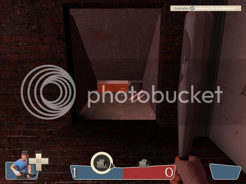
invade_construction_site_v1
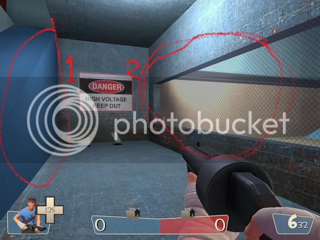
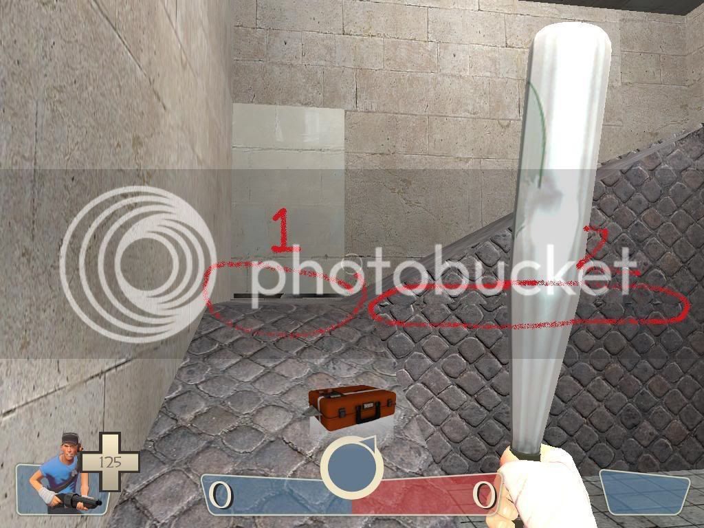
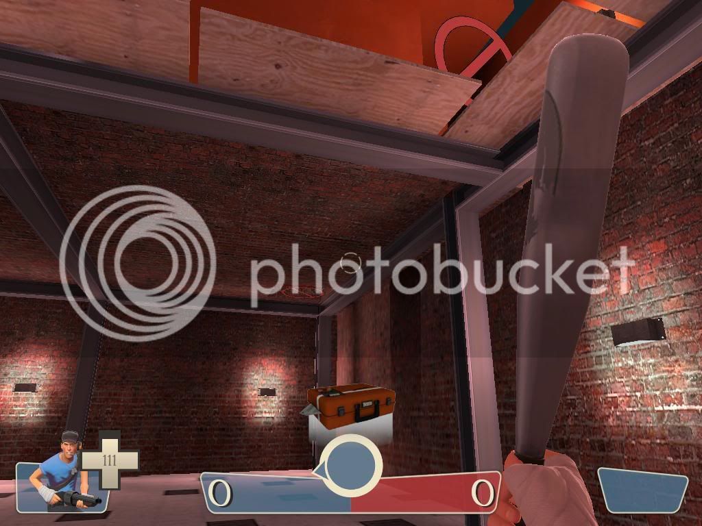
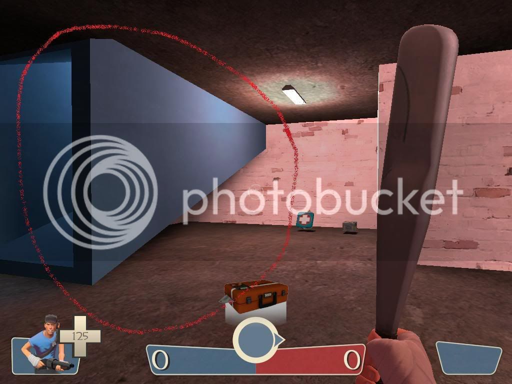
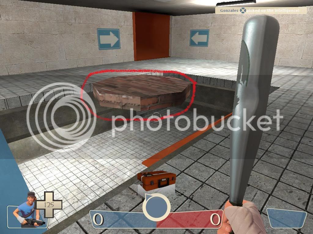
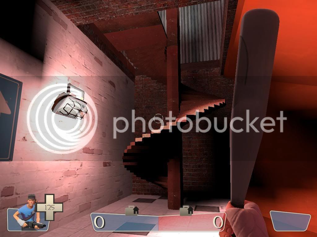
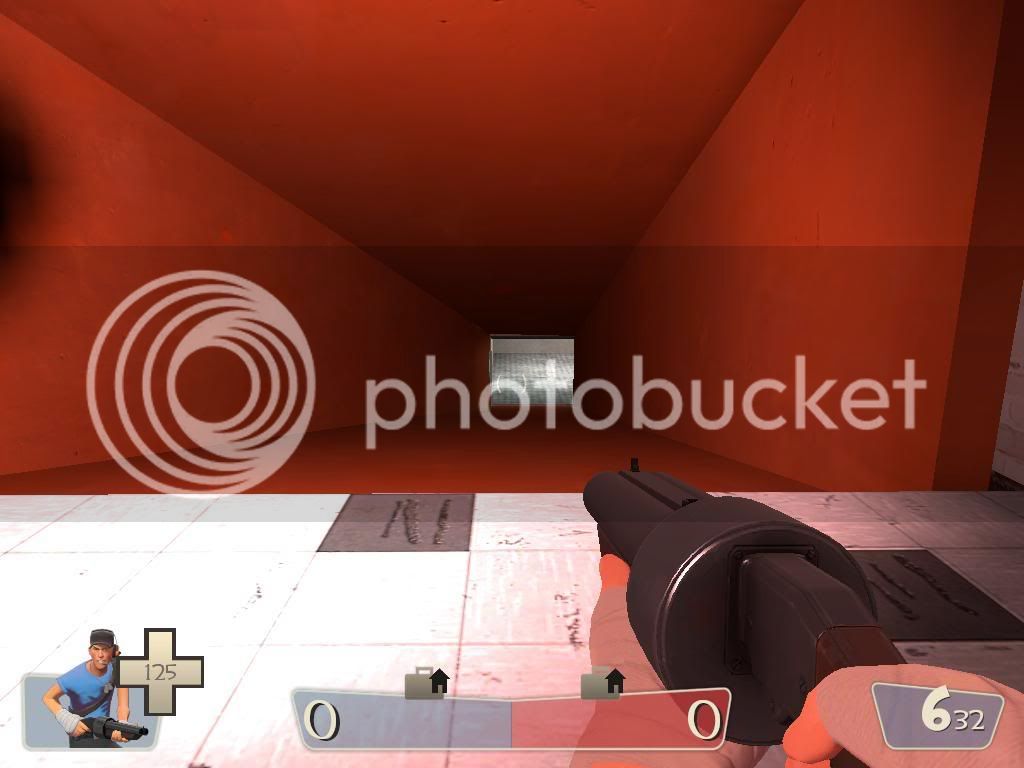
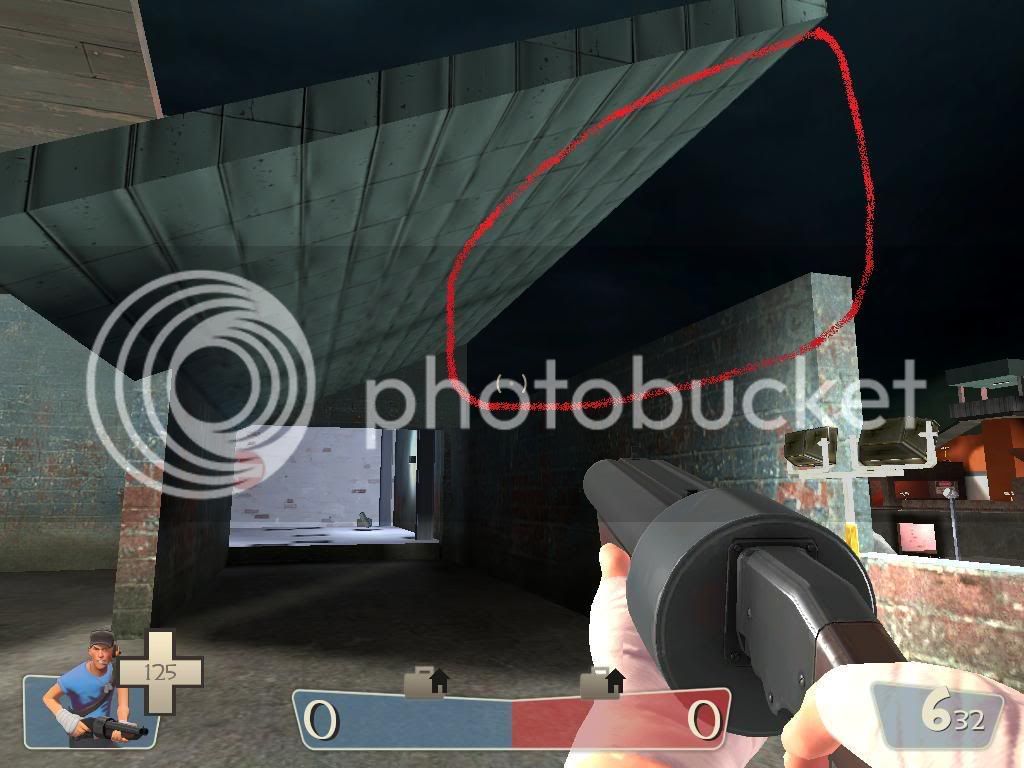
My first ever map. Please let me know what you think. I know you are probably going to hand me my head, but I appreciate you having a look.. Also if you have a solution to the problem with the reflections for the textures being purple please let me know. Thanks.
invade_construction_site_v1
My first ever map. Please let me know what you think. I know you are probably going to hand me my head, but I appreciate you having a look.. Also if you have a solution to the problem with the reflections for the textures being purple please let me know. Thanks.