WiP in WiP, post your screenshots!
- Thread starter Arhurt
- Start date
You are using an out of date browser. It may not display this or other websites correctly.
You should upgrade or use an alternative browser.
You should upgrade or use an alternative browser.


[7:43:16 AM] (Channel) Aly: we should start a new one just for the lulz
Should we?


takabuschik
aa
- Apr 14, 2013
- 663
- 343

dustmotes
L1: Registered
- Jan 20, 2014
- 18
- 10


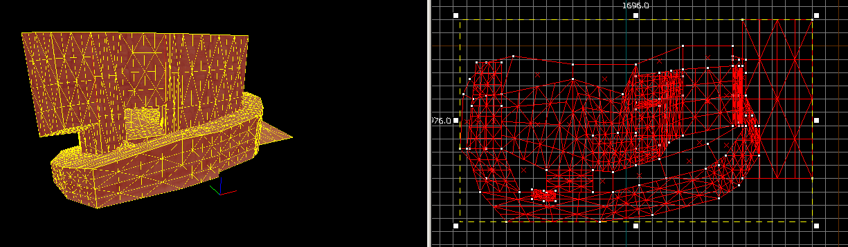
That's kinda intense. At least to me. I suck at displacements.
You're not the only one, look at that mismatch right next to the blue axis! Step up your game wareya!
ninja edit: it looks like all the cliff sections are different heights too :S
Not just that, but he also used a few displacements to cover the areas where it doesnt go well. Didnt you have a guide before explaining how to make displacements actualy sew well? It might be harder to do it on that area, but its not impossible.
Too bad i never realy made such creations as i find them interesting to make, but the maps i made simply didnt need them.
Too bad i never realy made such creations as i find them interesting to make, but the maps i made simply didnt need them.
Your displacement brushes should line up though, then they sew properly.
ThrowingPie
L1: Registered
- Apr 6, 2014
- 28
- 30
seth
aa
- May 31, 2013
- 1,019
- 851
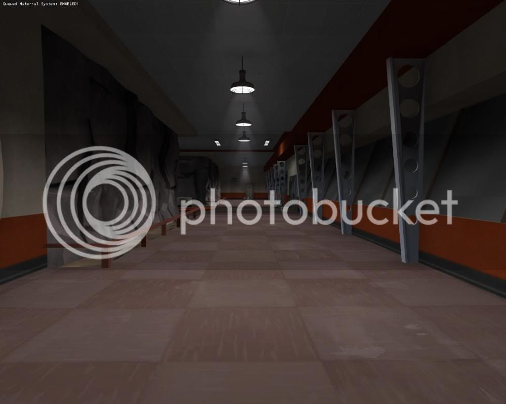
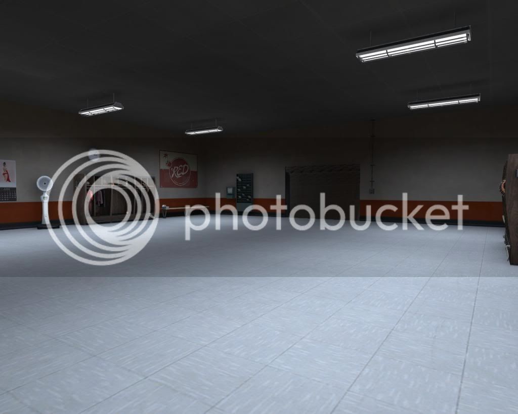
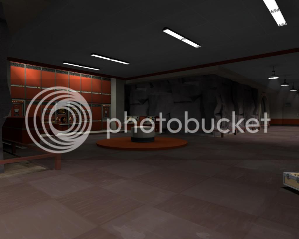
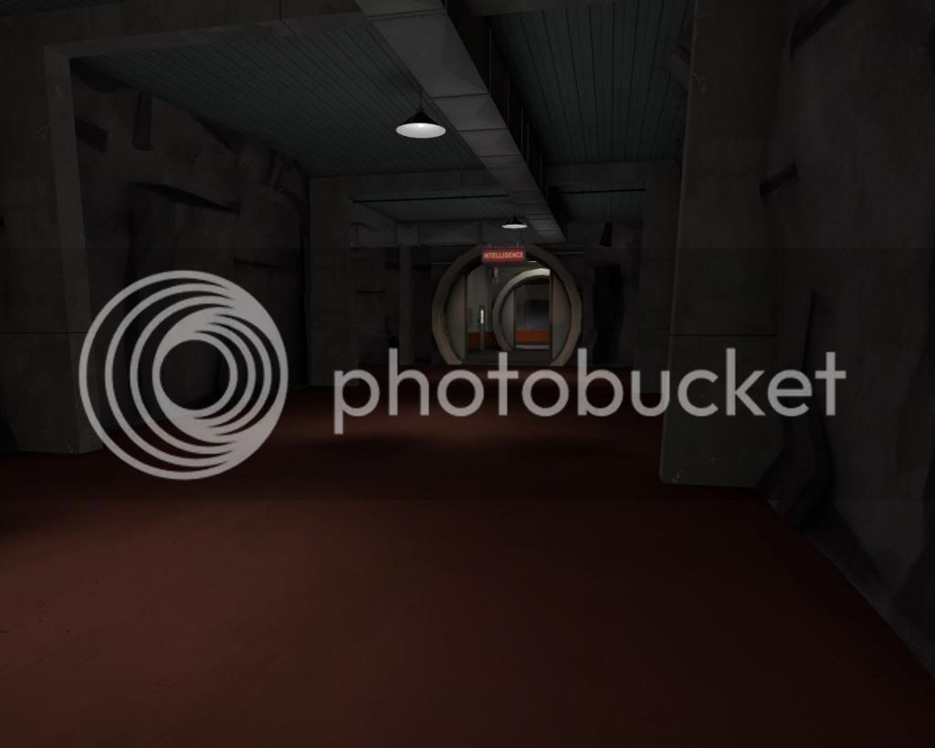
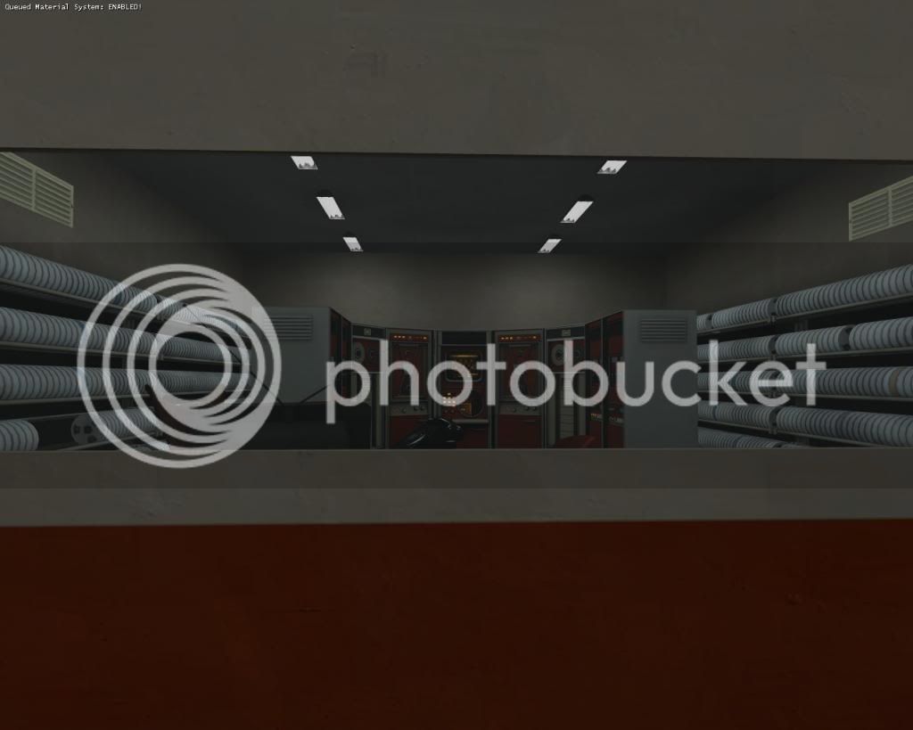
AustralianHH, I really like the simplicity of your visuals. They add to the map in a nice way without being distracting. However, judging by your screenshots the map looks a bit linear and closed-in. I think the more mobile classes aren't going to have quite so much fun on the map if everything has a shallow roof with little openness.
Last edited:
ThrowingPie
L1: Registered
- Apr 6, 2014
- 28
- 30