Making a Poster Overlay
by Nineaxis
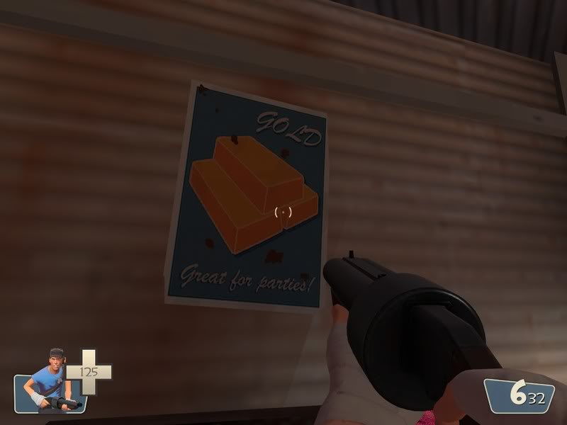
Here is my tutorial on making poster overlays for Team Fortress 2. Today we'll be making this:

http://forums.tf2maps.net/downloads.php?do=file&id=513
Creating the Base
The image creation program I'm going to use Adobe Flash CS3 Professional (unconventional, yes), but the program doesn't matter, so open up your favorite.
I'm going to start by opening up the TF2 palette to use as reference. You can download it here.
Now I'm going to make my image 512x512 square. On top of that, I'm going to make a 384x512 rectangle, left justified. I'm going to use the lightest tan color on the palette, the first one in the tan row.

Next I'm going to add a 354x482 rectangle on top of it, so that the tan forms a 15 pixel border on all side. I'm going to use the light red color, 3 from the left on the red row.

Congrats! You've made a base for your poster!
Creating the Image
Oh noez! Your poster is just two colors and boring! Time to add some fun to it. Since my poster is red, I'm going to do a product ad that follows RED's agricultural theme. Likewise, if I had chosen to make the second rectangle a blue color, I'd choose something related to BLU.
So, I'm going to do an ad for Redhill Livestock. I'm going to search on google images for a good picture of a cow. It needs to be a very clear pic and people should be able to easily understand the silhouette as a cow. I found this:

To give the poster the propaganda feel, I'm going to reduce the cow to a mere silhouette with some defining features highlighted- the spots. To further give the propaganda look, I'm not going to trace over it with the pen tool, but use the line tool to give a more blocky feel while not turning it into a cubist piece. So, on a new layer, I make this cow "wireframe".

Now just start filling it in with colors off the palette until you get something you like. Just avoid using anything off the team-color row your poster isn't from. Since this is a red poster, no colors from the blu row should be used.

The cow looks kind of alone there. It needs a background. So let's start a new layer behind the cow. I'm going to add a farm fence just by making some lines with the line tool. I'm going to make two lines spaced slightly apart, and copy and paste them to form a second row above. After that, I'll just add some vertical lines and copy and paste them at 30 pixel intervals for fenceposts. I'm going to color them the red to the right of the one used for the background, as well as fill in the ground below the fence to seperate it from the sky.

Adding your Text
So now we have a cow and a fence. That doesn't seem like a very good promotion for Redhill Livestock. It needs some text!
A really defining feature of mid-1900's posters was the text and the focus on styling it. Accent text was usually done in a "brush" style, making short exclamations about the product. So we'll start with the font.
Windows comes standard with a font called Brush Script (surprise!). That one works, but because it comes with Windows, people have beat the crap out of it and if you're like me, you can recognize it immeadiately and the initial reaction is "those people are cheap". No one had Windows in 1946 either. I like to use Dafont for getting new fonts to use. Check the Brush section in the Script category for some good ones. Here are 3 fonts I downloaded and Billy Gates' Brush Script:

Download Express
Download Forelle
Download Marketing Script
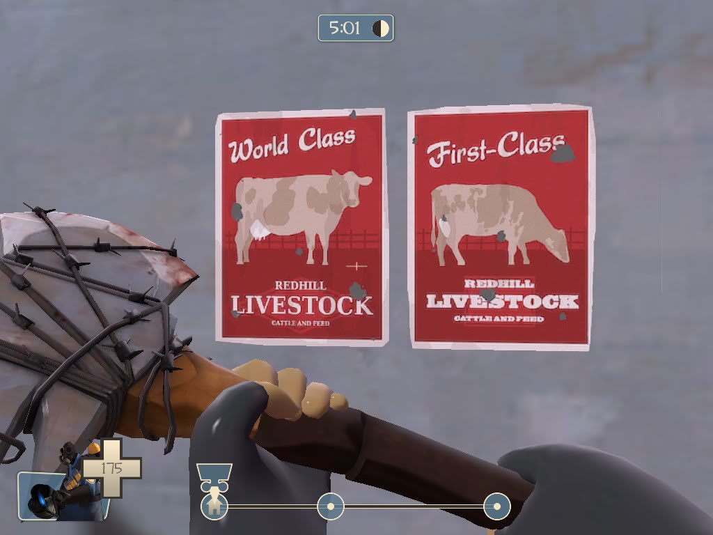
I use Express for all my RED posters, so I'm going to use it for this one too. What is Redhill Livestock's unbased claim to fame? Let's go with "World Class". So, I use the text tool to make World Class with the Express font at size 62. I'm also going to set it at a slight angle. I am going to make it the same color as the fence/ground. (Wait for the reason!)

Now, copy that text and paste it in the same place... and move a bit to the left and up, and change the color to the midtone tan. Amazing! Overlayed text! Fancy drop shadow! So now our Redhill Livestock, which no one has ever heard of, is "World Class".

For the bottom, I'm going to add a logo for Redhill Livestock. You might think Redhill is a cheesy name for a RED company, but judging from what Valve does, cheesy is the way to go. It's a red company and farms are generally near hills, so why not Redhill? I think Cliffe Rocks, Gray Gravel, and Red Valley Mining all fall into the same category.
Period logo's were made to the same simplicity as the poster artwork, so I'm just going to make a lighter red diamond and put some text over it. For this I'm using DeJaVu Serif Condensed. I'd recommend a sans-serif font when you aren't putting a logo on the poster. "Condensed" fonts work very well. The font is colored the lightest tan, same as the border.

Weathering
That poster can't be spiffy and new looking! It's in the middle of a run down farming area that's become a battle ground for corporate sabotage! Time to make it look like it's been there forever.
We'll start by "staining" it. I'm going to take the leftmost color on the red row and set it at 10% alpha (90% opacity). Use this color even for BLU posters. I'm going to take a midsize solid circle brush and do random vertical scribbles, keyword being vertical. Water drips would go downward, so make strokes from the top down. Another important thing is to cover large areas without making large blobs. Also, try and bring your splotches across area of different color. You don't want the splotches to be too noticable, but at the same time, because they are so opaque, you want to add some contrast by overlaying multiple colors providing visual variety.

So now your poster is stained. But surely at some point in time it was hit by something. Maybe a farmer wasn't careful with his hoe, someone leaned against it, or confused bird hit the broadside of a barn, but however it happened, some holes got torn into it. So let's make some... Valve style. Select the gray which is the color farthest left on the blue row. Select a smaller solid circle brush, and start making random circle-like shapes of varying sizes.

Now we need to cut some corners- literally. That poster couldn't have stayed a perfect rectangle with all that's happened to it. So I'm going to just cut some small amounts off the edges.

Save your image as a transparent PNG.
Finally, we'll make it look like it was printed in 1940 instead of 2008. For this I'm going to use GIMP, but I'm sure Photoshop has the same effect somewhere. Start by opening your PNG.

I'm going to add some HSV noise to make it look like it was printed on rough paper- the kind you'd want to print a poster on to hang outside. The effect can be found in the "Filters" section on the toolbar, under the "Noise" category. Through much experimentation, I've found that the default settings for noise works perfectly- noticeable but not too much.

Finally, we need it in .TGA format to convert to a VTF- Valve Texture Format. So, a simple "Save As" and select TarGa format, leaving the default settings. Save it named something simple but descriptive of your texture. Hammer's Texture Browser searches the name of your VTF, so having it named something appropriate it important. I'm naming mine redhillcattle, because it is a simple, and if someone knows what the poster looks like they shouldn't have trouble finding it.

by Nineaxis
Here is my tutorial on making poster overlays for Team Fortress 2. Today we'll be making this:
http://forums.tf2maps.net/downloads.php?do=file&id=513
Creating the Base
The image creation program I'm going to use Adobe Flash CS3 Professional (unconventional, yes), but the program doesn't matter, so open up your favorite.
I'm going to start by opening up the TF2 palette to use as reference. You can download it here.
Now I'm going to make my image 512x512 square. On top of that, I'm going to make a 384x512 rectangle, left justified. I'm going to use the lightest tan color on the palette, the first one in the tan row.
Next I'm going to add a 354x482 rectangle on top of it, so that the tan forms a 15 pixel border on all side. I'm going to use the light red color, 3 from the left on the red row.
Congrats! You've made a base for your poster!
Creating the Image
Oh noez! Your poster is just two colors and boring! Time to add some fun to it. Since my poster is red, I'm going to do a product ad that follows RED's agricultural theme. Likewise, if I had chosen to make the second rectangle a blue color, I'd choose something related to BLU.
So, I'm going to do an ad for Redhill Livestock. I'm going to search on google images for a good picture of a cow. It needs to be a very clear pic and people should be able to easily understand the silhouette as a cow. I found this:
To give the poster the propaganda feel, I'm going to reduce the cow to a mere silhouette with some defining features highlighted- the spots. To further give the propaganda look, I'm not going to trace over it with the pen tool, but use the line tool to give a more blocky feel while not turning it into a cubist piece. So, on a new layer, I make this cow "wireframe".
Now just start filling it in with colors off the palette until you get something you like. Just avoid using anything off the team-color row your poster isn't from. Since this is a red poster, no colors from the blu row should be used.
The cow looks kind of alone there. It needs a background. So let's start a new layer behind the cow. I'm going to add a farm fence just by making some lines with the line tool. I'm going to make two lines spaced slightly apart, and copy and paste them to form a second row above. After that, I'll just add some vertical lines and copy and paste them at 30 pixel intervals for fenceposts. I'm going to color them the red to the right of the one used for the background, as well as fill in the ground below the fence to seperate it from the sky.
Adding your Text
So now we have a cow and a fence. That doesn't seem like a very good promotion for Redhill Livestock. It needs some text!
A really defining feature of mid-1900's posters was the text and the focus on styling it. Accent text was usually done in a "brush" style, making short exclamations about the product. So we'll start with the font.
Windows comes standard with a font called Brush Script (surprise!). That one works, but because it comes with Windows, people have beat the crap out of it and if you're like me, you can recognize it immeadiately and the initial reaction is "those people are cheap". No one had Windows in 1946 either. I like to use Dafont for getting new fonts to use. Check the Brush section in the Script category for some good ones. Here are 3 fonts I downloaded and Billy Gates' Brush Script:
Download Express
Download Forelle
Download Marketing Script
I use Express for all my RED posters, so I'm going to use it for this one too. What is Redhill Livestock's unbased claim to fame? Let's go with "World Class". So, I use the text tool to make World Class with the Express font at size 62. I'm also going to set it at a slight angle. I am going to make it the same color as the fence/ground. (Wait for the reason!)
Now, copy that text and paste it in the same place... and move a bit to the left and up, and change the color to the midtone tan. Amazing! Overlayed text! Fancy drop shadow! So now our Redhill Livestock, which no one has ever heard of, is "World Class".
For the bottom, I'm going to add a logo for Redhill Livestock. You might think Redhill is a cheesy name for a RED company, but judging from what Valve does, cheesy is the way to go. It's a red company and farms are generally near hills, so why not Redhill? I think Cliffe Rocks, Gray Gravel, and Red Valley Mining all fall into the same category.
Period logo's were made to the same simplicity as the poster artwork, so I'm just going to make a lighter red diamond and put some text over it. For this I'm using DeJaVu Serif Condensed. I'd recommend a sans-serif font when you aren't putting a logo on the poster. "Condensed" fonts work very well. The font is colored the lightest tan, same as the border.
Weathering
That poster can't be spiffy and new looking! It's in the middle of a run down farming area that's become a battle ground for corporate sabotage! Time to make it look like it's been there forever.
We'll start by "staining" it. I'm going to take the leftmost color on the red row and set it at 10% alpha (90% opacity). Use this color even for BLU posters. I'm going to take a midsize solid circle brush and do random vertical scribbles, keyword being vertical. Water drips would go downward, so make strokes from the top down. Another important thing is to cover large areas without making large blobs. Also, try and bring your splotches across area of different color. You don't want the splotches to be too noticable, but at the same time, because they are so opaque, you want to add some contrast by overlaying multiple colors providing visual variety.
So now your poster is stained. But surely at some point in time it was hit by something. Maybe a farmer wasn't careful with his hoe, someone leaned against it, or confused bird hit the broadside of a barn, but however it happened, some holes got torn into it. So let's make some... Valve style. Select the gray which is the color farthest left on the blue row. Select a smaller solid circle brush, and start making random circle-like shapes of varying sizes.
Now we need to cut some corners- literally. That poster couldn't have stayed a perfect rectangle with all that's happened to it. So I'm going to just cut some small amounts off the edges.
Save your image as a transparent PNG.
Finally, we'll make it look like it was printed in 1940 instead of 2008. For this I'm going to use GIMP, but I'm sure Photoshop has the same effect somewhere. Start by opening your PNG.
I'm going to add some HSV noise to make it look like it was printed on rough paper- the kind you'd want to print a poster on to hang outside. The effect can be found in the "Filters" section on the toolbar, under the "Noise" category. Through much experimentation, I've found that the default settings for noise works perfectly- noticeable but not too much.
Finally, we need it in .TGA format to convert to a VTF- Valve Texture Format. So, a simple "Save As" and select TarGa format, leaving the default settings. Save it named something simple but descriptive of your texture. Hammer's Texture Browser searches the name of your VTF, so having it named something appropriate it important. I'm naming mine redhillcattle, because it is a simple, and if someone knows what the poster looks like they shouldn't have trouble finding it.
Last edited: