WiP in WiP, post your screenshots!
- Thread starter Arhurt
- Start date
You are using an out of date browser. It may not display this or other websites correctly.
You should upgrade or use an alternative browser.
You should upgrade or use an alternative browser.
Fredrik
L6: Sharp Member
- Aug 15, 2009
- 376
- 219
(Links are broken)
aww man. I'll try to fix 'em!
EDIT: they should work now!
Last edited:
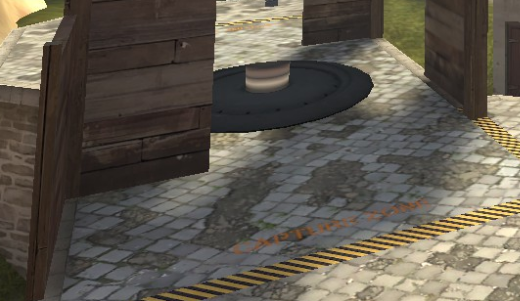
The word "swamp" blitzed through my head when i saw the first image, and i do not know why. *shrug* the fog and lighting is a great start, although you may want to increase the strength of some of the exterior lights for readability issues. Not being able to tell what team a person is on due to insufficient lighting is never a good thing 
Also, the balcony in this image looks accessible to demomen and soldiers, but its hard to tell.
Also, the balcony in this image looks accessible to demomen and soldiers, but its hard to tell.
Fredrik
L6: Sharp Member
- Aug 15, 2009
- 376
- 219
The word "swamp" blitzed through my head when i saw the first image, and i do not know why. *shrug* the fog and lighting is a great start, although you may want to increase the strength of some of the exterior lights for readability issues. Not being able to tell what team a person is on due to insufficient lighting is never a good thing
Also, the balcony in this image looks accessible to demomen and soldiers, but its hard to tell.
I didn't even notice that my lights were so weak.
So, I should decrease the light levels on the non-playable areas and increase them over playable areas, right?
Last edited:
Fredrik
L6: Sharp Member
- Aug 15, 2009
- 376
- 219
Basically, yes, and not just around the setup gates, but in most outdoor areas. detail areas shouldn't really be part of the map at this point.
Yeah, I didn't mean only around the setup gates. Idk why I wrote that.
Anyways, I got your point.
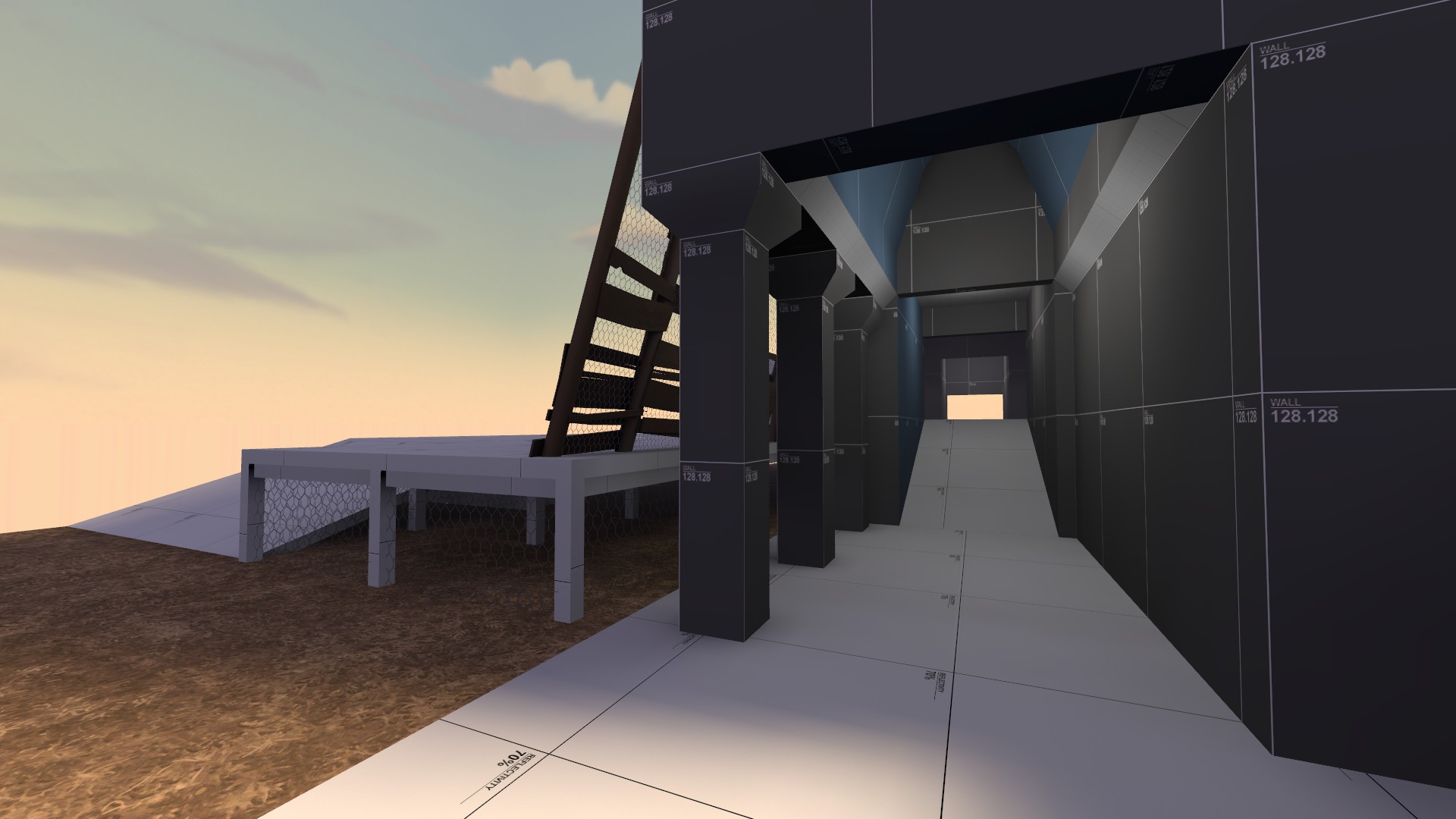
The mid tower looks a little strange, as does the sci-fi-y stairs up to the lighthouse, but otherwise that's looking great.
Tone the light in the arch in image 3 down. It attracts a lot of attention.
Consider making the skylight a slightly stronger colour- the maritime stuff can be prone to getting washed out by light like the kinda bland yellow you have now.
The corner bre_stone props need external light origins or they look much darker than they are.
Consider a few different roof textures. Some of the metal ones, particularly the blue-green one and the rust-red, can look quite nice.
But otherwise yes lovely.
EDIT: Oh, and, window top-middle-left of last picture looks like its z-fighting or something.
Beetle
L9: Fashionable Member
- Aug 17, 2008
- 627
- 178
leaf the jokes out of it. the forest looks too good for it.they're beautreeful
nightwatch
aa
- Sep 7, 2012
- 638
- 500
What wood you do to try to block off playable space? (I'm assuming these are for a real csgo map, not just a detailing proof) I'm finding it difficult to imagine how you could realistically border a gameplay area with forest nicely, and still keep up a player's realistic expectations of clipping into such trees.
CS map barriers of only trees wood be barking mad. I'm making them for someone else's CS:GO map set in a lumberyard, so that map will be foresty but have man-made barriers for much of it. Setting a CS map entirely in a scene like the one pictured above probably would not be appropriate, unless it were a gorge with lots and lots of rocks and vertical cliffs.
Last edited:
Beetle
L9: Fashionable Member
- Aug 17, 2008
- 627
- 178
Fredrik
L6: Sharp Member
- Aug 15, 2009
- 376
- 219


