Anthem

KotH Anthem b4

  • This map is featured! Our best maps, all together in one place for your viewing pleasure.

Ravidge

Grand Vizier
aa
May 14, 2008
1,544
2,818
Highlander, my p-rec demo: https://dl.dropbox.com/u/1281220/feedback/20120709_2021_koth_anthem_a2_ussr_cats.dem (I played really bad this map, sorry).

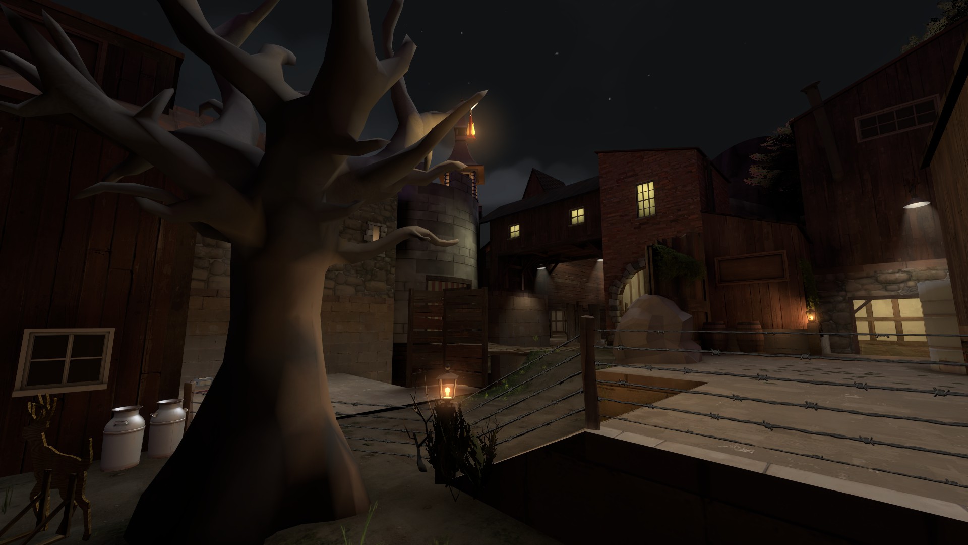
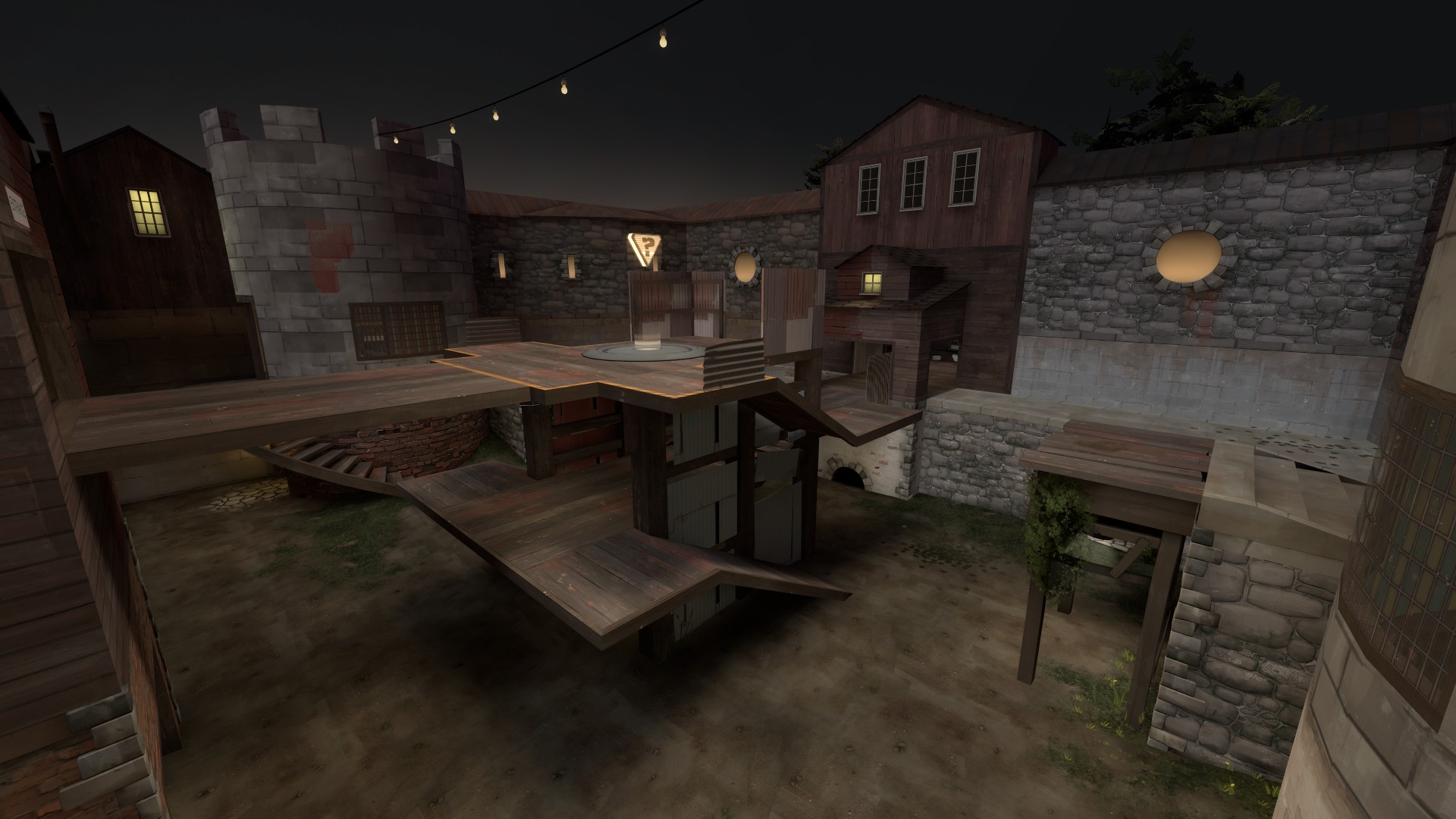
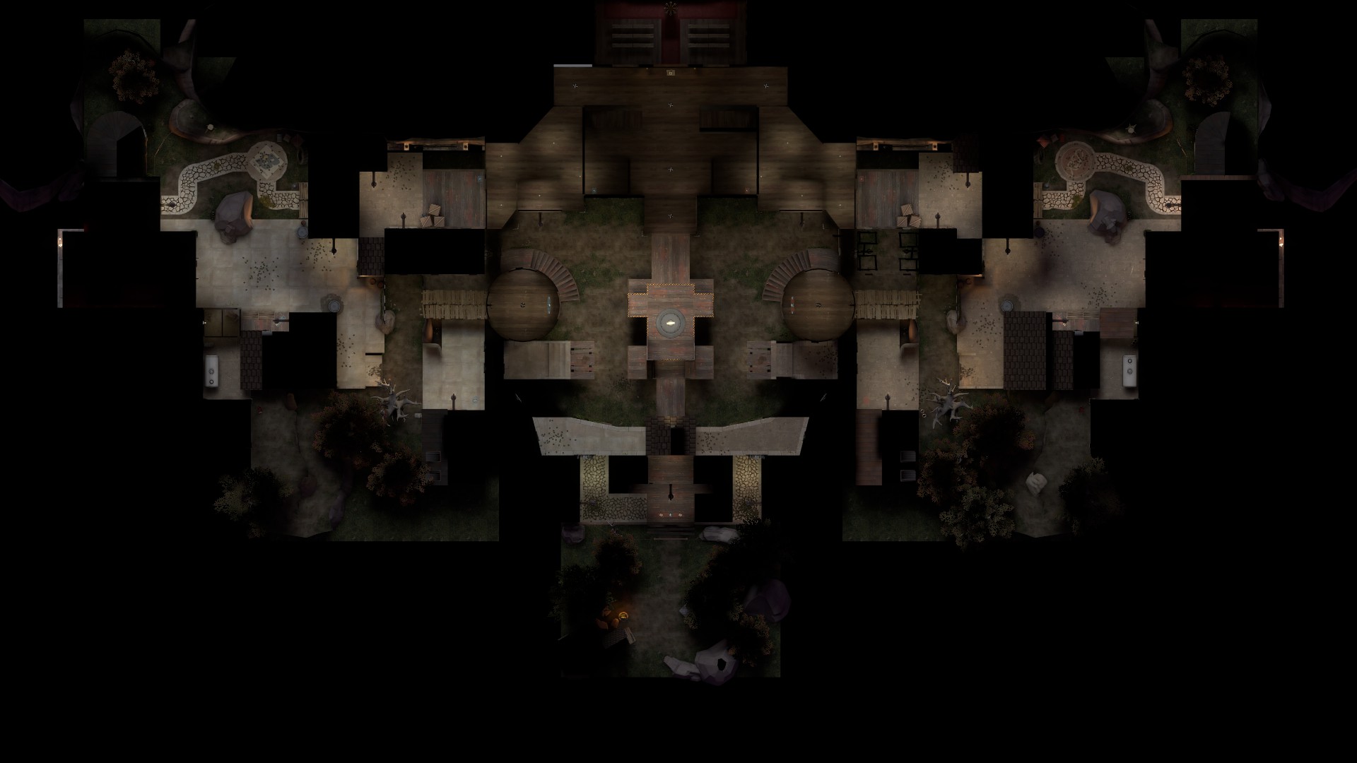
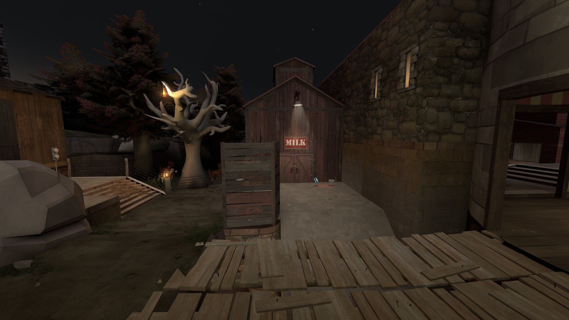
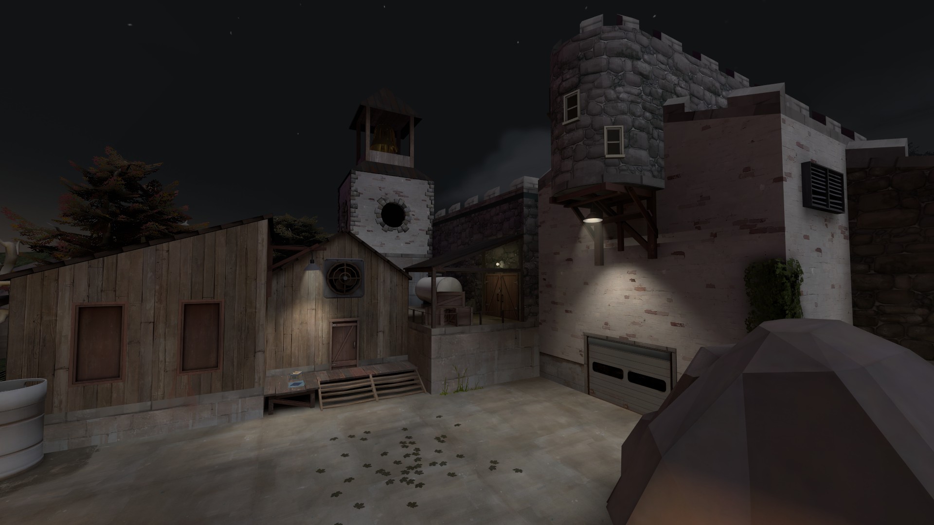
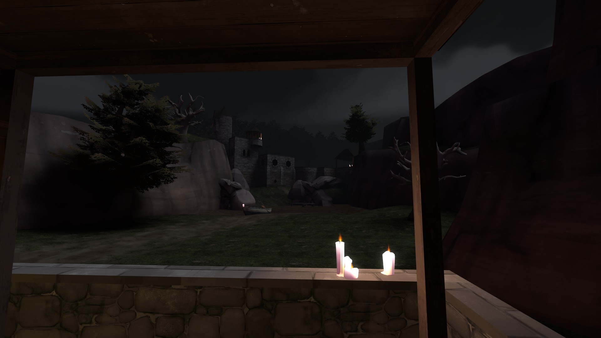
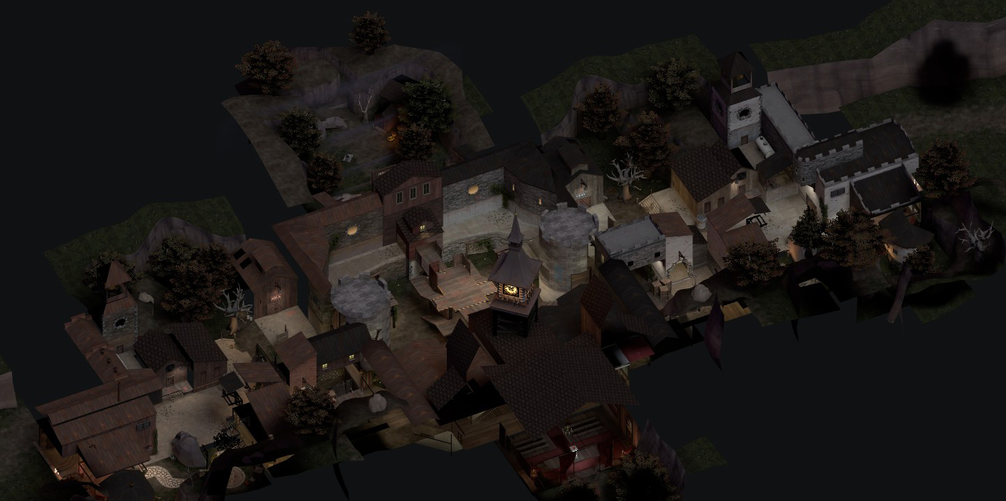
The map is entertaining enough, I'll skip the sweet talk and go straight to what I think the problem is.

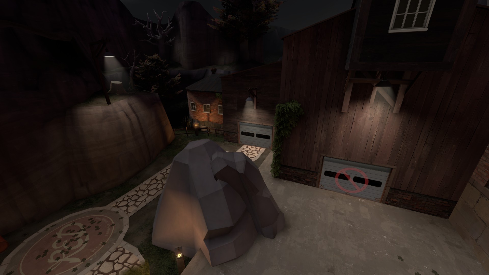
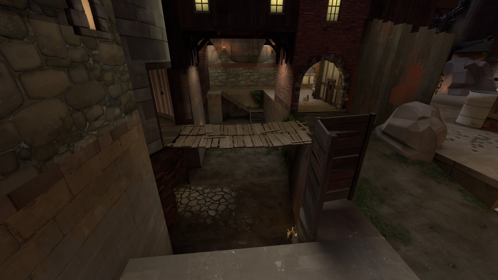
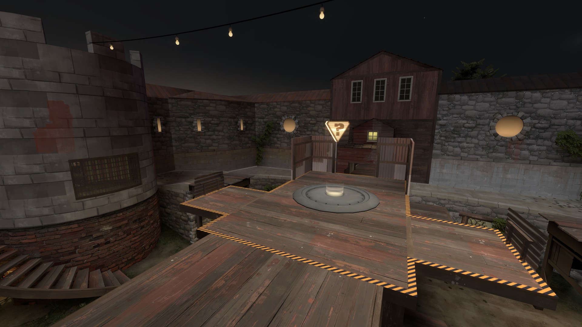
Sentries, mainly minisentries. When placed at the top of the cp they can cover every entrance to the area, maybe not to kill people but it acts like a radar beeping and firing a shot when someone tries to flank.
killing them is a must and they're tricky to focus down from the low ground and can be set up again within seconds.

Not sure how to solve this except by adding some route that allows snipers or soldiers to spam the sentry (the cp) from a distance further than the sentry range, but that could have other implications on the gameplay, you'd have to make this route really disadvantageous in general.. Making it one-way perhaps?
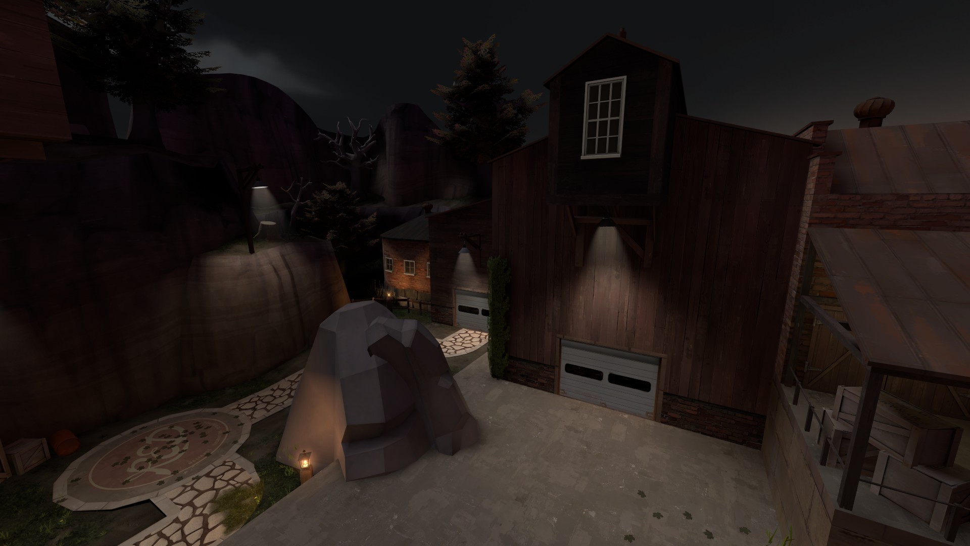
 

tyler

aa
Sep 11, 2013
5,102
4,621
a3:
changed some rocks into the cliff_wall rocks so i can use mirrored versions
adjusted the side white building again to simplify it
made it so you can enter the white building without a minisentry tracking you
adding some cover on the point and also reduced the existing cover a bit
added a visual timer before the point is active
very minor detailing

http://calcified.net/maps/koth_anthem_a3.bsp.bz2
 
Aug 23, 2008
404
380
Pugged it for 6v6. Obviously not your intended audience, but I hope you take what I have to say with a grain of salt. Was pretty fun. You should brighten up some areas around the map a bit.

Demo: https://dl.dropbox.com/u/3492731/spacesaver/20120714-0333-koth_anthem_a3.dem

1) The cap point is great. I agree that its hard to use a spy on there affectively (the backstab comment was valid) but I still think that the way the point is set up plays well for a lot of classes. Wouldn't change it to much, other than changing how the metal fences work so players can get onto the point from the other side (say by double jumping around). Maybe throw a tiny ledge on the other side of the fences, and get rid of th barrier so people could just walk onto it.

2) Right now, the area near the church is the biggest problem IMO. Basically, its very mazelike and incredibly difficult to tell when and where players are going to be attacking you from there, so its hard to figure out where to hold and counterattack. I would recommend simplifying the layout there, something closer to what you have on the other side of the map. Maybe make it a bit narrower, cut down on the number of halls and walls that divide that area up. Make it so there is only one entrance up from lower (the ramp that is directly near the church scene).

3) The circular room seems like a bit of a deathtrap as it stands right now. You pretty much want to stand there forever as med, so every single push to mid becomes a battle of standing in the circle and waiting for the enemy team to die before pushing in. Thats not much fun, meds in general prefer pushing and counter-pushing and being able to wander back and forth as the ebb and flow of combat occurs, and having the strongest position in the map be a single room with a medium health pack where you can just stand forever is not much fun. I also don't like the window. As it stands now, its incredibly difficult to get the drop on the enemy, say by switching to kritz and running your demo forward. They see you coming a mile away and they can spam you out from the point with very little effort. If you did remove the healthpack, I'm not sure where you would put the new one, but you might want to just make it a small and have the team rely upon the medium in the northern room, and then maybe put another medium in the southern room (near church).

4) I would ignore negative comments about soldiers on spire. Thats what spires are for. If you reduce or remove the spire then the middle area becoms very samey and not very interesting. Height is interesting for every class, not just soldiers, and the way the spire is now makes scouts fighting on spire way fun.

5) The distance between spawn and middle might be a bit much, especially for highlander with 5-6 slower classes. Compare to viaduct. Maybe move the spawn up by one buildings length?
 

tyler

aa
Sep 11, 2013
5,102
4,621
Hey thanks a bunch! I think you're right about most of that, including that I should take it with a grain of salt.

The only thing I don't know that I agree with is what you say regarding holding the tower as medic. Watched the demo about 1.7 times, seems like you wanted to hold it really badly but the Blu medic (Sakura) didn't really bother trying and had generally more success. Weirdly enough as the rounds progress you seem to try to hold it less and Sakura tries to hold it more and I feel like that's when the control Blu has slacks off and Red gains more ground.

I guess I don't know if that is good or bad. I mean, I built the map so that most players will go to the tower and attack from there; everything else is secondary. Therefore, is the inability to hold that successfully bad? I guess I have to remember that this is 6s. In Highlander, several of your points are remedied, and in pubs, those same points are more or less invalid. I think holding the tower is one of them.

I was worried the church area was still too complex, I didn't like it in a2 and it's better now but I think you're right. Lighting is also still an issue though I'm trying to do my best. Anyway thanks again, do it again in a version or two and tell me if anything is different. It's not HL but I find it pretty useful regardless.
 
Aug 23, 2008
404
380
I think the problem with the circular room is mostly just the healthpack. Having it there made me want to hold there when we were trying to push into mid. If I ever got spammed my immediate reaction to backup and get the health, then a scout would push me and I'd have to dance around in there for a bit and wait for pack again. If the health wasn't there, or it was a small health, holding there would "feel" less safe and I might try to push out a bit more agressively? But then you would have to think about how to distribute health elsewhere to compensate.

I don't have a hard and fast answer, that was just what I immediately thought as I was sitting in that room. "This is weird, not sure I like having to sit here and hump this healthpack". Your probably right about how it plays out when teams do tend to get more agressive, but its just something to think about.
 

tyler

aa
Sep 11, 2013
5,102
4,621
Hm, yeah, that's a fair point. I think I'll try to review some previous games and see if medics in HL tend to do the same thing. On the other hand I don't think I've really had a competitive minded medic on this map like you are. I'm gonna pay closer attention to that spot from now on. This is some of the most thought provoking feedback I've ever had for any map, thanks a ton.
 

tyler

aa
Sep 11, 2013
5,102
4,621
a5:
fully detailed! (no 3d skybox)
custom soundscapes!
finally optimized more than a little bit!
thought about changing the health pack in the tower and didn't (yet)

note: there is a little nodraw bug around the tower, i'm gonna iron that out later

2012-07-26_00001.jpg

2012-07-26_00002.jpg

2012-07-26_00003.jpg

2012-07-26_00004.jpg

2012-07-26_00005.jpg

2012-07-26_00006.jpg

2012-07-26_00007.jpg

2012-07-26_00008.jpg

2012-07-26_00009.jpg


download
 
Last edited by a moderator:

tyler

aa
Sep 11, 2013
5,102
4,621
OK so

In A6/B1/something there will be:
- better lighting
- a 3d skybox
- miscellaneous clipping and whatever else stuff added/fixed

I will also probably
- move some pickups around
- try to optimize better
- decrease the detail level in some areas and increase it in others

Anything else that I should be aware of that I am maybe not aware of?
 

tyler

aa
Sep 11, 2013
5,102
4,621
b1:
reduced filesize through lightmap optimization
moved or changed almost every pickup
now actually fully detailed, including all out of bounds areas
increased volume of soundscapes
fps *should* be better

b1a:
fixed a displacement showing where it shouldn't
added 2 spec cams per team per side

have more pictures who cares

2012-08-11_00007.jpg

2012-08-11_00011.jpg

2012-08-11_00004.jpg

2012-08-11_00005.jpg

2012-08-11_00006.jpg

2012-08-11_00008.jpg

2012-08-11_00009.jpg

2012-08-11_00010.jpg

2012-08-11_00002.jpg


download
 
Last edited by a moderator:

tyler

aa
Sep 11, 2013
5,102
4,621
Putting this here so I don't lose it

ANTHEM

Aesthetics

Final Aesthetics score: 79
Obviously it’s unfinished, with massive areas textured as minimally as possible. That’s a shame, since i think it might be the most promising map out there. While the spawn areas are lavishly decorated, the point is fairly bare. This was obviously the main hit to its score, unfortunately.The general theme is a nice twist on the underused Estate theme, with a considerable amount more atmosphere than i’ve seen in the theme before, which can sometimes seem weird and eclectic, here tied together by the lighting and the skybox.

Some props around the map are odd, and slightly out-of-place or inexplicably placed. There can be a feeling of necessity about a few- “I need a prop to go here, but what?” is a feeling familiar to anyone who maps on a deadline.

Lighting is generally excellent. A few lighting props are inexplicable or repeated, but dark areas are very rare, and the lights largely point you in the right direction. They also help to sell a subtle spooky ambience, one far more interesting than tf2 halloween’s “lol pumpkins” style. One thing i noticed was a few of the (lovely) curved corners could use smoothing groups on them.

Overall the main problem was the mass of little details that didn't quite fit, or that let the map down. Most of these are in the album of screenshots i’ve attached to it. Many are so small as to be unnoticed in actual gameplay, but the sheer number takes its toll after a while. Aside from the large unfinished area, the little issues all around the place are what lost this map points.

Album: http://leswordfish.minus.com/mbmQlEmKUz

Technical

Final Technical Score: 92
  • Frame rate good, comparable to or better than viaduct.
  • All entities seem to be functioning properly.
  • A few pop-in’s visible from the point.
  • Clipping generally good. Vertically, fine. Horizontally, a few issues around corners and such.
  • Nodraw optimisation good, and there are no places where you could obviously have optimised it better.
  • No console spam from props or such.

Following Kier and Ravidge's posts I will wrap up my work on B3 and probably call this project done.

Anthem

Aesthetics:
+ The lighting is good
+ Detail saturation is good
+ Most texture choices are good
+ Buildings are belivable

# Essentially no 3d-skybox. It wasn't needed, but it also makes the map feel enclosed. There's a high cliff or wall in every direction, apart from the OOB areas (which are also pretty small, but nice looking)

- Few cases of fadepopping props
- No soundscape

Score: 84

Technical:
Lowest FPS 93 +/- 3
+ Good clipping
+ Spawnpoints are rotated towards exit door, nice touch.
+ Some fading props, I'd like to see more

- The map is a straight line with vis through all outdoor areas.
- Very large merging areaportal in the mid-arena
- func_respawnroom doesn't reach the ceilings, very minor but since you can actually stand up there (on trims and stuff) I included it.

Score: 88
 
Last edited by a moderator:

TheKieranator

L6: Sharp Member
Mar 6, 2011
282
213
Anthem

Aesthetics

Final Aesthetics Score: 83

  • One of my favourite things about Anthem is that it has a sense of history, and it even compelled me to come up with an interpretation of it. While it is clear that Redmond and Blutarch don't live here, they have stayed here once. The small chapel, which I see as a funeral parlour, in the middle of the suggests that this is where Zepheniah Mann's funeral was held, and that the two bases here are where the brothers stayed (separately) during that event.
  • Lighting is great, which was to be expected since you've written articles about lighting. It feels like a Halloween map, even though it isn't necessarily one. If you scattered pumpkins around then it would scream TF2 Halloween. Don't actually do that though, Anthem is better off without them.
  • The combinations of wood, concrete and stone give Anthem a more rustic feel that ties in with the idea that this is not the permanent residence of a Mann. However, there are a number of props that feel out of place and were used just because they were needed.
  • To me, the round towers at the middle area look fake. They look like they were constructed out of wood and disguised as stone, in an effort to outdo the other side cheaply. If this was not the intention, then the walls need to be thickened greatly. A large stone tower would not be ~8 units thick.
  • Despite the spawn rooms and out-of-bounds scenes being very well done, the other areas, especially the middle area, could be improved upon. The centre is the focus of the map, where players should be spending most of their time, so it should be detailed much more.

Technical

Final Technical Score: 74
  • My framerate was slightly higher Viaduct, but there are a number of places that could be optimized better.
  • Clipping is smooth, but some props (especially ones that stick out of walls) could use some work.
  • There are issues with stuff popping in while in the middle area. You should try to fix this, maybe with your skybox.
  • I didn't see any entity issues.

imgur album with additional notes
 

tyler

aa
Sep 11, 2013
5,102
4,621
download b3

probably the last version

b3:
modified flanks
fixed some clipping
changed out ivy models
fixed some lightmap issues
fixed soundscapes
improved optimization a lot
added a jump platform for tower -> house jump route

2012-11-13_00008.jpg

2012-11-13_00009.jpg

2012-11-13_00010.jpg

2012-11-13_00013.jpg

2012-11-13_00016.jpg

2012-11-13_00017.jpg

2012-11-13_00019.jpg
 

sitebender

L3: Member
Aug 15, 2012
102
33
First of all this map is great. Now that I've said that I can gush some more. It looks great, there are a lot of nice details, good color pallet and it is a lot of fun. It also feels different than standard tower KOTHs. All classes feel useful. There are a lot of entry points without making it seem like you can get hit from anywhere. There are some well done detailed side paths for scouts and spies. The ammo and health are in really good spots to keep the action happening and to give the offense a chance. Great for rocket jumping.

The only negative thing is that I have no negatives about this map. I'm just a cheerleader here. Sorry.
 

grazr

Old Man Mutant Ninja Turtle
aa
Mar 4, 2008
5,441
3,814
When i ask myself what makes this map feel so artificial i notice the complete lack of shrubbery in nature areas (though i do see one or two in some out of bounds detail spots). Particularly the central area, though. Put some shrubs at the base of the trusses of the CP tower, near rocks, wall/structure corners and fences in general and the map should hopefully feel less artificial. Maybe throw in some rocks, wooden planks or tires. You can pretty much go mental with floor details in small maps to no ill effect.
 
Last edited:

tyler

aa
Sep 11, 2013
5,102
4,621
over 3 years later, b4 is out

Df42rnn.jpg


b4:
restored several routes to their b2 incarnation
adjusted optimization (will probably need to redo this entirely later)
fixed some minor bugs
created some more minor bugs somehow
adjusted some lighting

VRp0Zat.jpg


Here's an imgur album of screenshots

This release is a workshop-prep release. Treat b4 like everything is changeable--I would like to RC this soon and be done. Future changes will be improved detailing around mid (less boring buildings), better optimization (gonna have to redo it all), and various other little stuff. The only reason I didn't do that already is that I plan to heavily adjust the layout if possible and thereby destroy/rework lots of existing detail. So obviously I'm waiting to add more detail!

ovgCh0q.jpg


picture.php
 
Last edited:

Zed

Certified Most Crunk™
aa
Aug 7, 2014
1,241
1,025
jkqVQI2.jpg


This should really be continuous.