WiP in WiP, post your screenshots!
- Thread starter Arhurt
- Start date
You are using an out of date browser. It may not display this or other websites correctly.
You should upgrade or use an alternative browser.
You should upgrade or use an alternative browser.


TheKieranator
L6: Sharp Member
- Mar 6, 2011
- 282
- 213

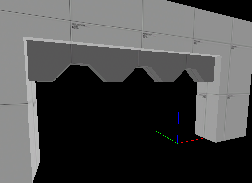
I still need to fix some brushwork and then I can release this new dynamic door for testing. It might look like I got inspired by PDT but actually I got my inspiration from Space Hulk.
plr_blimprace
Those teeth look like the sort of thing that should be a prop rather than brushwork. Brushes don't let you work at a fine enough resolution for that kind of detail.
A prop would probably render faster too.
Speaking of props, a little bit of debris I was working on last night for stoneyridge:

A prop would probably render faster too.
Speaking of props, a little bit of debris I was working on last night for stoneyridge:


im still waiting for you to make a boxing ring that contains a slightly smaller boxing ring
Boxing-ring-ception

Don't think I haven't thought of that before. Ever played Mortal Kombat: Armageddeon, perchance?
Nah, i prefer street fighter.
make a street to fight in outside the boxing ring place
- Apr 29, 2008
- 1,068
- 709
Here's something I've been working, how does it look? It's suppose to be a logo for a hypothetical Green team.

Actually pretty nice, you might want to break up the flat colour a little with some slightly smaller, subtle tonal variation and maybe a tiny weeny bit of noise too. Personally I don't think that typeface fits too well in the TF2 universe, it looks too postmodern. If you're going for something industrial then you're better off with a Geometric sans-serif like DIN or one of it's many variants.