The map in question is in fact looking simply divine as such a map should™.
With that I did some running around, checking for clipping, ammo placements, and theoretical gameplay assumptions based on where everything is and my options as a player. I'm going to start with my criticism with saying you have very nice track placement, and your maps simple layout is intuitive. A few revisions of how the side tunnel routes are and a bit of cleaning up to help players tell where the need to go and this should be a pretty solid map.
Now onto the images.
I'm able to get outside the map, easily
This takes place on top of the BLU's spawn. I found this just simply preforming two rocket jumps despite the cheated in health. With the Gunboats that's nothing.
As I turn around I noticed I have about half the map rendered, I can see into the other points, and I was able to just rocket jump from where I was to the other side of the map. Clipping is very important! (Also it's very easy to just
fall out of the map when I did this)
As a side note: I know it's an alpha but you might want to
hide this in BLU's spawn.
Also
this fern seems out of place.
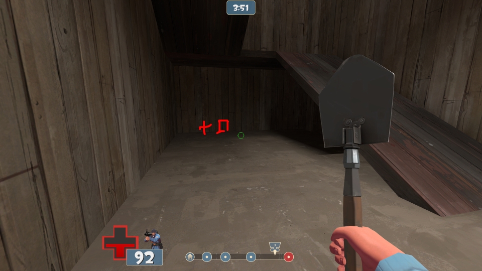
A few area's I probably shouldn't be on top of
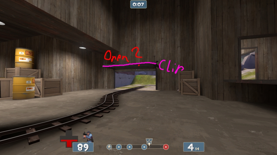
Double check the clipping
here, again I could just pop off about 2 rocket jumps (Ground, Wall Jump, Height Advantage). On top of the height advantage I could just walk out of the map.
Now
here, I don't believe should be reachable. Raise it up and clip it off. I'm probably 512+ hmu up.
Lighting in a few places really needs to brightened
In this
room (Also
here and
here) I can hardly see a thing, and as I've learned incredibly dark rooms does not get along with TF2. Throw in some really dim light entities next to the dark area's, brighten it a tiny bit.
With these two area's
here and
here I think you're just better off not making them platforms and simply solid pieces of geometry.
With the props, I found a few very ugly eye sores that could have easily been fixed with a few lights or shift in placement. Namely
these around the 1st control point.
Couple of layout ideas
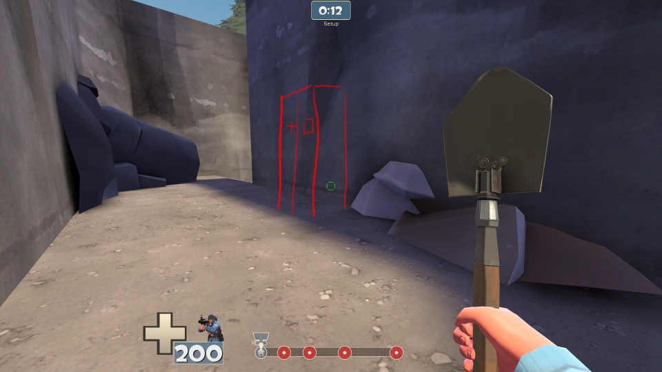
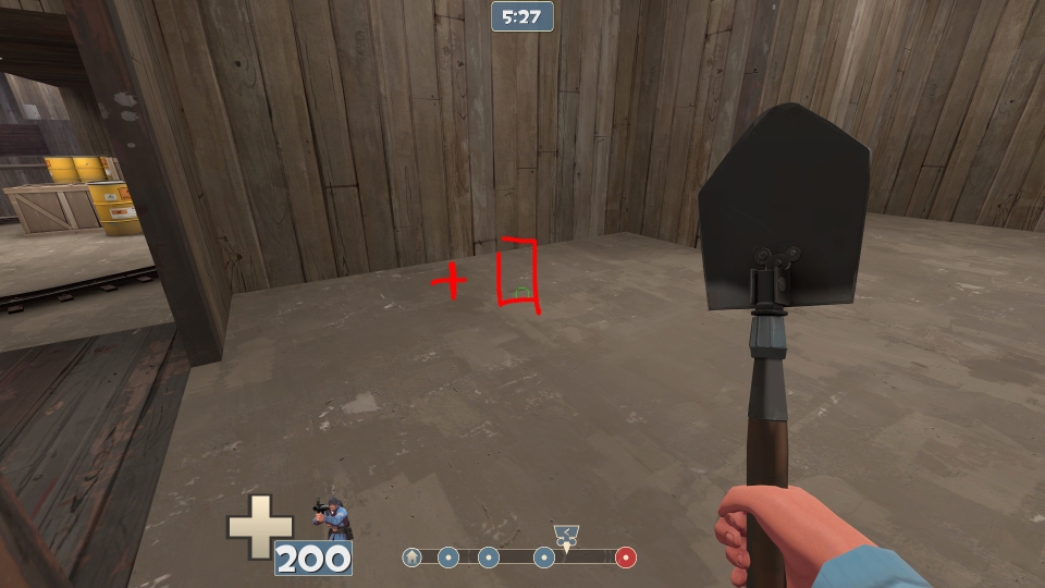
Why is there only
two exits out of blue's spawn? I can very easily see both and as a sniper I could walk back a few hundred units and snipe like there's no tomorrow. This of course goes both ways. I think you should add a third exit as illustrated in the image. (By door I mean setup gate)
Maybe
raise this up a bit..? Feels a tad cramped.
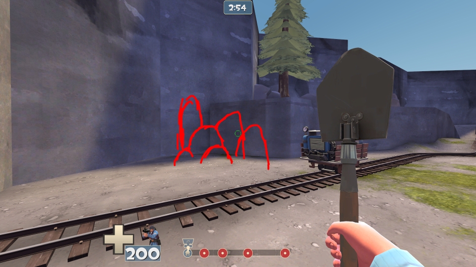
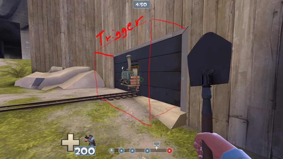
Alright now I was a bit confused about
this one. On the outside it's easy to see how it works but at the same time it leaves much to be desired. I think you should add wires or something to help explain why it's just precariously floating there. Make then thick cables.
Also in that same image I can imagine falling down in that death pit of a hole and just thinking "Well SHIT now I'm DEAD" for every class except maybe scout and soldier. Add another plank leading out of it on the opposite side. It might help alleviate that feeling a bit for BLU.
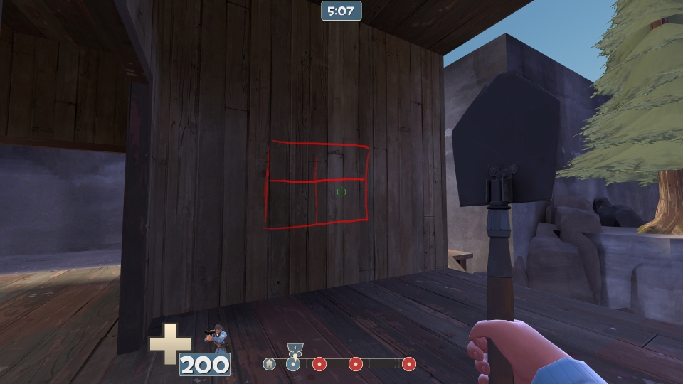
Now
right here, for better lack of words, aggravated me. It clearly looked like playable area despite it being extra scenery. I really think you should damn it off with some geometry or add more rocks, or something of that variety. If I had been playing I probably would just have wasted a ton of health rocket jumping towards it and died.
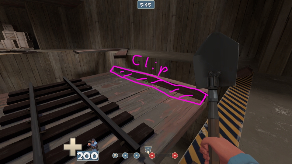
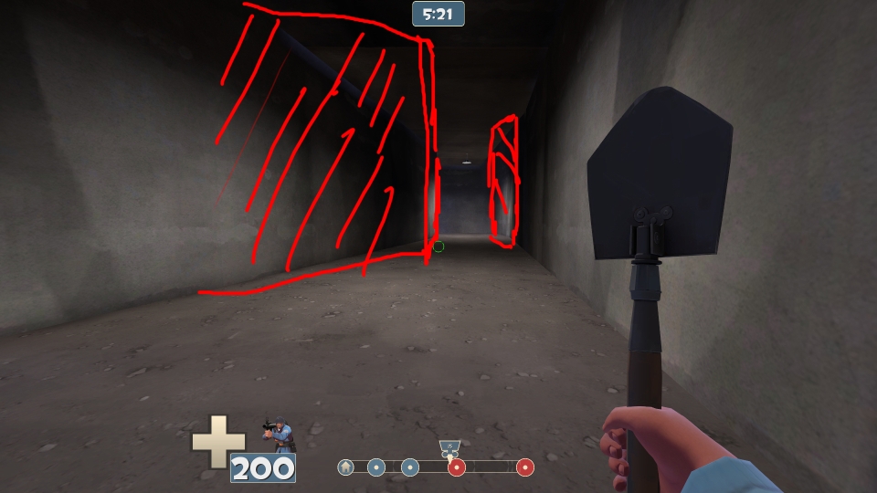
This tunnel is very long, boring, and is silently whispering "Please.. add some variety". Just as Bloodhound said I really think you should bring one side of the tunnel out a bit and push a tiny "room" into the other side of the wall as I illustrated. It makes it easier to dodge rockets, bullets, etc. Also it makes for a good place to put down a medium health and ammo.
I saw a few of
these tree's through the map and I think they look really nice. Although the way you're clipping them gets really annoying as I constantly run into them just casually jumping by. I think you should disable the collision on them and do a playclip as I have it up there. That choice is up to you of course, if you don't want that platform playable at all you may need to change it from being a simple tree. As a note, this happens in about one or two more area's with tree's in spots just like this. They weren't very far from this one.
Summary
It's a very nice layout, I love how the track pieces are positioned. Fix up those things I told you and you should have a nice alpha. I did have a ton of images about health and ammo placements, as well as criticism about how they're not very thought out (sorry to say). Alas it is 3am at the moment and I'm getting a tad tired. Tomorrow if you want I can post about a few changes you might want to make to you're placements.
One last thing:
I love these stair's/track slope combo.