pl_hoodoo [Final release]
- Thread starter YM
- Start date
You are using an out of date browser. It may not display this or other websites correctly.
You should upgrade or use an alternative browser.
You should upgrade or use an alternative browser.


Well I don't think it has much to do with the origin, I've got it working by copying an older version of the whole load of entities into the newer version (tried just the func_train and that didn't work) I looked at the two sets of entities for ages and I couldn't spot a single difference except that one worked and one didn't.... strange huh
Randdalf
aa
- Feb 14, 2008
- 1,051
- 931
I just ran through the a4 of the map, having downloaded it from an empty colts playground.
I really like some of the ideas in the map (like at the start of stage 2 the cart goes along the side of a red building), but there are a few things I don't really like about the layout in some parts:
- At the very start on one of the blu spawns, when you walk out of the door, there's a big ol' bumper in the way
- The one-way tunnel leading to stage 2, cap 2 is not obvious at first and I only found it once I'd (on my own admittedly) capped the point, plus the tunnel above it is quite unecessary, and doesn't really have any advantages over the bottom tunnel
- The one-way door on stage 3 should be on the other side of the tunnel (I think, I can't remember quite clearly)
It's looking very good so far, and especially in those screens.")
My Hammer hates me for some reason; whenever I try and make an orange/blu/red/grey map, it messes up my vertex editing on certain shapes for no particular reason
I really like some of the ideas in the map (like at the start of stage 2 the cart goes along the side of a red building), but there are a few things I don't really like about the layout in some parts:
- At the very start on one of the blu spawns, when you walk out of the door, there's a big ol' bumper in the way
- The one-way tunnel leading to stage 2, cap 2 is not obvious at first and I only found it once I'd (on my own admittedly) capped the point, plus the tunnel above it is quite unecessary, and doesn't really have any advantages over the bottom tunnel
- The one-way door on stage 3 should be on the other side of the tunnel (I think, I can't remember quite clearly)
It's looking very good so far, and especially in those screens.
My Hammer hates me for some reason; whenever I try and make an orange/blu/red/grey map, it messes up my vertex editing on certain shapes for no particular reason
- At the very start on one of the blu spawns, when you walk out of the door, there's a big ol' bumper in the way
- The one-way tunnel leading to stage 2, cap 2 is not obvious at first and I only found it once I'd (on my own admittedly) capped the point, plus the tunnel above it is quite unecessary, and doesn't really have any advantages over the bottom tunnel
- The one-way door on stage 3 should be on the other side of the tunnel (I think, I can't remember quite clearly)
- When I put that there you didn't have to run past it because the room it is in was the spawn, testing has shown that its a bloody pain and its already gone from the next version
- It will be far more obvious once its textured and detailed it gives a little advantage, its been quite usefull sometime as the main route is quite a choke point.
- As corion has been saying that door needs improvement and I've already planned how to do it when I get to it.
Just played the a4 map on the coltsplayground server.
I love the map, especially the trenches and the overhead walkways. NGies will have a field day putting turrets in hard to reach places. Also, there are a lot of ambush points so Demos will be able to set a lot of traps.
Some critiques:
It's a large map. So large that unless you are playing with a full server, some people will never get a kill or be killed. It may take an unusually long time to complete the map.
It's a good map for characters with long distance weapons (snipers, soldiers). It has some long corridors for them, but it doesn't have many choke points for pyros and heavy's. These characters will undoubtedly stay close to the Fat Man bomb as they will be disadvantaged everywhere else. In short, it could use more choke points.
Lastly, I found an invisible wall near the end of the first leg of the map. Here's a picture:
http://c.imagehost.org/view/0369/pl_hoodoo_a40000.jpg
Are you going to add the railway posts here?
http://c.imagehost.org/view/0731/pl_hoodoo_a40002.jpg
Overall I loved it. Are you going to use a
Last edited:
Are you going to add the railway posts here?
http://c.imagehost.org/view/0731/pl_hoodoo_a40002.jpg
Overall I loved it. Are you going to use a
Railway posts? if you mean the lights that change colour aren't they already there?
I've played a few times on a 4v4 and 5v5 and its alright, its actually not too bad, much to my suprise
Also, it looks the en of that last sentence got cut off....
Here is a quick thing about stage 1.
I think this building has to be made into an actual building. It will help flesh out the first stage much better; (you like work, right)
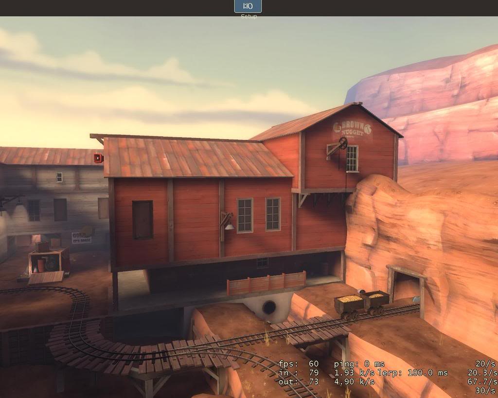
Make it a similar idea to this building in Goldrush;
Also this. I thought this was an accident dev texture thingy when I first saw it but then came to the conclusion it is supposed to be a concrete wall. This looks really out of place, perhaps its just too bright white or something I dont know;
I think this building has to be made into an actual building. It will help flesh out the first stage much better; (you like work, right
)
Make it a similar idea to this building in Goldrush;
Also this. I thought this was an accident dev texture thingy when I first saw it but then came to the conclusion it is supposed to be a concrete wall. This looks really out of place, perhaps its just too bright white or something I dont know;
Corion
L2: Junior Member
- May 17, 2008
- 67
- 8
I'm not sure I agree on the 3 cap points rather than 2, It works as a difficult 2 (bearing in mind it is the final stage and is suposed to be the hardest for attackers) but I think its too small and straight for a 3 pointer.
You can easily adjust the difficulty by changing the spawn times with each control point. It works quite well. You can also obviously change the landscape a bit to alter the gameplay in favor of the defense.
One part I would suggest making a bit more interesting is just after the first cap of stage 3. It doesn't seem like there's much going on it that area in terms of interesting gameplay. Maybe a ledge up on the outer wall that's easier for defenders to get up on?
I really think the biggest benefit of having 3 points would be more intuitive opening of that door.
Anyways ... here is some feedback from playing the "pretty stage 1" version. Unfortunately the server ended the map after 3 CP's were capped, so I never got to see the rest of round 2 for feedback.
Stage 1:
- The BLU upper spawn exit seems like it would be easy for RED to lockdown and own the small doorways from the actual spawn room from. I know you're probably not keen on layout changes at this point, but I'm really worried about this.
- The canyon wall just outside the BLU upper spawn exit is curved kinda funny and looks weird to me. It seems that you intended scouts to be able to get up there or something? Maybe not. Either way this area really needs to be touched up.
- The minecart tracks sometimes have very obvious drastic lighting changes (e.g. dark to light). A couple of ways you might fix this is by throwing a path_track in an area with a more midrange lighting value nearby and use that as the lighting origin. Alternately you could use smaller track segments in the sections with drastic lighting changes so it blends better.
- All of your stairs need to be playerclipped. This prevents the "bumpy" feeling players get when they walk over stairs and a few other problems too.
Stage 2:
- The player should be blocked farther up from going into the Stage1 area. Also, this may be something you plan to do in your next phase of beautification, but there need to be visible fences there. :0/
- The ramp just outside BLU spawn should probably be on the other side of the mine cart track. This makes it harder for RED to get right in front of BLU's spawn area, which should be avoided.
- It seems like there should be a ledge or some interesting landscape/gameplay elements opposite the building on the way to control point 1. (Opposite meaning on the right side as you leave the BLU spawn).
- There's a place right before CP 1 where players can get stuck in the ceiling if they're on the mine cart. It's a strange T cross-section right near a corner. For some reason players can get lodged in the ceiling right there. :0/
- There's also some drastic track lighting in this section, but you'll get to that eventually, I'm sure.
General:
- Let non-scout players jump on the cart without explosives. Please? It's so much fun. The edges of the collision could be slightly angled to let people on. That for me is one of the saddest things about your map right now.
/nod. I agree.Here is a quick thing about stage 1.
I think this building has to be made into an actual building. It will help flesh out the first stage much better; (you like work, right
/nod. I also agree with this.Also this. I thought this was an accident dev texture thingy when I first saw it but then came to the conclusion it is supposed to be a concrete wall. This looks really out of place, perhaps its just too bright white or something I dont know;
- Feb 26, 2008
- 1,626
- 1,325
Youme,
Your detail work is superb. Very little to criticize, this map is on the track to being released with one of the updates.
Consider turning around the crate full of props near the 1st cap so that the detail faces away from the long path leading up there. The other side is comparatively hurting for detail and this will give a performance boost in the area from the cart to Blue spawn.
You've obviously been working intensely at this map. Best of luck mate
Does it really need fleshing out? I might have a biased opinion but it seems pretty fleshed out to me and making that building enterable wouldn't add anything much to gameplay.I think this building has to be made into an actual building. It will help flesh out the first stage much better; (you like work, right
Its quite bright because its right in the sun, I think I might add some more detailing on the cliff wall behind it with the same texture to make it seem less out of placeAlso this. I thought this was an accident dev texture thingy when I first saw it but then came to the conclusion it is supposed to be a concrete wall. This looks really out of place, perhaps its just too bright white or something I dont know
Untill this hypothetical problem actually occurs I'll take no action on it because I don't believe it will happen without masses of coordination from red.The BLU upper spawn exit seems like it would be easy for RED to lockdown and own the small doorways from the actual spawn room from. I know you're probably not keen on layout changes at this point, but I'm really worried about this.
you mean the wooden side? I put the bit sticking out as a block for snipers primarily and a good SG spot for a good engineer (although I need to put more ammo in before it becomes any use for that)The canyon wall just outside the BLU upper spawn exit is curved kinda funny and looks weird to me. It seems that you intended scouts to be able to get up there or something? Maybe not. Either way this area really needs to be touched up.
not got around to that yetAll of your stairs need to be playerclipped. This prevents the "bumpy" feeling players get when they walk over stairs and a few other problems too.
You can, you have to find a slightly raised platform and/or do a crouch jumpLet non-scout players jump on the cart without explosives. Please? It's so much fun. The edges of the collision could be slightly angled to let people on. That for me is one of the saddest things about your map right now.
^^Your detail work is superb. Very little to criticize, this map is on the track to being released with one of the updates.
whoa thats actually a good idea, turn the box around and bung an occluder in the back so the props arent rendered. (I also noticed a performance hit in that area)Consider turning around the crate full of props near the 1st cap so that the detail faces away from the long path leading up there. The other side is comparatively hurting for detail and this will give a performance boost in the area from the cart to Blue spawn.
I guess this gives me reason to learn about occluders.
AWESOME-O
L10: Glamorous Member
- Mar 20, 2008
- 779
- 132
Does it really need fleshing out? I might have a biased opinion but it seems pretty fleshed out to me and making that building enterable wouldn't add anything much to gameplay.
You could make it so that you can place snipers or sentry's at windows orso.
roninmodern
L3: Member
- Feb 5, 2008
- 124
- 5
I ran around in pl_hoodoo_pretty for a bit this morning just to check it out.
Youme, I've gotta say the level of detail you've put into that map is incredibly astounding. I can't wait for it to be finished.
Youme, I've gotta say the level of detail you've put into that map is incredibly astounding. I can't wait for it to be finished.
- Feb 26, 2008
- 1,626
- 1,325
whoa thats actually a good idea, turn the box around and bung an occluder in the back so the props arent rendered. (I also noticed a performance hit in that area)
I guess this gives me reason to learn about occluders.
Ah, personally I would shave the box down to be as on the grid as possible-make the walls thicker if need be, and then you can keep the off-grid triangular sections from the cut into func_details. Keep the rectangular cores of its walls as world brushes. An occluder would work, but remember it would only block all of them when looking straight at the box. Also, occluders come with an up-front rendering cost. Just another option
Yeah I did a compile with full VIS and it wasn't there, then two compiles later with nothing that effects VIS it was there and I couldn't get rid of it I'm not entirely sure how to get rid of it now, some clever hint brushing probably, trouble is, I'm useless at hinting
I'm not entirely sure how to get rid of it now, some clever hint brushing probably, trouble is, I'm useless at hintingNot sure if you've addressed it yet, but some fences between the first and second stages during the second stage would be helpful. Right now you just have a clip across there and it might confuse some people.
I love the amount of detail in the first stage. The tunnel with the light at the end in the spawn is very eye-catching. I think it plays much better textured than it did with dev textures, since it makes it feel much smaller. Can't wait to see the other stages done.
I love the amount of detail in the first stage. The tunnel with the light at the end in the spawn is very eye-catching. I think it plays much better textured than it did with dev textures, since it makes it feel much smaller. Can't wait to see the other stages done.
Does it really need fleshing out? I might have a biased opinion but it seems pretty fleshed out to me and making that building enterable wouldn't add anything much to gameplay.
Dooo it. It will be awesome and make the 1st stage much more fun.
That first bit is already giving me fps issues whilst playing online I can't go and add more into it. That area is too large already and I can't see any advantage to making that building useable.
lazy lazy lazy :O:O:O