CP artpass_earkham
- Thread starter EArkham
- Start date
You are using an out of date browser. It may not display this or other websites correctly.
You should upgrade or use an alternative browser.
You should upgrade or use an alternative browser.


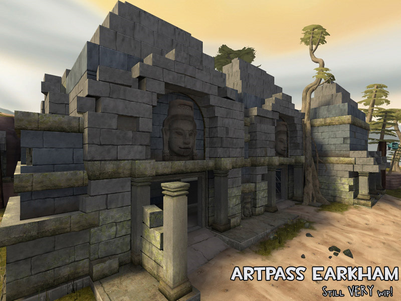
I don't think these shots showcase any of the issues with the Egypt theme.I'm pretty meh about the faces, they don't really fit in with tf2 style. In fact I could say that about a lot of the screenshots, but I don't see an easy way to fix this without it being all Egypt-y blandness.
The faces are a little less cartoony than they should be, though.
coagulated
L1: Registered
- Aug 12, 2010
- 26
- 13
I don't think these shots showcase any of the issues with the Egypt theme.
The faces are a little less cartoony than they should be, though.
No I know but I was saying that if the map were to be made more cartoony to fit the theme better it might end up looking something like egypt. I dunno, maybe it's the big stone blocks.
Last edited:
- Jun 11, 2009
- 704
- 628
as much as i love your custom content, the stonework really makes the scene lack :/
it's all on the same height level and looks so sharply cutout. some displacement love or even more models ?
i totally like the sense of weight you put in the second screenshot. that's a really nice touch. i think overall you could and should add soo much more temple-esque architecture. i really hope you can cook some things up there")
but my biggest crit is about your lighting situation. instead of the architecture casting beautiful and interesting shadows on the ground, almost the entire scene is dark and shaded and only some of the top bits get some light. i think you need to experiment on that again.
i really hope you'll bust your ass off in order to get your theme together. it would suck so bad to see all these thoughts and work buried somewhere :/
it's all on the same height level and looks so sharply cutout. some displacement love or even more models ?
i totally like the sense of weight you put in the second screenshot. that's a really nice touch. i think overall you could and should add soo much more temple-esque architecture. i really hope you can cook some things up there
but my biggest crit is about your lighting situation. instead of the architecture casting beautiful and interesting shadows on the ground, almost the entire scene is dark and shaded and only some of the top bits get some light. i think you need to experiment on that again.
i really hope you'll bust your ass off in order to get your theme together. it would suck so bad to see all these thoughts and work buried somewhere :/


Yup, lighting is crap right now. I'm going to need to remove the stationary sun from the skybox vtfs, since that limits what sunlight angles I can use. It does mean I lose my sunbeams, but lighting is pretty awful so it needs to be done.
Faces are final, unfortunately. No time to change those before the deadline (I do these myself, no dedicated modeler on this entry, hee).
Also, huh to the architecture comments. I purposely simplified a lot of it since the Valve map geometry isn't especially complex. Especially Egypt -- should I even be comparing to that map? Seems a lot of dislike for Egypt's style in general.
I'll go back and add more crooked & broken things and exaggerate the stonework.
Side note: does func_dustmotes not work in TF2? Can't seem to get it to show up.
Kep
- Jun 11, 2009
- 704
- 628
well, we could talk about valves geometry and what you're supposed to do with it for hours
i was talking about this screen that is using some quirky geometry - which looks really good and interesting:
http://i11.photobucket.com/albums/a180/EArkham/TF2Maps/artpass_earkham/wip_artpass02.jpg
and then this screen:
http://i11.photobucket.com/albums/a180/EArkham/TF2Maps/artpass_earkham/wip_artpass03.jpg
which looks totally uniform. i mean, when we talk about ruins here - which i hope is the case. why not make one element a little higher then the rest, suggesting that it somehow was tougher and resisted mother nature and it's rotten process. it looks so super straight 90° angles all over the stonework.
there could be some bigger parts fallen down and what not.
in the sense of this:
http://www.photoseek.com/83YUC-06-27-PacalPalace.jpg
but just making suggestions here, cause i think it'd be a waste to see your beautiful textures and models not put to best use
edit: if there's anything i could do for you....
i'm really good at offering help and then forgetting about it
So something more like this?

Could stand some more imperfections; still a lot of perfect corners there. Also, nevermind the lighting, it's still pretty crap.
Hmm, I may take you up on your offer. For now, though, your light props are approved for the artpass contest, yeah? Unless you feel like making a temporary light rig of some sort, like a construction light. Something that says "we just moved in and need light in this old temple."
Kep
Pc_Madness
L4: Comfortable Member
- Aug 31, 2009
- 164
- 51
- Jun 11, 2009
- 704
- 628
you know what i think would adress the straight line issue the best ?
make the lines in the texture not straight
basically like this:
http://www.beady.com/roundtheworld/images/MM photos/decorative_brickwork.JPG
see all the tiny imperfections around the stones ? generally they're pretty straight and accurate but a little edge here and there and voila brandnew irregular brick pattern that kinda helps selling the old temple feel, imo. i mean, even if they were super precise, some chipping here and there won't hurt, imo !
me being the antimaster of paintery stuff, of course i overdid the effect it on this picture with the wobblyness
FeartheMango
L69: Deviant Member
- Sep 8, 2009
- 69
- 25
Yup, I'm doing the complete pass first, then fix little things later. I need raw progress at this point, not wrestling with details. And lighting is going to be crap for the next set of screenshots, let me warn you now.
The towers are being redone. Bluntly, they didn't resemble my reference images at all.
One problem with making the texture wobbly is that it'd make it a lot harder to line the textures up. Especially when cutting out individual blocks. I probably won't do that. I might create some overlays with wobbles though. That'd work a lot better.
Also, I've got to spend some time making more props today. Heh.
Kep


Some shots of the areas around A. Other areas are finished but not ready to be screenshottified. Lighting is on a lot of props is daft cause I didn't compile with -staticproplighting, etc.


Andfixed improved the roof details on blu spawn:

Also, OMGOMGOMG deadline. Probably going to have to cut some corners and drop some ideas to get this finished on time.
Kep
And
Also, OMGOMGOMG deadline. Probably going to have to cut some corners and drop some ideas to get this finished on time.
Kep
Here are the final shots. And by "final," I mean "unfinished," not "done." Post mortem after screens:


POST MORTEM
While I could rush out a finished map before the deadline, I'd be extremely unhappy with it. Not only would I be unhappy, but I'd be outright ashamed. This is not mapper vanity or obessiveness (though certainly both apply partially), but an issue of being realistic.
* Quality- As stated. This is the number one reason I'm dropping out. The area still requiring detail is Point B and the exterior of Point C. On the plus side, areas I've finished can be ported to another map since I'm not sending this in.
* Time Available - My paying projects are suffering by putting time into this map, and quality-issues aside, that alone is enough to kill my entry.
* Lighting - The lighting on this map is quite frankly awful. A month ago, I spent most of a week comparing lighting screenshots and doing test compiles. I "temporarily" put in the goldrush settings just so I could have some screenshots, and I never took it out.
* Prop work - If I had a dedicated modeler, this would not be a problem. Unfortunately, being mapper, modeler, and texture artist with the time constraints means I can do all of them mediocre or I can do one of them very well. Many missing props (window ornamentation, roof details, additional root clusters, etc) as well as significant texture issues on the finished ones. Again, this is not content I want to release without some additional work.
* Layout - I've never been happy with the artpass layout, and the khmer theme -- no matter how desperately I tried to shoehorn it in -- doesn't fit the layout. While khmer temples have vertical elements, they're predominately wide structures with multiple openings. It's been a struggle to get what I have to work with the layout.
SUMMARY
Though the quality of the map just isn't there, as a test of a new theme (or more accurately a variant of Egypt), it was a success. Learned much on how to properly create it in a later map.
FUTURE PLANS
For future contests, I plan to collaborate with someone else. Either as the mapper or modeler, but not both. Lesson learned. I was too ambitious to try and create and do everything myself for this.
OR... I'll go with a much more standard theme so I don't have to spend any time creating new content, but where's the freaking fun in that!?
I'll be releasing the full texture pack (30+!). After I take a break, I'll revisit my props, correct the problems, clean them up, add the missing ones, and then release those as another pack.
Meanwhile, I'm still very enamoured with the Cambodian ruins theme. I'll be creating a mirrored 5 Control Point map using this theme (or possibly KOTH). Since a ton of detailing has already been done, this will go a lot faster once I start working on it. First however... blocking in a layout I actually like.
There's a fair chance that I'll finish the artpass version and release it for giggles. But it's no longer a high priority (or a priority at all). And it certainly won't be in time for the contest.
Been totally relieved to have killed this project off, quite frankly.
Kep