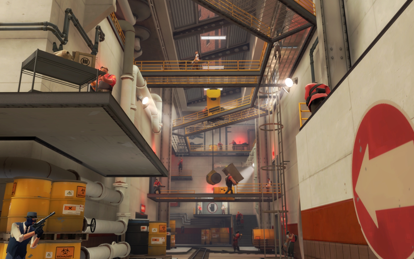
Manngrove

PL Manngrove rc

  • This map is featured! Our best maps, all together in one place for your viewing pleasure.

Fruity Snacks

Creator of blackholes & memes. Destroyer of forums
aa
Sep 5, 2010
6,394
5,571
Never hurts to get more input. I guess I should just sum it all up to say this...

I'm adjusting and carefully looking at the level of detail and lighting on my map for its next release, but you can expect it to have an average density of detail that is far higher than badwater and more in line with mountainlab, nightfall, and doublecross.

I'll look at your lighting this afternoon and provide some feedback on where I think you need to tone it down and what you should accent more.
 

tyler

aa
Sep 11, 2013
5,102
4,621
The other thing is... Mountain Lab, Doublecross and Nightfall still aren't half as detailed as your map is in some places. You're cherry-picking high density shots to justify your point while forgetting that as mappers we've all stared at every official map for hours. They all have boring hallways. Empty facades. Skyboxes that end sooner than you realize. Learn from this.
 
Aug 23, 2008
404
380
Took a quick peek at the map. Definitely diggin the visual style, a nice mix of mountainlab and well. Found some slight issues that I think could really help in certain parts:

http://dl.dropbox.com/u/3492731/spacesaver/pl_manngrove_rc40000.jpg

Not a huge fan of this platform, mostly because of the second set of stairs. Feels kind of ackward to walk up them especially when the health seems so close. I could envision people running headlong for the health, getting caught on the second set of ledges, and getting wrecked. My recommendation is to lower the platform to just one level, instead of having the stairs double back like that. Its a pain in the butt, especially having to lower all the detail work behind the glass, but I think you could make it work with minimal effort. Either that, or maybe reposition the health pack on the right, so people know they have to turn and jump for it, instead of walking straight up the stairs and mistiming the jump.

http://dl.dropbox.com/u/3492731/spacesaver/pl_manngrove_rc40001.jpg

Obviously, the detail work here is amazinnnggg. However, for such a key exit point for blue, I think the cart near the door is a bit chokey. It makes dodging, spamming or lining up shots in this area hard for blue, and leads to this exit being a bit harder to use than I think it should. Removing the cart would help with that a lot methinks. You could always drop it down below, giving scouts a potential boost to jump into that ledge.

http://dl.dropbox.com/u/3492731/spacesaver/pl_manngrove_rc40002.jpg

I know you blocked off the area here for detail reasons, but somehow I can't help but want to go back there. Maybe a bit more in the way of blockage? Not sure how exactly, but my immediate reaction is to want to check out that area, especially with the stairway. Personally, I'd love to have people spawn there, it would be cool if you could just detail the area behind the point, put a teture on the nodraw wall, and have players start in that general area.

That was just a quick walkthrough. I think the map looks awesome. Haven't seen it play, but to be honest, I think that the narrowness could actually be quite fun, especially with the cart acting as a damage buffer. Dustbowl last sees tonsssss of play, and this has a very similar vibe throughout. You just want to make sure players have enough options to be able to push all the way through,
 

R1ghteous

L2: Junior Member
Sep 22, 2011
70
33
Took a quick peek at the map. Definitely diggin the visual style, a nice mix of mountainlab and well. Found some slight issues that I think could really help in certain parts:

http://dl.dropbox.com/u/3492731/spacesaver/pl_manngrove_rc40000.jpg

Not a huge fan of this platform, mostly because of the second set of stairs. Feels kind of ackward to walk up them especially when the health seems so close. I could envision people running headlong for the health, getting caught on the second set of ledges, and getting wrecked. My recommendation is to lower the platform to just one level, instead of having the stairs double back like that. Its a pain in the butt, especially having to lower all the detail work behind the glass, but I think you could make it work with minimal effort. Either that, or maybe reposition the health pack on the right, so people know they have to turn and jump for it, instead of walking straight up the stairs and mistiming the jump.

http://dl.dropbox.com/u/3492731/spacesaver/pl_manngrove_rc40001.jpg

Obviously, the detail work here is amazinnnggg. However, for such a key exit point for blue, I think the cart near the door is a bit chokey. It makes dodging, spamming or lining up shots in this area hard for blue, and leads to this exit being a bit harder to use than I think it should. Removing the cart would help with that a lot methinks. You could always drop it down below, giving scouts a potential boost to jump into that ledge.

http://dl.dropbox.com/u/3492731/spacesaver/pl_manngrove_rc40002.jpg

I know you blocked off the area here for detail reasons, but somehow I can't help but want to go back there. Maybe a bit more in the way of blockage? Not sure how exactly, but my immediate reaction is to want to check out that area, especially with the stairway. Personally, I'd love to have people spawn there, it would be cool if you could just detail the area behind the point, put a teture on the nodraw wall, and have players start in that general area.

That was just a quick walkthrough. I think the map looks awesome. Haven't seen it play, but to be honest, I think that the narrowness could actually be quite fun, especially with the cart acting as a damage buffer. Dustbowl last sees tonsssss of play, and this has a very similar vibe throughout. You just want to make sure players have enough options to be able to push all the way through,

Thanks for the feedback sir. That first ramp Ill prob be reworking... that area feels a bit cluttered. Mostly I didn't want people to be shooting down from that doorway into point C. Ill have a look and may rework the stairs or may move the health pack. Its a pretty easy jump/duck, but Ill just have to look at it again.

As far as that cart... I have found that to be true. Ill likely be changing the blockage there to be something that takes up less space or perhaps removing it all together. I don't really want to drop it down to the lower side as I don't want scouts jumping up there. Demos/Soldiers are fine as when they get up there they will have the health penalty for jumping and have to cross the line of sight from the other direction. Either way good eye. I agree with you.

As far as that area in spawn I've gotten a lot of feedback that says the same thing. People try to go back there even though its just detail work. I will either remove the stairs and add some railing, put up a sign/blockage, or let players spawn back there and walk forward.
 

R1ghteous

L2: Junior Member
Sep 22, 2011
70
33
Found this on facepunch:

AD53.jpg


Thought it was pretty cool. Was made by facepuncher AntorkaDelta. :)
 
Last edited:
Oct 6, 2008
1,949
446
Hi,

I've just played this map 6-8 times on a 32 person (with lots of experience) server and it's gotten various comments most of them good but there have been some very frustraing items that I have been finding in play.

1. Outside to inside most of the attack is via the ground - Red has an unfair advantage of spamming the door from the inside and raining down stuff from the windows. To get to the 2nd floor you have to run away from the battle into the house, upstairs and accross the little wooden bridge. A couple of good snipers can prevent any attack from the top happening. I was thinking that there should be a ladder/ramp from the ground to that brick wall outside to allow for faster access to the 2nd floor. Perhaps a gate should go up when blue caps the first point to limit access to the 2nd floor opposite of the truck on that staircase therr. I was thinking would then make the gameplay like _big battle for main door - big battle to get the 3rd floor - big battle to take the corner approach the last cap - big battle at the corner of last cap and big battle for the last cap.

2. Uber, Uber, Uber.
You need an uber to gain main door, then inside to gain the corner, then one too get to the upstairs to the 3rd floor then one or two to take out the 3rd floor. If red is really well co-ordinated - it just becomes a frustration level, over and over again for the blue team. I think what would help is to put a bridge from the 2nd floor over the truck to the ledge at the far end - it would cut down the angle of attack from the third floor so that you would have to uber as much just to gain the stair case in the far corner from the main door.

3. The last point - advantage goes to blue - but not by much - a couple of tweaks may help.
a] The pipes on the sides if you hit one you end up falling into the water - can be frustraing fro blue/red trying to do an uber pushe either way - the attacking/defending class can loose their medic and vice versa.
b] From red side looking towards blue in center - blue can go right to left at the back (if they not sniped) and end up into the back left room. If blue sets up a base there it's super hard for red to clean out the rats from the nest because they can't get there easily. ie. hitting the pipes mentioned above. Perhaps you should extend the wire bridge section accross from one side to the other that will allow red to run back and forth more easily from the left side to the right and near the main battle zone(if you're worried about building defenses there you could always put in a nobuild). It also would allow blue to choose to keep fighting forward on a push or they can jump down into the center and fight from there.

Well anyways, I hope this helps - I love the map - I love what you've done with it - it's a cool idea - I've just found that some of the gameplay sems a bit off and favours the red team a lot.
 

R1ghteous

L2: Junior Member
Sep 22, 2011
70
33
Hi,

I've just played this map 6-8 times on a 32 person (with lots of experience) server and it's gotten various comments most of them good but there have been some very frustraing items that I have been finding in play.

1. Outside to inside most of the attack is via the ground - Red has an unfair advantage of spamming the door from the inside and raining down stuff from the windows. To get to the 2nd floor you have to run away from the battle into the house, upstairs and accross the little wooden bridge. A couple of good snipers can prevent any attack from the top happening. I was thinking that there should be a ladder/ramp from the ground to that brick wall outside to allow for faster access to the 2nd floor. Perhaps a gate should go up when blue caps the first point to limit access to the 2nd floor opposite of the truck on that staircase therr. I was thinking would then make the gameplay like _big battle for main door - big battle to get the 3rd floor - big battle to take the corner approach the last cap - big battle at the corner of last cap and big battle for the last cap.

2. Uber, Uber, Uber.
You need an uber to gain main door, then inside to gain the corner, then one too get to the upstairs to the 3rd floor then one or two to take out the 3rd floor. If red is really well co-ordinated - it just becomes a frustration level, over and over again for the blue team. I think what would help is to put a bridge from the 2nd floor over the truck to the ledge at the far end - it would cut down the angle of attack from the third floor so that you would have to uber as much just to gain the stair case in the far corner from the main door.

3. The last point - advantage goes to blue - but not by much - a couple of tweaks may help.
a] The pipes on the sides if you hit one you end up falling into the water - can be frustraing fro blue/red trying to do an uber pushe either way - the attacking/defending class can loose their medic and vice versa.
b] From red side looking towards blue in center - blue can go right to left at the back (if they not sniped) and end up into the back left room. If blue sets up a base there it's super hard for red to clean out the rats from the nest because they can't get there easily. ie. hitting the pipes mentioned above. Perhaps you should extend the wire bridge section accross from one side to the other that will allow red to run back and forth more easily from the left side to the right and near the main battle zone(if you're worried about building defenses there you could always put in a nobuild). It also would allow blue to choose to keep fighting forward on a push or they can jump down into the center and fight from there.

Well anyways, I hope this helps - I love the map - I love what you've done with it - it's a cool idea - I've just found that some of the gameplay sems a bit off and favours the red team a lot.

Wonderful feedback! Thank you so much. I have reviewed ~100 matches and alot of your comments fall right in line with what I've found and fixes that I have made. I'm waiting until the weekend is over to release RC5.

I'll address this more at length when I can but for now just rest assured you'll like what you see happen to the beginning of point 2 going from outside to inside and Inside to deep inside. The two implementations will fix your gameplay problems that you found in your points 1 and 2.

As far as point 3, I actually like the risk/reward scenario of crossing the pipes. If blu crosses the pipes then they have an immediate flank that is on top of both health and ammo. I have seen quick sentry builds/heavy medic combos/demo spawn isolation that would be over powered (in my opinion) if there wasn't a risk involved (esp one so big as falling into the water below and having to go back up through the houses on left and right again). From the red perspective its a little harder to make that jump, but not that hard in the end. You should have no real problem crossing it as long as your team is controlling the bridge... when your team loses the bridge and the cart is ~1/2 way across you're probably going to lose.

Ill address this more. Please add me so we can talk more.
 

R1ghteous

L2: Junior Member
Sep 22, 2011
70
33
Oh another thing... if you have the demos recorded I would love to review them first hand as well! Either way add me on steam. :)
 

Fruity Snacks

Creator of blackholes & memes. Destroyer of forums
aa
Sep 5, 2010
6,394
5,571
Alright, so, I can't give any gameplay feedback. I haven't played it... So I'll leave that for other people to argue, but I do have some lighting feedback, and some detail feedback that might get some of the people off your back.

Alright, lets start with the simple detailing thing:
This is creative, but no one in their right mind would make pipes like this, I suggest something more straighter. (More of the large white pipes perhaps?)
If I can't get back there, make it so I know that I can't (like put a cart or something there, something so I know that it is out of bounds)
Some shadow issues on these, i think putting a info_lighting in front of them, and having their lighting origin set to that would be best
Increase the texture scale on both of the water here. Your transition is pretty bad, making the scale will help a little, but you need something else down there to mask it a little (not hide perhaps, but just make it less obvious) --- ALSO, move the mist particles from the waterfall down, its too high up to be realistic.
Seam, small, but annoying.
Make the barrels look more supported. Its kinda silly the way they are being carried right now.
Make these stairs, with a wooden ramp backing. These currently just look really ugly
Cute, I like it, but unnecessary detailing. Also, how did those get down there? Small cans/bottles make sense. Not full tanks

Also, the skybox behind Reds base looks crappy in my opinion. You should lower/move back the buildings that are there, and add something between them and Reds base to show a proper division between the detailing. Right now, it looks like the red buildings are right on top of the base (and that doesn't make sense!)

Alright, now for the lighting lesson (part 1):
I'm not an expert lighter, but I do know a bit more than some people (If you look at backlot, you can see why I needed to learn a bit about proper lighting...). The main point in lighting a map is lighting the places that people need to be/see as best as possible. The Out of bounds area's we don't care about right yet.

What I've noticed is that you have a lot of lights. and I mean, A LOT of lights. They all seem to be on too. Your map is around dusk, so the env_light angle is a bit low, you can use this to your advantage. For example:
pl_manngrove_rc40014.jpg


In just this stretch, you have about TEN (10) lights that I can see, not counting the red lights (which, btw, tone down them, they are too wide on the lighting, or use sprites). This area could have a very nice shadow effect up towards the top. My suggestion is to turn off the upper lights, and use just the spots on the bottom. You should have enough light from the env_light and from the spots to have a properly lit path. This goes the same through that whole section.

Here there is the same issue:
pl_manngrove_rc40013.jpg

You have TEN (10) light sources here in just this shot, not including the the ones under the walkways. You could do the same thing here, you don't need a lightbulb every 2 beams, you can get away with 3-4 beams. Also, the hanging cone lights are un-necessary if you have the spot lights, along with the windows. **You might be able to get away with doing some silhouetting on the windows in the upper right (which is where you take a wide light_spot, make it the same color as env_light, make it a little less than the brightness of the env_light, and have it point in towards the map, it simulates natural light coming in through the windows**

Here some other places where your light density is too high:
This is in the building in front of blu spawn.
pl_manngrove_rc40005.jpg


This is the small building in front of blu spawn. You have 5 lights. You can still properly light that area (and the detail on top) with 3, just by turning off/getting rid of the the light on the farthest left of the picture, and the farthest right of the picture.

You can do a similiar thing here:
pl_manngrove_rc40008.jpg


Lighting lesson - part 2:
Now with lighting the playing area's, you also need to keep in mind the area's of interest. AKA: the capture points. So if you have spot lights shining anywhere, the first one's you place into the map, should be high lighting the points.

pl_manngrove_rc40003.jpg

Here is one place where I think you can tone down the lighting density a bit, AND, highlight the point more. The goal is to blow up the rocket, isn't it? Then why are all the spotlights shining downwards and none towards the rocket? You can do this simpley but taking the existing spotlights, and just turn 2-3 of them so that they shine on the rocket (You don't need to add any more lights here).

Lighting in a map is as important as detail and gameplay, if provides and additional feel for the map and helps the player become more immersed in the environment. A thing I find helpful when dealing with lighting for maps is to take out all the lights in the map, and then run through it (assuming its not pitch black). Then, go through and only light up the places where people can walk AND are too dark to recgonize team colors. Nothing else. Once that is done, then you can start to add minimal lighting to the detail areas of the map.

I hope this helps. I was really impressed with the way the map looks.
 

R1ghteous

L2: Junior Member
Sep 22, 2011
70
33
Alright, so, I can't give any gameplay feedback. I haven't played it... So I'll leave that for other people to argue, but I do have some lighting feedback, and some detail feedback that might get some of the people off your back.


You went on to say alot, and I read it all and listened to every point. I have gone through and adjusted the level of brightness/detail of various areas on RC5. I am waiting to release it so that everyone has the same version and is playing the same version over the weekend. Some of which you have shown some of which you didn't. Thanks for the direct input with very specific examples. I want to thank you taking the time to review the map at this level of detail. Would love to play with you soon.

Thanks!
 

tyler

aa
Sep 11, 2013
5,102
4,621
Frozen pointed out most of what I planned to send you later

Re this: http://dl.dropbox.com/u/8526839/pl_manngrove_rc40004.jpg

You actually need a lights.rad file. Check the link I posted a few pages back on lighting options.

Re this: http://dl.dropbox.com/u/8526839/pl_manngrove_rc40015.jpg

Make them easier to walk on as well, and don't mirror them on the other side. It's not interesting.

Frozen points out that you have a crazy amount of lights, which is true. If your compile time is really as long as you told me, cutting these will help as I'm betting most of it is VRAD.
 

R1ghteous

L2: Junior Member
Sep 22, 2011
70
33
Me and him talked about this a while ago, he should have one.

Mmmmm hmmm I have one, but I should have included those to it. Along with the barnblitz fence on the left in that pic... They are added in the RC5 version. Again this comes Sunday night or Monday night.
 

R1ghteous

L2: Junior Member
Sep 22, 2011
70
33
Re this: http://dl.dropbox.com/u/8526839/pl_manngrove_rc40015.jpg

Make them easier to walk on as well, and don't mirror them on the other side. It's not interesting.

I have considered changing them as they are interesting but mirroring them on both sides makes them less unique. I'm not sure if I'm going to change it because I like how it looks and it having a bridge on both sides that is not a brush but a unique prop like that ensures that players do know that its walk-able. I did add some player clipping to it in RC5 so that it feels more normal to walk on and doesn't bob the players up and down as they cross the ridges. I decided to do that after i saw a soldier miss what would have been an awesome air shot simply because the tiny ridge moved his player model up 2 units. Thanks for the feedback you were dead on about both parts, though I'm not sure that I'll change the pipes themselves.


Hi,

I've just played this map 6-8 times on a 32 person (with lots of experience) server and it's gotten various comments most of them good but there have been some very frustraing items that I have been finding in play.

1. Outside to inside most of the attack is via the ground - Red has an unfair advantage of spamming the door from the inside and raining down stuff from the windows. To get to the 2nd floor you have to run away from the battle into the house, upstairs and accross the little wooden bridge. A couple of good snipers can prevent any attack from the top happening. I was thinking that there should be a ladder/ramp from the ground to that brick wall outside to allow for faster access to the 2nd floor. Perhaps a gate should go up when blue caps the first point to limit access to the 2nd floor opposite of the truck on that staircase therr. I was thinking would then make the gameplay like _big battle for main door - big battle to get the 3rd floor - big battle to take the corner approach the last cap - big battle at the corner of last cap and big battle for the last cap.

2. Uber, Uber, Uber.
You need an uber to gain main door, then inside to gain the corner, then one too get to the upstairs to the 3rd floor then one or two to take out the 3rd floor. If red is really well co-ordinated - it just becomes a frustration level, over and over again for the blue team. I think what would help is to put a bridge from the 2nd floor over the truck to the ledge at the far end - it would cut down the angle of attack from the third floor so that you would have to uber as much just to gain the stair case in the far corner from the main door.

3. The last point - advantage goes to blue - but not by much - a couple of tweaks may help.
a] The pipes on the sides if you hit one you end up falling into the water - can be frustraing fro blue/red trying to do an uber pushe either way - the attacking/defending class can loose their medic and vice versa.
b] From red side looking towards blue in center - blue can go right to left at the back (if they not sniped) and end up into the back left room. If blue sets up a base there it's super hard for red to clean out the rats from the nest because they can't get there easily. ie. hitting the pipes mentioned above. Perhaps you should extend the wire bridge section accross from one side to the other that will allow red to run back and forth more easily from the left side to the right and near the main battle zone(if you're worried about building defenses there you could always put in a nobuild). It also would allow blue to choose to keep fighting forward on a push or they can jump down into the center and fight from there.

Well anyways, I hope this helps - I love the map - I love what you've done with it - it's a cool idea - I've just found that some of the gameplay sems a bit off and favours the red team a lot.

Back to this now that I have a bit more time...

I have found that what you said in points 1 and 2 isn't really a problem in servers with fewer than 16 players (8 on each side) but when you get past that threshold the combination of good sentry placement, demo/soldier spam, and an heavy/medic combo on the bridge that connects the red team to the house in the warehouse and the battlements means its a lot stronger choke point than I had originally intended for it to be.

To amend this RC5 will have 2 things that RC4 does not.

1. It will have a skill jump ladder on the outside of the building to allow blu players to gain easier access to the battlements area. This will ensure that players (other than a demo/soldier) don't have to leave the fight and go into the house behind them to go upstairs and then cross the bridge. But instead have an alternate route at that doorway to make that doorway less of a bottleneck for blu.

-and-

2. It will have an additional hallway that connects blu side of the battlements across the garage (which will have a deck above the garage) all the way across to the connector where they can gain access to the third floor. In my earlier play testing the truck wasn't a truck it as a skill jump with an elevated height. It worked well to create an area that was high enough to see most of the warehouse and outside of most sentry gun range, but the sight line wasn't imbalanced because the barrels in the middle of the room break up the sight line against the back wall where red often mounts its defense. Players mostly stopped using the elevated position once it was a prop and not a brush and it's now used as mostly an obstacle for teams to push either direction. I've lit it, added steps adjusted the angles, you name it, but players don't use it as often as they should. So to fix this I'm adding that deck above the garage to give players the extra access to the second floor (by means of the truck itself) as well as making it a more obvious position to engage the red team that is inside of the warehouse. Additionally this change will add the connector to funnel more blu players upstairs and make the fight more interesting and play out more like it did in earlier testing.

Keep in mind these are just the changes to the actual structure of the area. I have also changed the lighting/detail work to help focus players where it is most advantageous for them to focus.
 

R1ghteous

L2: Junior Member
Sep 22, 2011
70
33
Well I'm going to be finishing up some final work on gameplay tonight... if anyone has anything else to add please let me know.

Overall the map is playing almost exactly how I had wanted it to. Aside from the previously mentioned changes that connect the battlements and warehouse as well as the added access point from outside to the battlements I am really happy with how it plays. Please let me know if anyone has had any other issues with gameplay.